Prototype 3 visuals + interactive

I shifted my idea to an app for food diary, and it will recommend closed restaurants based on what types of food you ate before.

I got many feedback from my last prototype, for example, people do not like “shake” feature, so I change it to use “swipe” to look at recommended food. They also think that showing closed restaurants on map is unnecessary, so I choose to only show one image of a dish per swipe. The location will show up only when the user is interested and tab on to see more information about the dish.

my food diary

Interactive one on marvel:

https://marvelapp.com/2b8j08i/screen/25207575
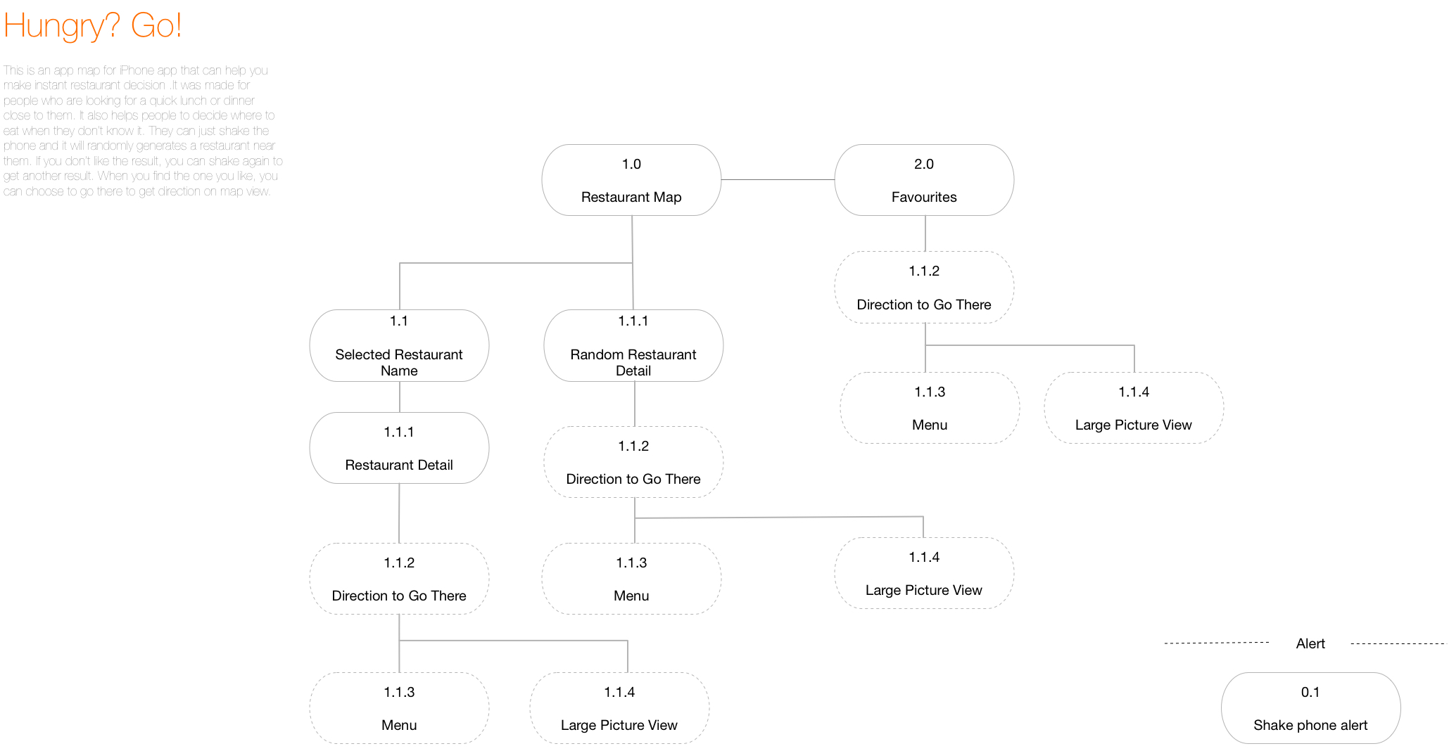
 

Prototype 2-App Map + Wireframes

After last week’s user test, I add some icons that will be like filters when the user is trying to find a restaurant.  The tester told me that he still wanted to make some sort of decisions before the app gave a random result.

I also changed the icon for “favorites” because one of the testers told me that he could not understand the star as “saved favorites.”

Another small change is that I add the white block under “Hungry?” to separate the text and the map so that it’s more readable.

I also add the back button on restaurant detail page and make it full page. Before, I was afraid that detail page separate from the map, so I make it like a pop up window upon the map, but after user test, I was told that a whole full screen view will be better.


Week 1-Self Intro+3 Things+Wireframes

A bit about me:

I’m Yue Guan, a MFA DT first-year student. I come from China, and I graduated from Boston University last year. My background is mass communication studies and visual arts. I’m interested in interactive design, media studies and speculative design. I love pixel game apps (like eBoy FixPix) and food apps!

My selfie:

https://drive.google.com/open?id=0B9XNWpugKw9dOTZNZVpWS0N2Szg


Three things I learned from Apple HIG:

1: “Apps respond to gestures, not clicks”

Click does sound like we are still on a web page, and the truth is that a touch screen can do so much more than a “click.” These gestures include tap, drag, flick, swipe and shake. Now with force touch, we can also use hard tap.

2: “Onscreen user help is minimal”

Users would not spend much time on reading tutorials about how to use this app.

3: “Always have a reason for customization”

We need to let the task drive customization decisions. Too much useless customization will cause a headache.

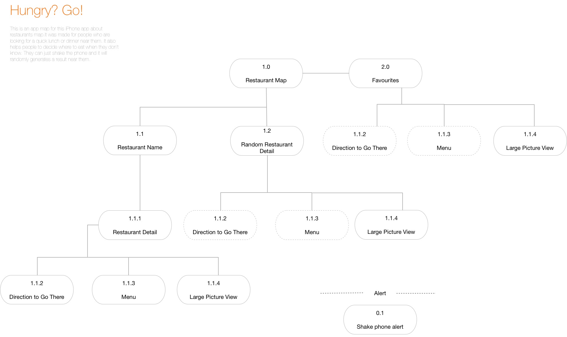
My first week app map:


My first week wireframes: