Brandon Palmer | Wireframe & Prototype_2 | 3 Things I learned from Paper Prototyping

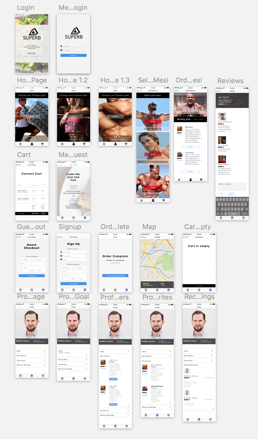
Three Things I learned from Paper Prototyping:

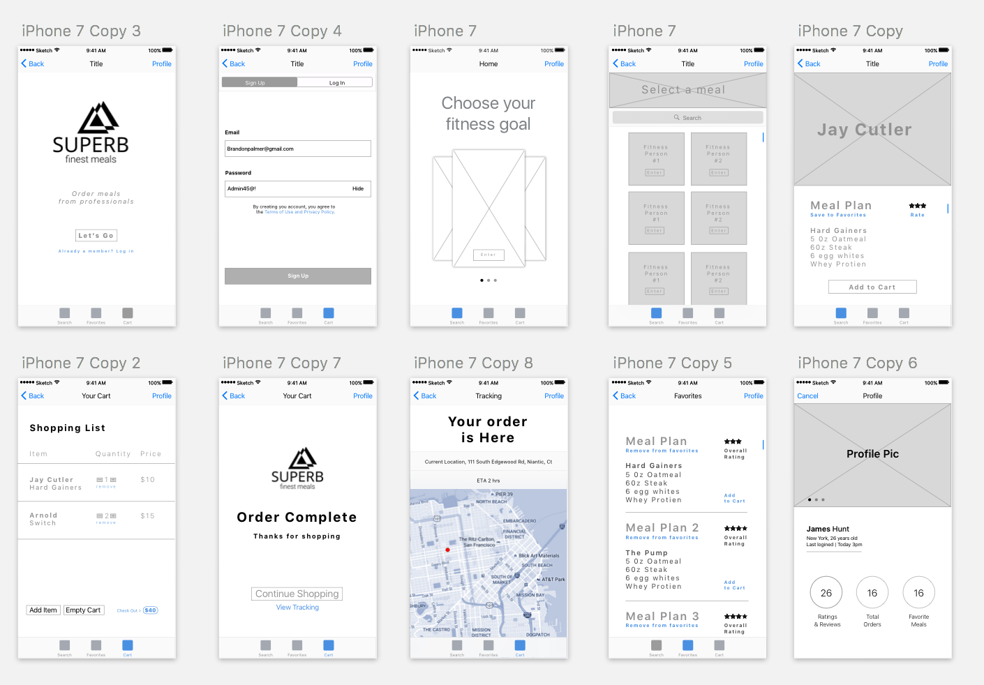
What I learned from prototyping is that most people will not take the time to signup to use an app that they’re unfamiliar with. So I found that adding a guest login option is an alternative direction to take. Regarding the feature for signing up for a free membership, the benefits consists of giving users a 10% discount on all meals they purchase. I also have learned that the way things are worded are key for simplifying the users experience. For instance, my landing page stated “Meals designed by professionals.” Instead of specifying who the professionals are. Another key value that I have learned from user testing is that there had been confusion with the profile page. The users didn’t understand the functionality of what this feature had provided. Overall the feedback that I have obtained had been positive, There is still much work that needs to be iterated through the next developmental process. But I have gained useful feedback.

Critique Notes

• Change display name on the landing page. (“Meals designed by professional athletes”).

• Change “Homepage to Meals”
• Homepage should consist of all categories and specific meals assigned to their parent. (Allows the user to analyze most data without having to search.) Faster traffic for consumers
• Fix typography, Color Scheme, Make 40px of padding in-between each tappable element. (Between ratings and favorites inside the profile page).
• Make the interface on the Meal page(Orig Homepage) more engaging and visually appealing through hieratic elements.


This is the PDF


Superb_Remodel_optimized


Brandon Palmer | IOS & Google Material Design Specifications

Mobile Media:

01/28/17

IOS HIG (Human interface Guidelines)

  • Clarity
    • Icons are created to be subtle and precise
    • Negative space, colors, fonts, graphics, and interface elements highlight importance which convey interactivity
  • Deference
    • Content typically fills the screen
    • Minimal use of bezel, gradients, and drop shadows keep the interface light and airy ,while ensuring that the content is paramount
  • Depth
    • visual layers and realistic motion convoy hierarchy. Transitions provide depth as you navigate through content. 
  • Metaphors
    • People learn quickly when objects and actions are metaphors for familiar experiences. Like flipping through pages of a book. 
  • User Control
    • People are in control. Not the app
    • Apps can make warnings. But the app doesn’t control decision making. 
    • The best apps find a balance between enabling users and avoiding unwanted outcomes. 
    • Apps make people feel like they are in control by keeping interactive elements farmilar and predictable, and making it easy to cancel when operations are underway.  
  • Widgets
    • widgets provide information without needing to open an app
    • people add widgets to the search screen 
  • 3D Touch
    • Pressure sensitive (Peek, Pop, Quick Actions)
    • Accessibility features are created for people with hearing, vision and other disabilities 
  • Authentication 
    • People often abandon apps when they have to sign in first. 
    • If your app requires authentication, display a brief friendly explanation on the login screen that describes the reasons for the requirements and its benefits 
    • When possible present choices. Its important to add options that are easily assessable, instead of typing in responses. 

Android Design Guidelines

  • Environment 
    • Material Design is a three dimensional environment containing light, material, and cast shadows.
    • All materials have an X Y Z dimensions. 
    • Light and Shadows. (Key lights create directional shadows. Ambient light creates soft shadows)
    • Materials are always 1dpi thick
    • Materials cannot pass through each-other
    • Material never bends or folds
    • Material sheets can connect and join together
  • Motion 
    • Material Design is alive, aware, and intentional 
    • Responsive animation to create energy
    • Material Focuses on how fast it moves instead of how long it takes to get there. 
    • Monition shows that an app is organized, and what it can do. 
    • Motion is quick. Shouldn’t keep the user waiting longer than necessary 
    • Motion is clear, simple, and coherent. They should avoid doing much at once
  • Color
    • All color pallets should include sufficient contrast between different UI elements
    • Limit your selection to 3 hues from the primary pallet and 1 accent color from the secondary pallet. 
    • Primary Color should be the most widely used color across all of your screens and components
    • Secondary Pallet can be used to indicate a related action or information
    • Accent Color Should be used for floating action buttons and interactive elements
      • Text fields and cursors
      • Text Selection
      • Progress Bars
      • Selection controls, buttons and sliders
      • Links
    • If your background color is the 500 version, make your accent either white 100% or black 54%
    • Dark text on light backgrounds (Opacity)
      • Primary Text 87%
      • Secondary Text 54%
      • Disabled/Hint text 38%
      • Primary Color 100%
      • Accent Color 100%
    • White text on Dark backgrounds
      • Primary Text 100%
      • Secondary Text 70%
      • Disabled/Hint text 50%
      • Primary Color 100%
      • Accent Color 100%
    • Use opacity instead of grey text. 
    • Icons and other elements work better being black or white at 38% opacity
      • Dark Icons
      • Active Icon 54%
      • Inactive 38%
      • Light Icons
      • Active 100%
      • Inactive 50%
  • Themes
    • Lets you apply a consistent tone to the app 
  • (post on blog one #thursday app before midterm and one after midterm) 
  • You need to write about your critique and iterations on your paper prototypes 

Design Tools for Prototyping 

omnigraffle

Framer

Flint

Marvel 

Point is measurement sequence

4 pixels in every point

packs more information into a smaller size