https://popapp.in/w#!/projects/530fe50b09c93aa12cb3d98e/preview
Author: Seungkyun Lee
Cuisinary App map + Wireframe 2
This is my second iteration of my food dictionary app Cuisinary.
App Map + Wireframes
My food app is called “Cuisinary” and it’s a food dictionary. Here is my first iteration.
#thursdayplays: Triposo World Travel Guide
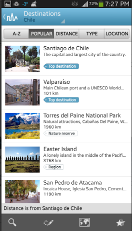
As the name of the app suggests, this is a travel guide app, and a very very useful one! I just discovered it today and wanted to share it with everyone.
Triposo World Travel Guide is available for both Android and iOS, and it has information packages for a whole list of countries all around the world. You can download those individual country packages on your phone so that you can view them offline. (The size is fairly large, but this is still useful since you may or may not have internet connection while traveling.) I downloaded Chile for example here.
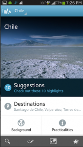
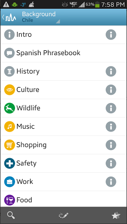
What I really like about this app among all the other travel guide apps is how it presents information. The layout is very clean and simple, which makes navigation super easy. The app offers background information about the country, such as its history, culture, safety tips, etc. Plus it has a useful phrase book for non-English-speaking countries.
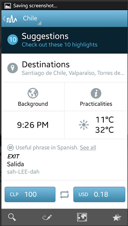
My most favorite part is the exchange rate calculator, like you can see on the bottom of this screenshot. I’m sure this exchange rate calculator would come in extremely handy if I were traveling abroad.
Similar to this app, TripAdvisor City Guide also works offline, and it has a lot of useful information for travelers. In fact, I feel like TripAdvisor might have more information than Triposo. But personally, I like Triposo better, because I have trouble navigating through the lists and blocks of texts in TripAdvisor. Triposo lists out information as well, but oftentimes it is accompanied by pictures, which I prefer. The tag-like system in Triposo also helps me learn more at a glance.
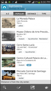
One thing that Triposo lacks compared to TripAdvisor City Guide is the rating/ranking system for restaurants and other tourist destinations. It does have some sort of ranking system but I’m not sure where it’s getting that information from. The ratings and rankings in TripAdvisor are super helpful, so it would be nice if Triposo could somehow bring in those features (but without cluttering the layout).
Overall, Triposo seems like a well-designed app that offers useful information for a lot of different cities and countries around the world. I really want to travel now so that I can use this app!
Ideas for food themed app
I have two ideas for food-related apps.
1. Food Dictionary: I often run into situations where I don’t understand a good portion of the menu/ingredients at restaurants. So I’m interested in making a food dictionary app that can be helpful in such situations. The app will contain general information + images of various cuisines from around the world and their commonly used ingredients. In short, this app will be a visual dictionary specifically for food, and I think it could be particularly useful when traveling abroad.
2. Gummy Bear Weather: A weather app with a gummy bear theme… Perhaps this will make any sort of weather feel nicer? In this app, whether it is snowy, rainy, sunny, etc., everything will be represented through gummy bear imageries. This app isn’t exactly meant to solve specific design issues, but rather, is purely for fun.
My Thoughts on iOS User Interface Guidelines
1. Branding: I found the section about branding particularly interesting because of how such a simple difference could make a big difference in user experience. The guideline presents a comparison between recommended and not recommended designs. It was funny to see how the logo and advertisement shout for attention in the “not recommended” example, and I could clearly see how one was much less visually pleasing to look at. I am an Android user, and I feel like I see this “not recommended” version a lot in my Android apps (especially in the apps that exist for Android only). I have an iPad as well so I often compare apps between iOS and Android. Now that I think about it, it seems like apps on my iPad tend to have far less obtrusive branding and advertisements, compared to apps on my Android phone. A lot of apps on my phone have visually annoying logos and banners everywhere. When it comes to apps that are for both Android and iOS, however, they tend to be more well-designed in terms of user experience. I don’t know the exact reason for these differences between iOS and Android apps. It might just be a coincidence, and perhaps the apps that I install on my phone happen to be the poorly designed ones. Or could there be other reasons?
2. Interactivity and Feedback: It was interesting to see all the standard gestures laid out in one place. I thought it was quite amazing to realize how natural most of these gestures have come to feel. The part about avoiding making up new gestures for productivity apps (in contrast to how new gestures could be an element of fun in game apps) was interesting too. It made me realize how gestures could bring different effects to the users depending on the main purpose of the app.
3. Terminology and Wording: I particularly appreciated the phrase “Every word you display in an app is part of a conversation you have with users.” I thought it was a really nice way to think about text in apps, and made me think of the word “empathy.” Also, the part about considering user’s locale was helpful. It is obvious that there are smartphone users all over the world, but I don’t think I ever thought about it in the context of app design. It was a good reminder for me to be aware of the diversity of users, not just culturally but also geographically. This section also mentions how important the App Store description is in communicating with potential users. When I look back, though, I rarely pay attention to the app descriptions when I’m searching for new apps. My habit is to jump directly to user reviews, and if I find the app interesting, then check if it offers in-app purchases. I’m curious if this is just me or if other users do the same.
Overall, the guideline was informative and it made app design seem like a breeze, even though I am fully aware that is not true. In any case, the guideline helped me think of UI elements that I wasn’t aware of before. It was also fun to look at the visual examples think about the recent graphic trends.
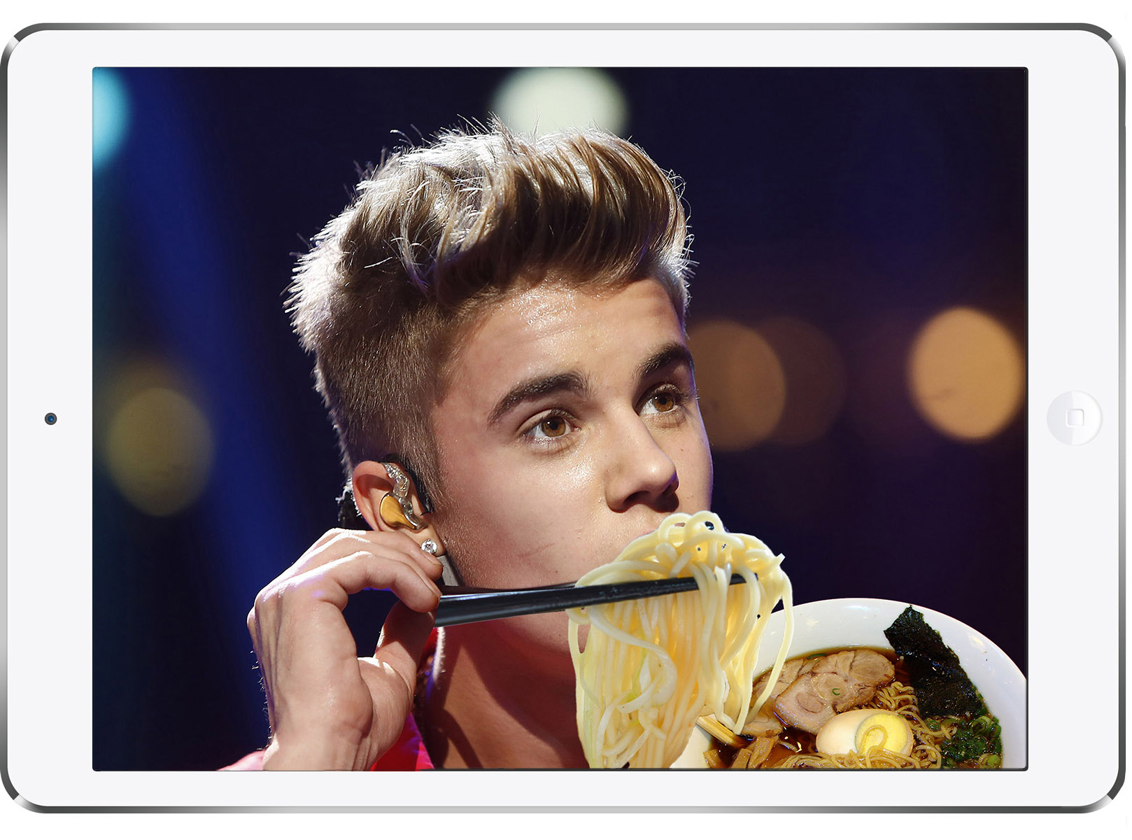
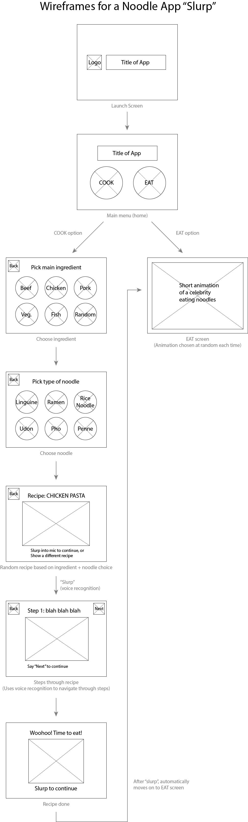
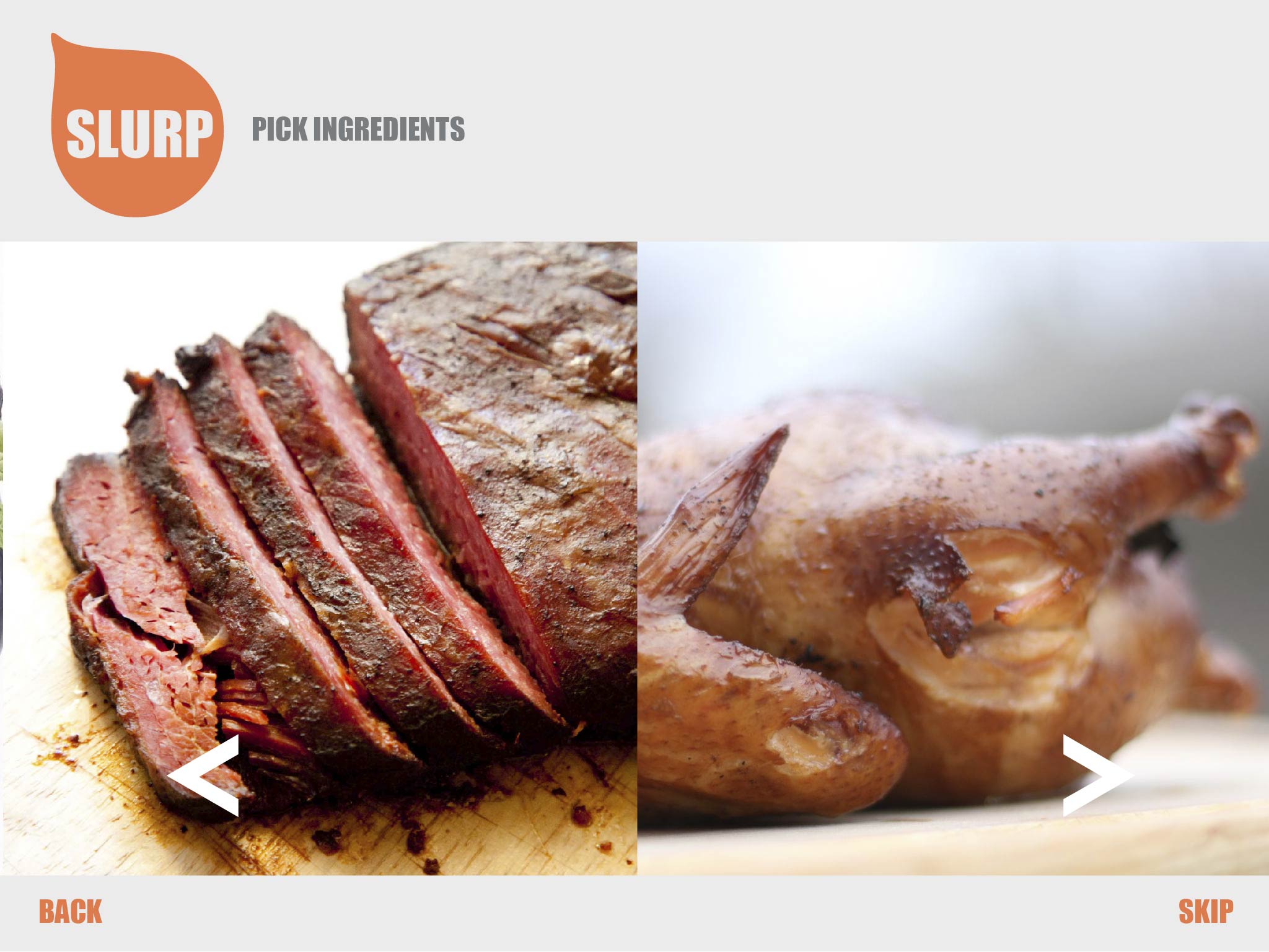
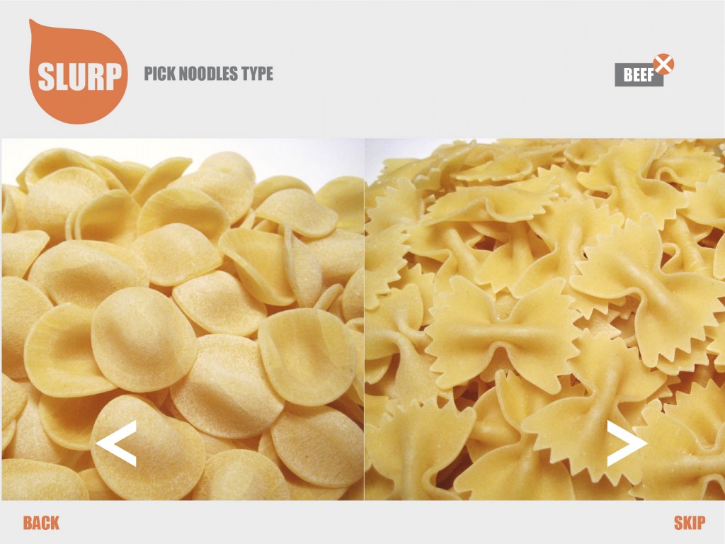
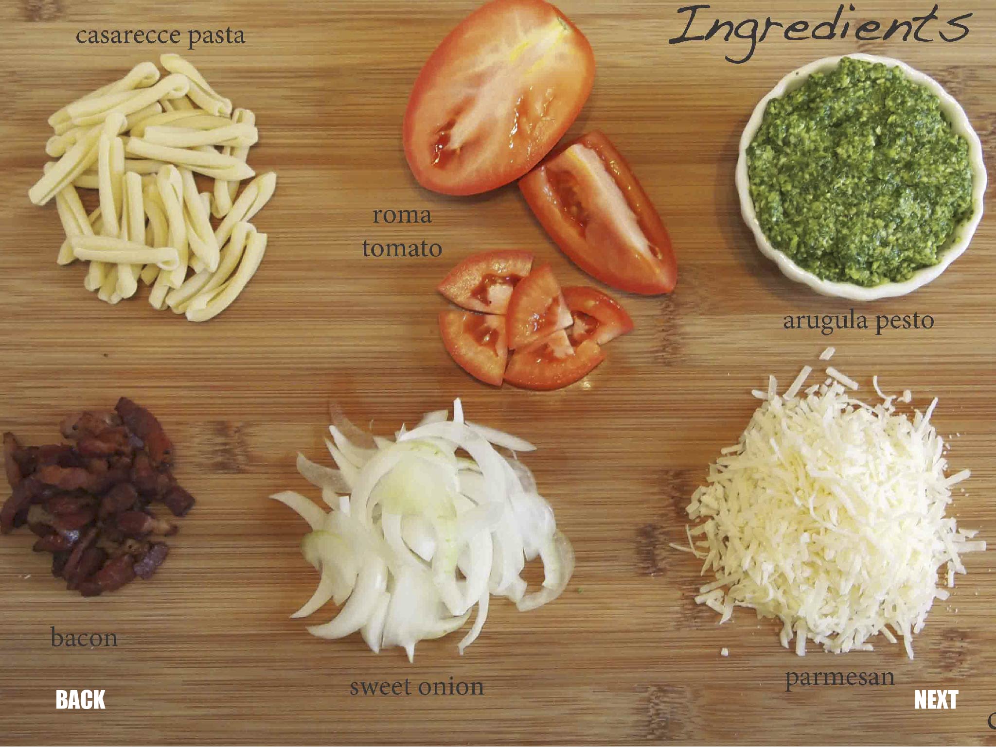
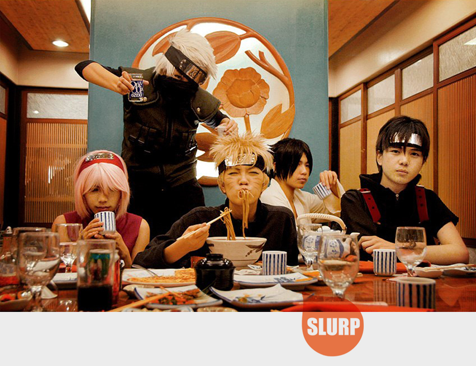
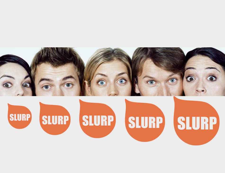
App Scramble: “Slurp”
Team: Tingjian (Carrol) Shen, Yang Wang, and Seungkyun Lee
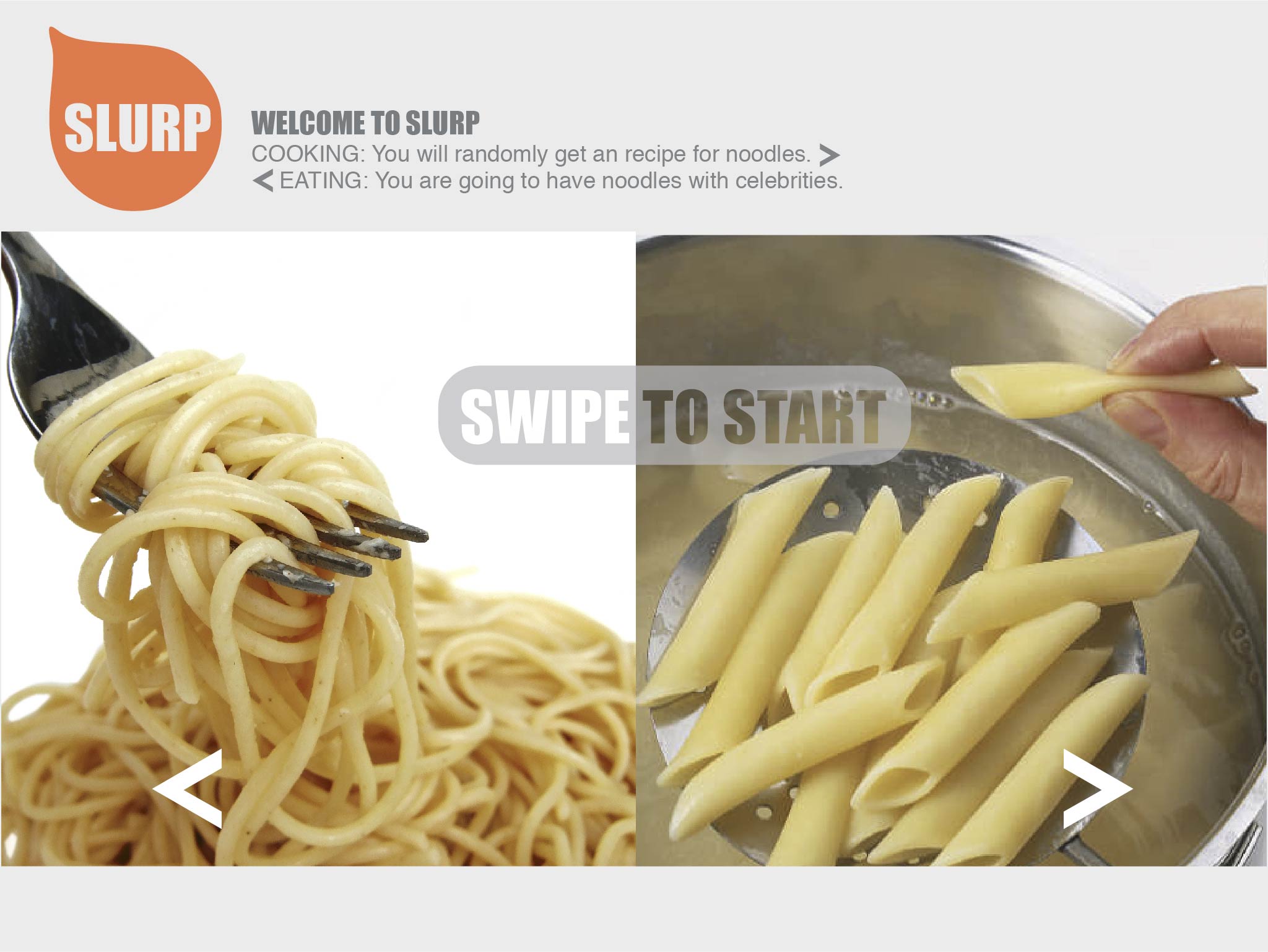
The name of our app is “Slurp.” It is a noodle recipe + eating company app for the iPad.
In terms of the recipe feature, we decided it would be useful because we assumed single people in their 20-30s wouldn’t be very good at cooking. Noodles are relatively easy dishes to cook, so we thought target users would like to see the recipes.
The other feature of the app, which is the eating company feature, is the twisted side of our concept. We assumed single people would eat alone most of the time. In order to help with the loneliness, we decided to include the option to have a celebrity/movie or TV character show up on the screen to accompany the users while they eat.
In terms of interaction, we imagined using voice command. The part where the user needs to slurp near the microphone is to play with the idea of noodles. Voice command also comes in when the user moves forward or backward through the different stages of the recipes. There are buttons on the screen, but we thought the user wouldn’t really want to touch the screen with their hands while cooking, so we thought the voice command would be useful.
Wireframe:
Icon:

Mockup:


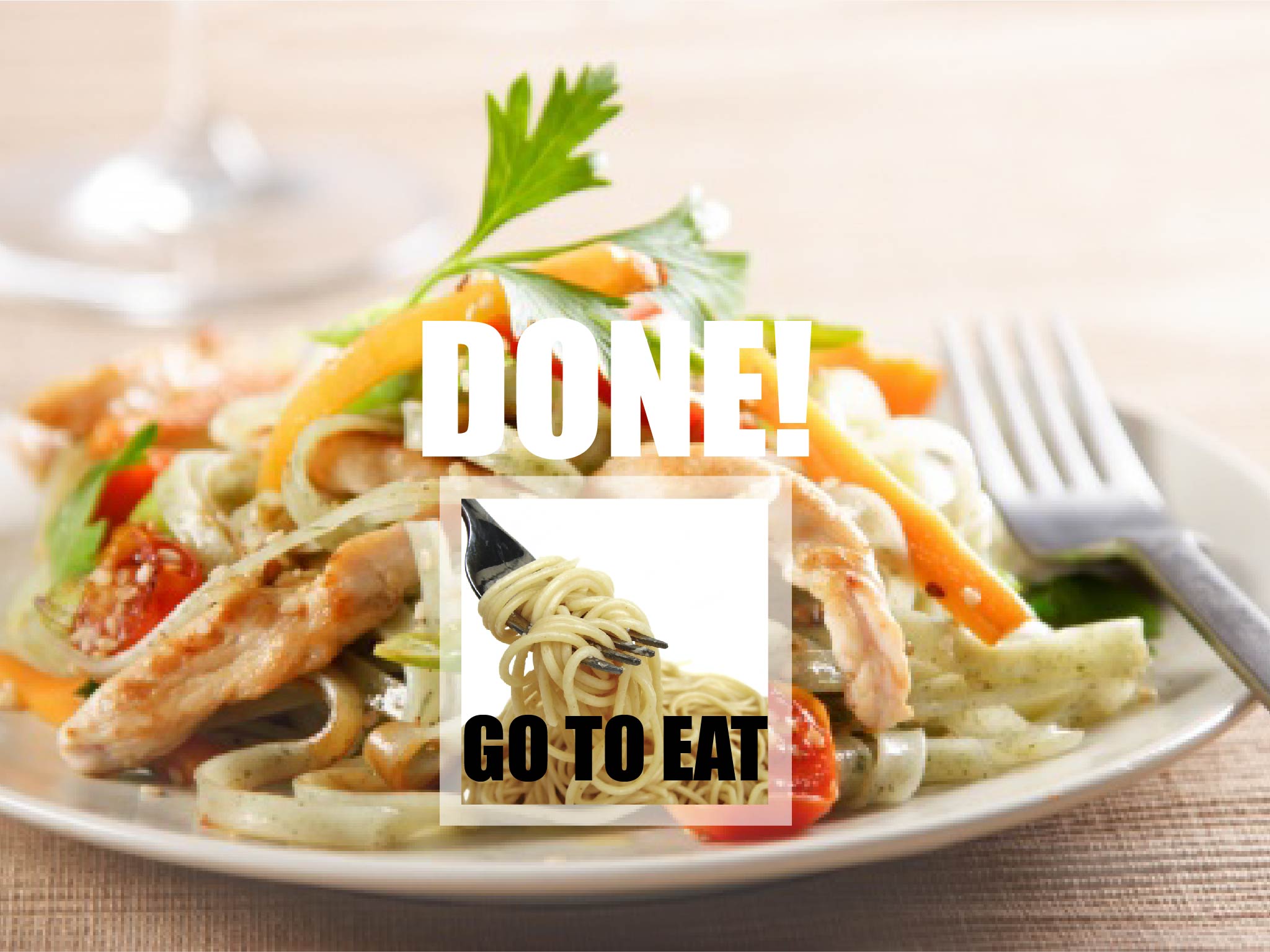
These are some of the screens that the user could be eating with.


Bonus: JB eating noodles with you!!