Iteration:
1. buttons and texts are way tooooo small!
2. pantone CMYK bars are too close to each other
3. be careful of putting too much information in one page>consider slide right and left to reveal more
Iteration:
1. buttons and texts are way tooooo small!
2. pantone CMYK bars are too close to each other
3. be careful of putting too much information in one page>consider slide right and left to reveal more
Things I learned from prototyping:
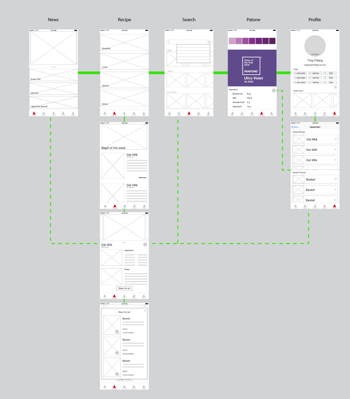
1.Saved item is suggested to remove from tabs and have it’s own button floating on the page.
2.Smoothies should combine with recipe. Also, the instructions of choosing the colors are unclear. This week, I designed a CNYK bar which is a pretty intuitive interface for users.
3.Added shop as one of the tabs.
4.During the paper prototyping, my users pointed out several missing “return button”, which I added this time.
Hello! This is Ting.

My background is Industrial Design with a year experience in exhibition design.
3 things I learn form IOS Human Interface Guideline is mostly about iPhone X:
1.Bolder navigation. To improve clarity and context when browsing and searching, apps can implement navigation bars that include large, bold titles.
2.Safe area layout guides. Adhering to the system’s safe area ensures appropriate insetting of content within layouts and prevents content from underlapping the status bar, navigation bar, toolbar, and tab bar.
3.Minimize the use of modality. Generally, people prefer to interact with apps in nonlinear ways. Consider creating a modal context only when it’s critical to get someone’s attention, when a task must be completed or abandoned to continue using the app, or to save important data.