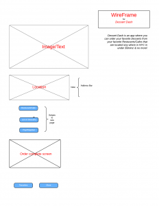
Paper Prototyping Feedback

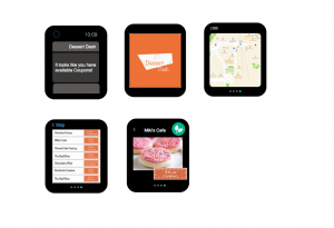
Alter logos/Remove – confused as buttons

 swipe or arrow feature

start with the cheapest desserts work your way down

Add +1 to the cart icon

Add “get it with the coupon”

With the cart title, include number of items

Add a shopping cart to all dessert pages/ Reduce the number of desserts that day

vibration as an indicator that deal has ended

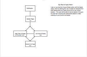
no need for splash page

Add status or order

issue with back button

have a buy button with the coupon

Have a close button on the last page
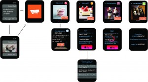
Final Prototype

1.01

Final Iteration for Dessert Dash 

Things i worked on from last critique :

*having the cart as a separate tab
*text legibility
*substitute toggle button with text “map”
*substitute dollar signs with text “deals”
*move the tabs to the bottom
*included a splash screen

What i learnt overall about Digital Prototyping:

It helped yield more authentic feedback from end users; having something physical to engage with, helped me get clear idea as to the user’s preferences.

First Design Prototype

Slight changes i made from from the wireframe based on feedback:

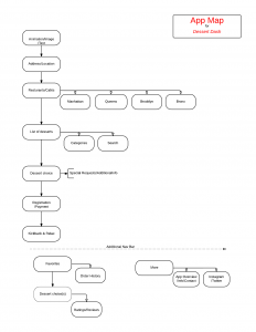
  • Merge the splash screen and landing page – Also upon opening the app, it will automatically show the dessert restaurants around you by random order
  • Leave out Desserts as a tab option & incorporate it as a search bar
  • Reduce the amount of text on your DASH cart page

Here’s just a layout design of the main pages.

foodapp