iOS Human Interface Guideline

1. Ensure legibility by using the system fonts

When designing an app, I thought it is ok to use any font as long as it is legible. I did not take into consideration that this font should actually be legible at any size. System fonts are made to fit this criteria. Other fonts however might be well adjusted at one size but then issues such as kerning might interrupt legibility when the size changes.

2. Be straightforward if your app runs in only one orientation

In my first wireframe I only considered the application to be running only in a portrait format. Now I am rethinking about the possibility of having it in landscape as well and how that would look like.


3. Make it easy to focus on the main task by elevating important content or functionality

It made sense to me before that naturally more important tasks would be more towards the top of the screen. However, I had no idea that there is a huge difference between the upper right corner and the lower corner versus only the upper and lower sections.

4. Make it east for people to interact with content and controls by giving each interactive element ample spacing

I was well aware of this logic but it’s very convenient to see that the hit target is 44 x 44 points

5. Focus on the needs of 80 percent of your users

As a communication designer my logic was to try to cater to everyone’s needs. However, this can be very problematic because sometimes the more specific tasks or information can overcrowd the page. Although this is a user centered design, it is interesting to see that if certain functionalities might not be wanted by most users, it can be left out. Another option would be is that it can be hidden and can pop out or expand if it’s wanted.
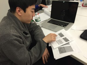
Food Scout // In Class User Testing

Participant 1

IMG_1751

Profile

Chis Lee  //  25  //  South Korea  //  Based in NYC  //  Graduate Student

User Input

Screen Shot 2016-02-04 at 5.32.01 PM

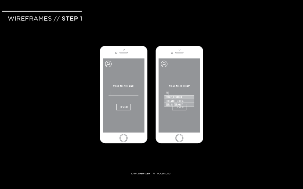
The user found the interaction direct and had no problem figuring out the first step which is to type in the location

The user did not consider interacting with the profile icon. This means that it’s function was not obvious. Supposedly, it should be linked to the user’s profile. But this is the first page, so it should be a sign in page for the first time, and then a personal profile for returning users. I need to think how to make obvious to the user that this is clickable without confusing them whether to press on it or go to the location first.

Screen Shot 2016-02-04 at 5.32.02 PM

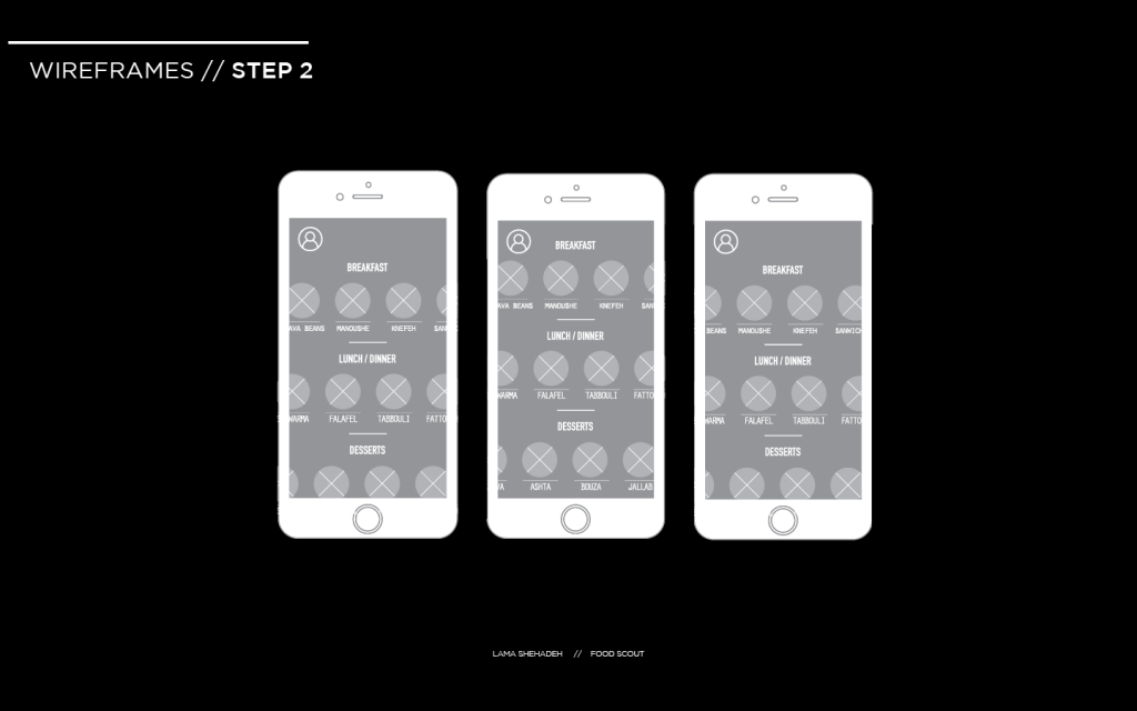
The direction of swiping was obvious for the user. However, he was looking for a search option that allows him to look up items. I want to keep the items restricted to local iconic food items. Looking through the icons gives room for more exploration by the traveller. I will do a few more user test in order to decide on the addition of the button or not.

Screen Shot 2016-02-04 at 5.32.04 PM

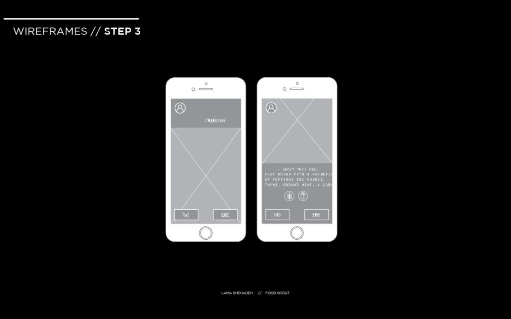
The user did not know that there’s a possibility to scroll down on the page. The user opted to go foe find.

Screen Shot 2016-02-04 at 5.32.05 PM

Screen Shot 2016-02-04 at 5.32.07 PM

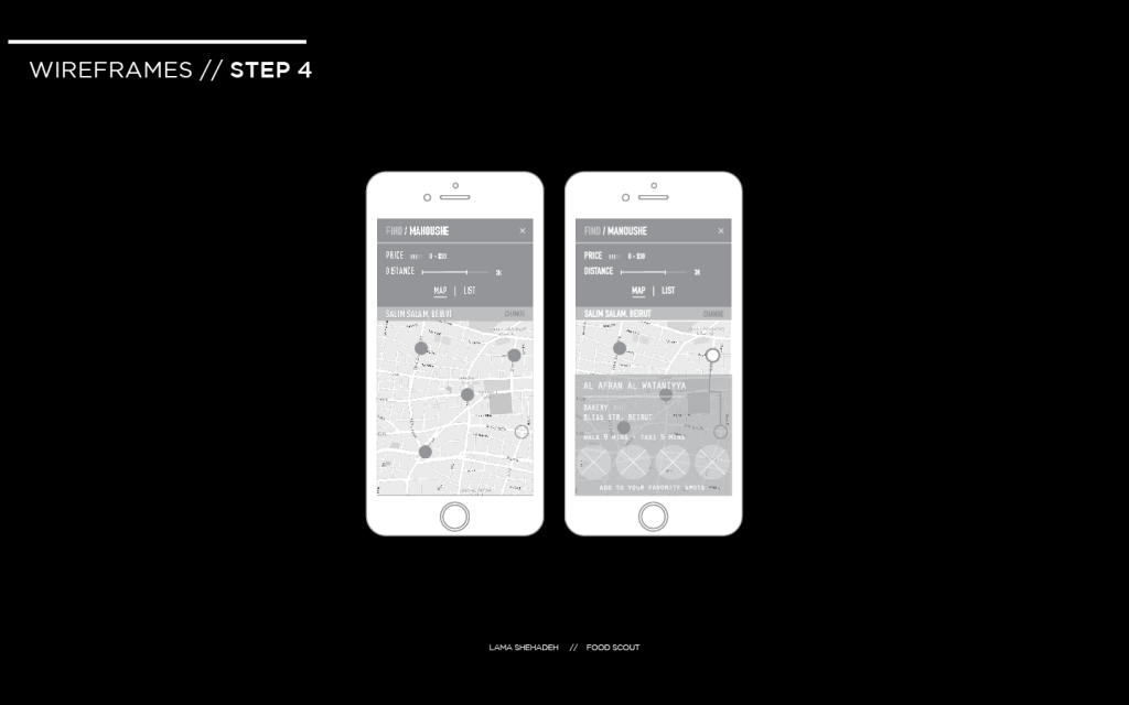
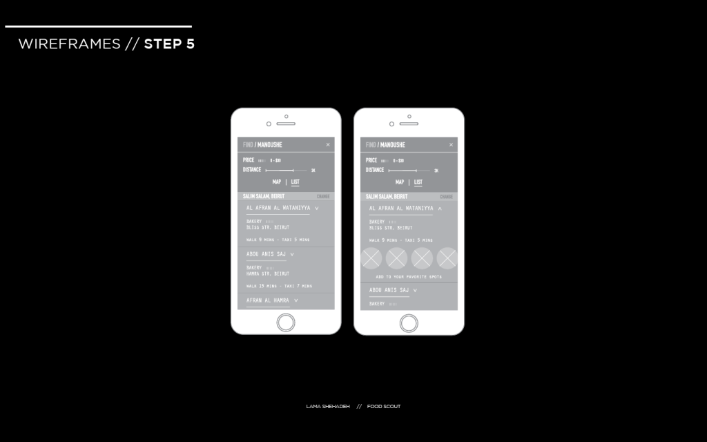
The user was confused by the price indicator and found it too be too small. He was not able to easily tell his location on the map and was confused by the written location as well. The word “change” next to his written location was unclear to the user to what it would be affecting exactly. He was unable to identify “Add to your favorite” spots as a button. The user confused the word “List” to mean the menu list.

Screen Shot 2016-02-04 at 5.32.09 PM

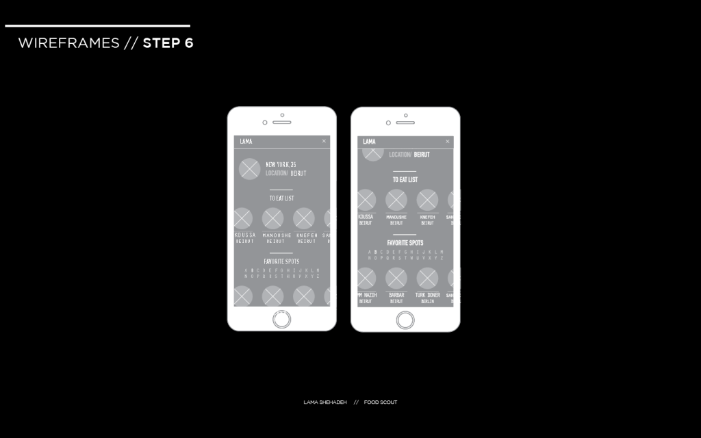
The user had no problem going back to the find the profile icon. He preferred to the see the same filtering mechanism used for “Favorite Spots” to be applied to this section.

I will be conducting two more user tests. Thereafter, I will identify what is positive and negative at this stage and iterate on the interface and experience.

Food Scout // Presentation 1

Lama Shehadeh_P1

Food Scout is an application for travel and food enthusiasts. It caters to the needs of adventurous travelers that wish to enjoy authentic and cultural food experiences on their travels. Existing application review restaurants and give minimal information about the cuisine. One has to do a separate research to find out about a city’s dishes.