#thursdayapps_Dubsmash

Dubsmash-Could-Join-Snapchat

Dubsmash is a mobile app to create short selfie videos dubbed with famous sounds.

I saw this app through some celebrities who have posed some funny videos on the instagram. After sharing the still photos and life videos on those social medias, it seems like people need something new other than the regular life visual contents. So Dubsmash seems like a great cure which can add some flavor in people’s life. Then I downloaded this app to play with it, it’s very easy to follow and play. Also, the funny sound that pre-made behind your video is short, around 5-15 seconds, which is appropriate long for your friends to watch and enjoy. I like this idea very much!


Below are some screenshots from this app.

IMG_2267

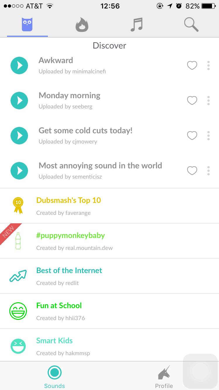
When you open this app, it will start with this page, which is very easy to follow, you don’t need to set up an account at the first page. Also, the “discover” shows the recent very popular sound in the very begin part, which leads the new users to try in the very first time and determine whether they will keep use it or not.

IMG_2268

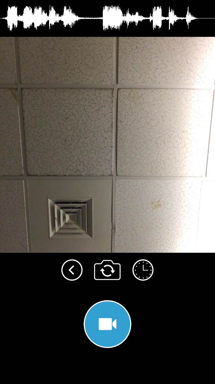
After you select a sound you would like to have, it will automatically jump to the selfie camera mode, and tap the “camera” icon, it will start to record. The whole process won’t take longer than three minutes, which is a very good idea for people who just join this app and play with it and enjoy!


iOS Human Interface Guidelines Notes

  • Embrace borderless buttons

By default, all bar buttons are borderless. In content areas, a borderless button uses context, color, and a call-to-action title to indicate interactivity. And when it makes sense, a content-area button can display a thin border or tinted background that makes it distinctive.

contact_card_2x

Before, I didn’t there is a default that all bar buttons are borderless. This seems like a new “rule” based on iOS for apple users, because I still remember all the buttons were supposed to be designed like a 3D real button with some shadow, which leads users to think this button is clickable. However, flat design for UI seems like a new trend for designers to follow.

  • Make it easy to focus on the main task by elevating important content or functionality

to do this are to place principal items in the upper half of the screen and—in left-to-right cultures—near the left side of the screen:
focus_on_main_task_2xI never know this rule before. I understood why the upper information is more important because people read from top to bottom, but I don’t know why the left side should be placed more important content. Then I guess, because people read from the left side to right side, and most used control bar is placed on the left side as well.

  • Starting and Stopping

It’s often said that people spend no more than a minute or two evaluating a new app. Don’t tell people to reboot or restart their devices after installing your app. Restarting takes time and can make your app seem unreliable and hard to use.As much as possible, avoid displaying a splash screen or other startup experience. It’s best when users can begin using your app immediately.

Screen Shot 2016-02-08 at 12.22.56 PM

I totally agree with this guideline, I never thought about this as a designer before, but I did this all the time as a user. I will delete too complicated app after one minute if I can’t start to use it or play it or ask me to register and log in and …….. I guess maybe there are too many apps in the market right now, which makes users losing their patience and want to have the high efficiency and have a great use of the useful apps.