Group2 – Prototype1 & App map


Quick Meals

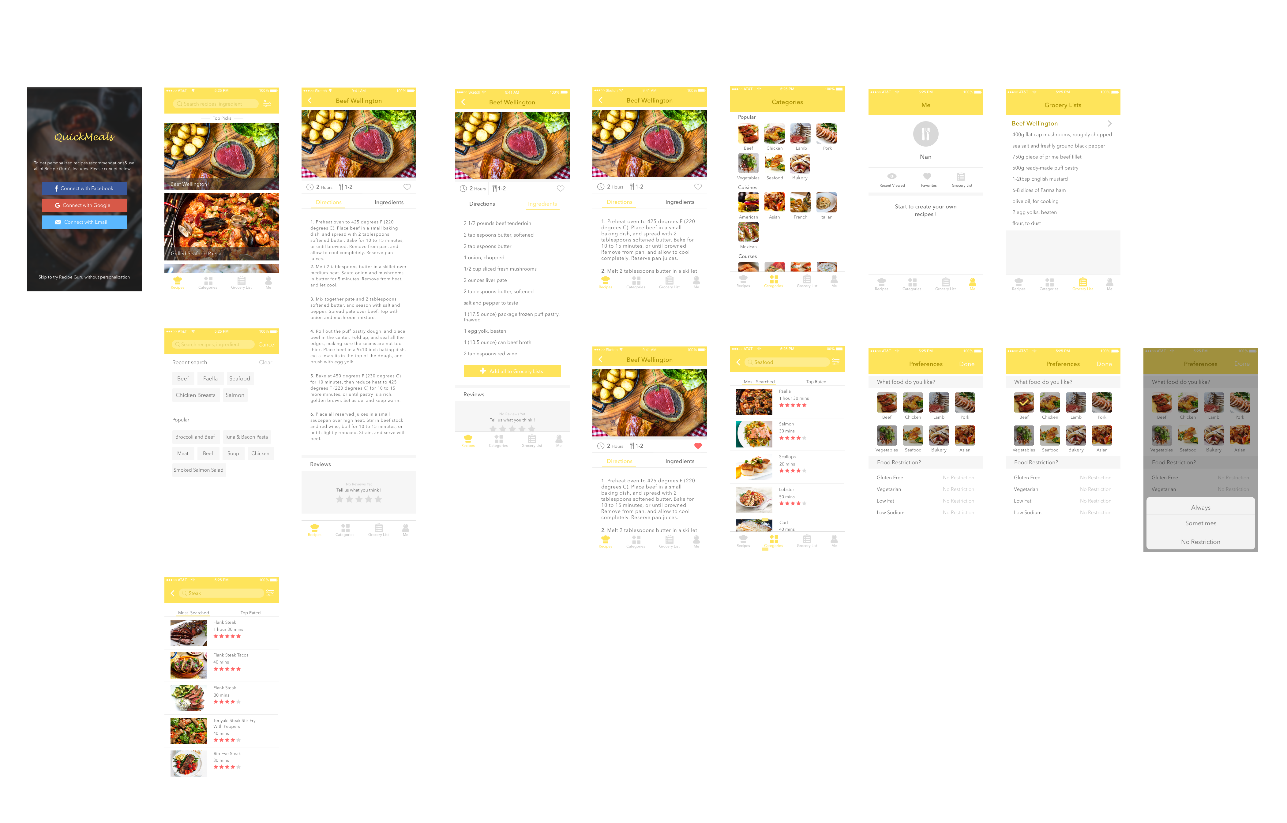
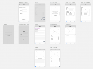
Quick Meals app is a growing database of quick and easy recipes that can be made in few minutes. Search for a recipe by using categories like 15-min quick meals, 30-min quick meals, popular, cuisines and dish type and even occasion. All recipes come with photos, timing, directions and ingredient lists. Find one you like and you can add favorite it so you can find it later. You can also view a grocery list for each one and check all the things you need. This will be saved to one of the tab lists you can check while shopping in the market. In addition, you can search for certain foods like steak or seafood and the app will give you a list of various ways of cooking steak or seafood, and then you can look at the step-by-step instructions on how to prepare it and get to know for how long it will take.

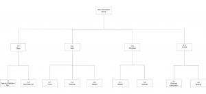
App Map

Prototype 1

Introduction

3 Interesting things about iOS Human Interface Guidelines 

  1. Apps integration with Imessage

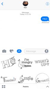
Apps can integrate with Imessage by an extension. It lets users share specific content – text, photos, videos, stickers, games etc. Here is an Imessage stickers app made by me. It is a series of peacock stickers with text. https://itunes.apple.com/us/app/pealets/id1195799309?mt=8


2. Integrating Widgets on the search and home screen

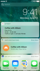
Users can add widgets to the search screen by swiping left. You can also access a widget by using 3 D touch to press your app icon on your home screen.

3. Peek and Pop:

Use 3 D touch to preview an item – mail, image, message, link – anything. Simply apply a little pressure to fill the screen and lift your finger to exit the peek. In some, you can also swipe up to reveal buttons.

Selfie and Intro:

Hello, I’m Gunjan. My first and everyday rule in life is “Inspire and get inspired”. I believe that we learn the best things from people. I love creating instant rapid prototypes and iterating. I also love designing social platforms. My background is in Electronic Media. I am a currently a designer creative technologist studying MFA Design and Technology at Parsons, The New School for Design, New York.

Assignment#1 Elly Lin

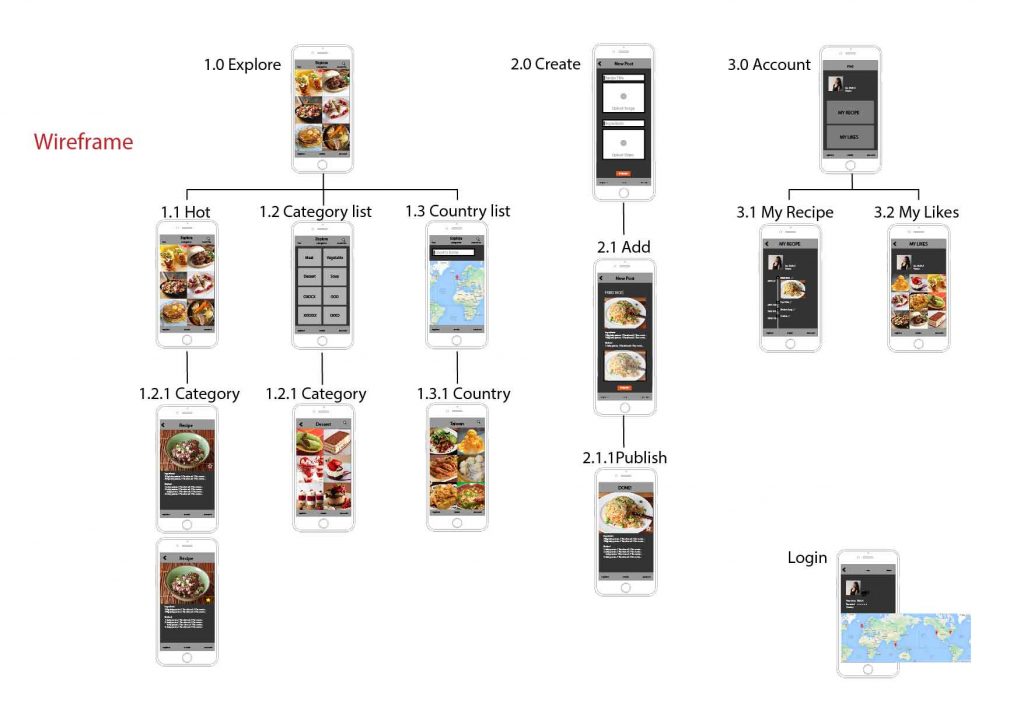
  1. Food App

Yummy is an app that you can explore and share your own hometown recipe. Based on my experience, students live in a foreign country always miss their homemade food a lot.

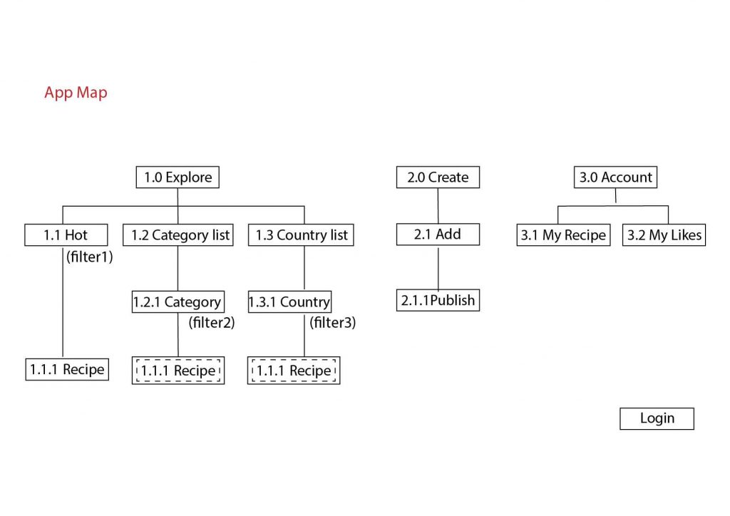
When opening this app, people will be put on a default page, and then, they can choose a filter to explore the food: hot, category, or country. The second part of this app design is users can create their hometown recipe and share. The last part is they can open their account to see what they have made. And also, they can look at the recipes (the likes) that is collected from others.


  1. Notes of iOS Human Interface Guideline

(1) Use animation and motion effects judiciously.

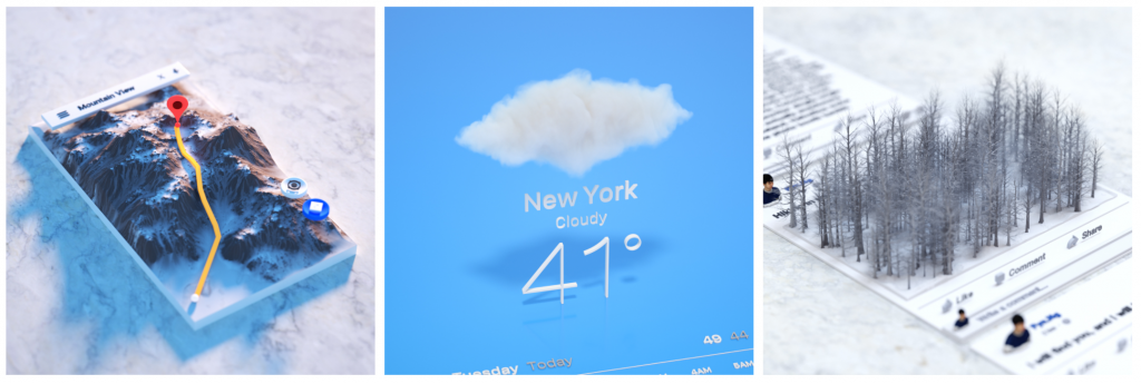
I didn’t know overusing the motions will make the users feel disorienting and difficult to control the app. It reminds me a work by Fyn Ng when I saw this guideline. This work used 3d models to represent an imagination of app. Maybe now it is not the time to do so. But in the future, it could be. So now, we still need to use the motions carefully, especially in apps that don’t provide an immersive feeling.

(2) Test your icon against different wallpaper.

The guideline provide an good example for testing icons on Home screen. I always test icons on a dark and white screen. But just as the guideline mentions, it is not enough, we need to check it on different photos of background, and even the dynamic one.

(3) Launch screen

Every app must have a launch screen. As the guideline mentions, it is a way to show your app is fast and responsive.

Wireframe &APP map – Jieming Yu

EasyTrip 

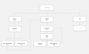
• EasyTrip is an APP designed for travelers to discover the best places to play, eat and stay. And making it into a plan.

• With this app, user can plan trips directly from this app and share with friends.

• User can discover millions of

places, like restaurant, point of interest and other popular places. And add it to your plan with one single tap.

• User can easily find the best restaurant / Point of interet to go along the trip.

My wireframe is attached below here

Wireframe


For February 23, 2017

  • Take your learnings from critique and paper prototyping and create a visual design for your app. Group 1 will present their designs in class.
  • Create a digital prototype to test during class using Marvel or another digital prototyping tool of your choice.
  • Note 3 things that you changed in this iteration due to things you learned from paper prototyping with users to get credit for doing your paper prototyping.

Week 1_Misung Kim

3 things I learned from Apple HIG:
Since I’ve interested in iOS GUI design, I rarely looked up the iOS design HIG in detail and this exercise helped me a lot to find some useful guidelines. Here are some of them that I didn’t know.

01.
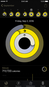
Test your app’s color scheme under a variety of lighting conditions
When testing apps, I used to check visuals as well as functions and usability. However, I did not know that lighting also affects how apps look like and it sounds a bit challenging to figure out how to adjust colors and what are the best choices.
02.
Be aware of colorblindness and how different cultures perceive color
This guideline changed my view toward how to define and signify signs in order to consider people’s various color perception. Normally, I’ve designed apps for people who have no trouble with sights and common sense of viewing colors. However, as I found colorblind people’s pain points, I will keep in mind to contemplate the choice of colors and the way of distinguish values and colors.

03.
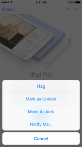
Action Sheets:
Provide a Cancel button if it adds clarity.
Make destructive choices prominent.
Avoid enabling scrolling in an action sheet.
As the interface was so natural and intuitive, I have overlooked how it guided people to react to it.
– Destructive or dangerous actions among choices should colored in red
– A cancel button should be at the bottom of the options.
– Regarding to the purpose of action sheets, it should be done promptly. Therefore, it should be designed concisely. (Avoid making it scrolling)

Bio
I am Misung Kim from South Korea. My background is Visual communication design and used to work as a UX/UI designer in Korea. From creating graphic interfaces for smart phones to designing accessible education tools for children or non-korean, I focus on playful and interactive design. I really care about communication between people and creating a harmonious environment and always eager to design user-friendly, and which is easy to access.

Food app Concept

Granny’s hometown homemade food

It is a homemade hometown food
delivery service for people who are away from their hometown and longing for the food there. Users will be matched with a grandma who has lived in a particular region or is able to cook specific local foods.
It meets individual tastes of different people from various regions in the States.

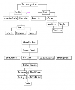
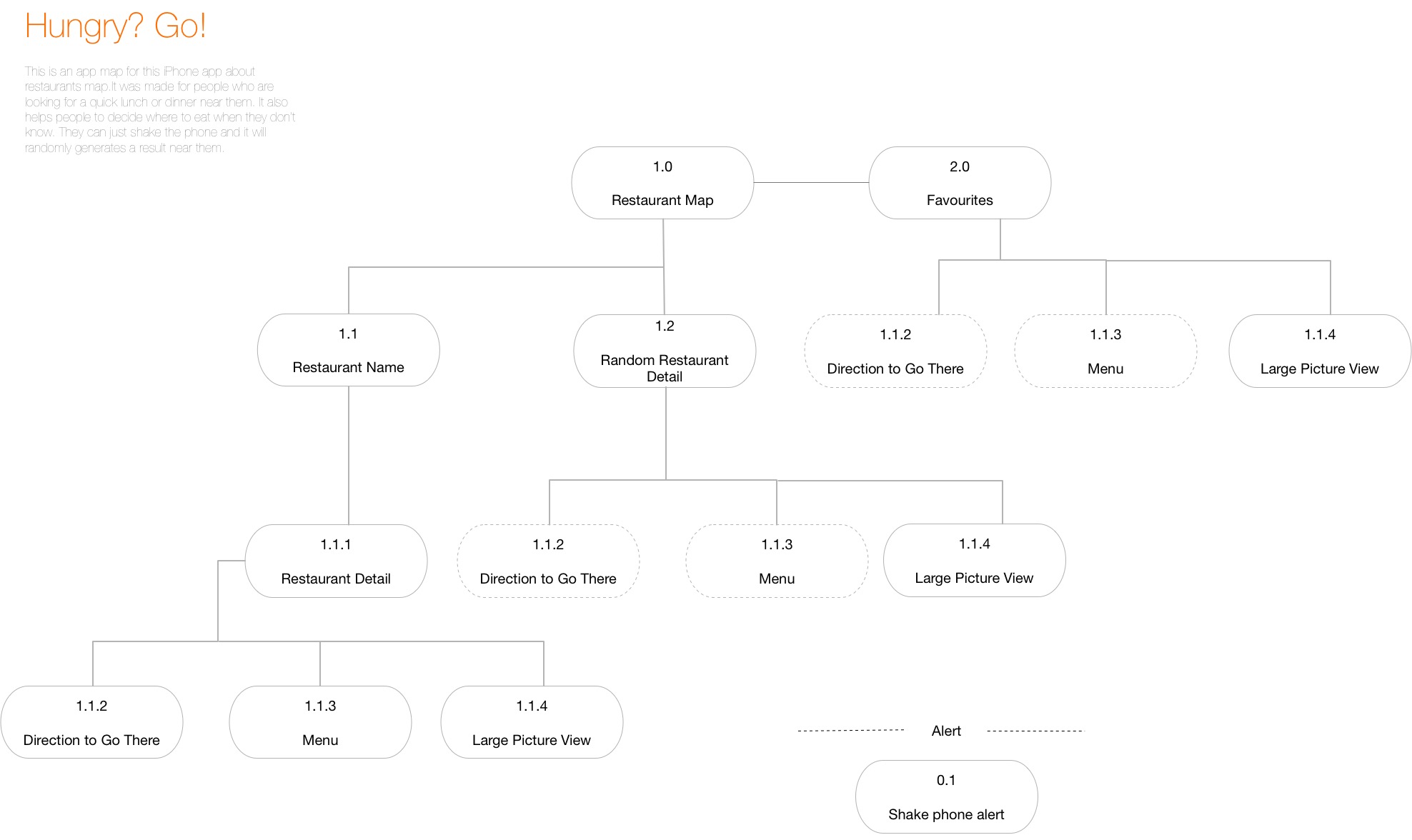
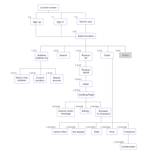
Appmap
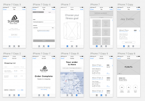
Wireframes
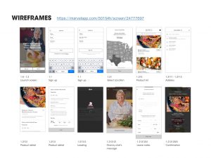
https://marvelapp.com/501fj4h

Prototype 2-App Map + Wireframes

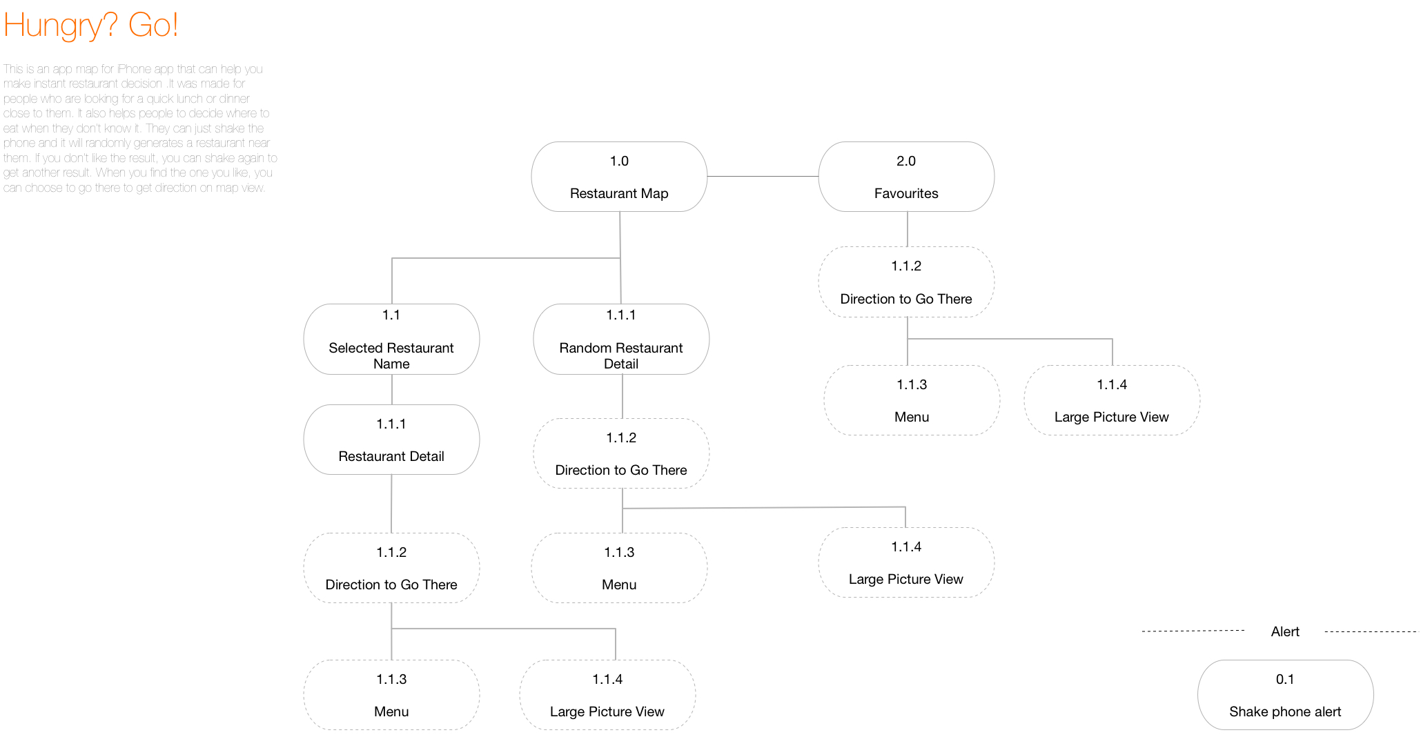
After last week’s user test, I add some icons that will be like filters when the user is trying to find a restaurant.  The tester told me that he still wanted to make some sort of decisions before the app gave a random result.

I also changed the icon for “favorites” because one of the testers told me that he could not understand the star as “saved favorites.”

Another small change is that I add the white block under “Hungry?” to separate the text and the map so that it’s more readable.

I also add the back button on restaurant detail page and make it full page. Before, I was afraid that detail page separate from the map, so I make it like a pop up window upon the map, but after user test, I was told that a whole full screen view will be better.


Shenxun Wang week 1

3 things you didn’t know from the Apple HIG 

  1. live photos(2.1.3)—the interaction way of live photo is pressing.
  2. Audio(2.3)—music will not be disrupted after plug in the earphone, but music will be stopped after you plug out the earphone.
  3. Typography(4.5)—SF UI TEXT is for the size under 19p, and SF UI Display is for the size beyond 20p.

Bio

Shenxun Wang is a designer, technologist, and maker who uses design & technology to enhance our social relationships and physical surroundings. He is a master candidate of Design and Technology in Parsons School of Design. He has a combined experience of sports technology, UI/UX design and design strategy. He is interested in design leadership, making a social impact and creating business profit by using sophisticated design products.

APP MAP


WIREFRAME

Week 1-Self Intro+3 Things+Wireframes

A bit about me:

I’m Yue Guan, a MFA DT first-year student. I come from China, and I graduated from Boston University last year. My background is mass communication studies and visual arts. I’m interested in interactive design, media studies and speculative design. I love pixel game apps (like eBoy FixPix) and food apps!

My selfie:

https://drive.google.com/open?id=0B9XNWpugKw9dOTZNZVpWS0N2Szg


Three things I learned from Apple HIG:

1: “Apps respond to gestures, not clicks”

Click does sound like we are still on a web page, and the truth is that a touch screen can do so much more than a “click.” These gestures include tap, drag, flick, swipe and shake. Now with force touch, we can also use hard tap.

2: “Onscreen user help is minimal”

Users would not spend much time on reading tutorials about how to use this app.

3: “Always have a reason for customization”

We need to let the task drive customization decisions. Too much useless customization will cause a headache.

My first week app map:


My first week wireframes: