EASIPES_Apple TV_Final


EASIPES on Apple TV

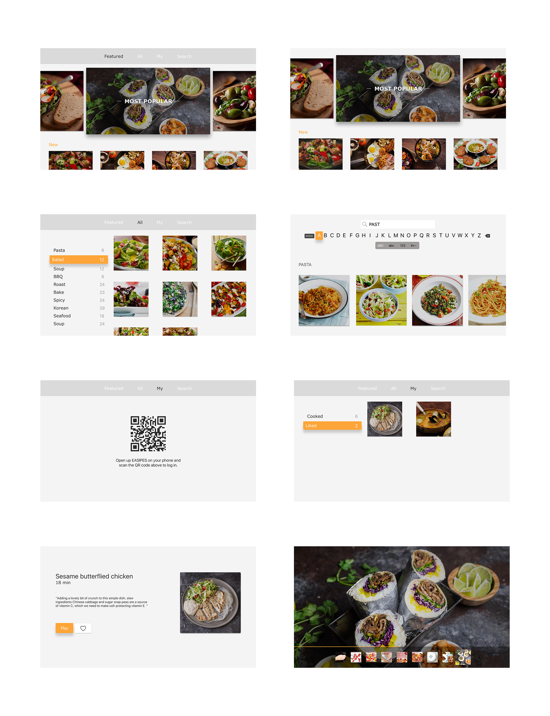
For the Apple TV version, I started from thinking how to take advantage of the TV platform. It turns out that using video content as an aid for the mobile App is a good choice. Also, the step-by-step feature still exists in this video context.

Something I learned from user test:

  • In the Featured section, I added some displaying strategy for those featured recipes, such as the most popular recipes in this week and the new recipes, to help users make a choice more easily
  • I used scanning QR code as the method for the user to log in
  • In the video playing view, I used thumb image as a guide. The user can choose any step to play by selecting the thumb image on the bottom. When the user clicks on an image, the corresponding video will be played automatically. There’s also a progress bar to show the playing progress of each specific video.
  • For the visual design, I made the color lighter than the mobile app in order to let the images shown more clearly.

Apple Tv project_ Jieming Yu

Easy Trip on Apple TV

Project Overview:

For the Apple TV, I want to focus on city recommendation. Unlike the mobile phone application, which is easy to typing and navigating through different views, Apple TV app is more suitable for showing high quality images and videos. So in this app, you can choose the city you want to visit by different catalog, such as theme, season and story. When you go into the seasonal view, it will show you the best cities you can visit in different months. After choosing the city, it will recommend several travel plans for you. In the each travel plan, you can easily see some photo and video of every sights and restaurants.

What I learn from user test:

1.the word”seasonal” may be confused, it can be replaced by “month” .

2. In the recommend itinerary view, I can show more information for every itinerary.


#ThursdayApp FastTyping

FastTyping is an iMessage app that allows you to compete against your iMessage friends in typing speeds. The game is fairly simple as it only involves users typing as quickly as they can by following the given prompt (which are usually within the topics of Music).

The user interface is also fairly simple. Each category that the user is given has a background of a different color and the interface only consists of the prompt and a typing text field.

Because of the nature of iMessage always having a text field on top, on my first try I actually ended up typing into the iMessage text field rather than the one given in the app.

The experience of “penalty” is also not as emphasized. Rather than giving me a score that I don’t understand how it was calculated, I would have preferred the application itself displaying some form of error sound or a change in the color of the text. Also, the application also does not show how many points I have earned so far from playing. 

Brandon Palmer | TVOS FINAL | Things I learned from critique feedback

Concept: Superb TVOS is an alternative meal preparation app in addition to the IOS variation. Superb TVOS focuses on video content and meal browsing as its own identity. After presenting my final iterations, I have gained various feedback. First off, Superb TVOS doesn’t allow users to purchase meals. Instead it allows users to view existing meals and favorite them. Which directly sends data to the ISO version, allowing users to purchase from the ISO cart. The TVOS version also allows the user to sign up for a membership service in order to receive video content.

Error: TVOS should only focus on video content and membership services instead of mixing favoriting. This conclusively simplifies functionality while making the experience separate from the ISO version.

Error: Filtering video content and favoriting specific videos would be beneficial for users to further interact with the apps functionality. It makes sense for individuals to have complete control over their membership services.

Error: The content on the top portion of the meal screen should direct the users to view all of the video content. Instead the meal screen focuses on both favoriting meals and videos. And there is no way to view all of the meal options, which is a problem. Further implementations would be to remove meal viewing, and focus primarily on video content.

TV OS_Visual Design_Misung Kim

AppleTV_UIKit

Based on findings from my paper prototype, I iterated visual design.

What I found from the user test:

1. To show the overall feeling and experience of the service to the users who use the application for the first time, the content that can be seen only by scrolling down on the first page is moved to top area.

2. Added featured section below the navigation bar like a featured movie to show users diverse options regardless a region and let them know which options they can experience on the app.

3. Added a popup page to give users a feedback that let them know whether the item is successfully added with two buttons derives them either continue shopping or check it out.

4. Due to the trait of moving the buttons one by one with the remote control, it seems more efficient to click the arrows to change the main picture one by one rather than clicking each picture.

For April 13, 2017

  • Work with your partner to prepare wireframes and paper prototypes for your app
    • As a reminder, you Project 3 app can be either a phone or a tablet app on any topic.
  • Group 1 will present their wireframes
  • Groups 1 and 2 will have time to do paper prototyping


Here’s the overall plan for Project 3:

April 13-
Project 3 Wireframes 1- Group 1
Paper prototypes

April 20-
Project 3 Wireframes 1- Group 2
Paper prototypes

April 27-
Project 3 Designs- Groups 1 & 2
Digital prototypes

May 4-
Choose your own add on- Groups 1 & 2- AppleTV, Apple Watch, iMessage, or Voice

May 11-
Project 3 final presentation with guest crits