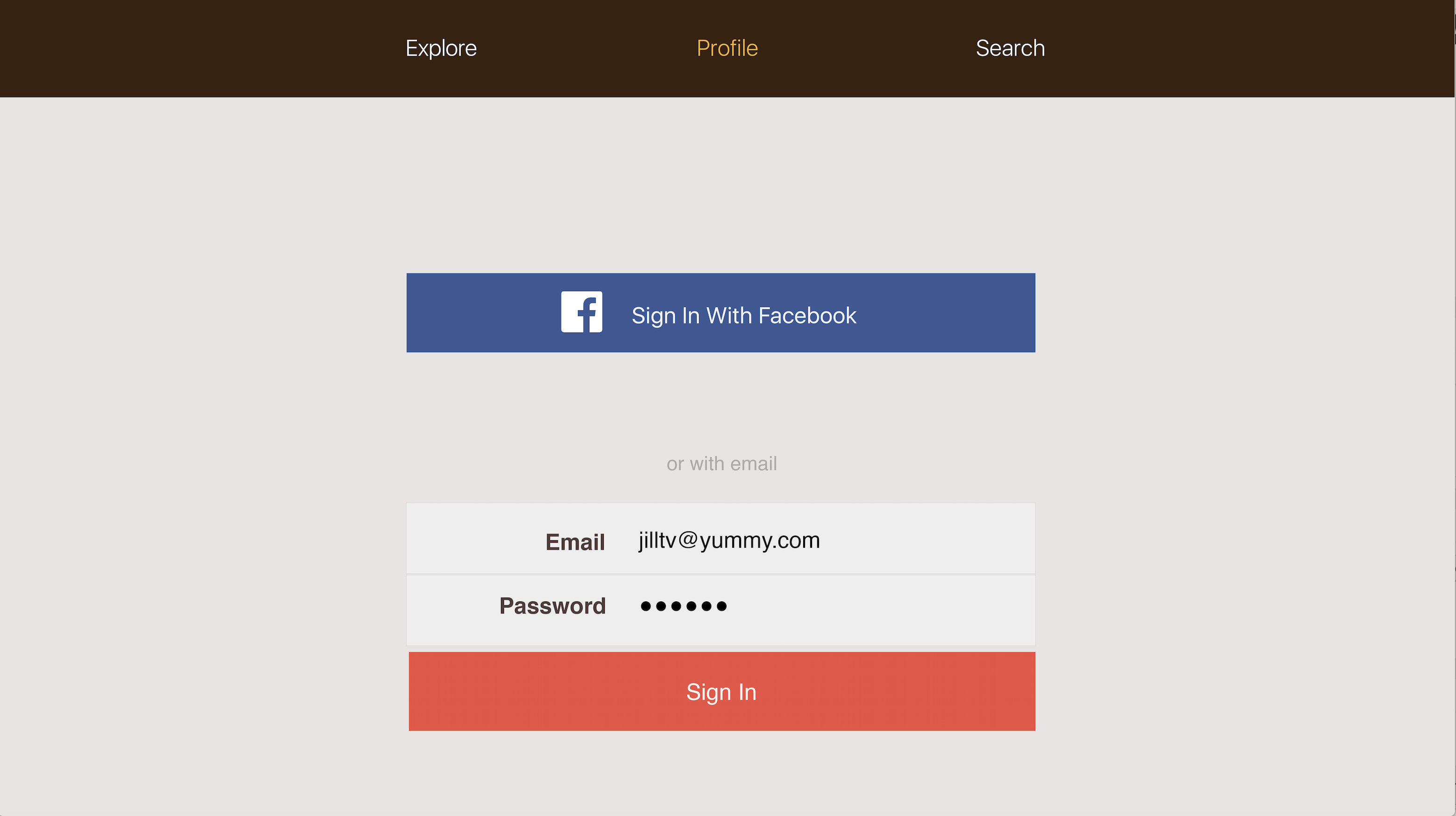
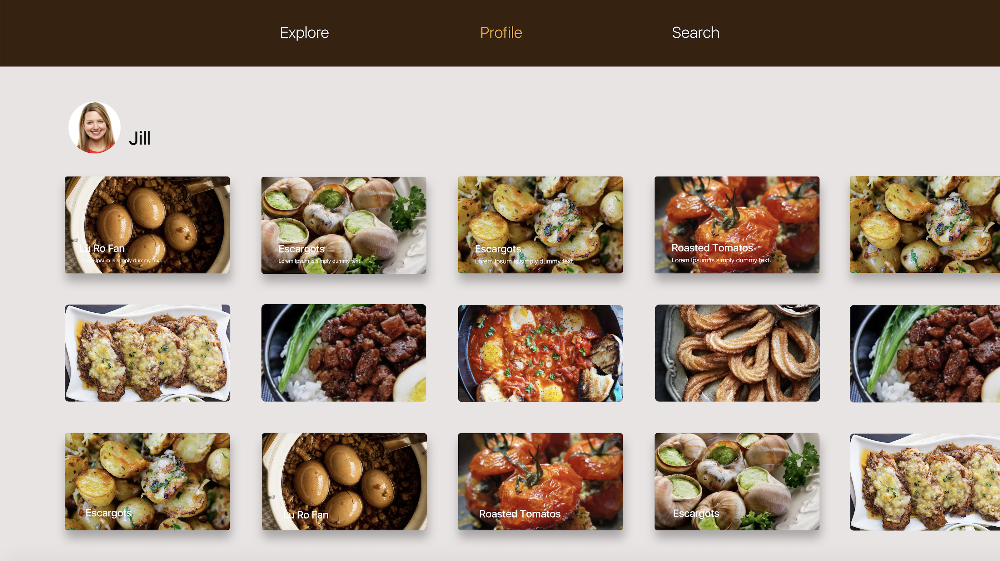
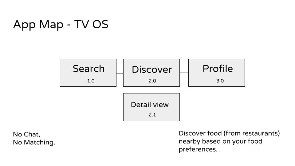
For the Apple TV version. I took off the function of “create” personals recipes. I want people to focus on the function of explore and their collections in the profile page.
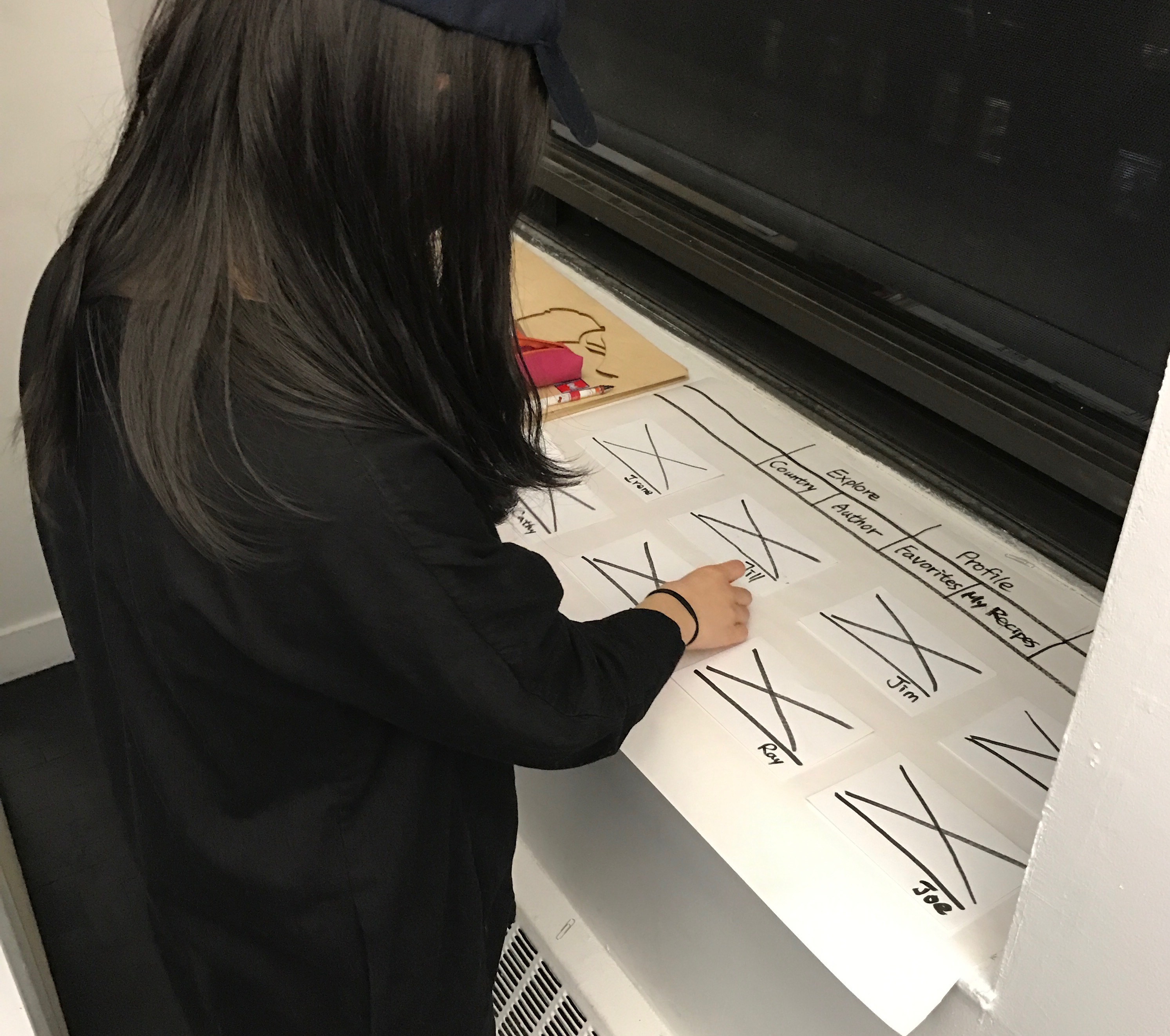
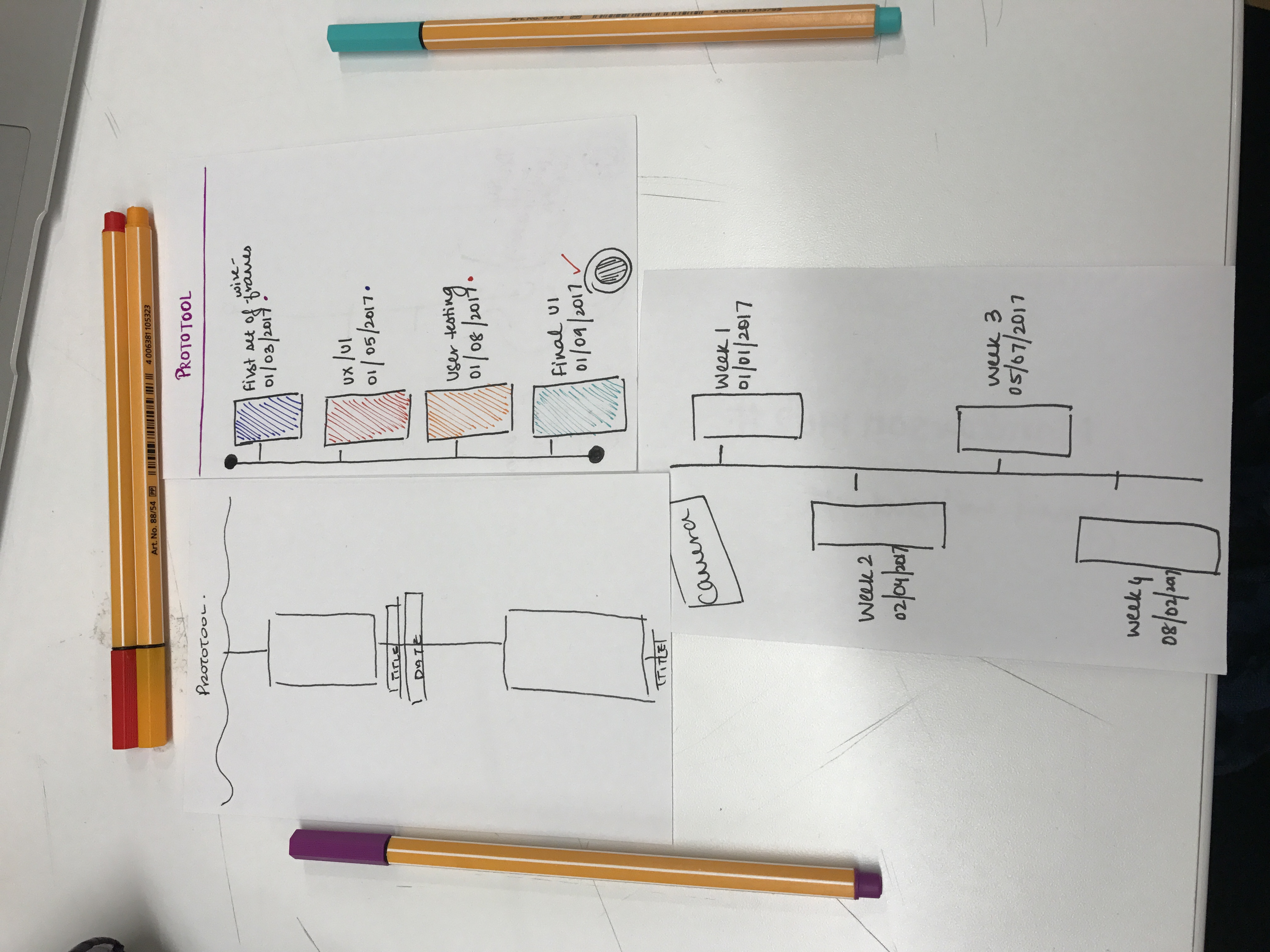
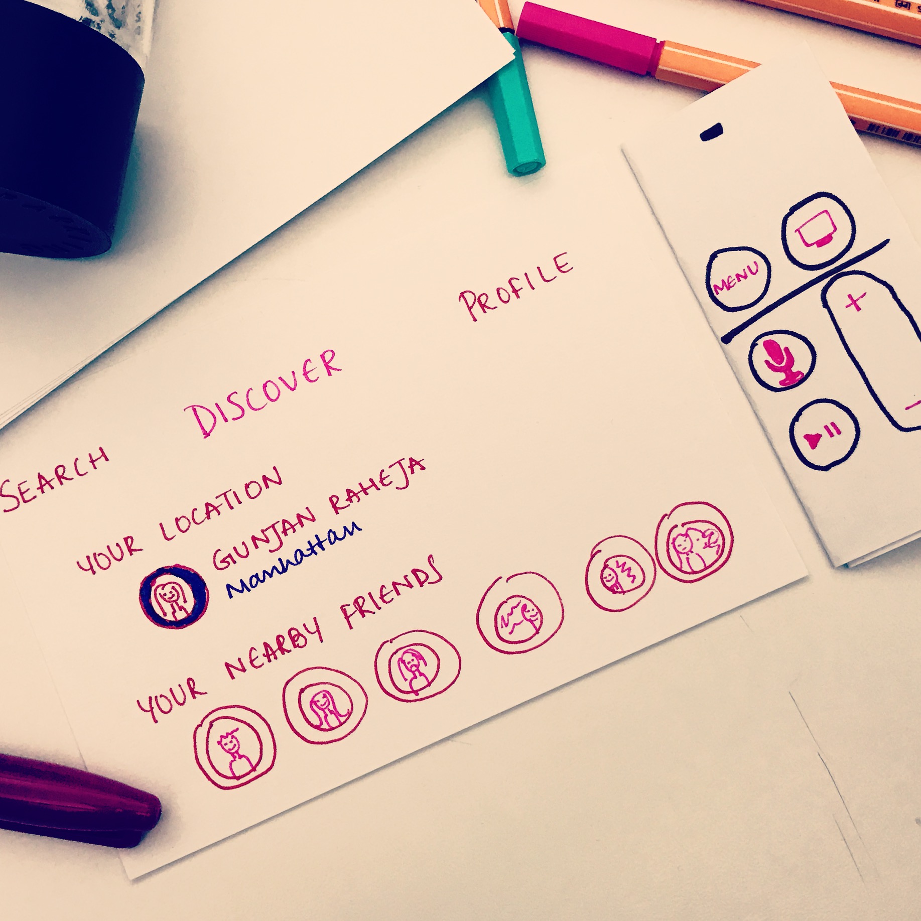
The paper prototype I have done in class:
Users’ feedback:
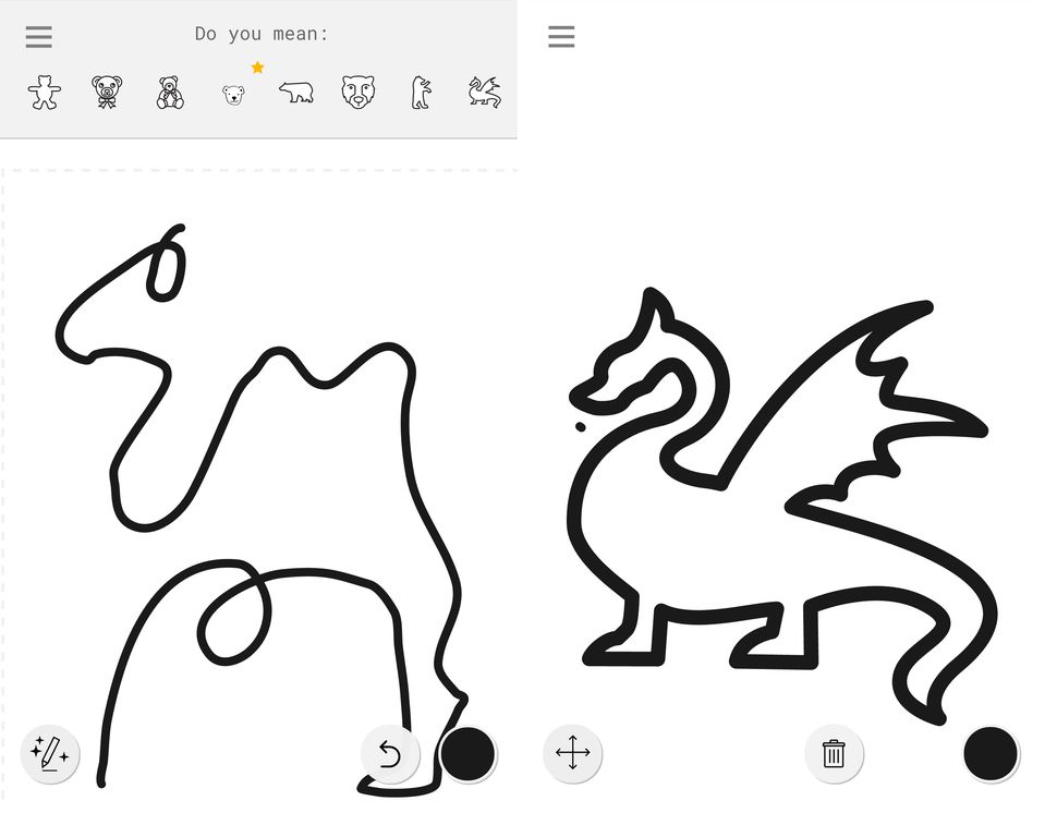
The bar on the top cannot do the sublayer such as Country and Author layers under the Explore bar, and Favorites and My Recipes under the Profile bar.
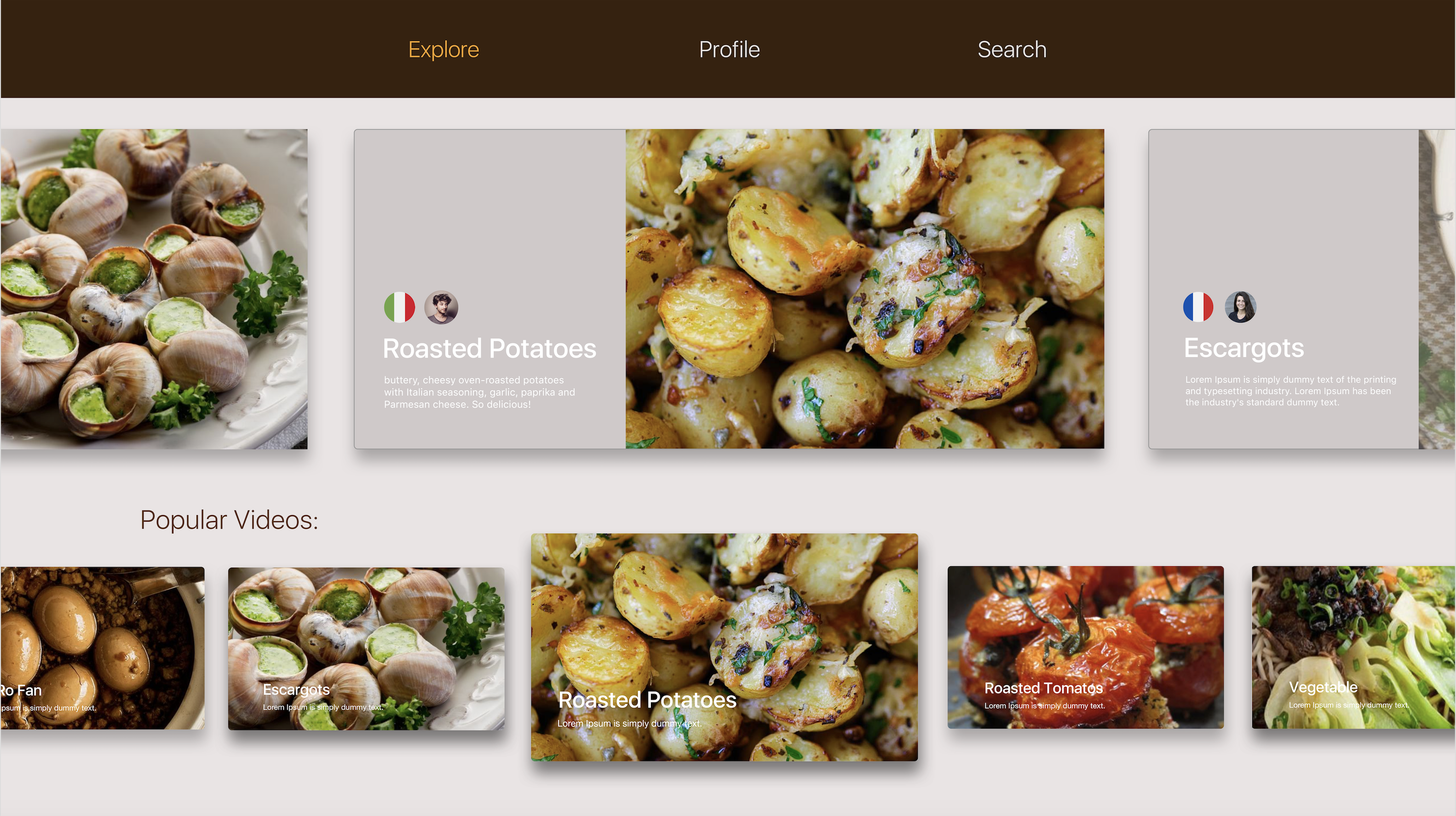
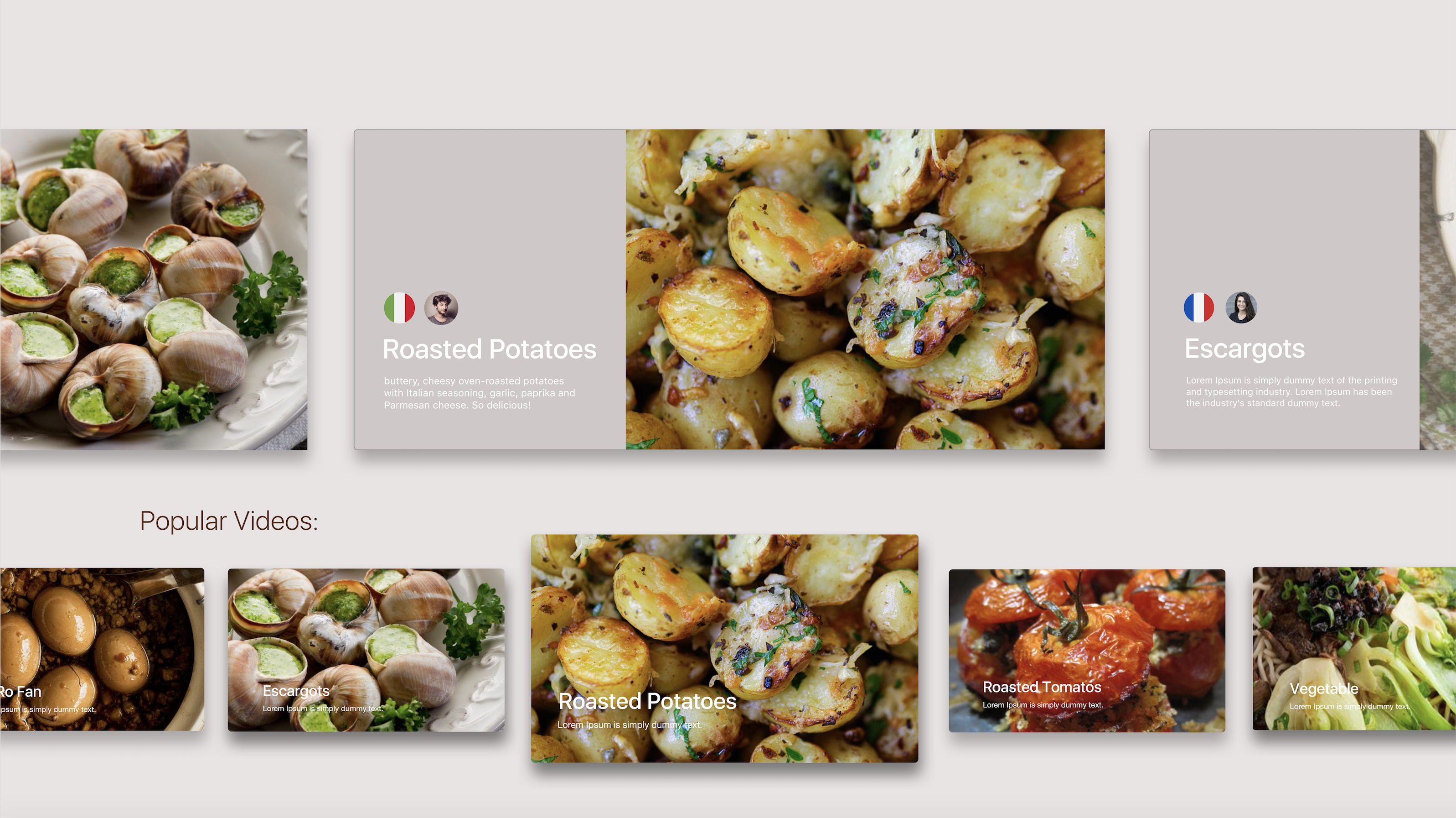
The visual version:
Feedback from class:
need to tell more actions after clicking on the video.
The circle icon is confused. Because it can be click on video and flag, but not on the country and authors’ icons.
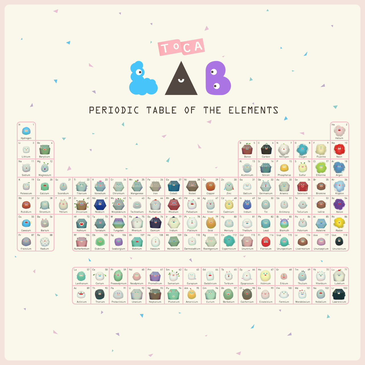
Toca Lab is an playable app game for children. Also, it can cultivate children interest and knowledge in Chemistry.
The periodic table can encourage children to collect all of the 118 elements, by trying out the functions of heat, wheel, freeze, waves, and blend.
The app shows a great collaboration of artist, programmer, technical artist, and play designer.
The reason that I love this app a lot is because I am interested in children education. I think this app successfully help children who are afraid of chemistry by those cute and funny animations. Also, for those kids that haven’t start to learn chemistry, this app will help them build in many interests.
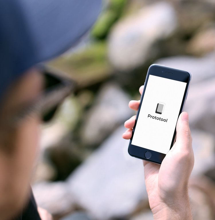
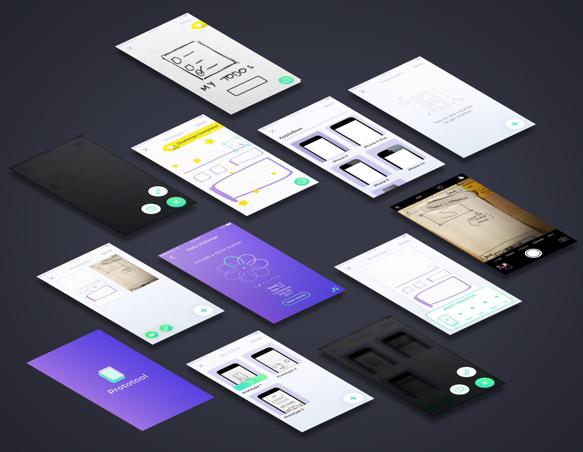
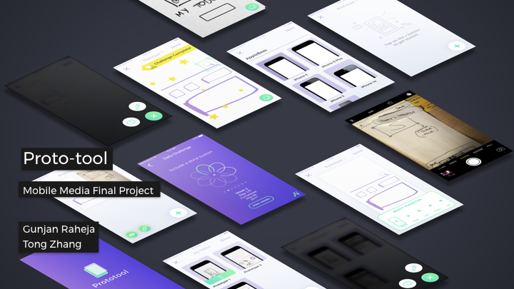
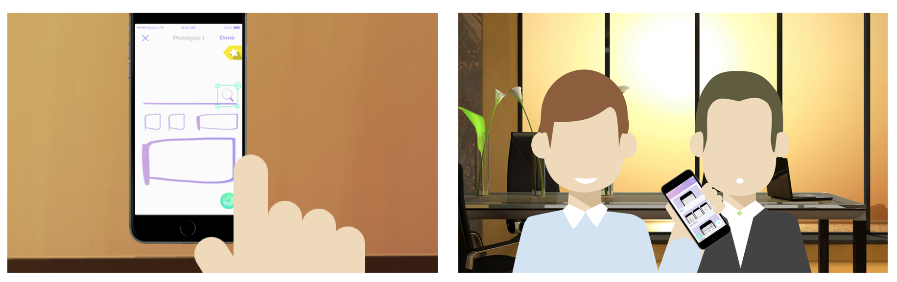
How might we build a mobileprototypingtool for designers to sketch & create rapid low fidelity prototypes to document and user-test?
CONCEPT:
Proto-tool is a mobile application that allows UI/UX designers to quickly sketch and document low fidelity prototypes. It also encourages designers to continue improving and working on their work through daily challenges.
PRECEDENTS:
Adobe Comp CC and Google Autodraw – works with machine learning sketching and prototyping.
MOBILE:
Quickly create prototypes and sketches on mobile to document process.
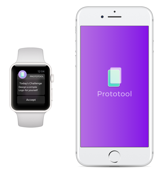
IWATCH APP:
UI Challenges with everyday Challenges.
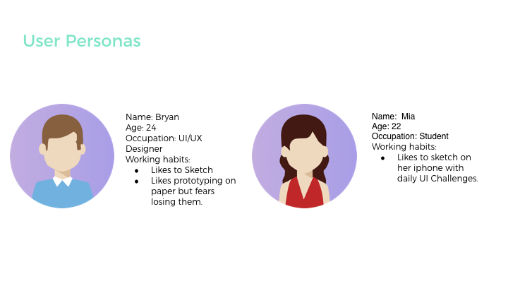
TARGET USER/AUDIENCE:
Our Target Audience are User Interface and User Experience designers who love to prototype on the go, on mobile or just paper prototype/take photos to document work.
SOFTWARE:
(Made with Sketch, Framer, Principle and After Effects)
3 THINGS WE LEARNED FROM DIGITAL PROTOTYPING: (to improve on our prototype)
While we prototyped on paper, we thought the wheel interface would be effective. Once we implemented it digitally and tested it out – we were wondering about how effective the wheel interface for timeline/projects would be. We started asking questions such as: What if a user had too many projects? Can they search through the wheel? This digital prototyping session and user testing session helped us understand our needs and functionality better.
We also realized that High fidelity prototyping would be too detailed to perform on the iPhone.. The main functionality of the the application is to mark ideas and prototype low fidelity screens. High fidelity would require attention to detail which can be tiny on the iPhone. So we are sticking to low fidelity prototypes + sketches with Daily UI Challenges and hotspots.
Explore/Community functionalities not necessary
3 THINGS WE LEARNED FROM PAPER PROTOTYPING:
We learned the importance of hierarchy and functionality of every icon. We prototyped, sketched, designed digitally and came back to the drawing board and paper to paper prototype again. The main idea was to understand each TAP, each function and also understand how clear the icons were.
Would the timeline be week based, day based or project based?
Enabling less number of taps and more interactions while sketching, etc.
Thinking about the hierarchy and main navigation – What elements are most important? We wanted to experiment with the idea of being able to document work process. We came out with various solutions that could reflect our concept, such as lists, groupings, and narrowed down with organizing projects through a timeline. A problem with this approach though, is that it would be more difficult for users to be able to refer to previous projects. For instance, what if one user prefers to work on different prototypes for different projects at the same time? It would be preferable to organize projects through different names. Would the timeline be week based, day based or project based?
Another issue that rose from this prototype was the iconography and language that was employed. Some icons were misleading and difficult to understand, causing the users to get lost when using the application.
User flow was also another issue that was not worked on well in this prototype. The UI gave more emphasis for users to record their prototypes with the phone even though the sketching option was equally as important.
POINTS WE NOTED DOWN AND CHANGED IN THIS STAGE:
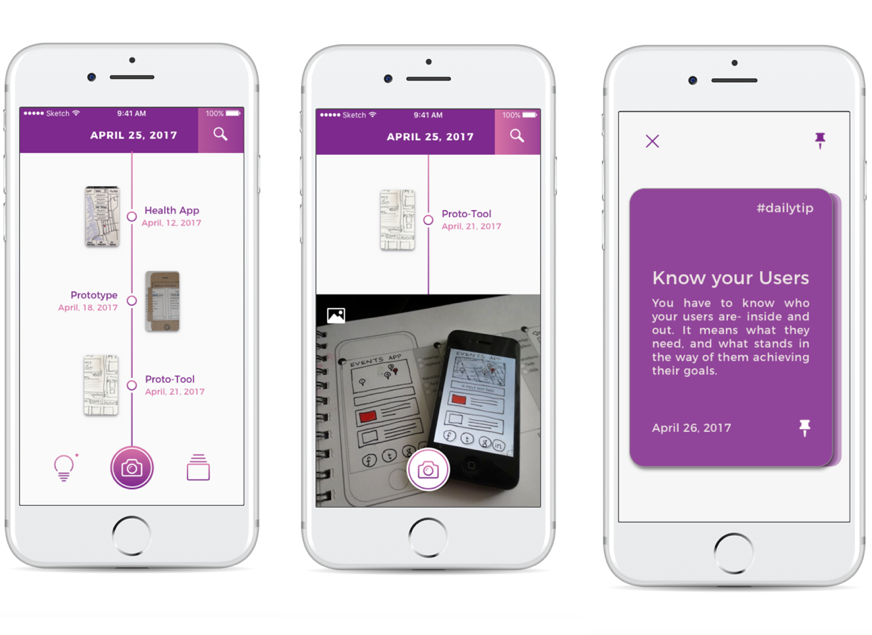
TIMELINE – Design use, Main Navigation and Hierarchy, Date on Header and UI Tips to UI Challenges
While we prototyped on paper, we thought the wheel interface would be effective. Once we implemented it digitally and tested it out – we were wondering about how effective the wheel interface for timeline/projects would be. We started asking questions such as: What if a user had too many projects? Can they search through the wheel? This digital prototyping session and user testing session helped us understand our needs and functionality better.
We also realized that high fidelity prototyping would be too detailed to perform on the iPhone. The main functionality of the application is to mark ideas and prototype low fidelity screens. High fidelity would require attention to detail which can be tiny on the iPhone. So we are sticking to low fidelity prototypes + sketches with Daily UI Challenges and hotspots.
Explore/Community functionalities with including themes might not be necessary as most of the cases designers would not want to share their prototypes with the community.
It is a hidden picture finding game that I discovered while searching for a game that can heal my stress without thinking anything. I was able to play comfortably because of warm colors and atmosphere that seemed to read the picture book without text.
After finding the number of items that animals presented on each screen, you will get the next screen. Difficulty is not high level, and you can see hints when you get stuck. Since I wanted to concentrate on the moment while playing, I tried not to use any hint but only focus on the screen as much as possible. If you are looking for something that you want to clear your mind or want to try no-brainer, I highly recommend this game.
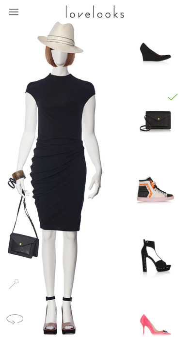
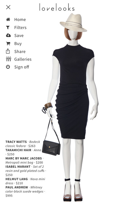
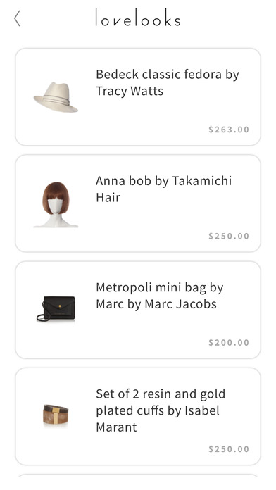
Lovelooks is an app that allow people to browse the lated designers’ collection and to create personal outfits from those collections on the screen. Due to my personal interest in fashion, I found this app is really interesting and innovative in the way that it has made the experience of browsing designers’ collections like playing a dressing-up game. When I used Lovelooks the first time, choosing cloths to put on the model immediately reminded me of those dressing-up games that I played when I was a young girl. It is both fun and very cute. On the other hand, it has also provided opportunities to people who may not be able to afford the designers’ collection to explore their styling from the designers’s collection. I feel Lovelooks is really a new “toy” to play with for people who love fashion.
How might we build a mobileprototypingtool for designers to sketch & create rapid low fidelity prototypes to test?
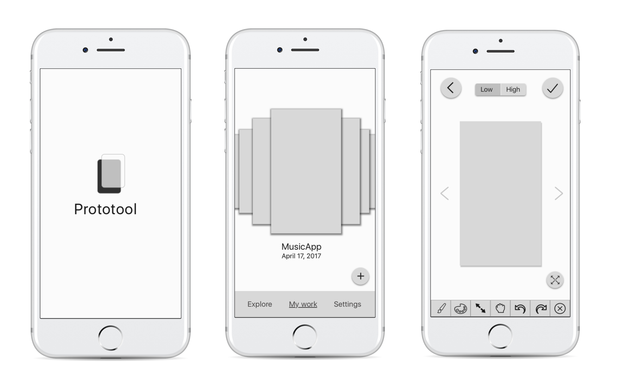
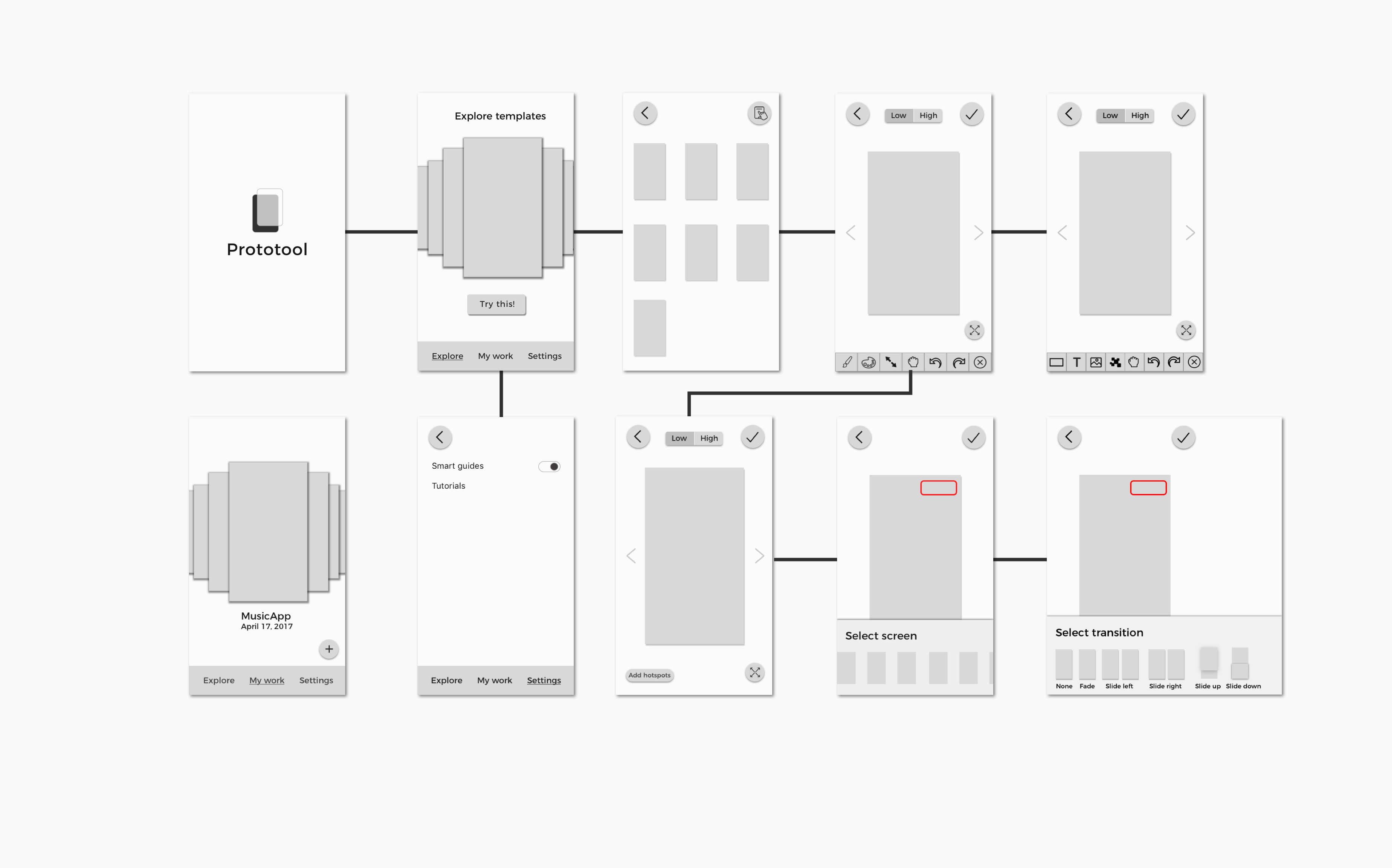
Concept
Proto-tool is a mobile application that allows UI/UX designers to quickly sketch and document low fidelity prototypes. It also encourages designers to continue improving and working on their work through daily challenges.
Target Audience
User Interface and User Experience designers who love to prototype on the go, on mobile or just paper prototype/take photos to document work.
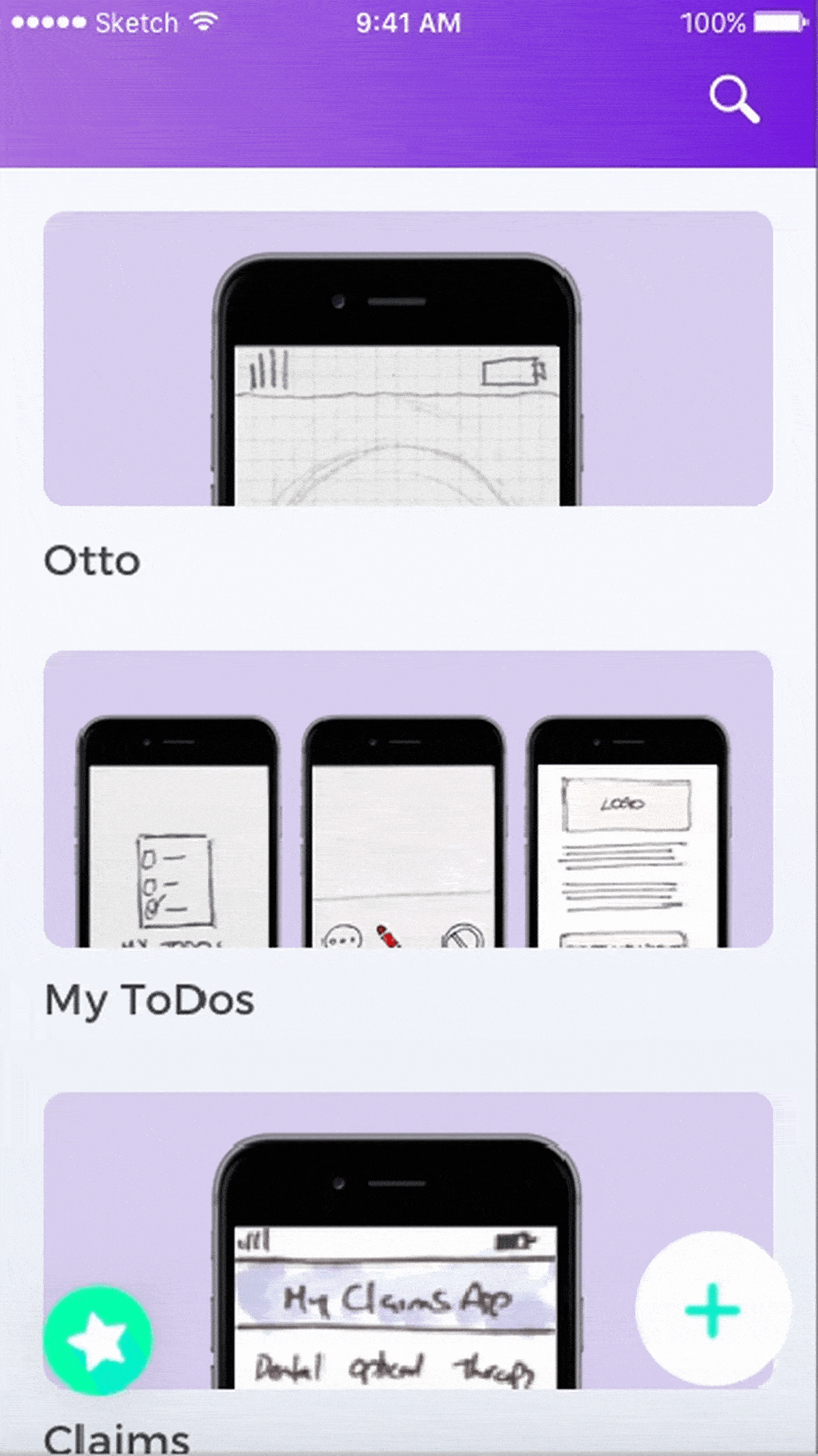
Storyboards
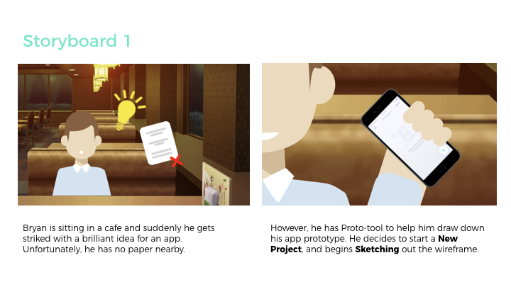
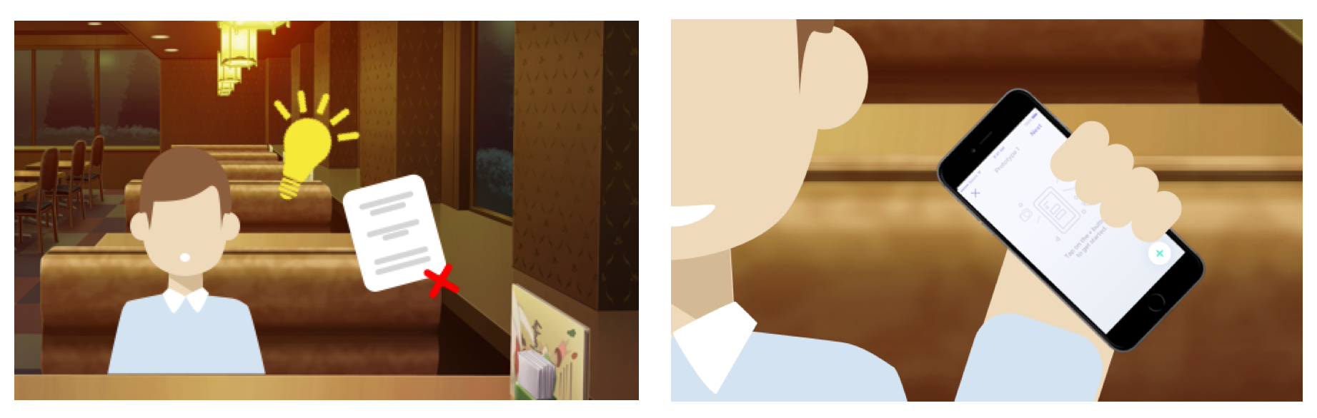
Storyboard 1
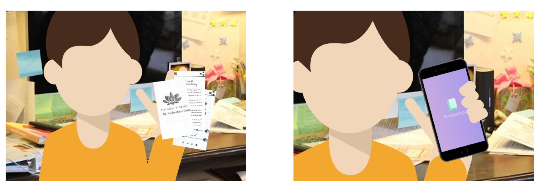
1. Bryan is sitting in a cafe and suddenly he gets stricken with a brilliant idea for an app. Unfortunately, he has no paper nearby.
2. However, he has Proto-tool to help him draw down his app prototype. He decides to start a New Project, and begins Sketching out the wireframe.
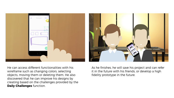
3. He can access different functionalities with his wireframe such as changing colors, selecting objects, moving them or deleting them. He also discovered that he can improve his designs by creating based on the challenges provided by the Daily Challenges function.
4. As he finishes, he will save his project and can refer it in the future with his friends, or develop a high fidelity prototype in the future.
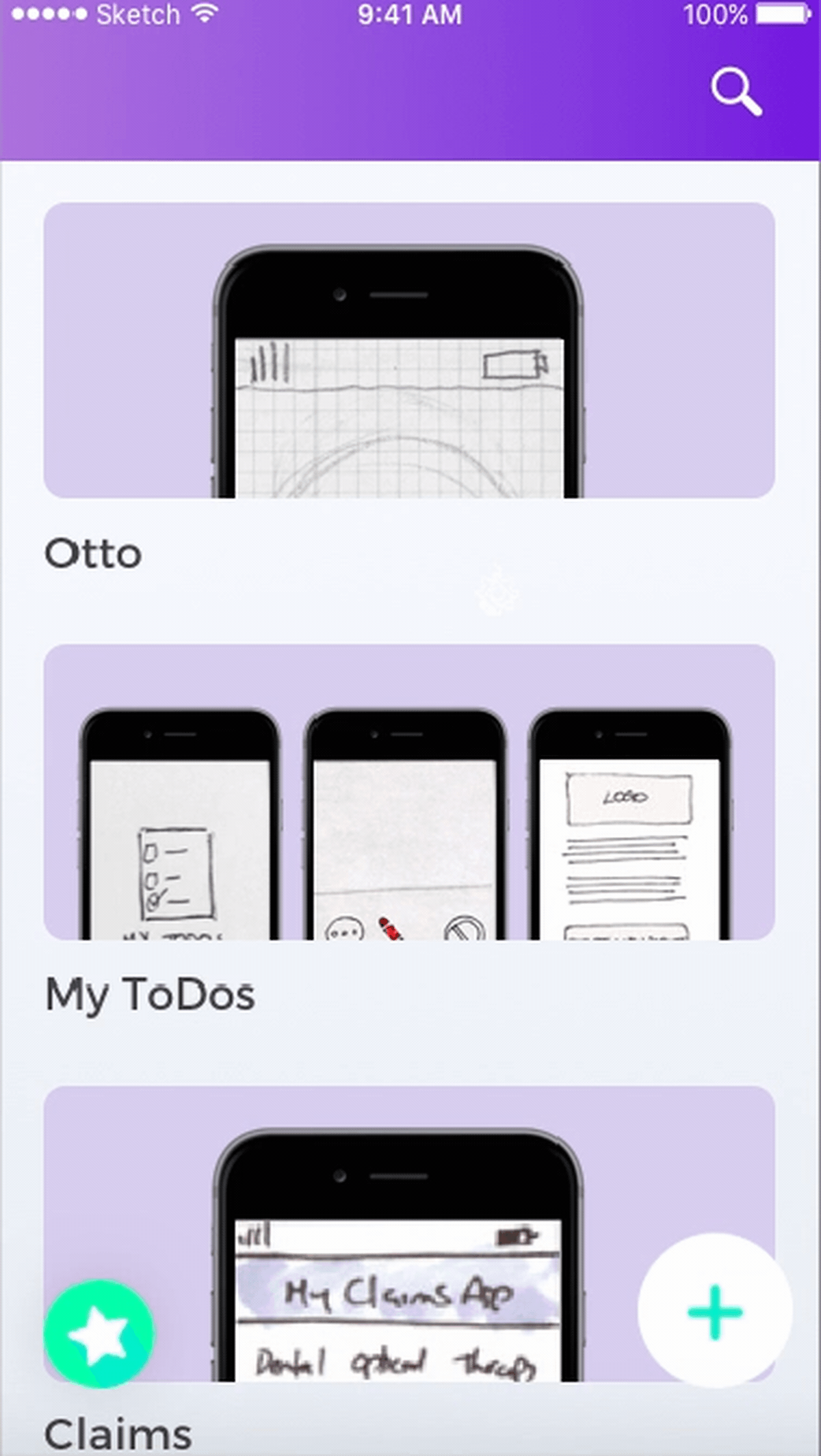
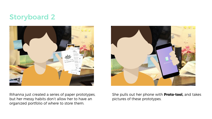
Storyboard 2
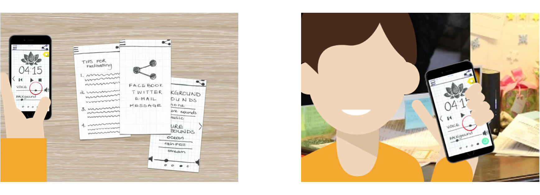
1. Rihanna just created a series of paper prototypes, but her messy habits don’t allow her to have an organized portfolio of where to store them.
2. She pulls out her phone with Proto-tool, and takes pictures of these prototypes.
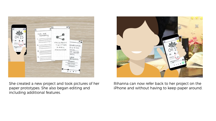
3. She created a new project and took pictures of her paper prototypes. She also began editing and including additional features.
4. Rihanna can now refer back to her project on the iPhone and without having to keep paper around.
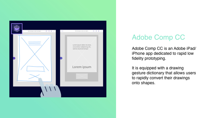
Precedents
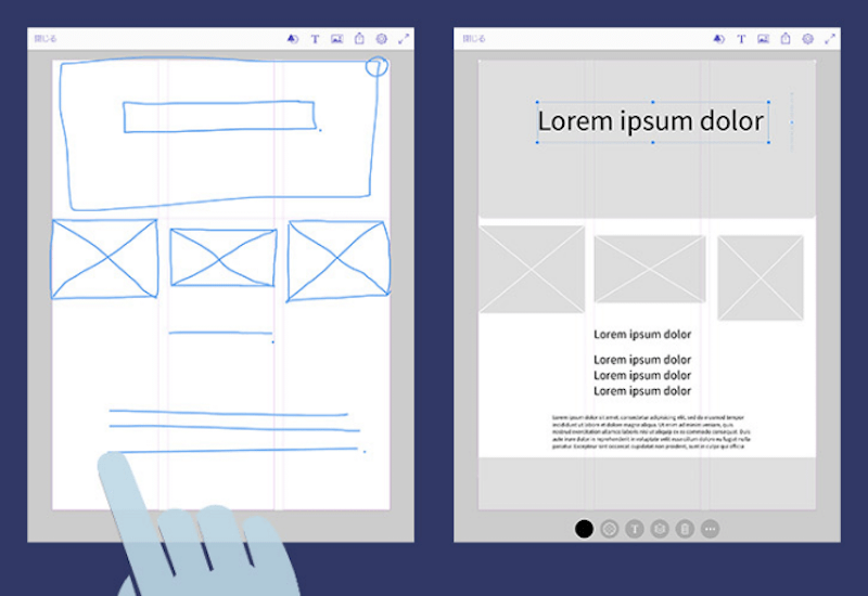
1. Adobe Comp CC
Adobe Comp CC is an Adobe iPad/iPhone app dedicated to rapid low fidelity prototyping.
It is equipped with a drawing gesture dictionary that allows users to rapidly convert their drawings into shapes.
2. Google AutoDraw
Google’s newest experiment: a website with embedded machine learning that allows you to easily convert doodles into professional drawings.
While we prototyped on paper, we thought the wheel interface would be effective. Once we implemented it digitally and tested it out – we were wondering about how effective the wheel interface for timeline/projects would be. We started asking questions such as: What if a user had too many projects? Can they search through the wheel? This digital prototyping session and user testing session helped us understand our needs and functionality better.
We also realized that high fidelity prototyping would be too detailed to perform on the iPhone. The main functionality of the application is to mark ideas and prototype low fidelity screens. High fidelity would require attention to detail which can be tiny on the iPhone. So we are sticking to low fidelity prototypes + sketches with Daily UI Challenges and hotspots.
Explore/Community functionalities with including themes might not be necessary as most of the cases designers would not want to share their prototypes with the community.
Thinking about the hierarchy and main navigation – What elements are most important? We wanted to experiment with the idea of being able to document work process. We came out with various solutions that could reflect our concept, such as lists, groupings, and narrowed down with organizing projects through a timeline. A problem with this approach though, is that it would be more difficult for users to be able to refer to previous projects. For instance, what if one user prefers to work on different prototypes for different projects at the same time? It would be preferable to organize projects through different names. Would the timeline be week based, day based or project based?
Another issue that rose from this prototype was the iconography and language that was employed. Some icons were misleading and difficult to understand, causing the users to get lost when using the application.
User flow was also another issue that was not worked on well in this prototype. The UI gave more emphasis for users to record their prototypes with the phone even though the sketching option was equally as important.
Apple Watch Extension Prototype 1
The Apple Watch extension serves as a way to encourage Proto-tool users to keep designing and thinking of a way to incorporate daily challenges into their UI/UX designs.
User testing & Learnings:
One of the issues that was not taken into consideration was the idea of connectivity between the Apple Watch and the iPhone. Because the Apple Watch served as an incentive for users to continue using the iPhone application, we wanted users to accept challenges through their watch as well. However, the idea of the user having to check in on a daily basis by accepting that they have completed the challenge of the day seemed rather redundant.
Because the screen of the Watch is rather small, it would be more accessible for users if they were to access their past challenges organized in another way. Instead of viewing daily challenges, one could prefer to see them organized by week.
Reviewing past works could be a feature that not many users would visit. However, we felt complied to keep this as a feature as users might want to revisit their previous work in another device or screen.
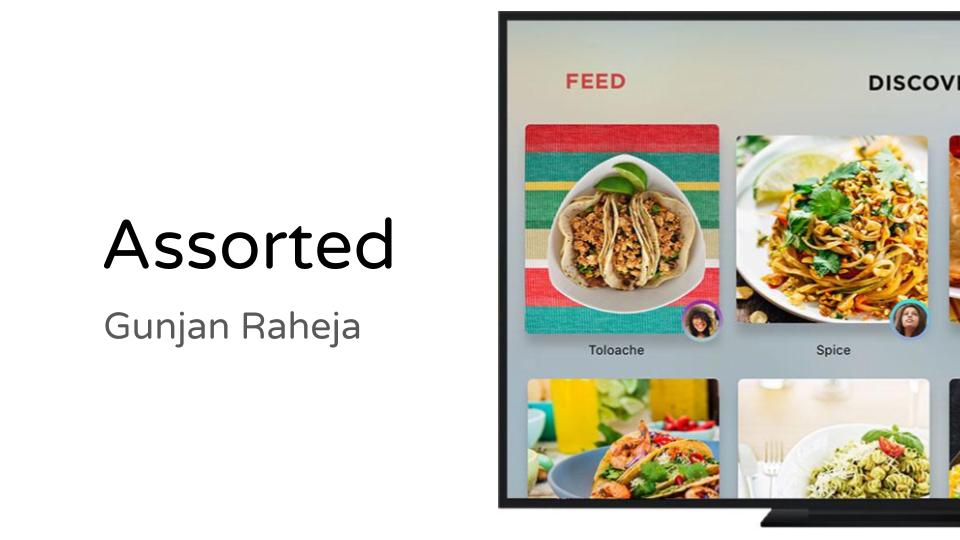
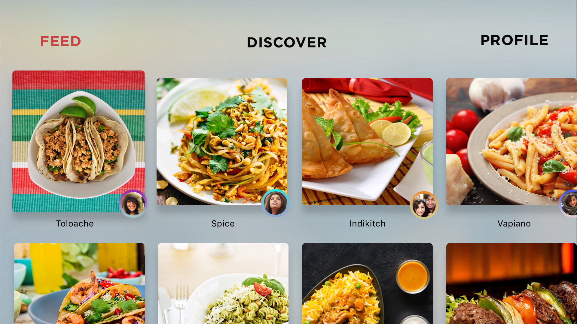
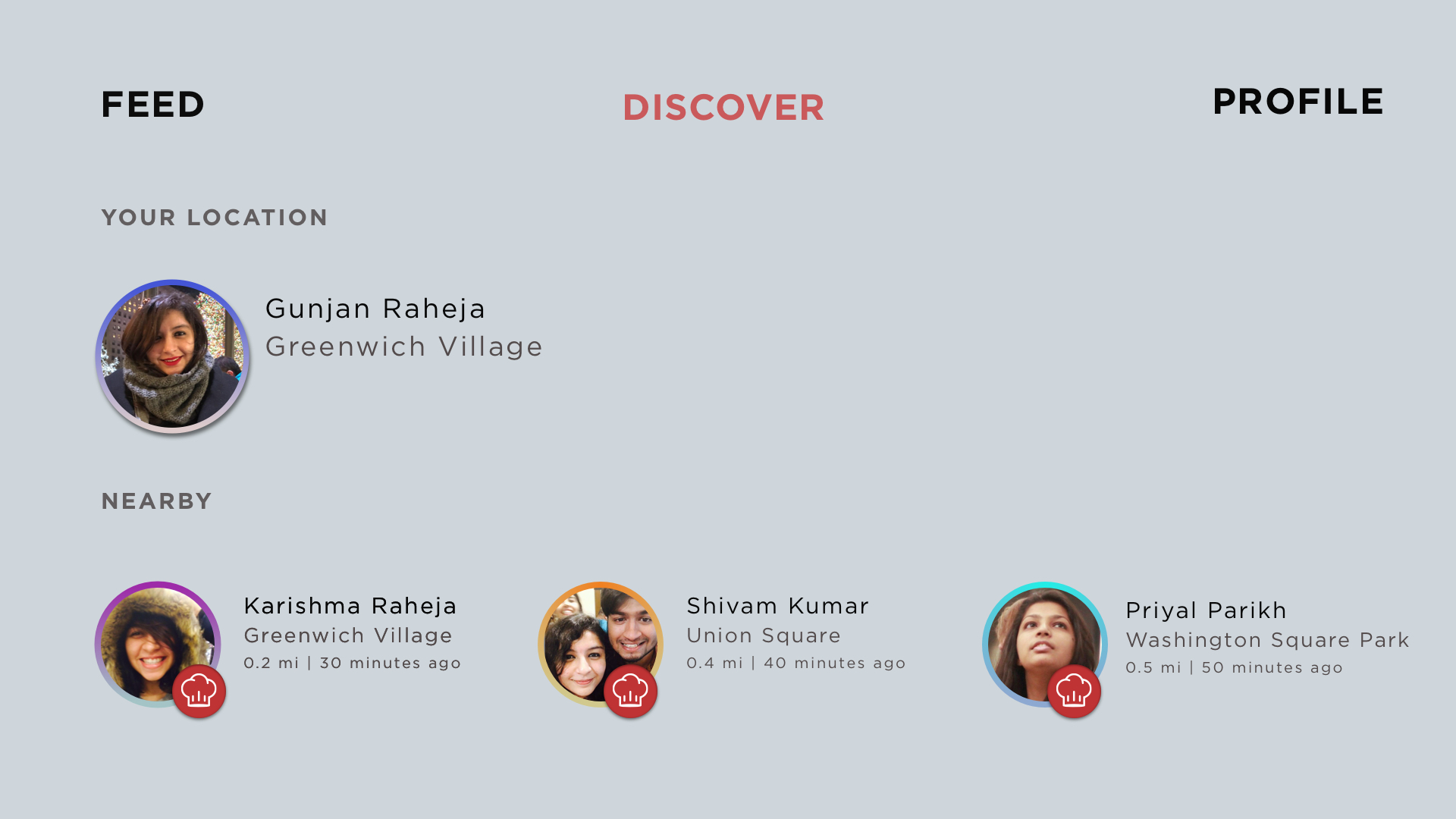
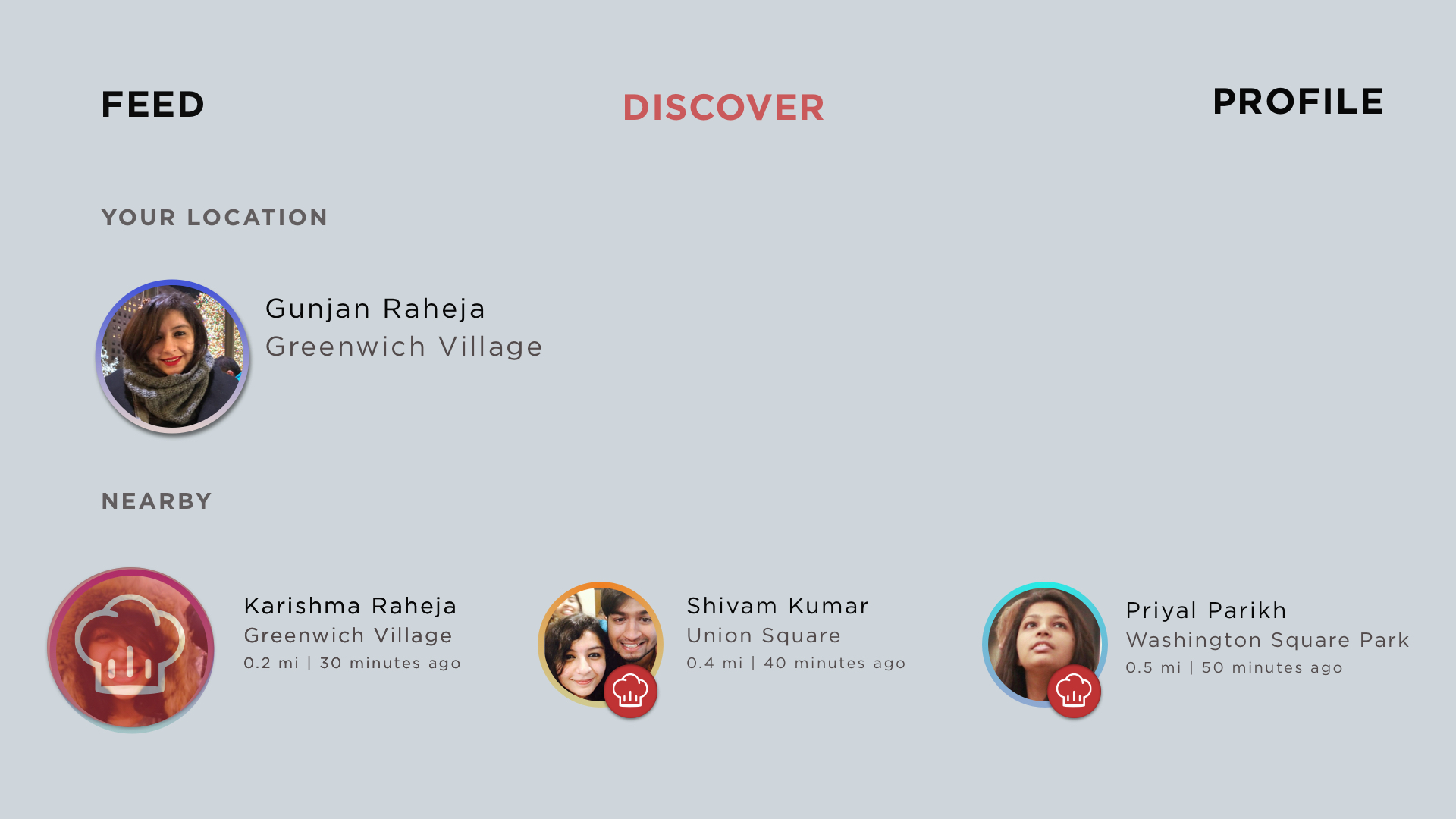
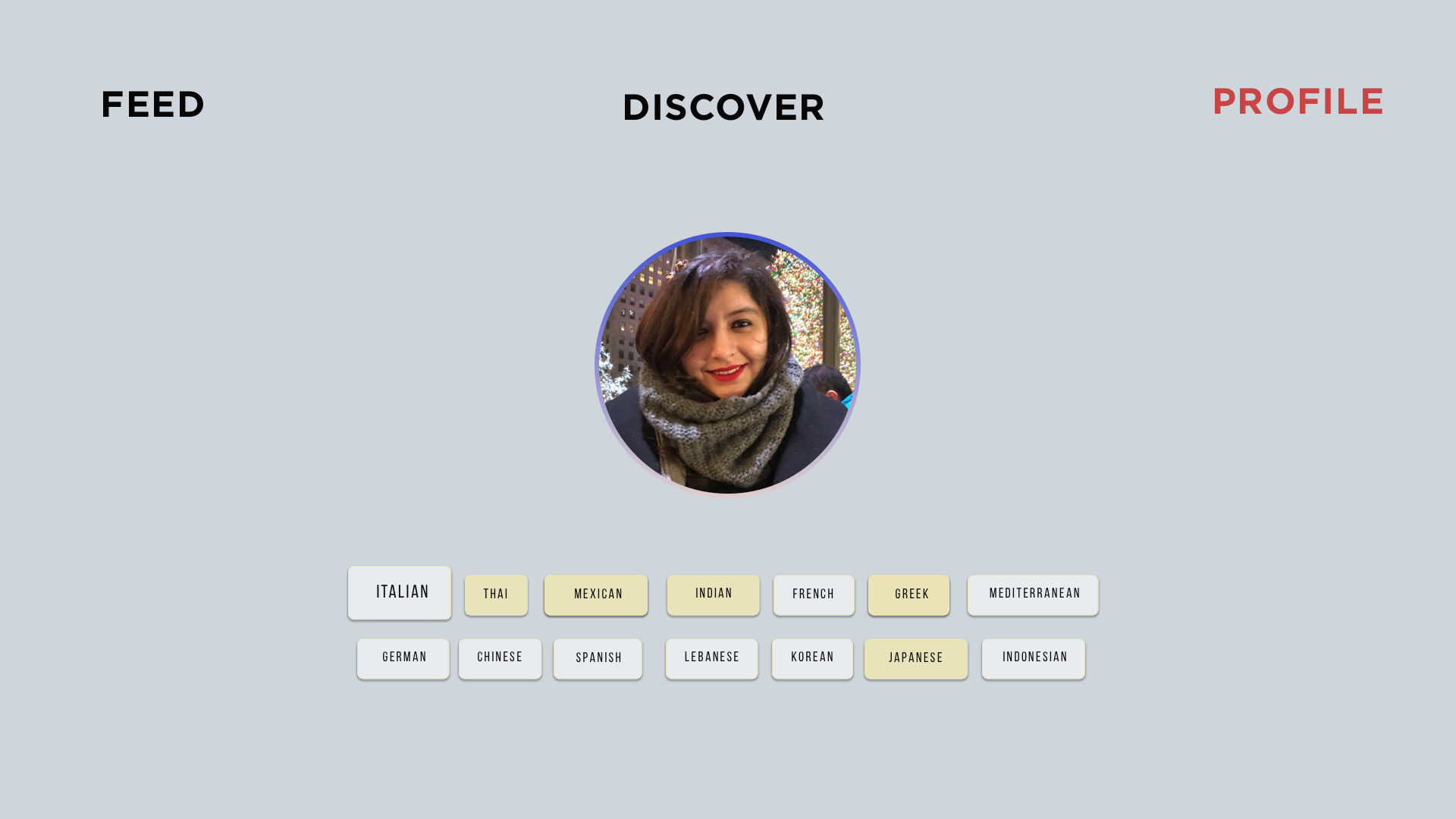
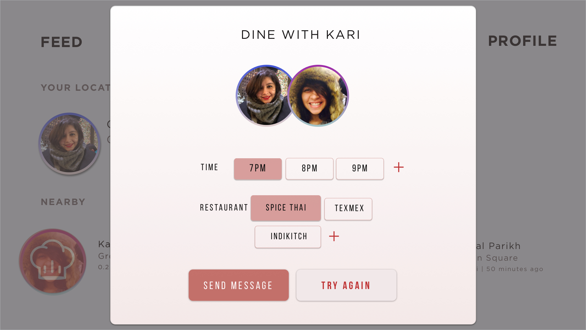
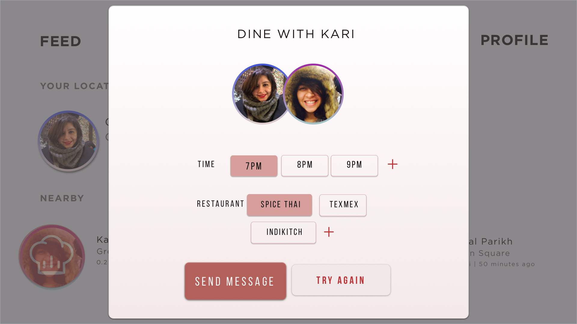
Assorted is an application to grab a meal with nearby friends. You login through facebook, find nearby friends and grab food! On the TV OS app, you can also Discover Food from different restaurants nearby based on your food preferences and ratings from your close friends.
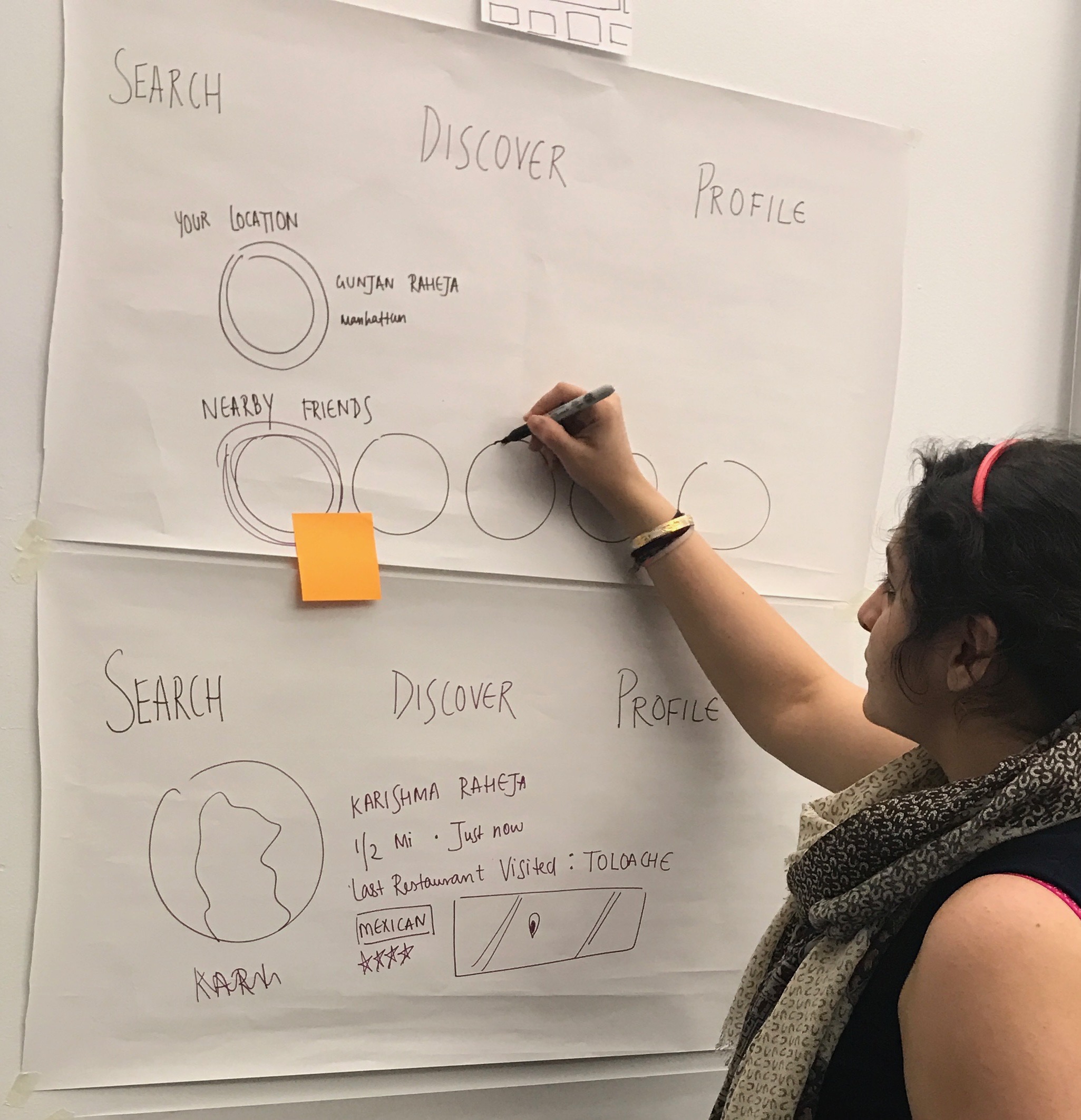
EARLY IDEATION AND SKETCHES:
3 THINGS I LEARNED FROM PAPER PROTOTYPING:
Understanding the main interaction – What is the main function of the app that you want to cover in a few taps?
Hierarchy – Which elements are most important for the Navigation..
Map Navigation doesn’t exist in tvOS – thinking about different ways to organize the feed
FEEDBACK AND QUESTIONS RECEIVED:
So the Mobile app matches you with someone to eat with but in the Apple TV you can select and click? YES
Because there are no maps navigation in TvOS – think about different ways to depict nearby friends
what we’ve learned from the last critique was that
“Review my cleanup” is not that clear for first users
tvOS
https://marvelapp.com/45h0593
We were trying to be more creative but we don’t know that our initial design may against the tvOS Human Interface guidelines. Therefore, we end up changing the “scroll down” function on the main view, but instead, we keep three tabs on top so that the TV interface structure could be more easy to navigate.
For the background on the main view, we will definitely use videos as background because it will add more dynamic dimension to its experience that would ultimately lead to longer engagement.
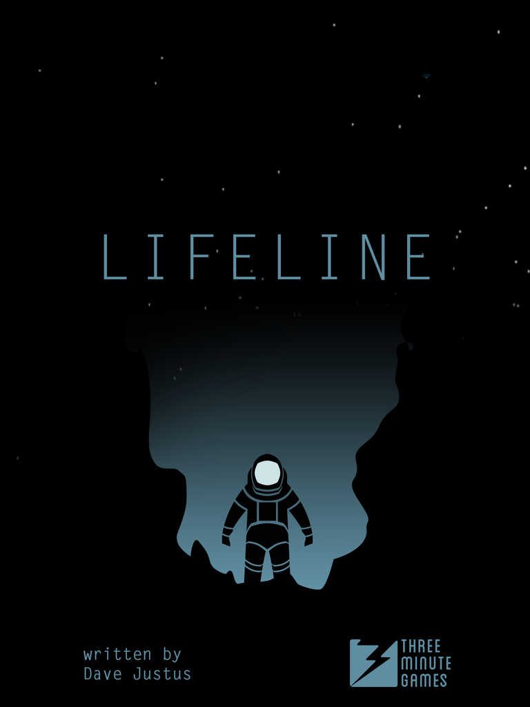
Link: http://store.steampowered.com/app/585290/Lifeline/
Lifeline is an immersive story of survival and perseverance, with many possible outcomes. Basically, this is a text-adventure based game that an astronaut named Taylor who is the only person survive a plane crash onto an undiscovered moon. As a player, your must guide him through this whole journey and your goal is to keep him alive as long as possible. In addition, the game is heavily based on your decision, and that your decisions could either save or kill Taylor in the game.
The moment when I started to talk to Taylor I felt like the character was real. The App plays out in “real time” which means that sometimes Taylor goes off to do something else and you don’t hear from him for a while. That really makes me feel that I am interacting with a real person. Personally, I don’t hate waiting because I don’t have much time to play the game. But for the game person and you do not have patient, this is not the game you are looking for.
However, text only communication can be also a really boring aspect. you only have two answers to choose from at a time, and sometimes I just don’t want to choose any of them. and the game has too many texts which I really hate reading too much, and especially Taylor talk fast then I can read which is also quite annoying. But overall, I think it is worth to play it!