wk09_Stella

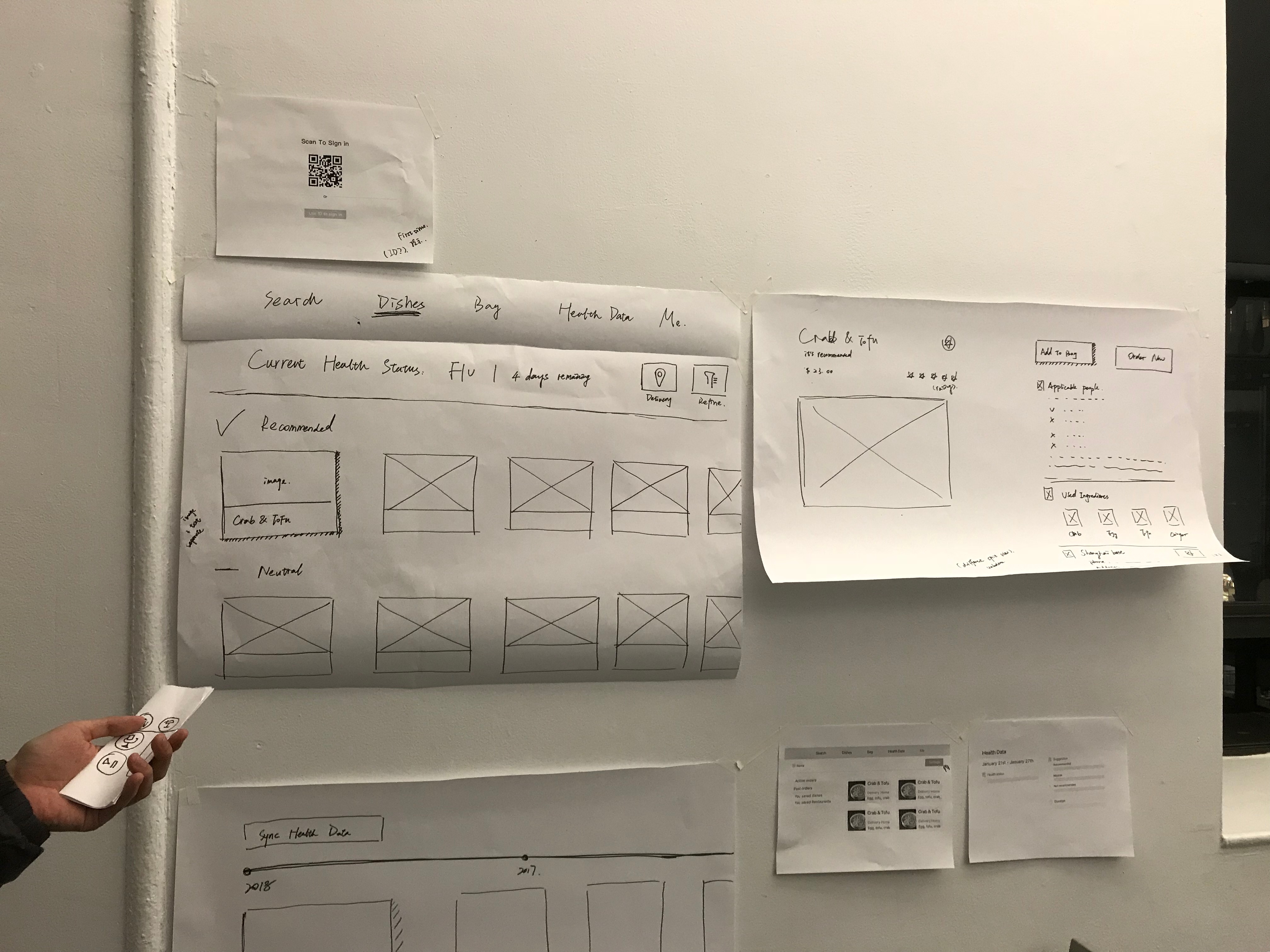
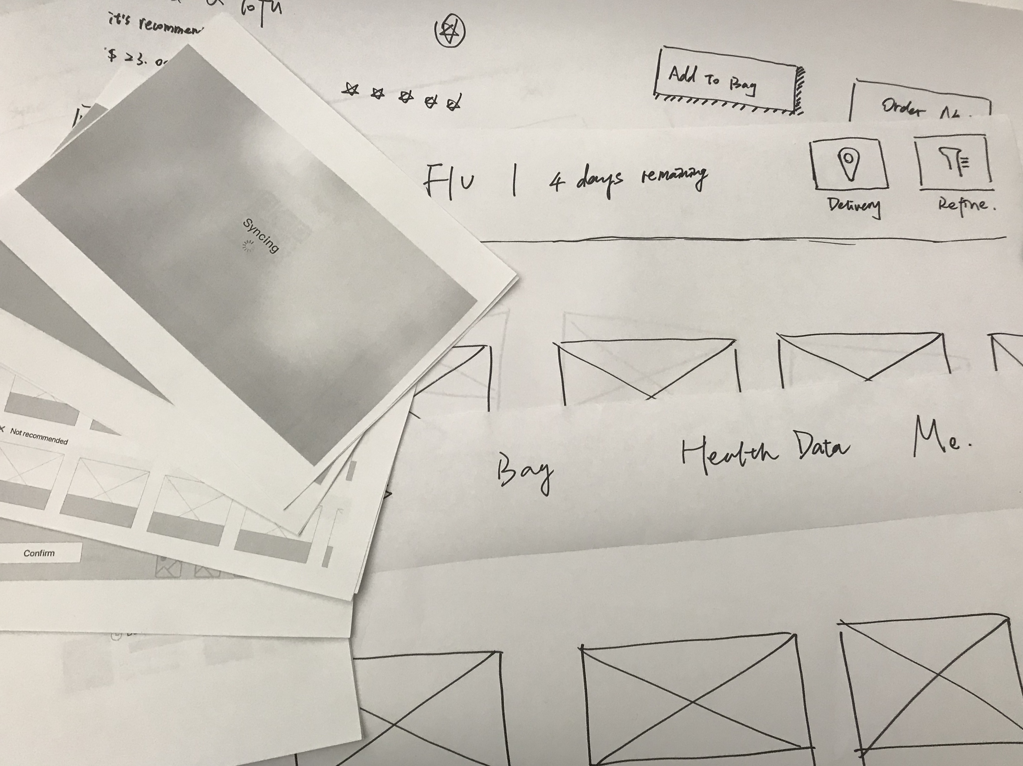
2-3 user insights that I learned from paper prototyping

  • Reconsider the category for the menu tab.

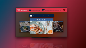
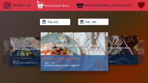
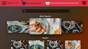
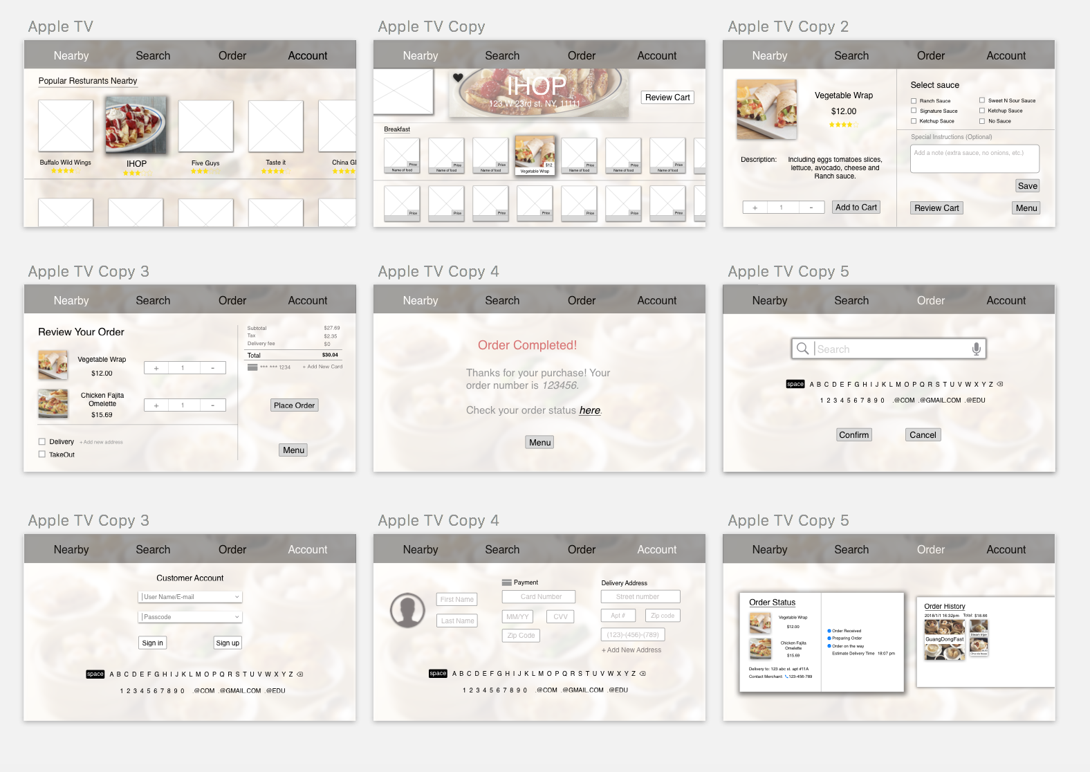
From the critique as well as the user test, I found out that the initial category on the menu tab is not that familiar to users. Hence I referred to some shopping applications on Apple TV and redesign the menu tab. I added a logo on the left corner and an icon for shopping cart on the right corner, which correspond to users’ habits more.

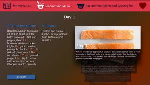
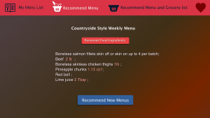
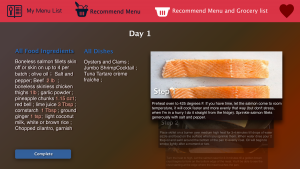
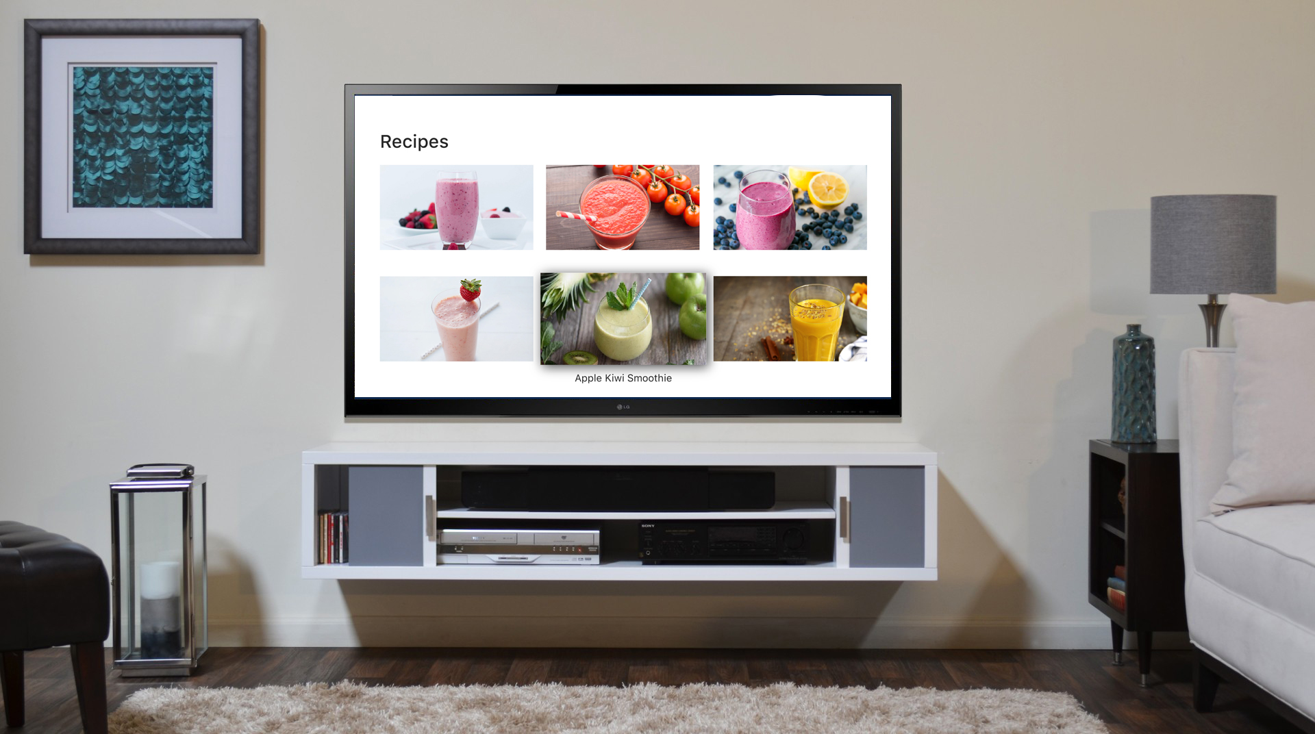
  • Redesign the layout in the “CURRENT” view.

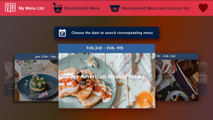
From the user test, I figured out the vertical layout for current recipes was not that efficient, which didn’t keep consistency from the layout of “SHOP” view as well. Hence, I changed it to the grid layout which is more clear and informative.

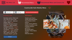
  • Rethink user experience in the “SHOPPING CART” view.

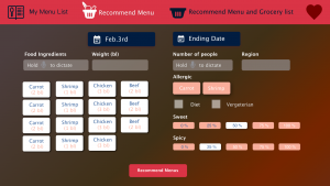
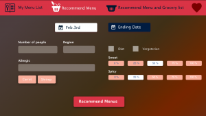
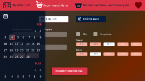
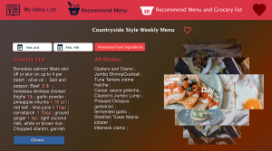
Initially I only designed a confirm button in the “SHOPPING CART” view. However, I found that users may need more actions such as reviewing the recipe here. Accordingly, I added more features in this view. For instance, users could set their start and end date for the plan, and review the recipes they select before the confirmation now.

Final Visual Design

WK9_Yin Hu

Insights from paper prototyping

Log in view: confused about the User ID, what if it’s the first time for users?

Me tab: What’s the function of setting? is that necessary?

Confirm details: put things in the middle

Bag tab: inputting card info is complicated… think about change card and time function here.

The brief description of BonFood apple tv version

Bonfood tvOS version app is a simplified version of the Bonfood iPhone version. I suppose that users of this tvOS version app have already used this app on their iPhones. Considering the typing problem on apple tv, I cut functions: (1)managing health data (including adding new/ editing/ deleting)(2) setting function in me tab, which means users should have the pre-setted delivery address information and card information, so in this apple tv app, users just choose which address and card to use.

Updated app map

feedback of presentation: the sync button is not necessary in the Health Data tab.

Visual Design (updated)

Digital Prototype (updated)

#thursdayapps || Frannie

Forest is an app that is designed to help users to start an anti-mobile-phone lifestyle in order to focus on their real life. When the users turn on the app, they will have to stop using their phone for a preset amount of time in order to grow a tree. If the user left the app in middle of the preset period, the tree will die and they will have to start over. The final goal is to grow out a whole forest by growing trees one by one. It’s a great app to keep people focus on whatever they are doing in their real life, no matter it’s working, studying, or communicating.


The users will need to keep focus to get more coins in order to buy other types of tree. Other than that, Forest also work with an organization to grow out real trees in real life. The coins can then use to plant a tree in reality. It also has chrome extension now.

Week 9 – Franky Wang

App Design For Apple TV – Yumtube

Yumtube is a film app for Apple TV to recommend good movies, episodes, and documentaries about food for families. While users are watching videos, some food appeared in the movies will be highlighted and the recipes are provided by the app. Users can follow the recipe to cook dishes appeared in the movies. The target user will be the family group. Taking advantage of the big screen, the recipe can be displayed on the same screen along with the video play, which makes the experience to be shared by all the family members.

Insights from user test on Mar 15:

+++ Reconsider the category for the video on the index page.

The main operation on the index page will be swiping and clicking on the pad, so it is important to minimize the complexity of accessing the 2nd-grade menu. In this case, there’s no need to differentiate the categories of videos. Since the introduction is already included in the poster and 2nd-graded menu, there’s no need to figure out whether it’s a documentary or comedy on the index page. After all, they are all videos about food.

+++ The rating system is unnecessary in this app, simplify the using process.

The source of videos about food is limited. Unlike the other film app that recommends users according to the rates, Yumtube focuses more on the recipe content from the video, which makes the rating system less supportive to the user’ choice. And the process of rating on the remote control is not handy enough.

+++ List the concluded recipe at the beginning of the video instead of displaying it at the end.

Simplify the function for users who just want to read the recipe. They can reach all the recipes without watching the video, or have a basic impression of the video content.

Wireframe of the new version:

Visual design and prototype

Week8

User Test

User Testing Insight

  1. Don’t need closing icon –  Apple TV has a back button.
  2. Remove the first search screen – make people tap the search keyboard right away.
  3. What screen do people see when people type in many different types of ingredients? — So I designed another version of the interface.
  4. For the bookmarking the cookbook, the icon should be outside of the recipe photo because Apple TV cannot focus on inside. — I took out the icon outside of the recipe photo, so people can focus on the icon separately.
  5. Consider the interface when there is many ingredients or steps descriptions. – So I made squares surrounding the step descriptions, so people can scroll down by square to square.

Final User Flow / Wireframe

Final UI


Final Prototype

https://marvelapp.com/3ajf5eg/screen/40010319