Food Picker – AppleTV – UI design

Based on the user test last week, I changed some parts in my app:

  • When the user opens the app, it would focus on the current location button. (It was not clear that user tended to ignore this button.)
  • In the restaurant detail page, I change the layout of “menu” and “save” buttons. (It was confusing when they placed together.)
  • Remove the popular tag on the menu page. (It looked like a clickable button.)

Prototype: https://marvelapp.com/599ii57

Brandon Palmer | Paper Prototype | Week 1

Three Things I learned | Note there are many problems with the first prototype. These are the Top 3 errors found from user feedback

Main View | Display errors
After presenting my first iteration for Superb, I quickly found out from user feedback that the home view was to complex. The display consisted of three main divs in the center of the screen. Each div was intended to function as a carousel to scroll through and choose different options. The user thought that the carousel was an advertisement, and took around 5 seconds to realize its function.

Solution: 
Make the home view show possible options to choose from, without stacking each element. (Simpler the better).

Meal Selection View | Layout and usability
As the user continued onto the next view, they suddenly became distracted with the disorganization of each display element. All of the fitness star names were on this page, without images of food. Causing the user to become aggravated with the choice selection. Ultimately making the user choose a random person without knowing which meals they were going to review.

Solution: Create a system that displays each category with some of the top meal options in the view, As selectable.

Profile view | Functionality
The profile consisted of three main elements. One section for Rating & Reviews, another for Total orders, and Favorite Meals. Now the user instantly questioned the reasoning behind this page. Since the elements had been designed for information and nothing more. The profile had no use. So my main feedback was for the user to be able to go back into the profile and reorder the previous meals.

Solution: Give the Profile Functionality, or take it out completely. Developing an ordering system that operates as a simple checkout could be a nice touch to bring back users.

Paper Prototype | Notes


Vigilant | Apple TV app design

Concept:

Vigilant is an Apple TV app that allows users to watch and care for their drunk friends on the road to good food.

This application is meant to be an extension to quik, the iOS app that lets drunk users find the nearest restaurant that satiates their hunger.

App map:

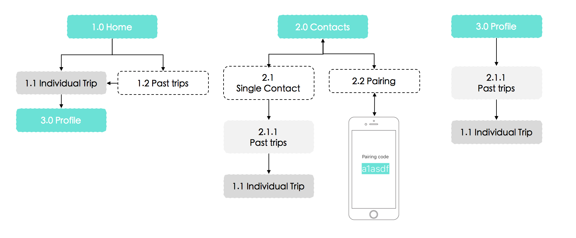
The connection between Vigilant and Quik are through Contacts. A unique 6-digit pairing code will be generated from the Quik iPhone users (each digit code will be unique to each user). This code will be typed into Vigilant’s Pairing view. In turn, a request will be sent into Quik so the Quik user can confirm the acceptance. Once the pairing is done, Vigilant users will be able to watch over their friends whenever they start a new trip.
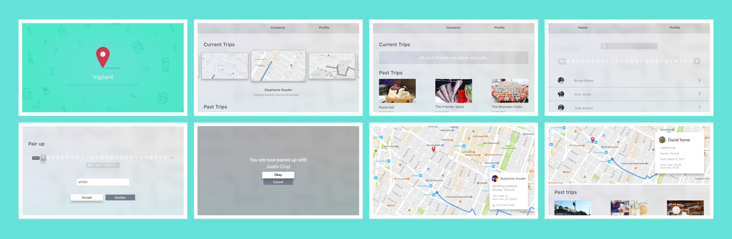
Prototype 1:

Marvel: https://marvelapp.com/562e5ce

Prototype 2:

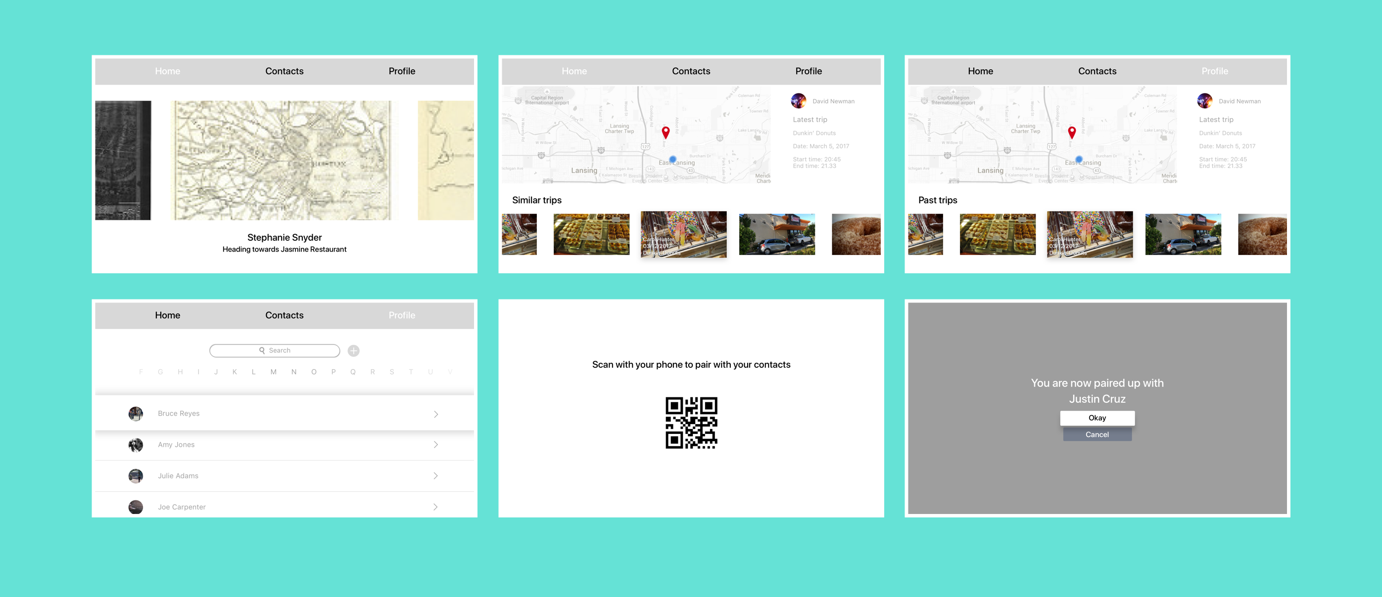
PDF: zhant293_prototype2

User insights & solutions

1.Contact List: An essential part of this application is for users to be able to track their friends’ whereabouts through the Apple TV. The initial idea for the first prototype was to have the application access contacts through the phone (Apple ID). However, as this functionality was not possible, I opted for other alternatives for users to connect with each other. For the second prototype, I decided to add a QR code for the user to scan the phone. However, it seemed like the intention of the application is not for the phone to add the TV, but the opposite. For the third prototype, I switched to a pairing passcode (generated by the iPhone user).

2.Trip hierarchy: On the first prototype, the active maps took out almost the entire layer of the home page. Users would be able to switch to different maps by scrolling down through the list on the right. For the second prototype, I decided to change the layout into a wheel format. This would allow for the user to see a more hierarchical view of the maps as well as view all maps available on the same screen. However, considering that the app could be opened when there are no ongoing trips, then the home page would look rather empty. To solve this issue, I decided to add the Past Trip sections in the third prototype.

Design

Marvel: https://marvelapp.com/2ecf0f6 

Powerpoint: zhant293_mobilemedia_project2_appletv zhant293_vigilant_appletv_prototype