Lens for Apple Watch_Group: Cathy Sun, Jin Huang

LENS for Apple Watch allows users to control, remote the ios LENS app when you are watching VR videos without taking your phone out of Google Cardboard.  

It also enables notifications to keep user updated with their following publishers.  

Presentation Slides 

Feedback: Better not use Digital Crown, can design the entire interface as a button to realize the same function.

For May 12th

  • Post any and all of your assignments on the blog that you have not yet. Everything should be posted before class starts. As always, if it’s not on the blog, you don’t get credit.
  • Create a final iteration of your project 3 app to present to outside critics. You are encouraged to present a bit of your Apple TV/Apple Watch/Accessibility pass.

Yue and Jasmine – Lynda’s Learning Paths App Prototype 01-4/28

This is our first Lynda Learning Path’s App
https://marvelapp.com/5fid0h6

Here are some user insights:
1) Saving individual courses vs. entire learning paths

2) Button sizes should be tappable
– “Add to favorites” button

3) Learning Paths should be prioritized over individual courses, thus it may be beneficial to explore this as our “Home” page.

4) Rewards
– What does this look like?
– Users have a tendency to view their own profile more than others. How can we make this space provide the feeling of accomplishment and encouragement to achieve more (CTA – try more learning paths)

5) Consistent Tab Bar

7) Examine user flow for Free Trial

8) Does “Home” have to be called “Home”? Consider a new verb that instantly associates with what users expect.

9) Streamline the business learning path for an iPhone app, while the programming learning path can be demonstrated in our Apple TV app.

Next steps:
– Improve upon these insights
– Create an Apple TV app

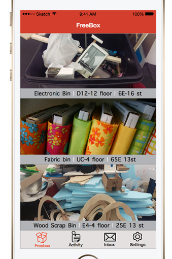
FreeBox 2.0| Wireframes Part – II


Last week, we submitted a new iteration of FreeBox after receiving the below feedback:

  • Inbox and notifications is still a problem for people.  Users were confused why it was under the “Me” tab.
  • The drop-down menu on the “post message” page to set tags is confusing. Rather then be visible when adding them
  • Want more in-between screens to help show how to set notifications etc.
  • Alerts would be a better name than notifications

You can  read the our previous post on regarding this iterative process with our wireframes here.

Continue reading FreeBox 2.0| Wireframes Part – II

#thursdayapps – Paper

Photo 5-1-16, 22 03 01

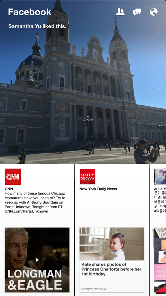
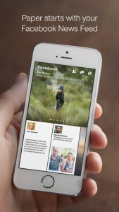
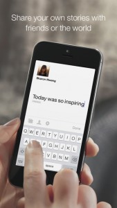
Paper is an alternative Facebook app for people who don’t like the original one. I have used Paper for a while because there are so many problems with the classical Facebook app. The biggest problem is that it occupies too many storage to just keep caches on my iPhone. And the only to free up is to delete and reinstall the app. Then I found Paper to replace the old one. There are a lot of difference between Paper and  classical Facebook app. Posts are going horizontally on Paper while Facebook displays posts vertically. To me, the UI is much clearer and easier to read on Paper.

screen322x572

screen322x572 (3)screen322x572 (4)


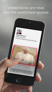
Also most functions we frequently use on Facebook work well on Paper, like posting, leaving comments, checking-in, sharing posts, etc. However, we cannot like posts with emoticons and do live stream for now because it does not update for more than one year(Yes, it has stopped updating since March 2015). If someone is tired of the classical app, you can try Paper. The only thing that new user has to do is to be familiar with the new operation but it won’t take long to get used it.

Facebook-Paper-Icon
Paper app icon

Notice: Paper is only available on US App Store. So it is required to have an US account to download it if you don’t have one.