1st User Testing: Drew, Carrol, and Decho


1. connect each menu together. so user can follow the story
2. from ingredients view, links to the shopping section.
3. more information about the child labor
4. home view, (main page) the most important menu is donation part. stand out donation part and the personal information is unnecessary.
what I applied
CONSISTENCY – size of lists, and position of images
CALL TO ACTION –let user to donate easily
CONNECTION – connect between three menus
INFORMATION HIERARCHY – from the most important to less important.
2nd User Testing and Feedback

LEGIBILITY: less opacity UI: share button,consistency USER could be broader
UI: share button,consistency USER could be broader
USER could be broader. not only parents and kids
POP prototype LINK
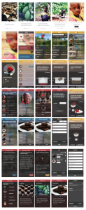
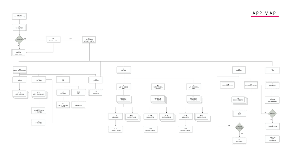
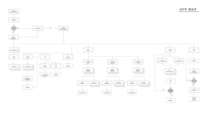
This is new site map and I worked on app map again based on feedback.
Visual Design Iteration2