Feedback to “IOS Human Interface Guidelines”

I didn’t go through all the context, I focused on some specific topics I encountered in our group project instead.

  • Orientation

”In general, launch in the device’s default orientation.” However, if it is essential that your app run in only one orientation, you should launch your app in the supported orientation, regardless of the current device orientation. Also, avoid displaying a UI element that tells people to rotate the device. And if people rotate the device 180 degrees while using the app, it’s best if the app responds by rotating its content 180 degrees.

The difference between iPhone and iPad is the default orientation. For iPhone, obversely, it is portrait orientation. But, When you use iPad, you won’t pay attention for the location of home button. So, for iPad, the default is the current device orientation.

  • Gesture

The guide suggests avoid define new gestures because users have to discover and remember new gestures and also users will be confused if they are similar to standard gestures.

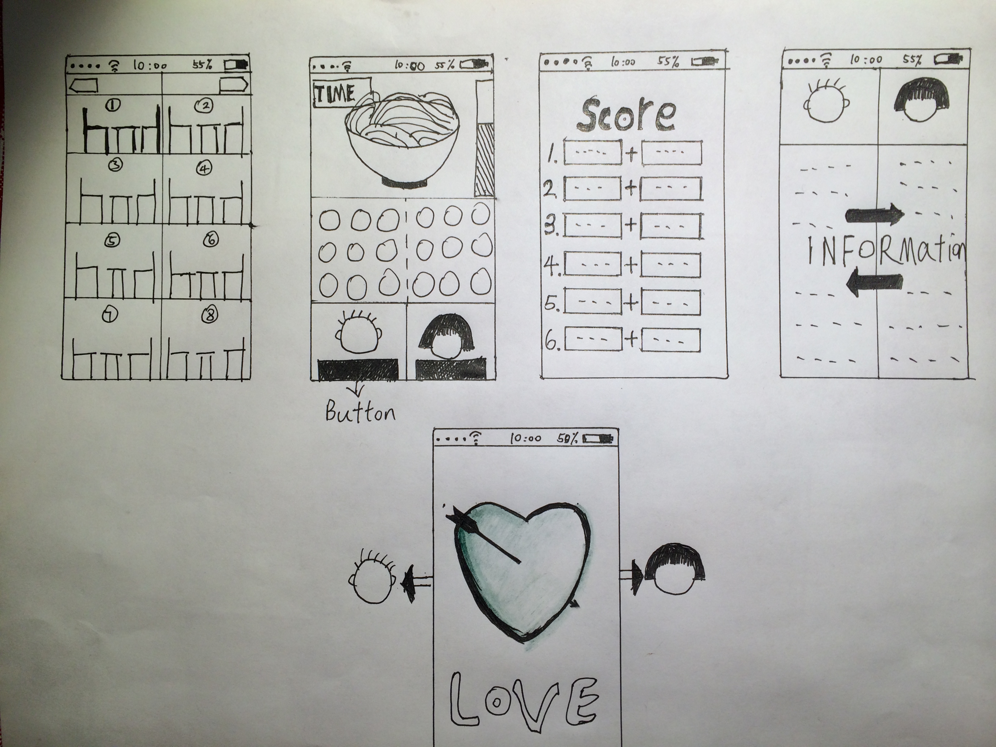
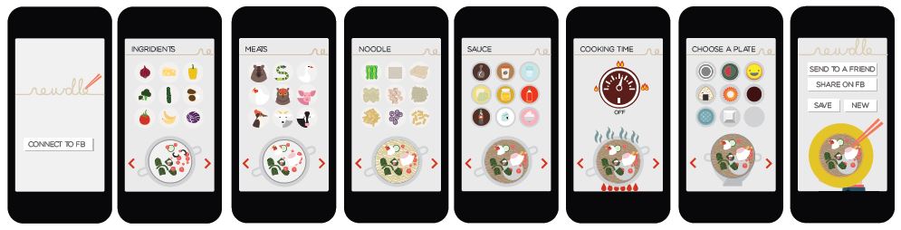
For our app, users can pick up chopsticks by using two fingers. The gesture is very similar to the standard gesture: pinch which can zoom in and out. I am wondering that if new gestures are close to daily experience, like you use two fingers to manipulate your chopsticks, do they still feel confuse?

  • Advertisement

In the guide, I only found the information about how to use an alert. What about the pop out window? Also, I am curious about how to show ads in your app properly?


[iOS Human Interface Guidelines]

Thoughts:
• It was interesting to learn proper terms and steps(?) of iOS interface design.
• This reading made me realize lots of screens serves purpose of faking users experience – They make you think A is happening but what’s really going on is B.
• “Get information from iOS, when appropriate. People store lots of information on their devices. When it makes sense, don’t force people to give you information that you can easily find for yourself, such as their contacts or calendar information.” and This guide also encourage developers to stay away from giving users alert about “terms of agreement”, do it as invisible as possible. When Android gives you a box to check with a lists of access they will gain from my phone every time I want to download any app. I’m not sure how far should we go under the name of “better user experience”. I’d rather see my rights visible even if it means a few seconds delay.
• I was surprised to read a lot of valuable/ specific knowledge Apple shares with this guideline (e.g. User behavior/ immediate response, detailed design guide etc.)
• “At the smallest three text sizes, tracking values are relatively large; at the largest three text sizes, tracking
values are relatively tight” <- I didn't understand what it mean by "large"/"tight" tracking.

Questions:
Screen Shot 2014-02-08 at 10.51.43 AM
Confused about how the structure works. and what is UIView?

Team Tophie: Noodle Match

2014-02-05 22.00.16

  • Team member: Tony and Sophie.
  • App: noodle+game+single people
  • Our app is called “Noodle Match”, it is a noodle game for single people and the goal is to match two of them by playing this game. We find that the core elements of a successful dating is to have a nice conversation and a tacit understanding, so we decided to add more interactions to this game. Two people(must be single) are team up automatically and begin to play this game. A bowl of noodle will appears on the top of the screen and there would be 10 seconds for they to remember that kind of noodle. After 10 seconds, an empty bowl appears, and their goal is to choose the ingredients in front of them by telling each other which ingredients should be added(using micro phone to talk). There would also be time limit, so the players need to be quick; a process bar also appears on the right of the screen, so they would know how close the noodle will be like the one before. When time is over, their names and score will be on a ranking list. The top three winners will receive a big reward: having a sweet candlelight dinner with their partner( of course, the main dish will be noodles.) Each player has a profile, so everyone can see their personal informations, we really hope our Noodle Match can finish someone’s single life. ^____^

Team Newdle Update

Hi, we are team Newdle.

Here are the members of our team:

Aero Wang, Chloe Koo, Joori Lee, Seung Ki Ryu

We started our project with the keyword “Noodle” in the category “Entertainment,” targeting single young adult users.

Having four unique ideas initially, we realized that an application that encourage users to explore and share will be most entertaining and suitable for young adults. Therefore, we decided to create this mobile app that allows users to virtually create noodles and share with their friends on Facebook.

To begin with our concept, we created early wireframes shown below:

Photo Jan 30, 8 54 38 PMPhoto Jan 30, 8 54 32 PM


Using the wireframe as a guideline, we moved forward and created some illustration and visual style of the app. See blow:

Capture_1


And then we decided our logo:

newdleman


After having most visual elements ready, we revisited the architecture of our app and recreated a new set of wireframes:

IMG_5848


And finally we went ahead and created a visual mockup:

Capture_2

After all of our visual elements and interactions are ready, we moved forward into the develpment, and finally this is the demo of our app, enjoy:


Or you can watch on Youtube: http://youtu.be/JroxOuuRlbI

We also came up with new and improved UI design. We will implement in our next version!
MOBILE-NEWDLE-FINAL