Ku- July 22nd Assignment

About me:
Hi, I’m Ku which is short for Kukuwa. I’m currently a Production Coordinator at Collab. In my spare time you can find me riding my bike, fermenting foods and going to the beach.
Things I learned from the iOS Human Interface Guide:
– When possible, present choices. Make data entry as efficient as possible. Consider using a picker or table instead of a text field, for example, because it’s easier to choose from a list of predefined options than to type a response.
– Use visual weight and balance to convey importance. Large items catch the eye and appear more important than smaller ones. Larger items are also easier to tap, which is especially important when an app is used in distracting surroundings, such as in the kitchen or a gym. I
– Let the user jump right into the app through the launch screen, allowing them to get to the action quickly.
– Let the user jump right into the app through the launch screen, allowing them to get to the action quickly.
– Use red for destructive and dangerous actions.
– Less is more. You don’t need to constantly display brand assets. There are more discreet branding methods such as custom color screens and custom backgrounds.
My app:
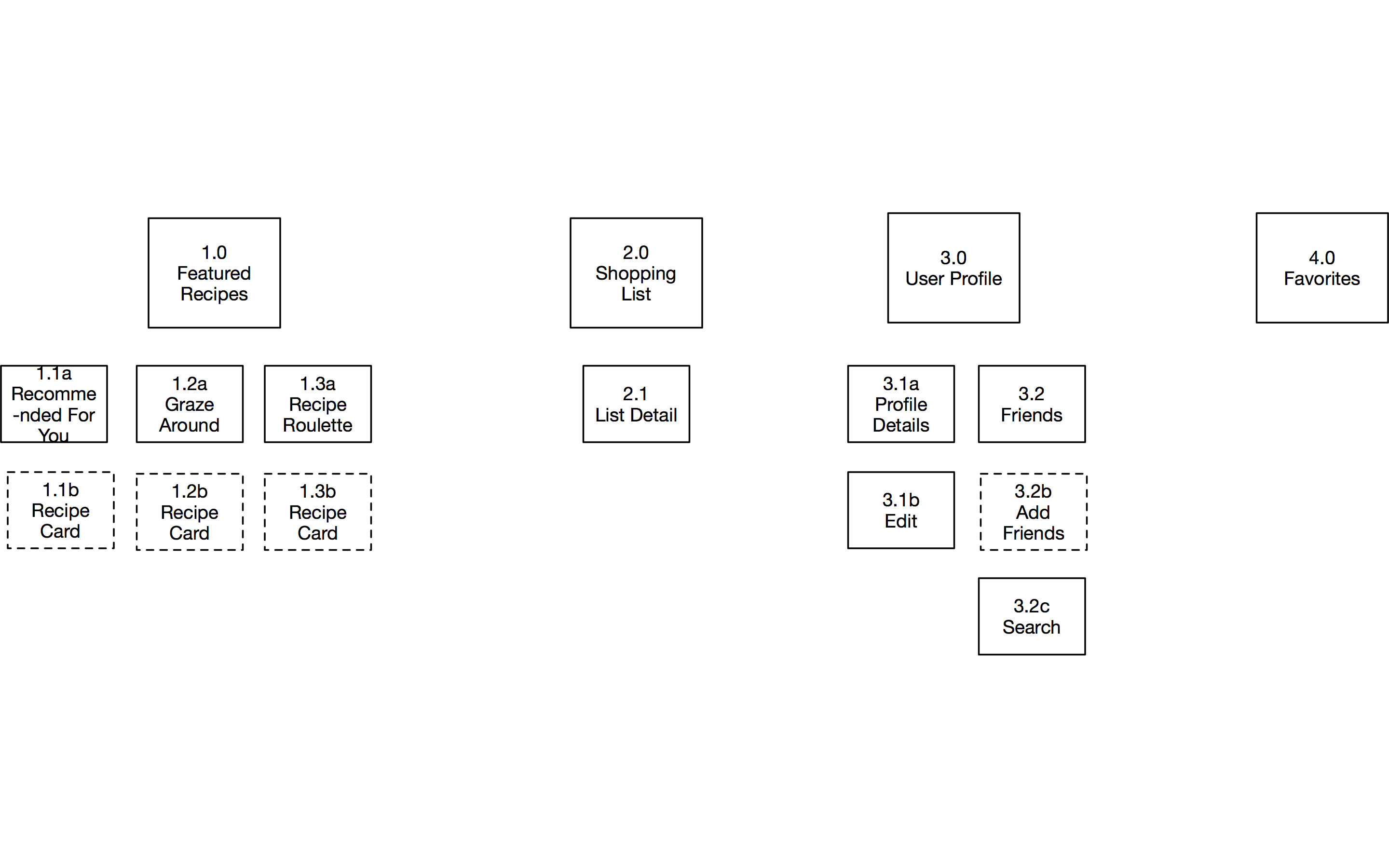
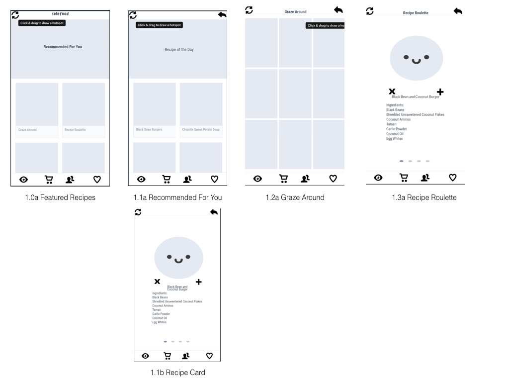
Solefood a meal planning app for individuals who are cooking for one and limited on time. It suggests individually portioned recipes (based off of user preferences) consisting of 10 ingredients or less. Based off the the recipes you choose, the app will automatically compile a shopping list for you. You can also connect with friends to see what they are cooking and explore what’s being cooked by other users.