Karina Tristandy – Week 1
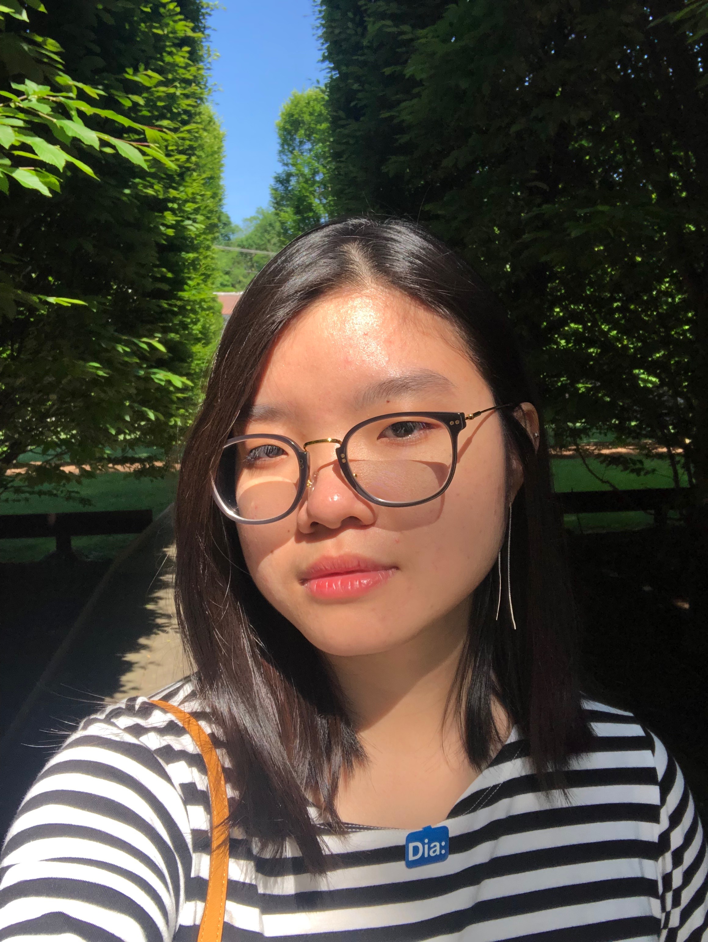
Hello everyone, I’m Karina and my background is a visual designer. I graduated Parsons School of Design in 2017, earned my BFA in communication design and since then have worked with branding and visual identities in both studio and agency setting. Currently I’m trying to make a shift towards more strategic/ product design roles, and trying to understand UI/UX as well as prototyping better which is why I took this class.
Things I’ve learned from HIG:
- People are generally impatient “If you make people wait for content to load before seeing results, they may interpret the lack of content as sluggishness. Instead, show placeholder text, graphics, or animations where content isn’t available yet, and replace these elements as the content loads. Whenever possible, preload upcoming content in the background, such as while an animation is playing or user interaction is occurring.” This is important to know for loading screens, just so people won’t think the app is lagging.
- *Avoid asking for setup information up front. People expect apps to just work. Design your app for the majority; users that want a different configuration will adjust preferences to meet their needs. Derive setup information from the system and defaults, or through a synchronization service like iCloud. If you must ask for setup information, wait until it’s actually needed, prompt for it once, and let users make future adjustments in your app’s preferences.
*Delay sign-in as long as possible. People often abandon apps when they are forced to sign in before doing anything useful. Give them a chance to fall in love with your app before making a commitment to it. In a media streaming app, for example, let people explore your content and see what you have to offer before they must sign in to play something.This is nice to know as often we prompt users with putting their information, but allowing the content first and then delaying sign up to as long as possible is the best way, Existing signups are also a good way to make the process quicker and more efficient - Consider how your use of color might be perceived in other countries and cultures. In some cultures, for example, red communicates danger. In others, red has positive connotations. Make sure the colors in your app send the correct message.This was interesting as different cultures have different biases about different modes, its important to know that not all colors mean the same even within the same context.
App Concept:
My concept is to create a recipe sharing platform where people who miss authentic home cooking can find recipes, share their own and can learn from others. Users can share their own home recipe, find different trending recipes, specific cuisines, bookmark them, share them and can learn to cook from the help of other people. I find that recipes get hard to manage on the internet, and you are unable to categorize them well, I feel that an app that can gather all the functionalities of finding, keeping and sharing recipes that is close to your heart can be beneficial for those who are dealing with homesickness for example, or just to create a new community of cooks.
Jul 21, 2019 @ 14:11:19
Mentioned in class but to reemphasize:
– how to feature recipes by folks that you’re following
– how can you make uploading a recipe as easy as possible
– does notifications need its own tab, or could it be folded into profile?
In recipe creation, you’ll likely need to allow for more than one picture? How many do you want to allow for? Can you upload video? Can you attach a photo or video to something in the recipes (e.g. an ingredient or step?)
By making the default tab Explore, you’re driving your users to be finding new recipes to try versus constantly returning to old, saved recipes. That’s a fine choice, just want to make sure it’s intentional.
Some of your copy and buttons are quite small. Make sure to look at them on a device for readability and touchability. Also keep in mind that anything touchable needs a 44x44pt touch area.
I wonder if any additional type of networking would be useful for the creators in your app to drive engagement? Could they self organize into interests groups that publish likeminded recipes?