Jordan Steiner — Week 1

Hi — this is the only selfie I have in my phone (I swear I’m not that serious).
I’m Jordan, and I like to experiment and learn and pick up new hobbies (most recently it’s been candle-making and interactive installation design). I’m a design/strategy consultant by day, soccer player on the weekends, and every now and again I have some free time to start a new project.
One thing I really didn’t know about the iOS guidelines was the small names for buttons/ui elements (like stepper or slider or segmented controls). I usually just do my best to describe what I know — and when I ultimately can’t describe it, I’ll sketch out the ui element I’m thinking of.
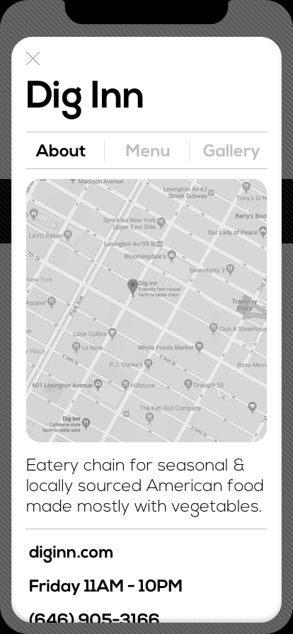
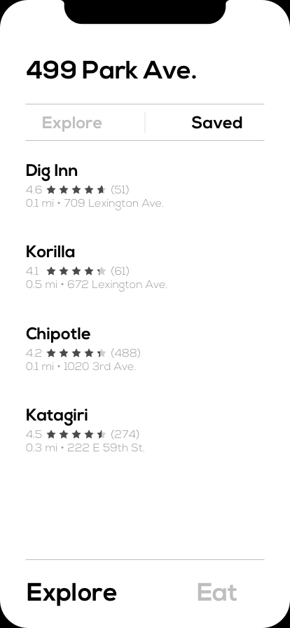
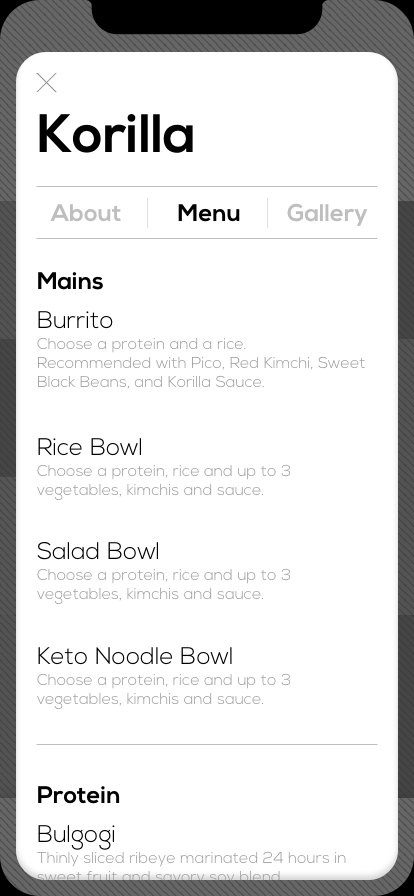
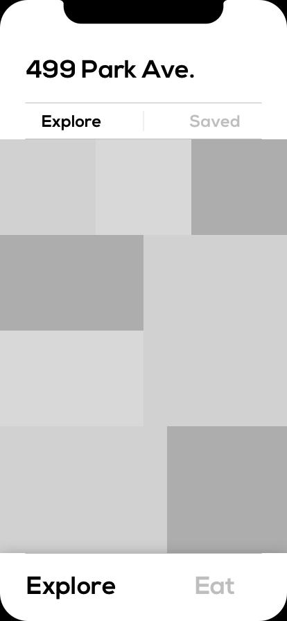
My app concept: Let’s Eat! is an app for friends and coworkers in NYC to quickly and fairly decide on where they’re going to eat lunch.

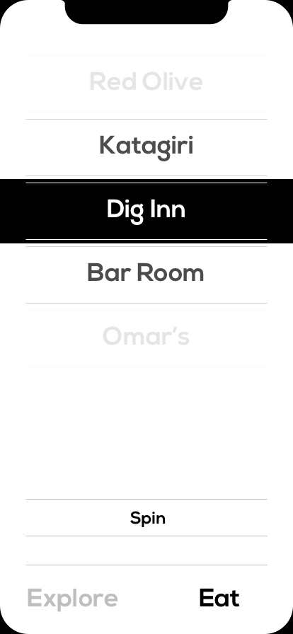
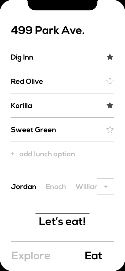
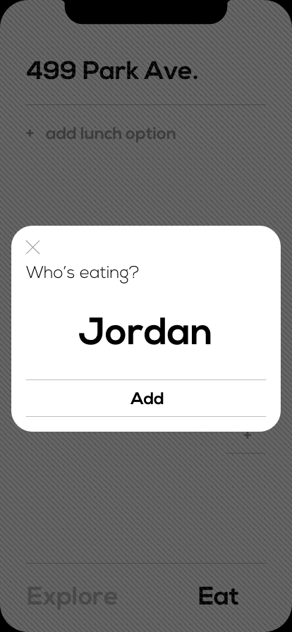
Jul 21, 2019 @ 14:19:46
I wonder if you need two tabs. The “Let’s Eat” flow feels like one discreet journey that would take all of your attention. Perhaps the explore view is just the entry view and there is a button that takes you into a focused “Let’s Eat” mode.
As we discussed in class, I’m all for keeping things as simple as possible for your user and the folks they’re coordinating with. Keep pushing to see if you can simplify any further.
I feel like you either need strong, contextual onboarding or more instructional information interspersed in the Let’s Eat flow. Perhaps some is just hierarchy; with the names of the eaters below their choices, it’s hard to infer that there will be different choices for each eater.
How does inputting restaurants work? Are you just typing names or does it match with real restaurants? Can you easily input favorites?
Does each person only get a certain amount of items or are you leaving that type of rule making to the users themselves? If a person really wanted to weight towards Dig Inn, could they enter it multiple times?