Rui Maekawa — Week 1
Bio
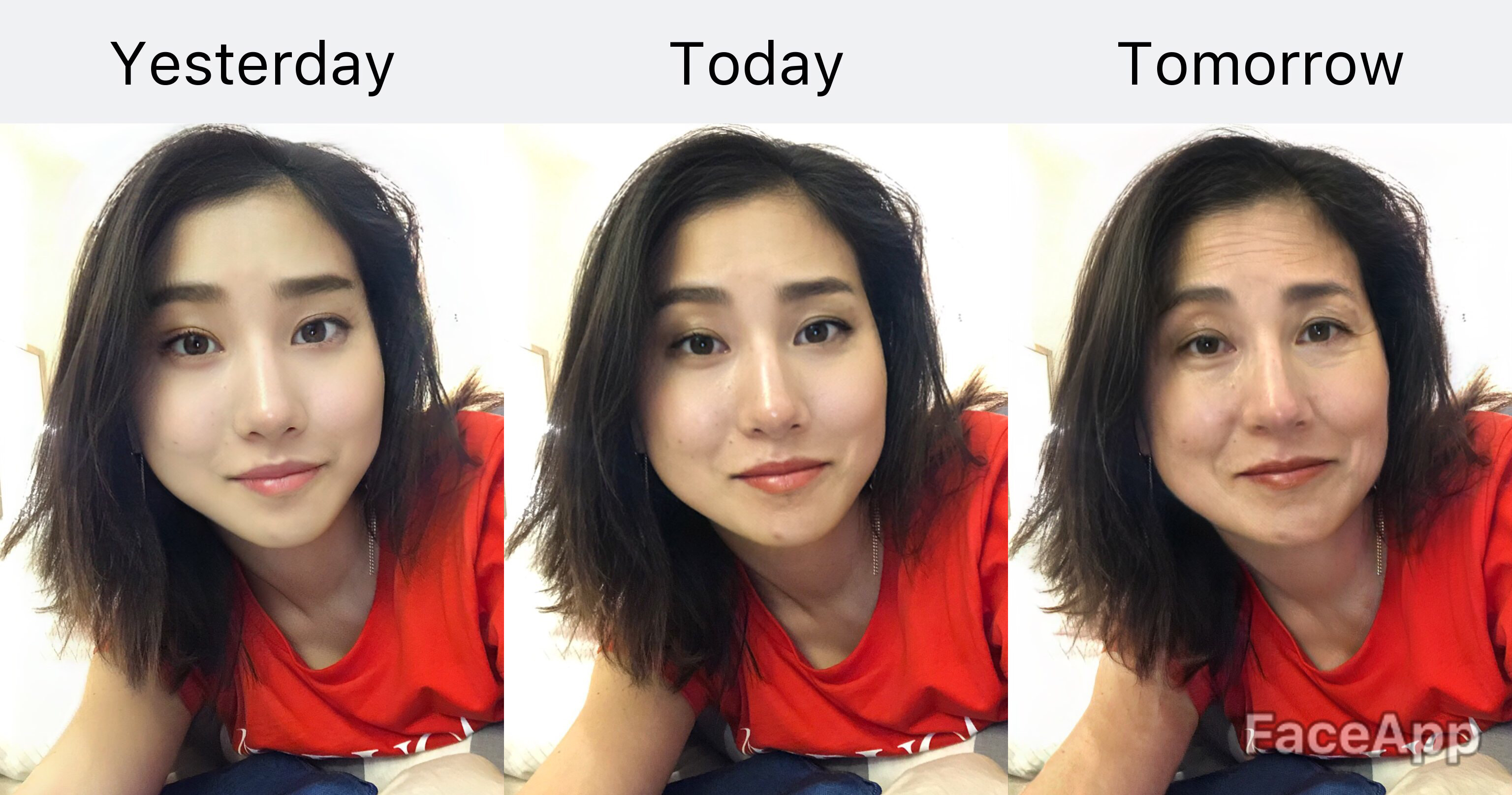
I’m a design director from Japan currently working at Lippincott NY. My interests are in beautiful branding, surprising motion, satisfying 3D, amusing AR, good beer, good wine, and single malt whiskey—and I’m so excited to add UI/UX to this list!
\\\\\\\\\\\\\
Three things I didn’t know from the iOS Human Interface Guidelines
- As a visual designer, it’s obvious for me that colors, typefaces, imagery and other visual elements should reflect the tone of contents, but never thought even standard controls and behaviors should also convey what the intention of an app is for. (Aesthetic Integrity)
- iPad Apps work on Mac
- Little details really matter A LOT. Especially amazed how users (me) learn and build familiarity to elements in the UI Kit, and use them without even thinking.
\\\\\\\\\\\\\
My app idea
Mindful breakfast guide for grown-ups who are sick of cereals.
We are all busy. We don’t have time in the morning…but don’t we really? This app helps to make your morning calm and peaceful through sophisticated breakfast recipes and mindful eating audio guides that are corresponded to each recipe.
\\\\\\\\\\\\\
Wireframes
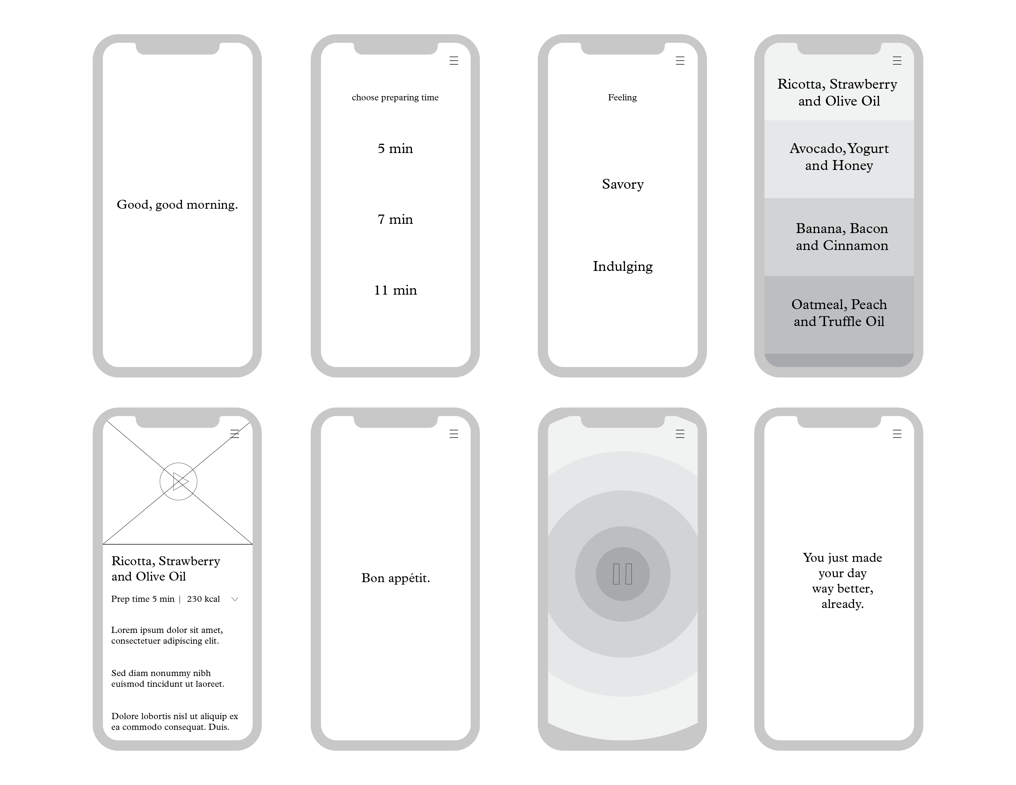
Jul 21, 2019 @ 16:07:31
Instead of requiring so much setup time each time you open the app, try and lead with content. Could you just show grouped breakfast options/meditations that could be further filtered?
Will the guided meditation also take you through the cooking process? It seems like you could integrate the same mindfulness in the preparation as the eating. At very least, this should influence how you display the preparation steps and ingredients.
Would it be worth any historical or weekly information that spurs me to return to the app regularly?