


Author: Qinwen
Thursday App
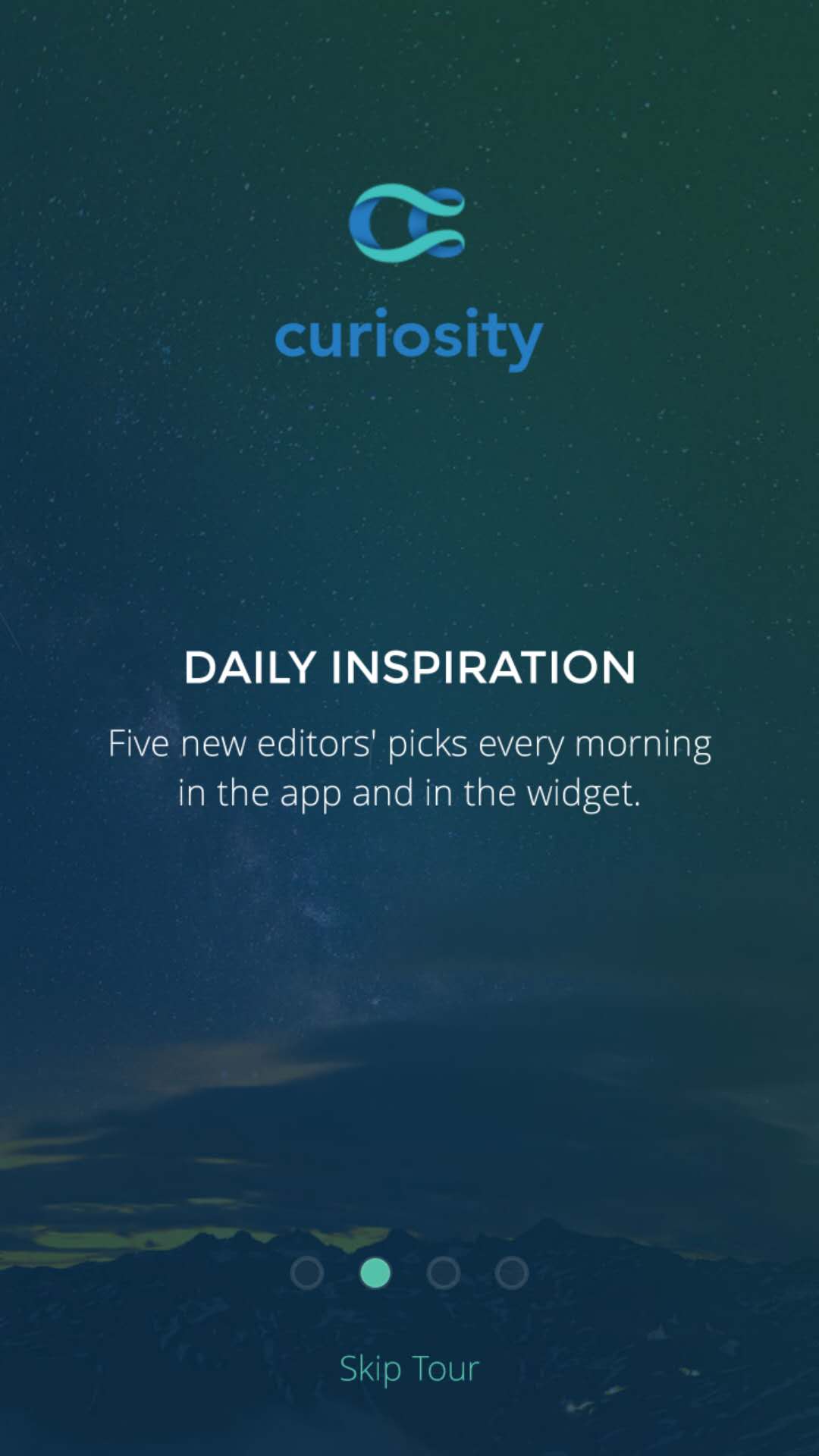
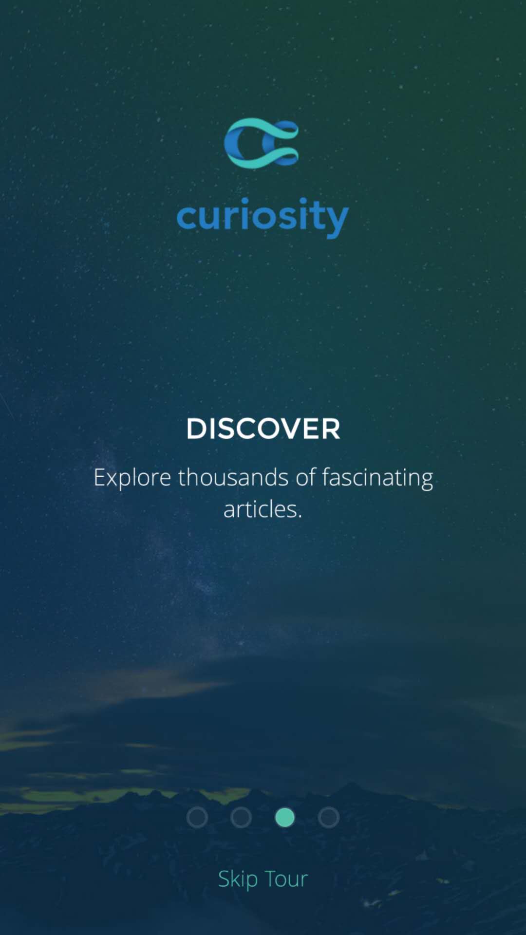
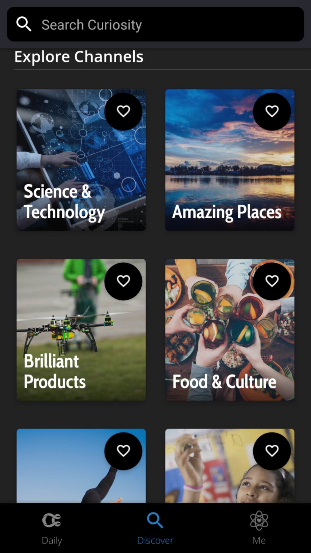
Curiosity
This app is a good place to kill boring time while on waiting or on the train. First of all the graphic style and layout is kind of attractive for me to read and explore in the app. The other thing I like a lot about this app is that you can select your own interested topics or categories you are curious about, and keep reading fun articles. More than thousands of subjects in the discover page that will keep you digging in this app.


Week 6_Apple TV app
3 things I learned from Apple TV HIG:
1. Text size:
| Style | Weight | Size (Points) | Leading (Points) | Tracking (1/1000em) |
|---|---|---|---|---|
| Title 1 | Regular | 76 | 96 | +11 |
| Title 2 | Medium | 57 | 66 | +13 |
| Title 3 | Medium | 48 | 56 | +15 |
| Headline | Medium | 38 | 46 | -26 |
| Callout | Medium | 31 | 38 | -16 |
| Body | Medium | 29 | 36 | -13 |
| Subhead | Medium | 29 | 36 | -13 |
| Footnote | Regular | 29 | 36 | -13 |
| Caption 1 | Regular | 25 | 32 | -3 |
| Caption 2 | Medium | 23 | 30 | +3 |
2. Some remote gestures:
- Press the Home button once to return to the Home screen from anywhere.
- Press the Home button twice quickly to bring up the App Switcher, which displays all apps open. Swipe up on the Siri Remote’s touch surface to force close an app.
- Press the Home button three times quickly to access VoiceOver.
- Press the Menu button once to go back.
- Tap is for moving focus point, not same with clicking.
3. Layout
• Include appropriate padding between focusable elements. The element gets bigger when it comes into focus. Consider how elements look when they’re focused, and make sure they don’t unintentionally overlap important information.

• Allude to hidden content by partially displaying offscreen elements. In large collections where content doesn’t fit on a single screen, hint at the additional content by showing portions of the offscreen items.

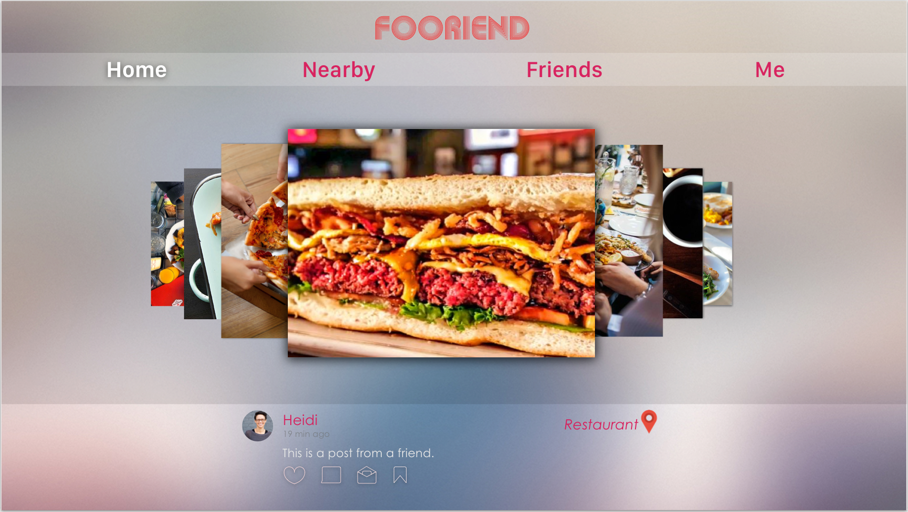
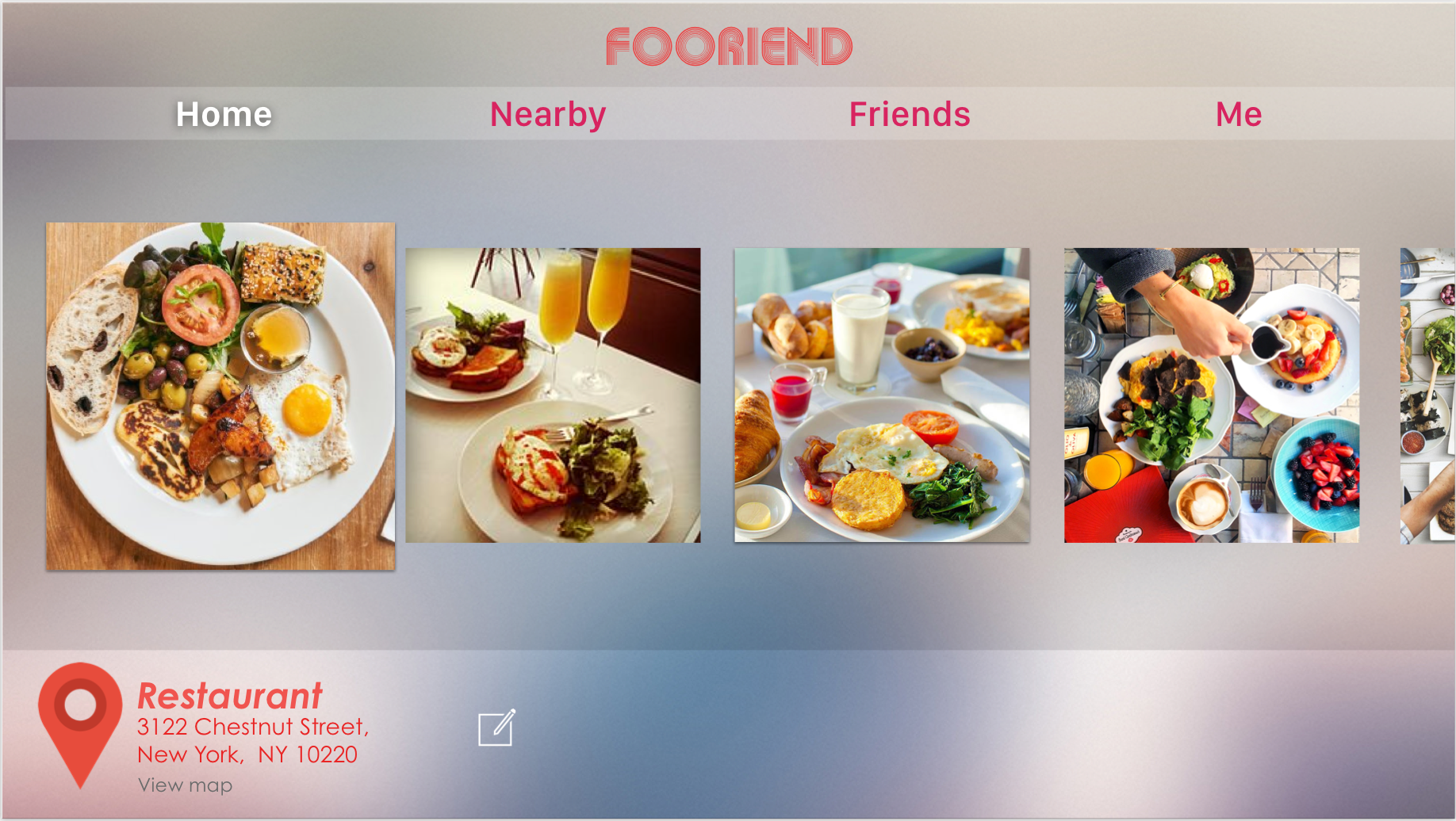
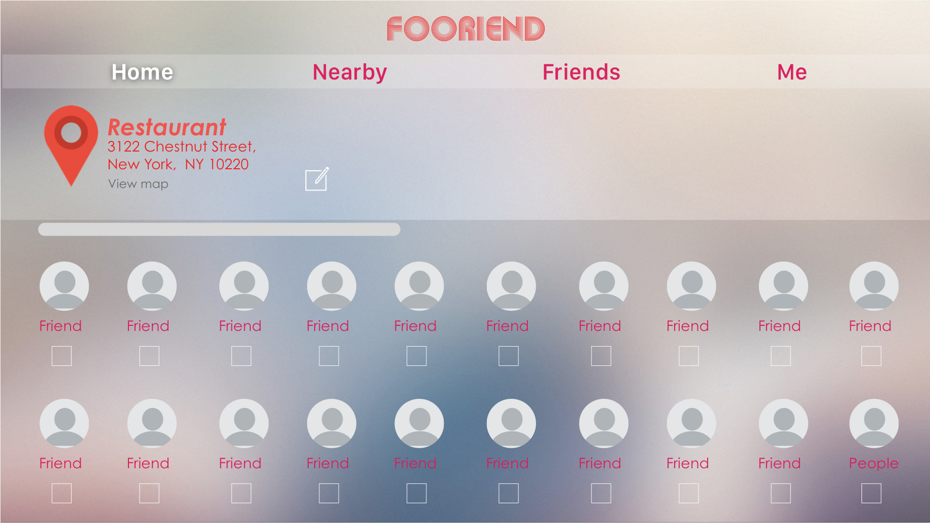
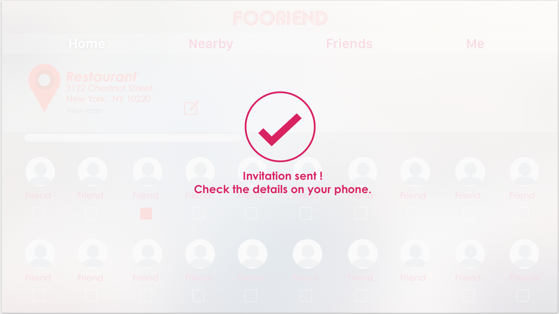
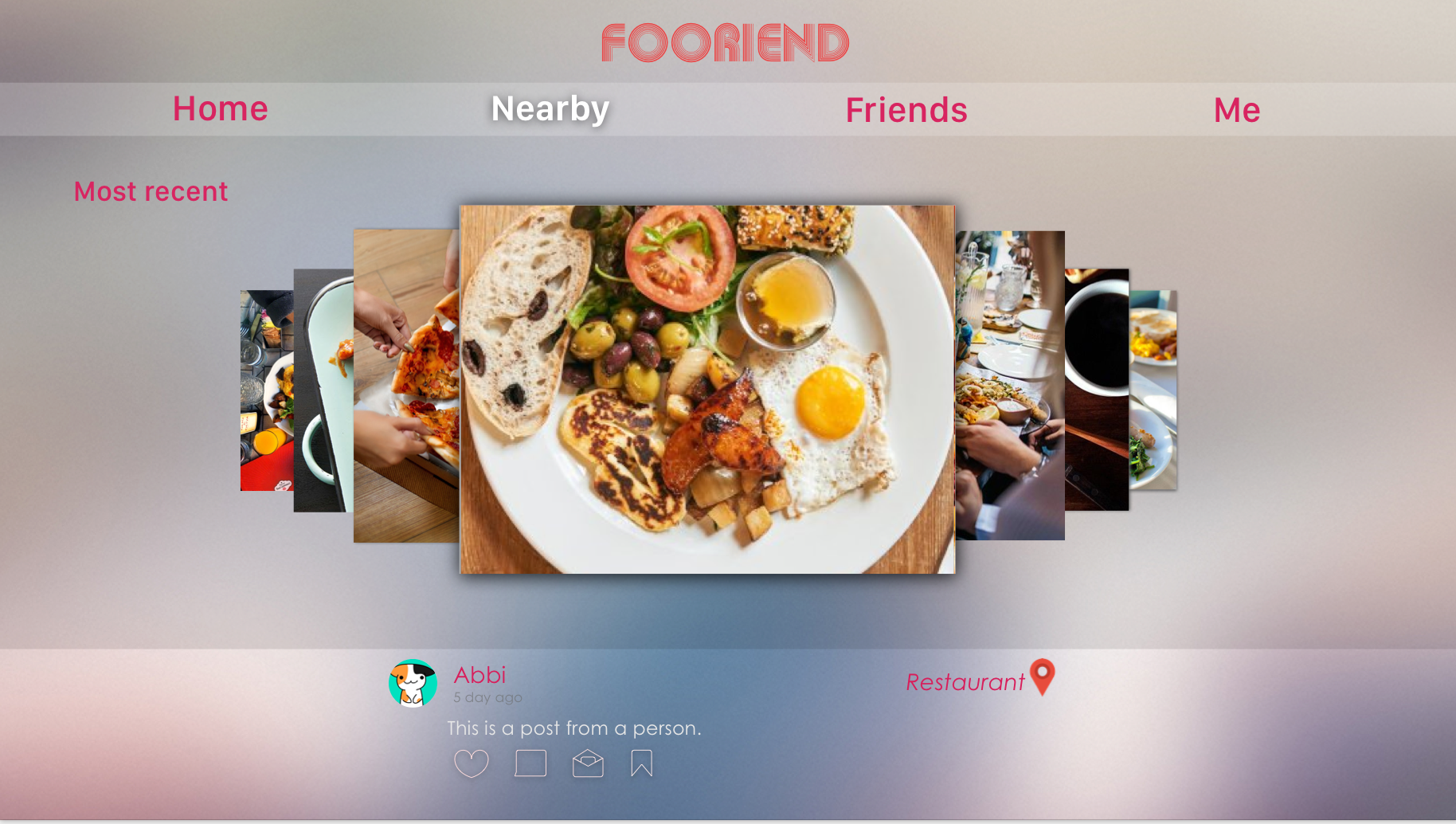
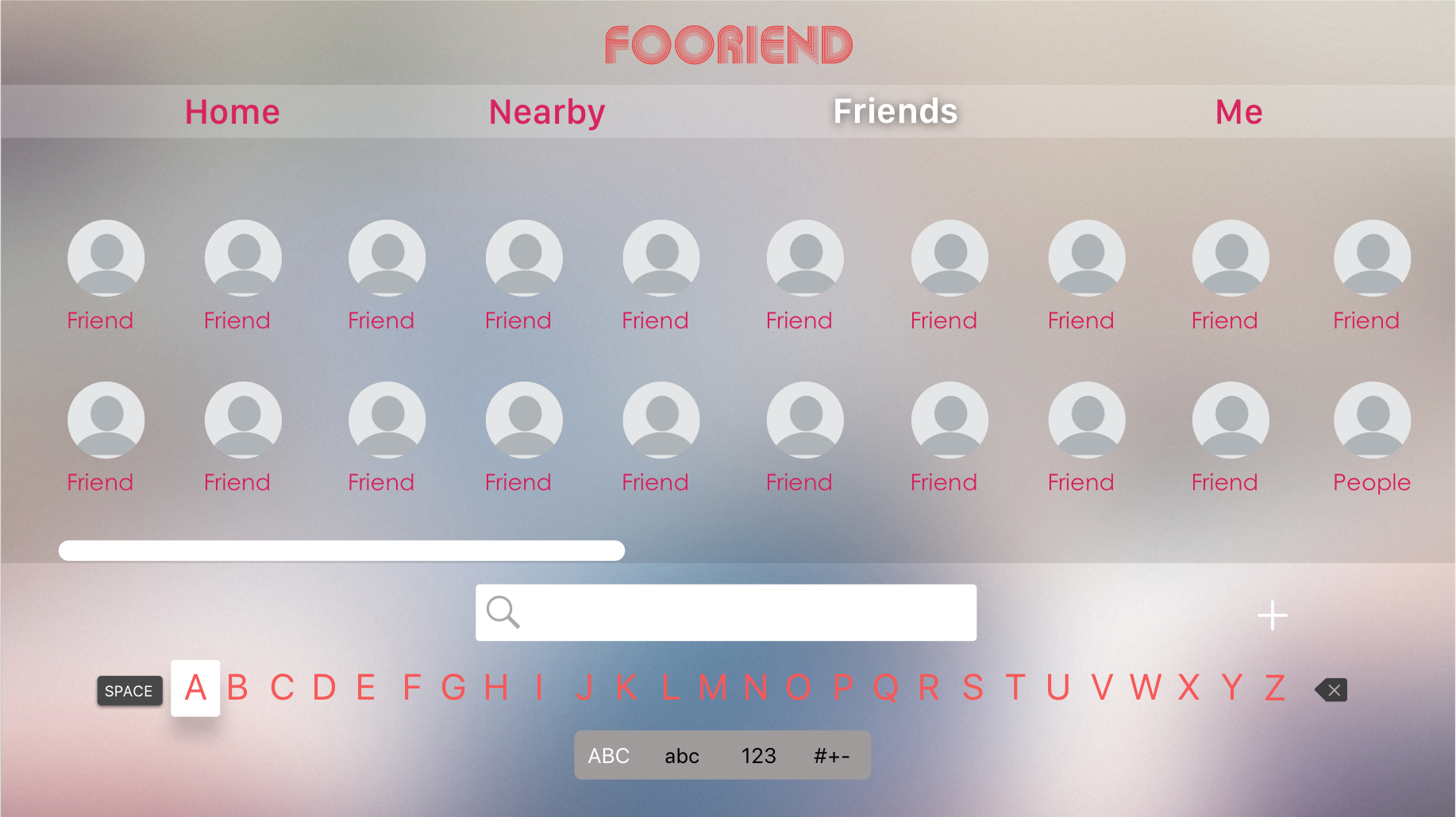
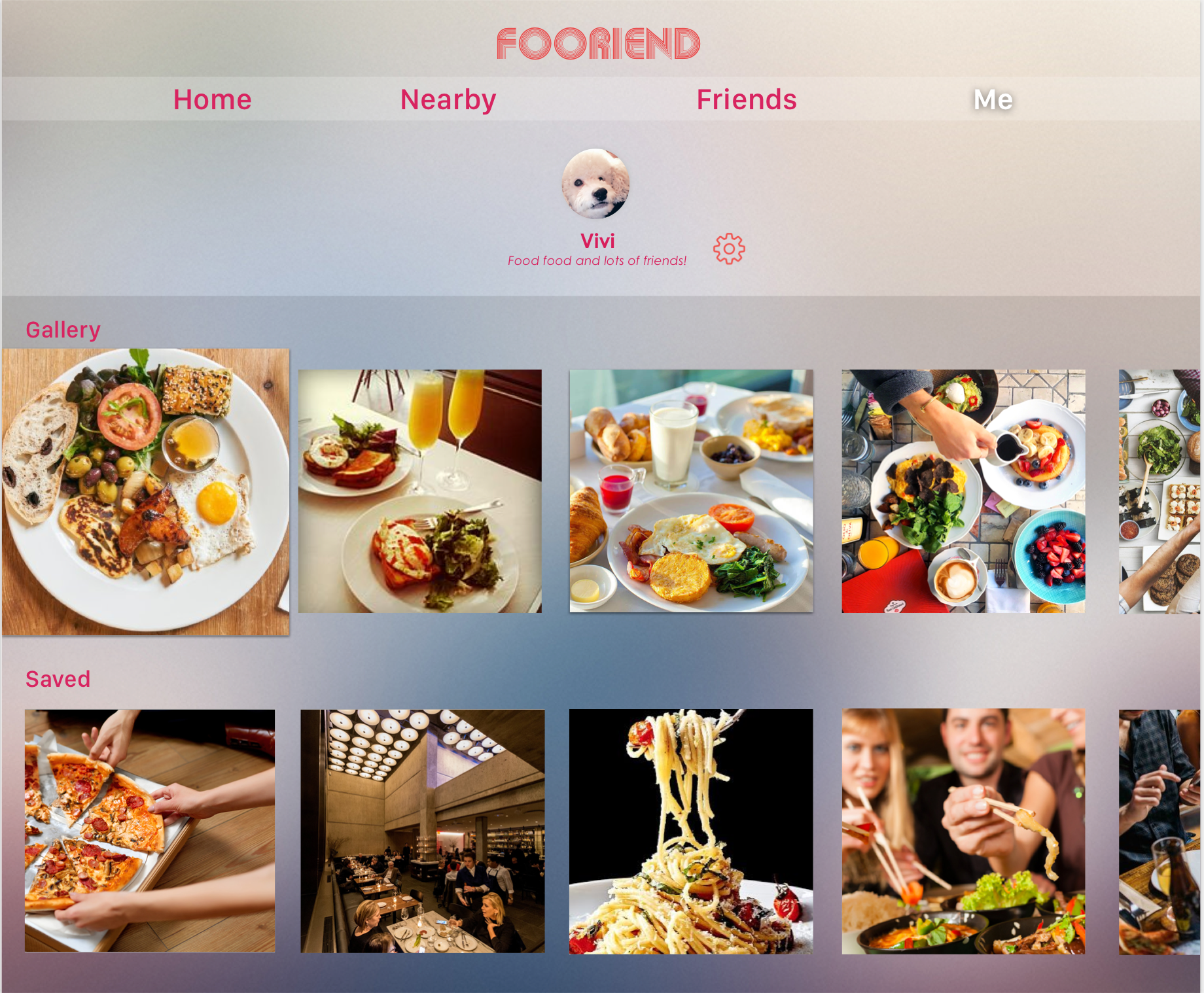
My apple tv food app
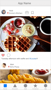
Considering my food app as a social media platform that heavily based on images and which the interaction between friends involved mostly are comments and message. I decided to cut down some functions. So on the tv, the app will only have four tabs: Home(feeds), Nearby, Friends, Me.
Week 5
Final version test link: https://marvelapp.com/40gh5ai/screen/39121224
Week 4
Digital Prototype: https://marvelapp.com/2cdi1hf/screen/38293516
User test feedbacks:
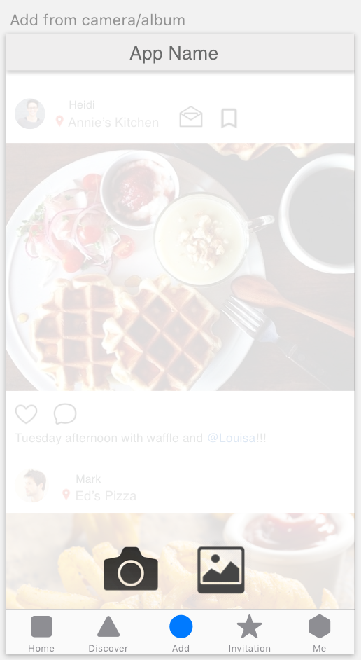
- When the user tap “Add” button, it can directly show the camera instead of giving options of add from camera or photo album.

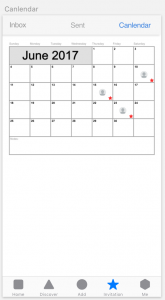
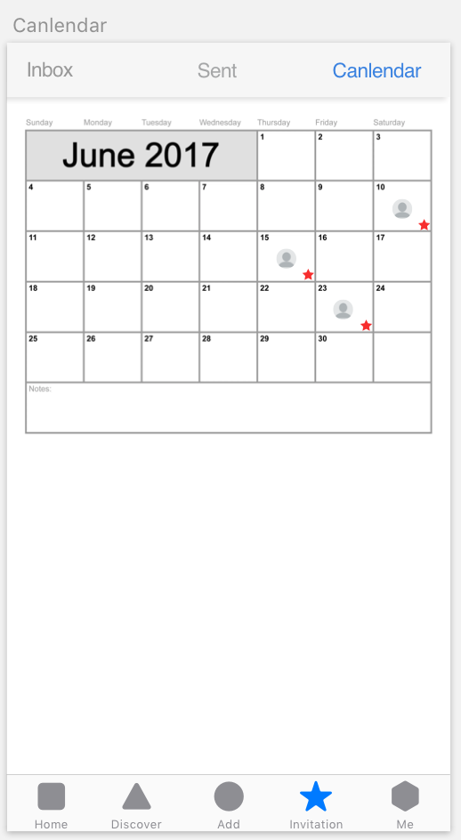
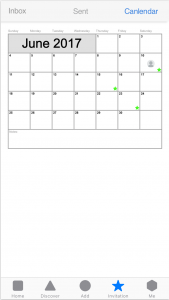
- The “calendar” screen that under “Invitation” tab is not necessary, the user can mark the date by using their calendar app.
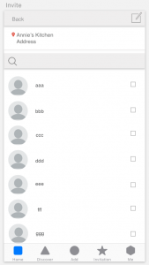
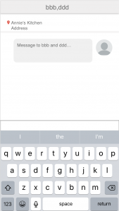
- User can invite their friends to go eat together through text message, email, or other message apps. Reconsider the utility of the in-app message function.
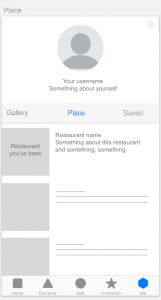
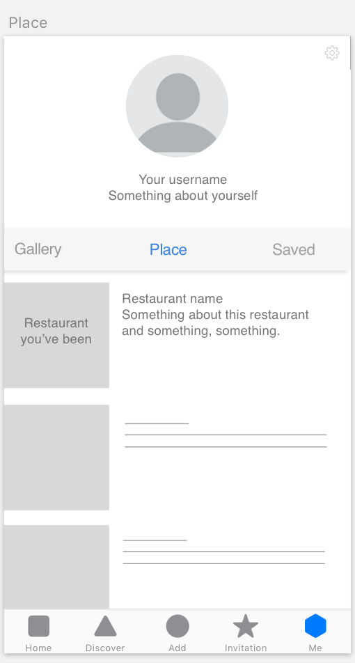
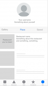
- The “Gallery” and “Place” that under “Me” tab can be combined into one screen.

Week 3
New iteration FoodApp
Week 2_Qinwen
3 User Insights
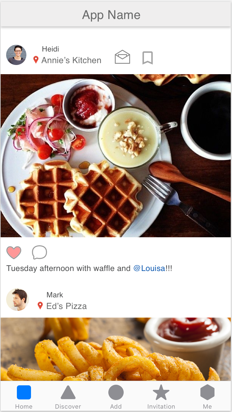
- User expected something happens after tapping the image and want to view more about the restaurant, such the map, distance, rating and etc..
- Add function “start a plan” (same with facebook messenger) that can add plans to calendar directly when the user invites a friend in the dialogue box.
- User wants to see who they went to the places together rather than the posts from others about this restaurant.


Qinwen_Week 1
About Me

I’m Qinwen Xing. My background is graphic design. Most of my previous work are focused on branding, book design, and packaging.
3 things I don’t know from the Apple HIG
- Apple changed their system fonts to a new typeface “San Francisco” since ios 9.
- 3D touch gives the user more possibility to interact with contents, such as peek and pop allows the user to preview photos, links, page and etc. It’s important that the peek view is designed big enough so that fingers don’t obscure its content.
- Make animations optional. When the option to reduce motion is enabled in accessibility preferences, the app should minimize or eliminate application animations.
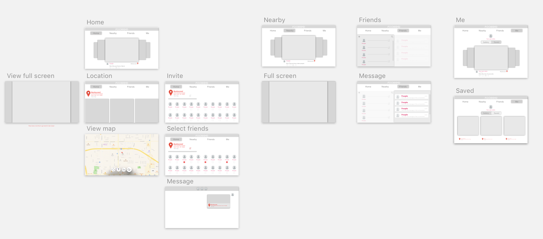
App Map
App Wireframe
![]()