Thursday Play_VSCO CAM_Feng

VSCO Cam is an app I have used for a while. It combine picture taking, editing and sharing just like what instagram does, but it does better. The best of this app is the UI design is so clean and simple. And the photo filters it provides also are really great. I could easily take very professional photo with artistic quality by using this. And fine-tuning capabilities with sliders for every effect help you get the look you want.

vsco-cam-iphone--690x460 vsco-cam

You can also import photos one at a time into VSCO for editing. The app lets you share images via conventional means, like Twitter, Instagram, and Facebook, but it desperately wants you to submit your images to the app’s central sharing feature, an online photo gallery called the Grid. The only way to get your own shots into the public Grid is to be selected via a mysterious vetting process, but if all you want to do is make your photos available to friends, you can share a URL for the images you add to your own personal Grid.

VSCO-Cam-3.0-for-iOS-Side-menu.jpg

vsco_ios-100245899-large


Thursday Play: Blue Cheese

Screen Shot 2015-05-12 at 2.14.31 PM

Blue Cheese is a menu translator and dictionary. This app could complete menu translation immediately via simple scanning of single or multiple lines. With using this app, people could easily obtain detailed ingredient and flavor descriptions with food images, food and view historical information, and food comments.

Since a lot fancy restaurants usually have a dim space, this app also have the light function. It help people to light the menu.

For now it support translation between Chinese and English.

There is a love story behind of this app. Ray, the founder of Blue Cheese, was an international student studying in a university in the United States and was pursuing a Taiwanese girl in his freshman year. When Ray took the girl to an Italian restaurant for their first date, they were both confused by unfamiliar food names on the menu and had no clue what to order. The girl asked Ray for suggestions, so Ray ordered a Grilled Romaine Salad with Blue Cheese dressing for her. He had no idea what blue cheese was and just wanted to order for her to show his cultural savvy. Ray thought foods with beautiful names such as blue cheese must taste good. But after seeing the unpleasant look that appeared on his date’s face while she was chewing, he realized he must have made a huge mistake. After searching online, he was shocked that the blue dots are actually mold. He felt horrible and promised her that she will never have to order blindly again. Although the girl has gone back to Taiwan, Ray never forgot his promise, and built this app for her with the hope that she and others will be able to order with confidence wherever they travel. The “Blue Cheese” story made the app featured as the “Best New App” in the iTunes AppStore in China. Ray hopes she will see Blue Cheese and that this time she will like blue cheese.

Order Together? Revised Wireframes By Feng and Xueer

Feedbacks: We realized that online shoppers would prefer searching for a product on a computer rather than a smartphone via our test during class last week. This changed the whole thing. We have to redesign the approach of entering a url.  Therefore, in the second version of our wireframe, users can enter a product url by either “Copy and Paste” or “Scan”. By “Scan”, we mean using your phone to scan a url on your laptop browser. We leave the implementation of this important and innovative interaction to our wonderful developer team. [presentation]

Here are our revised wireframes.

wireframe.v2.page1 wireframe.v2.page2 wireframe.v2.page3 wireframe.v2.page4 wireframe.v2.page5 wireframe.v2.page6 wireframe.v2.page7 wireframe.v2.page8

Order Together? App Map and Wireframes By Feng and Xueer

Order Together is a working title for Feng and Xueer’s final project. We can hardly find an apposite name for our app, so we are opening for any suggestion or recommendation.

Our target users are those who are New Yorkers, online shoppers, Metro riders and most importantly those who want to get a great deal. It is not easy to satisfy the seller’s conditions for an individual customer, eg. reaching certain total amount in a single order, in order to get the desired deal.

We offer a solution for our users by letting them pool their orders. You may just want to buy one item that costs $29.99 but still expect to get a “15% off when you spend more than $80” deal. Now you can order with others to qualify for that, with no extra charge. By connecting online shoppers, we have the opportunity to bring bigger deal to them and also create a new daily habit for our customers and merchant partners.

Building for the long term, Order Together is not just an iPhone app. It is an e-commerce platform. To provide our web buyers a great experience, we will leverage the company’s global relationships and scale to offer consumers a vast marketplace of unbeatable deals all over the world.

Based on this theory, we start this project at a point where hypothetically we have already had a strong marketing team, a professional developer team and also a lot of pick-up spots located around NYC Metro stations.

Here is the initial sketch of our app map.

appMap.sketch

Here is our revised app map. This app has four views.

Screen Shot 2015-04-18 at 4.21.04 PM

Screen Shot 2015-04-18 at 4.21.15 PM

Screen Shot 2015-04-18 at 4.21.31 PM

According to the app map, we started to design our wireframes. Here are the sketches of our wireframes.

2015-04-18 16.42.42

We assume that our users have already known what they want to buy and have already found the product online. They only need to enter the product url in our app. We can get all the product info via this url. Here we had a question: what is the most user-friendly way to enter a url in this app? The first idea we got is “Copy and Paste”. We design a url input bar on the top of the main view.

2015-04-18 16.43.06

Big Bite for Apple Watch(2nd Version)_Feng

According to the feedback I got from last play test, I made some change on my apple watch app. Here is the digital prototype.

Instruction for my digital prototype: 1. Scrolling Down – tap the blank space on the bottom of page. 2. Force Tap – This function only exits in this page.(Should not, but for the test…) Press the blank space on the top of the page.

Apple_Watch0003

The change I made based on the feedback of the prototype test play:

1. I redesign the context menu. After researching, I believe the only thing we and change if the icon images and button labels. The color, position and also the typeface are template. We hardly change too much.

Apple_Watch0017

2. In the last version, my app mix the two systems, hierarchical system and the page based system. Therefore I redesign a few pages to make sure I am keeping using the page based system.

Apple_Watch0004           Apple_Watch0003            Apple_Watch0005

3. In my app, I wish when there is some thing(a bar or a label) could provide a hint where he is/how many steps will finish this recipe. I used a left side bar for this purpose. However, during the test I found the bar was hardly to see and also could confuse people to think that is something else. Therefore, I change the design. I use the pie chart under the main page button for this function.

Apple_Watch0013       Apple_Watch0014       Apple_Watch0015       Apple_Watch0016


Big Bite for Apple Watch_Feng

According to my Big Bite for iphone, this apple watch app is a recipe-quick-view app which allow people to make their favorite recipes to go.

Here is the my first digital prototype.

Since the flinto don’t have force tap, the upper part is regular tap ( to check the details of the recipes ) and the lower half is the force tap( come out the like and dislike button ).

I find I still have a lot confusion about the watch function. For example, 1. Is there a statue bar on the top of the screen just like what an iphone has? 2. About the force tap. Could we customize the button, such as the button label, button color and button size?

Big Bite for iphone_Feng (Refine)

This is the second digital prototype of Big Bite for iphone. Here is the link.

I change some graphic design. And another change I did in this version is removing a lot unnecessary buttons. The main functions in this app now are only What’s popular, My favorite, Add, and My recipes.

Since this app is not used for social net work, the user profile is also very simple. Only the user name and user image.

And also, I add two more categories in “add a new recipe” page. Therefore, now I have six kind of recipe adding flow: Truffle, Bar, Bakery, Cool Drink, Hot Drink and Candy. The name of the categories are still waiting better terms ( I am not sure for the Bar and Candy ).


Big Bite for Apple Watch_Feng

Project Concept: Big Bite is a iphone app to help chocolate lovers easily and orderly editing and organize their own recipes. However, considering the limitation of the apple watch, the Big Bite for apple watch removes all the editing function and only keeps viewing recipes function. It turns to a convenience tool which allow users to take a quick look for their recipes.

Here is my Appmap and wireframe version 1.

appleWatch.001appleWatch.002 appleWatch.003 appleWatch.004

Big Bite_Feng

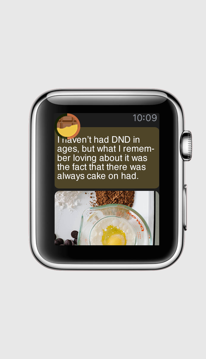
Project Motivation: The idea comes from my personal experience. As a cook lover and recipes app user, I always face a issue: the existing recipes from other users are lack of logical and orderly organization.

Project Concept: In this project, I try to make an app which contain a recipe creating flow. By going through the flow I provide, users could easily come out a logical and orderly recipe.

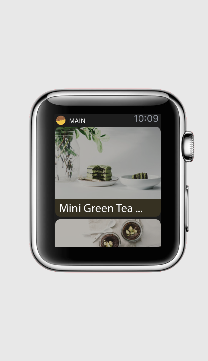
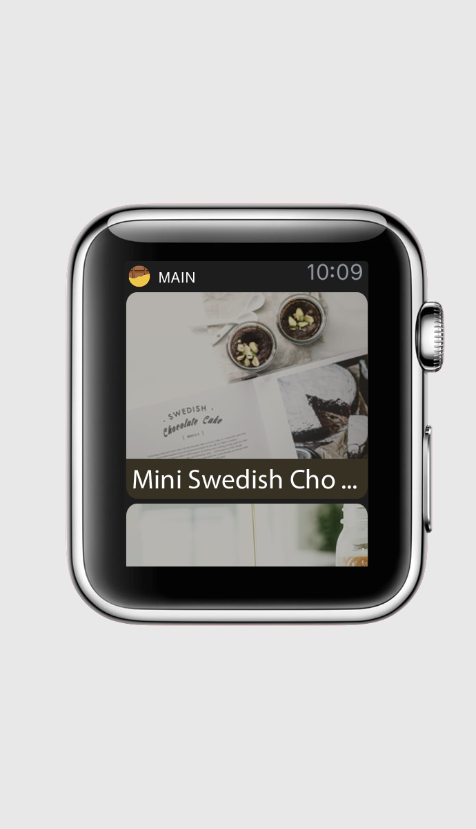
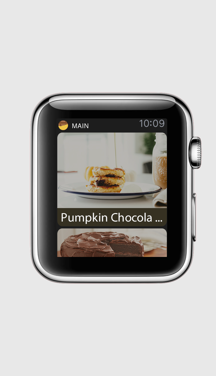
Project Target Audience: This app is for the people who love making chocolate and chocolate dessert. It is for people who like to create and record their cooking steps. It is also for those people who would like to share and exchange their own cooking experience with others.

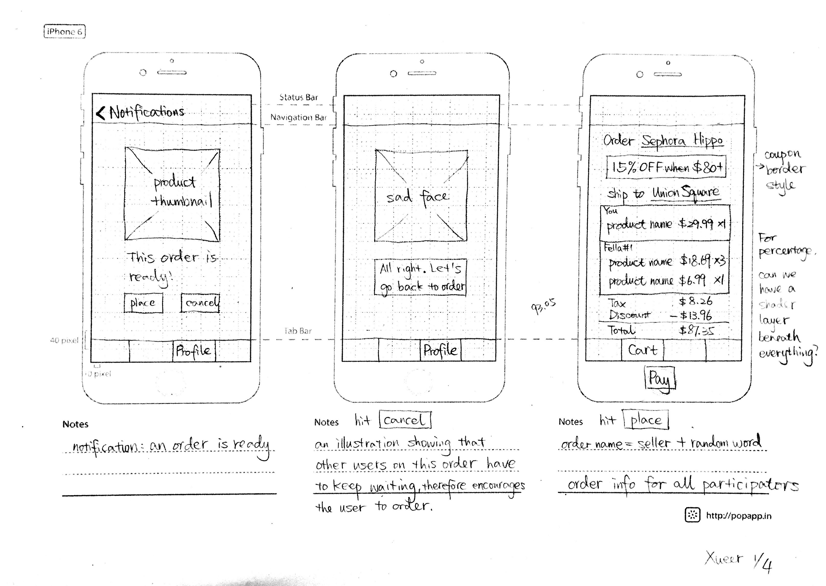
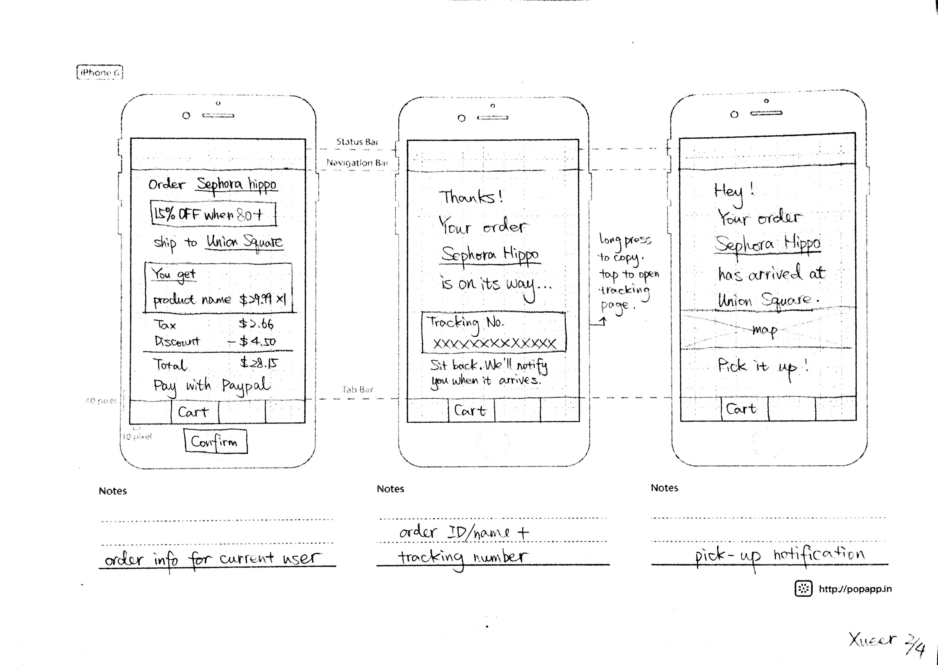
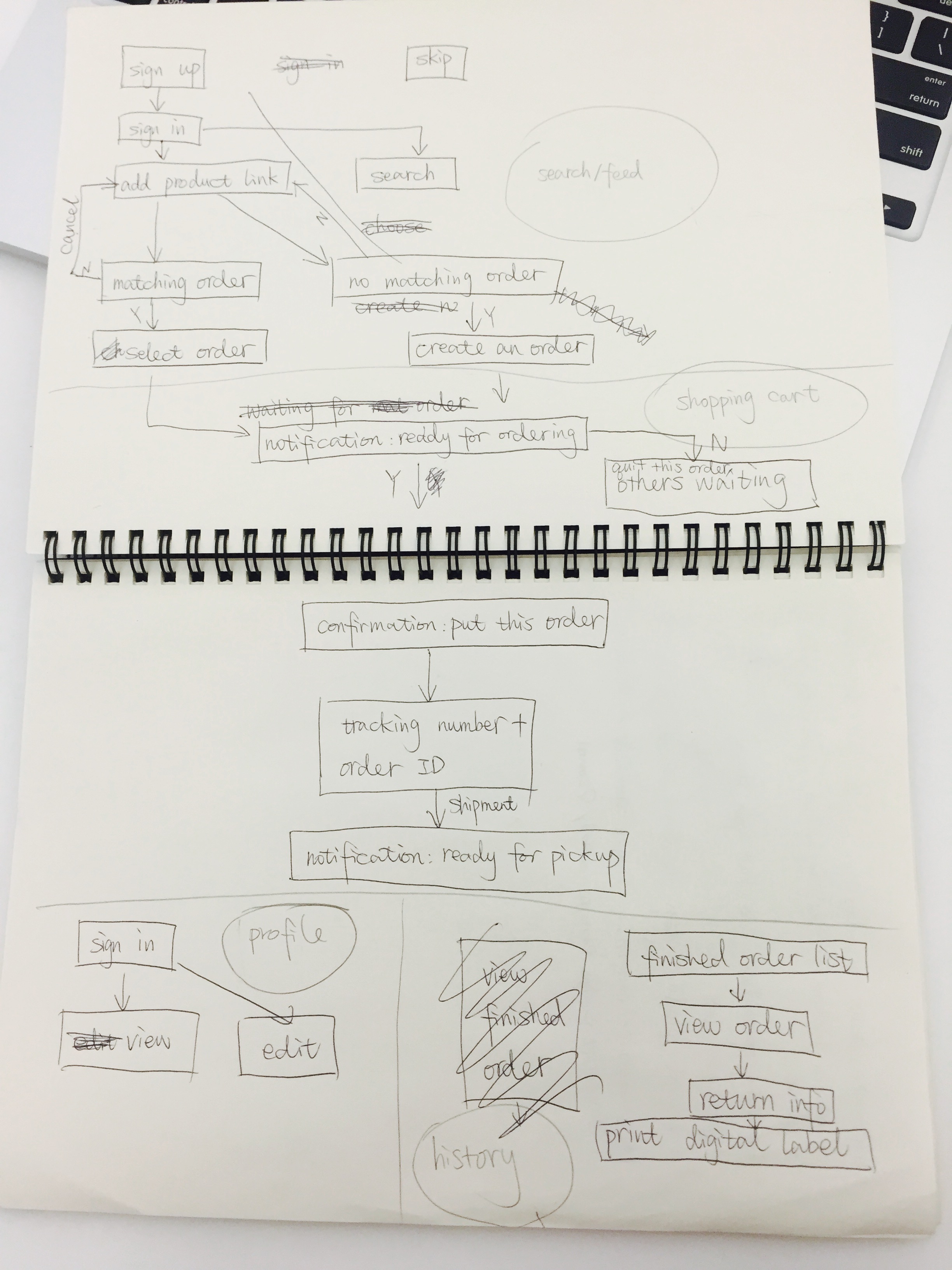
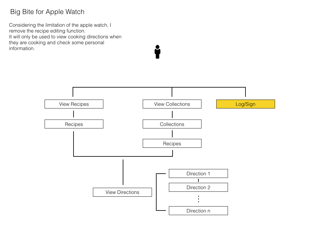
My App Map and Wireframe version 1

AppMap-01


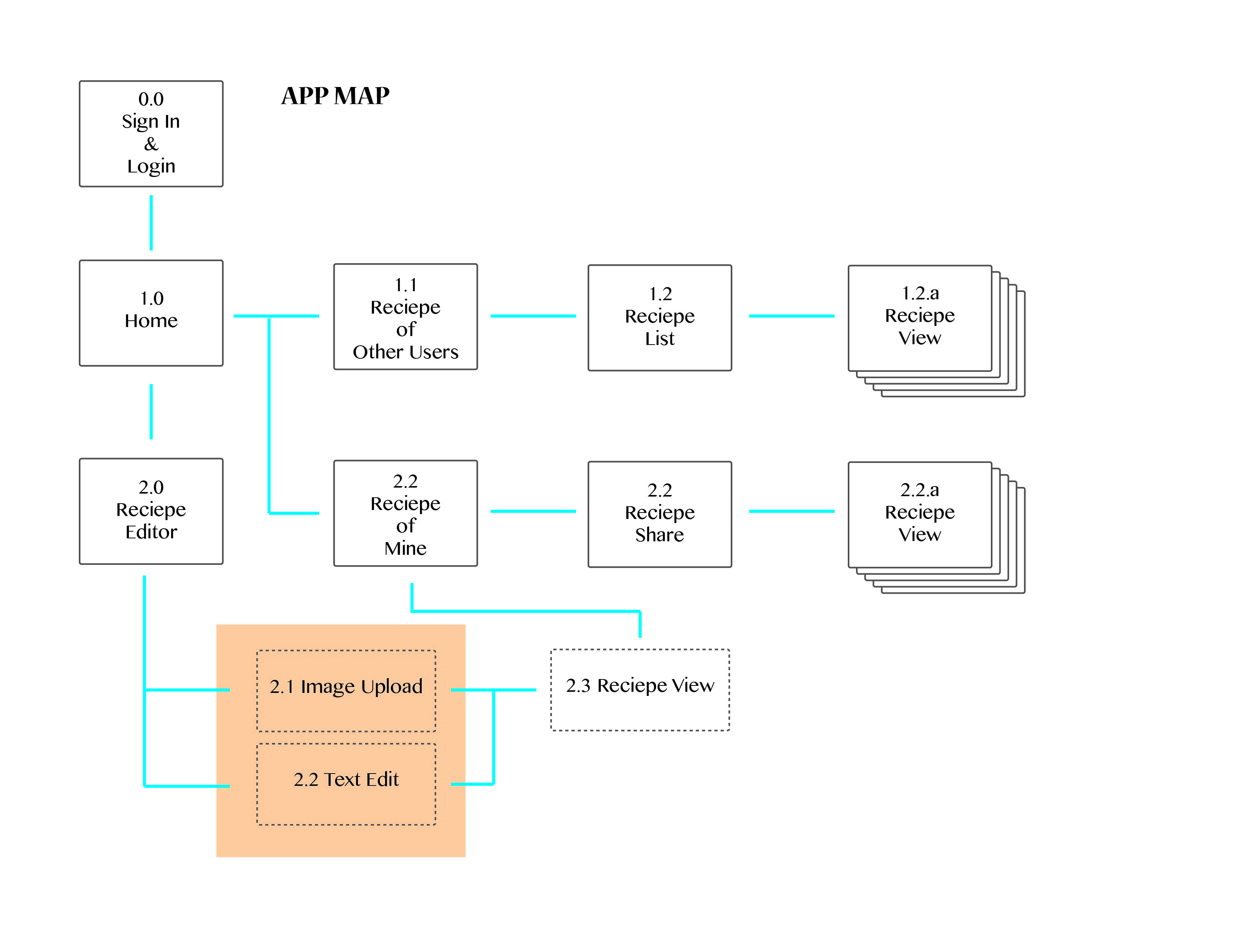
Here is the map about the recipe editing function.AppMap-02


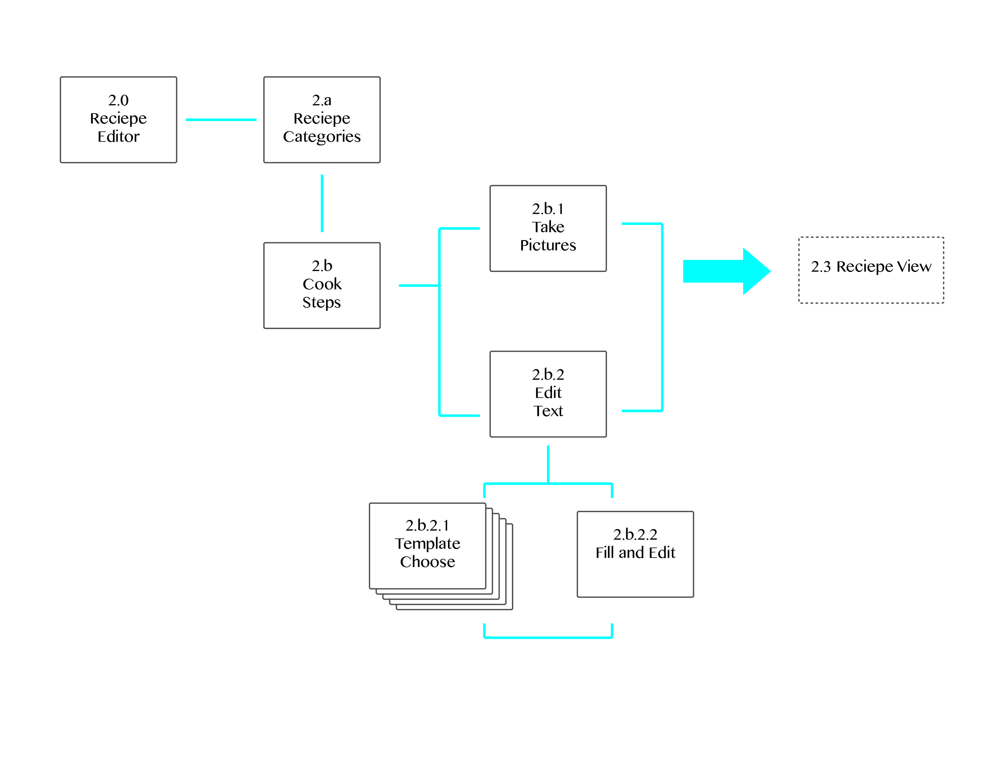
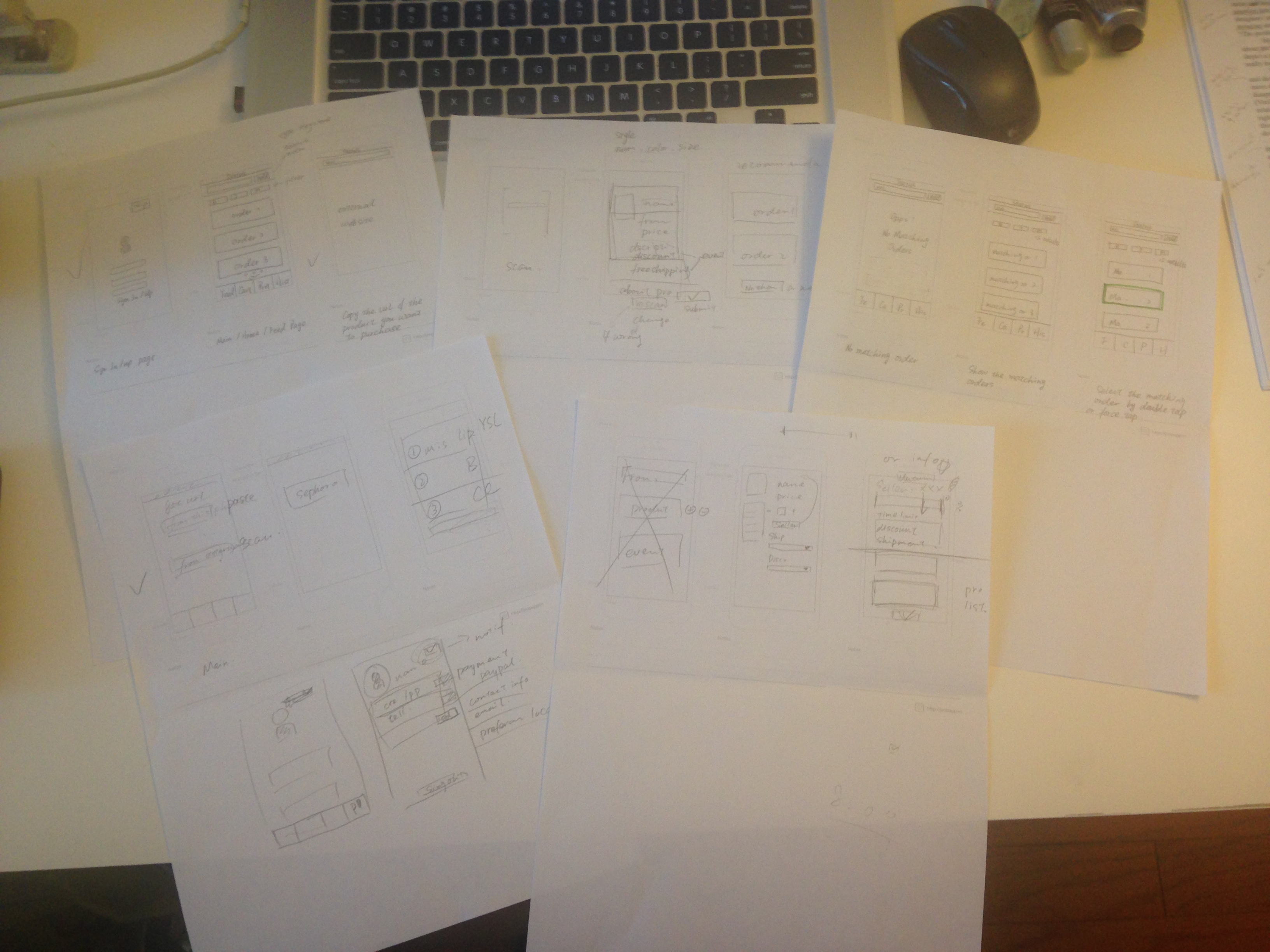
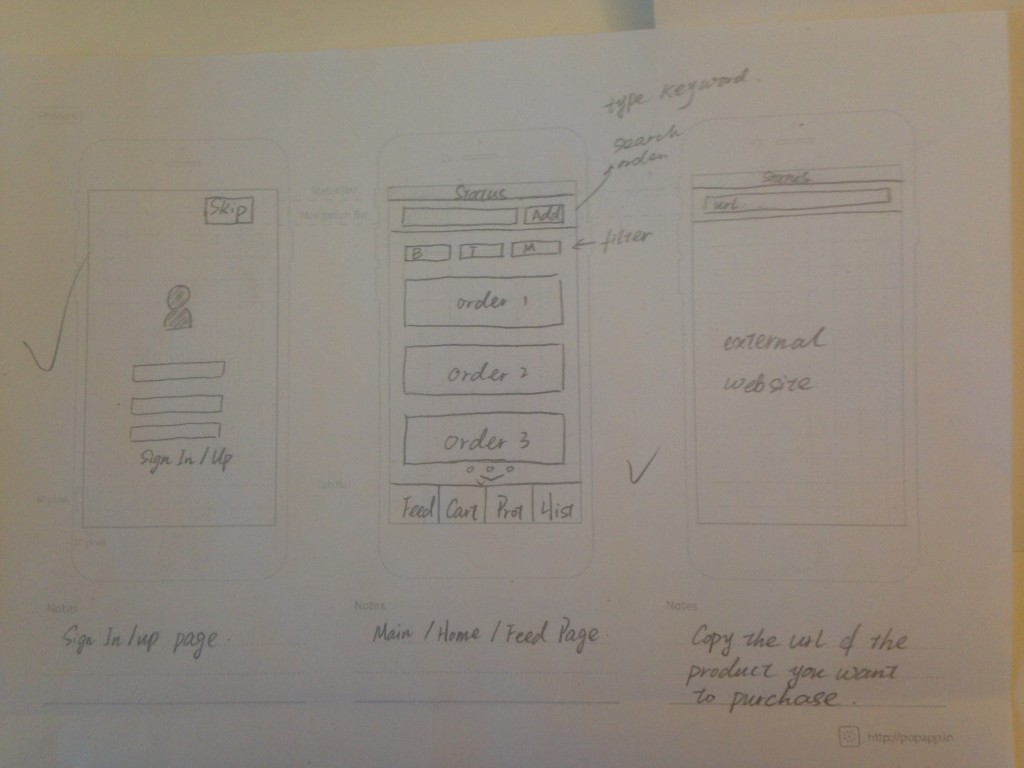
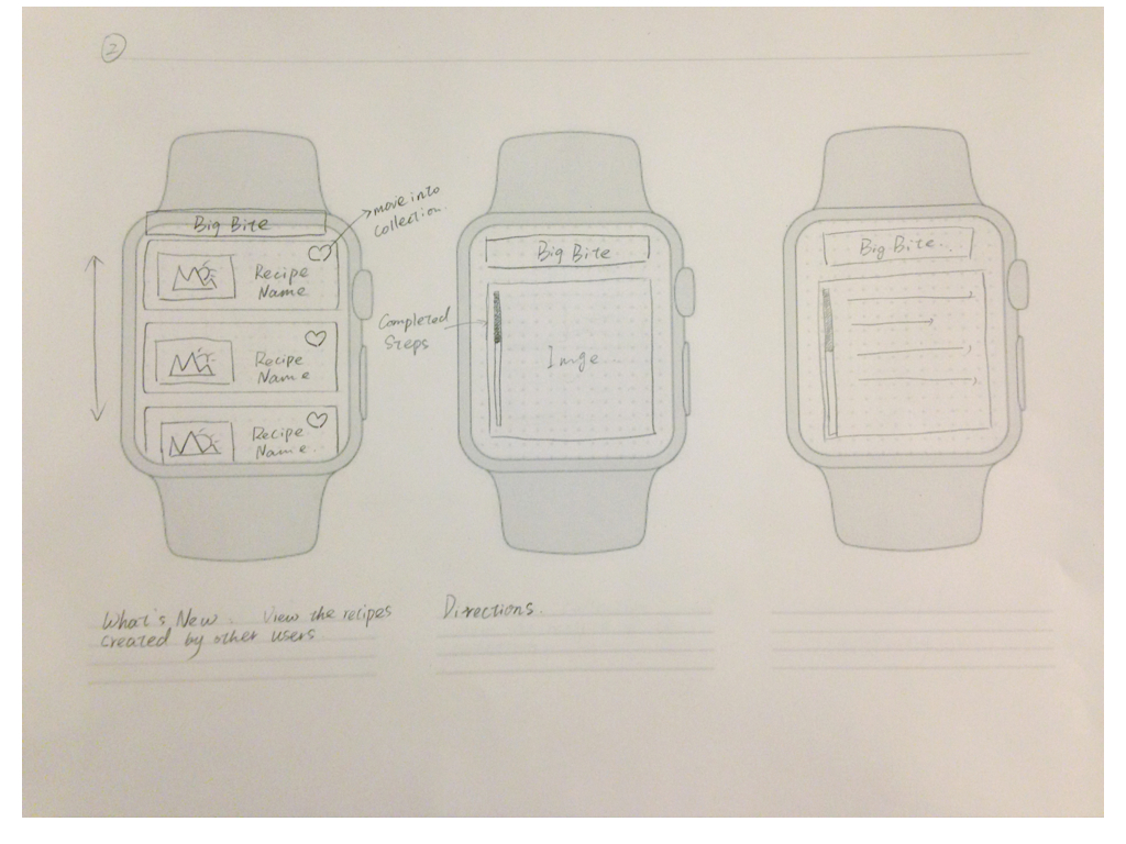
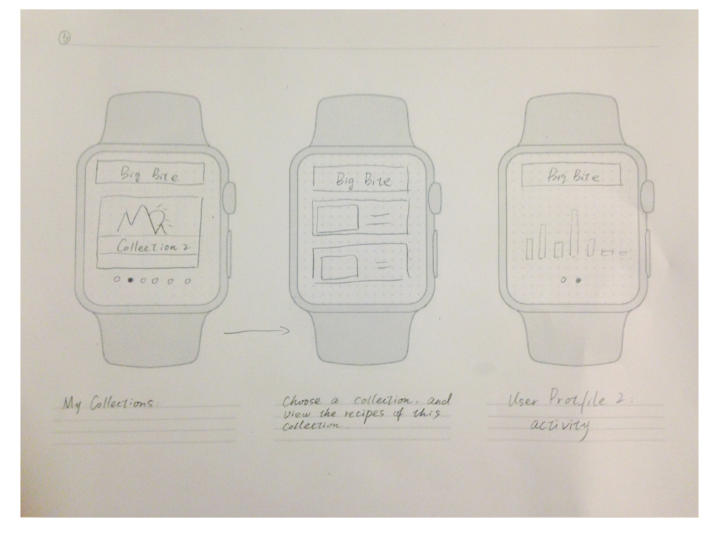
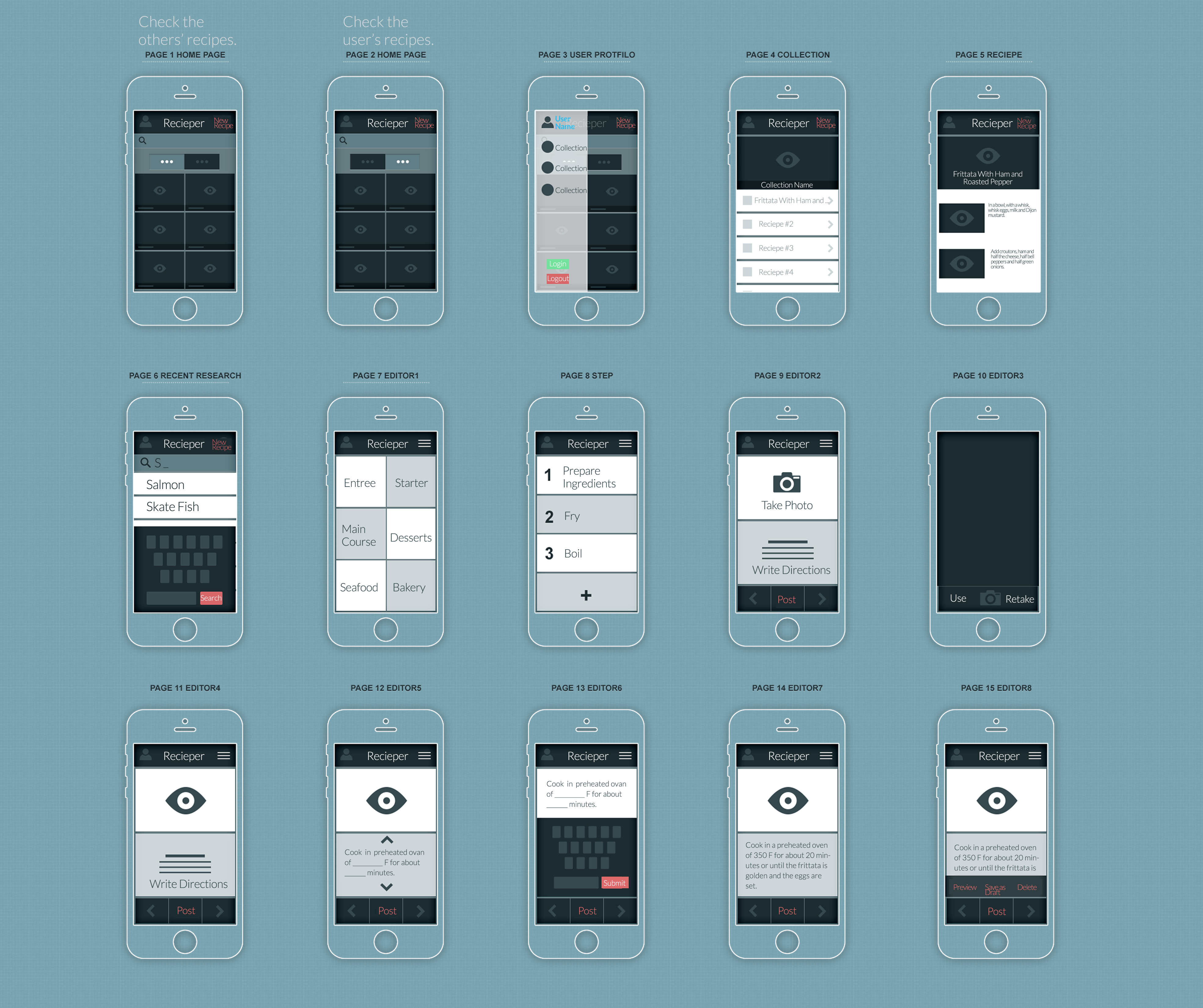
Here is my wireframe

wireframe_version2

Feedback for the app map and wireframe version 1: The main feedback I get from the 1th version is about the template sentence. In this prototype, people have to keep choose which template sentence to use. That actually wastes a lot of time and losses the fun of text editing. Instead of selecting template sentences, a clear and concise flow could be more help them to organize their cooking steps.

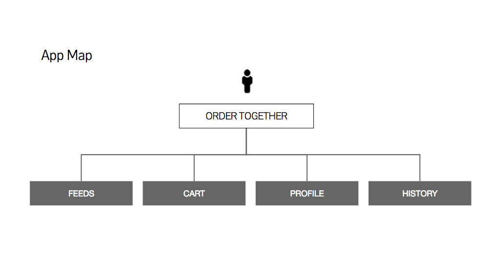
And then, I come out my second version of app map and wireframe.

My second version of app map 

AppMapVersion3-03


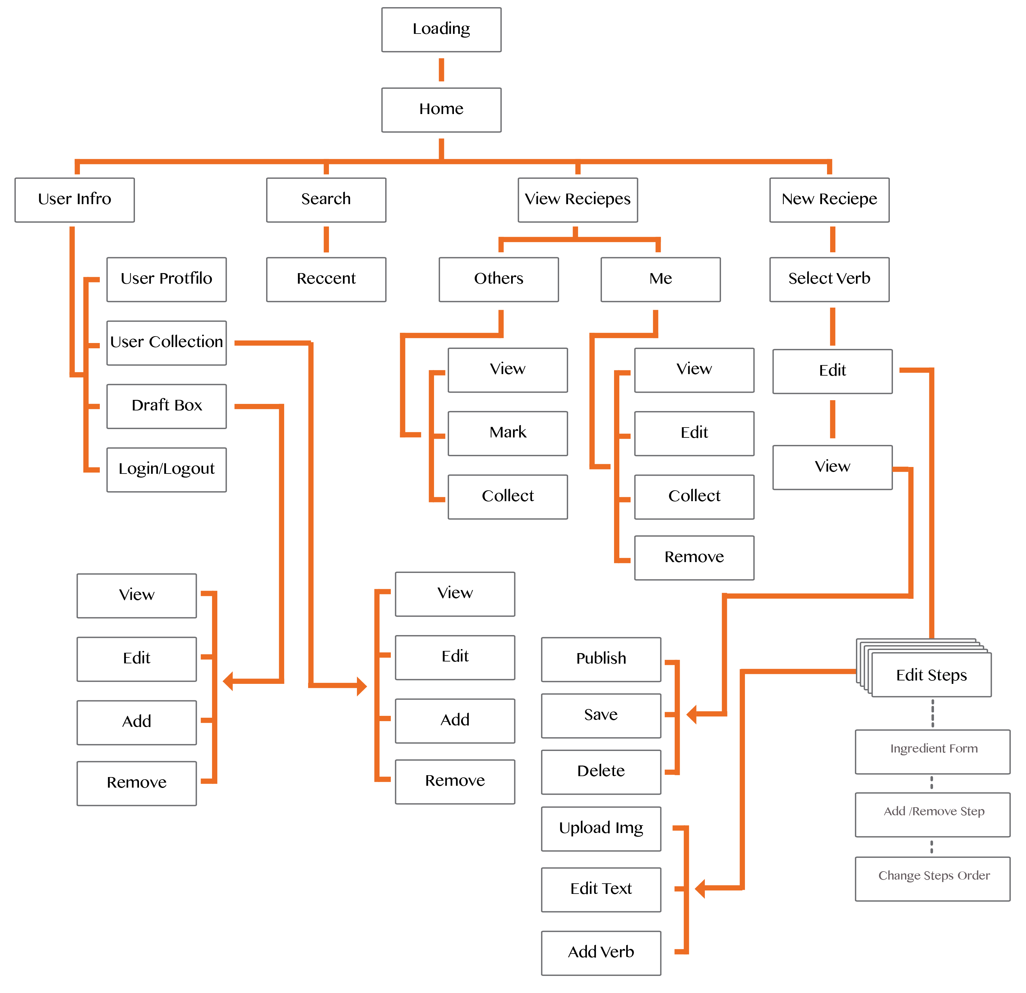
In this version, I make more detail about how this app work. The recipe creating flow is based on the different verbs in the process of cooking, for example “Wash”, “Cut”,”Melt” and so on. According those verbs, users could generate their own STEPS. This could help they organize the detail directions in different steps.

Here is my digital prototype.

Feedback from digital prototype:

1. As a iphone app, each page of my app provide users too many function and options. I need to simplify the functions and buttons.

2. The “Preview”, ‘Add More’,”Next” button make people confused. Sometimes, users don’t need those functions, so they shouldn’t appear.

3. The “Create New Recipe” page should belong to be part of the flow. When they edit a recipe, they should have the possibility to go back and change the name and descriptions.