Prototool_Group_Gunjan+Tong

RESEARCH QUESTION:

How might we build a mobile prototyping tool for designers to sketch & create rapid low fidelity prototypes to document and user-test?

CONCEPT:

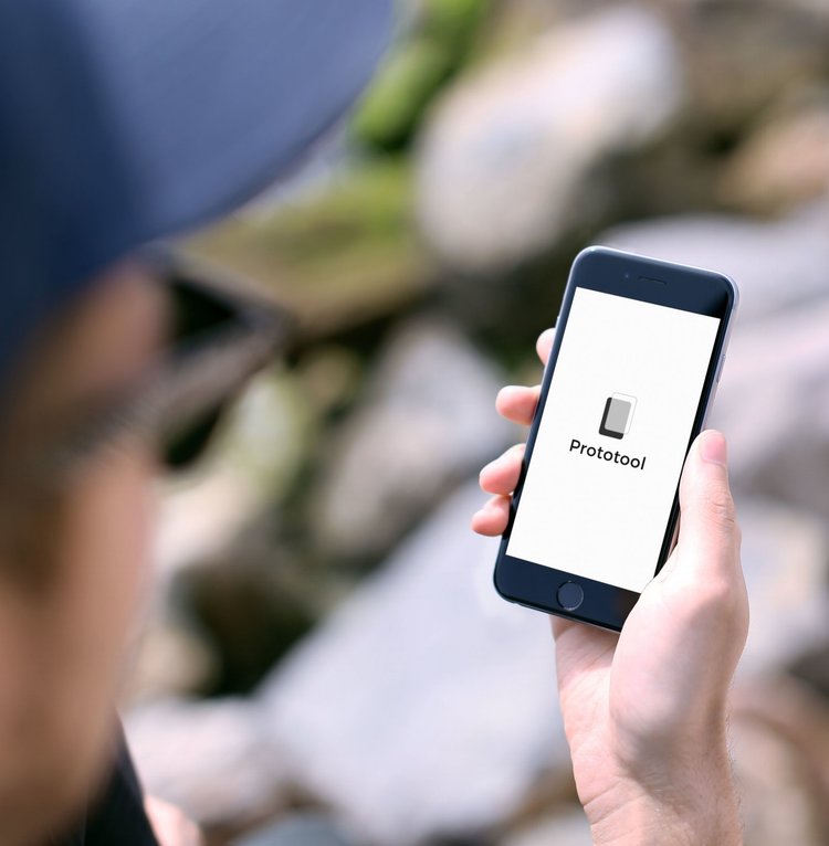
Proto-tool is a mobile application that allows UI/UX designers to quickly sketch and document low fidelity prototypes. It also encourages designers to continue improving and working on their work through daily challenges.

PRECEDENTS:

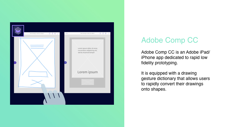
Adobe Comp CC and Google Autodraw – works with machine learning sketching and prototyping.
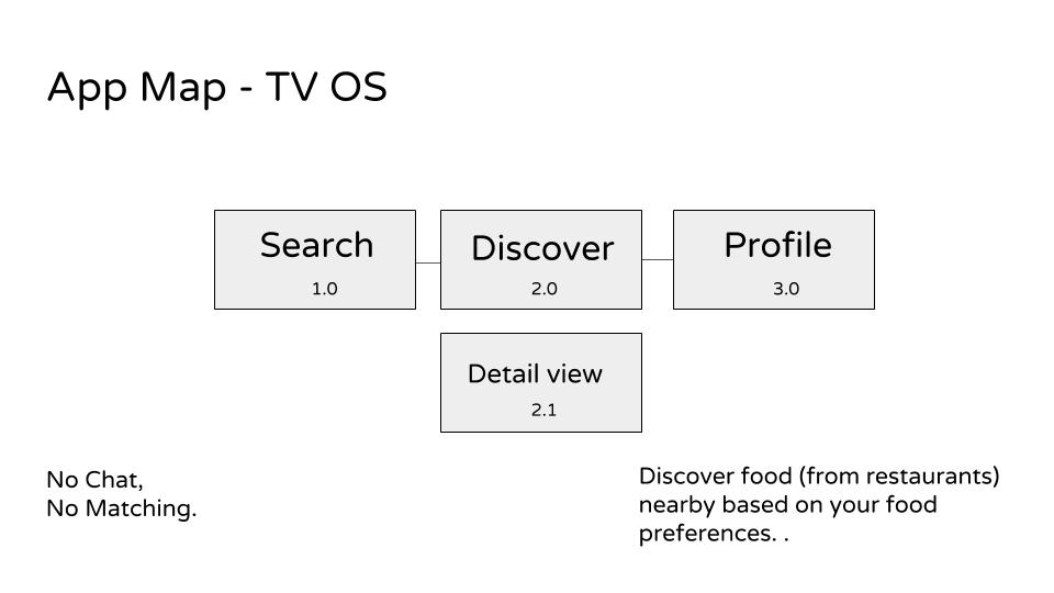
MOBILE:

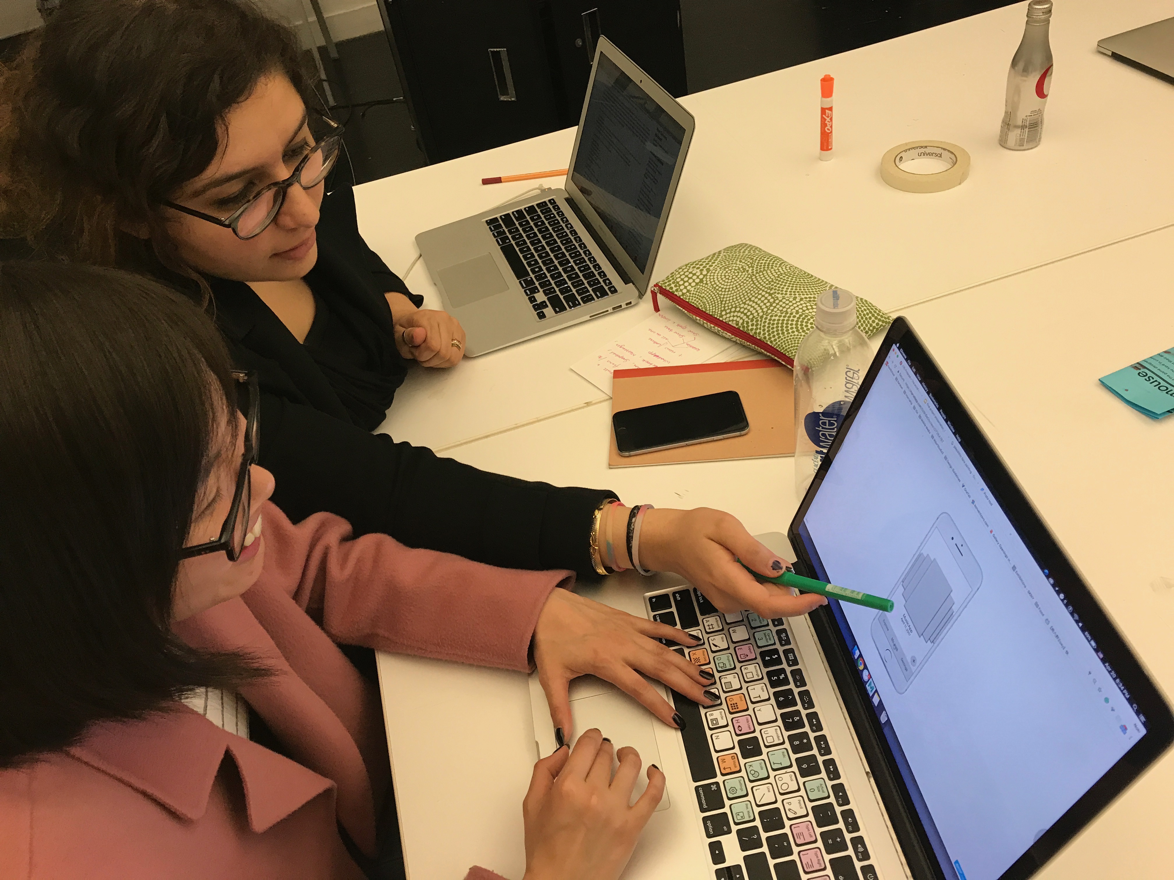
Quickly create prototypes and sketches on mobile to document process.

IWATCH APP:

UI Challenges with everyday Challenges.

TARGET USER/AUDIENCE:

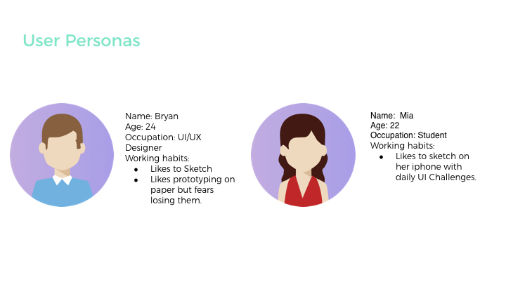
Our Target Audience are User Interface and User Experience designers who love to prototype on the go, on mobile or just paper prototype/take photos to document work.

SOFTWARE:

(Made with Sketch, Framer, Principle and After Effects)

LATEST PROTOTYPE:


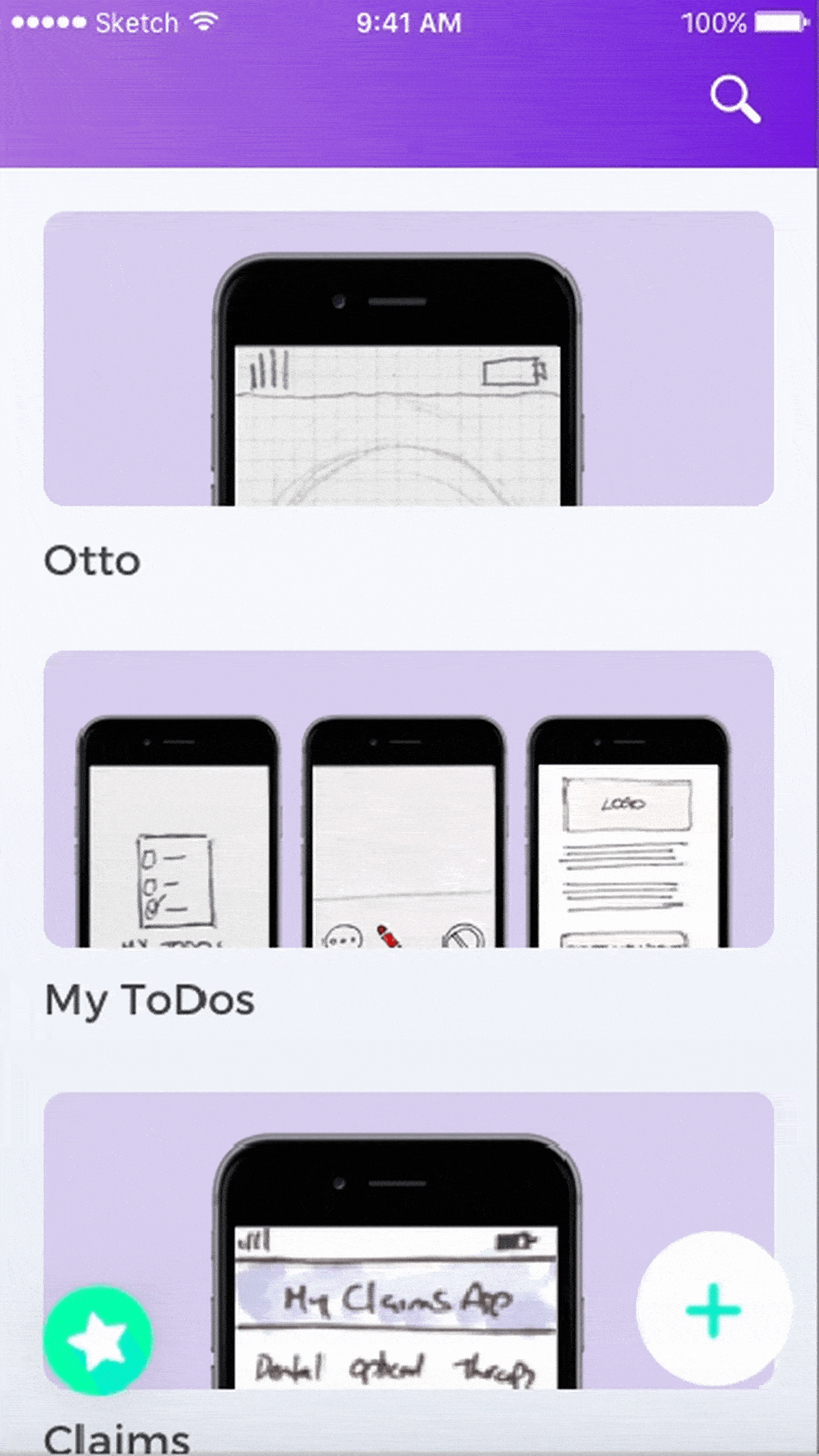
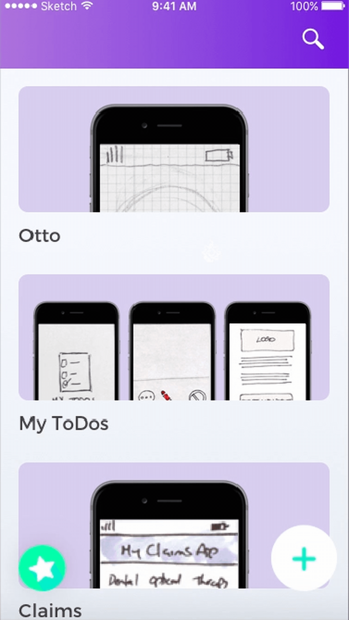
Click here to see our latest Prototype (Made with Marvel)
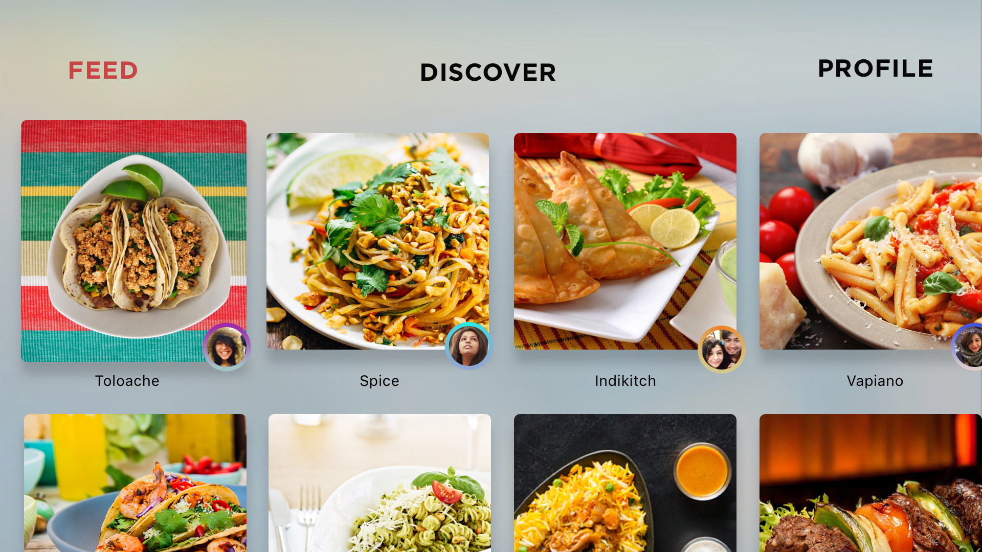
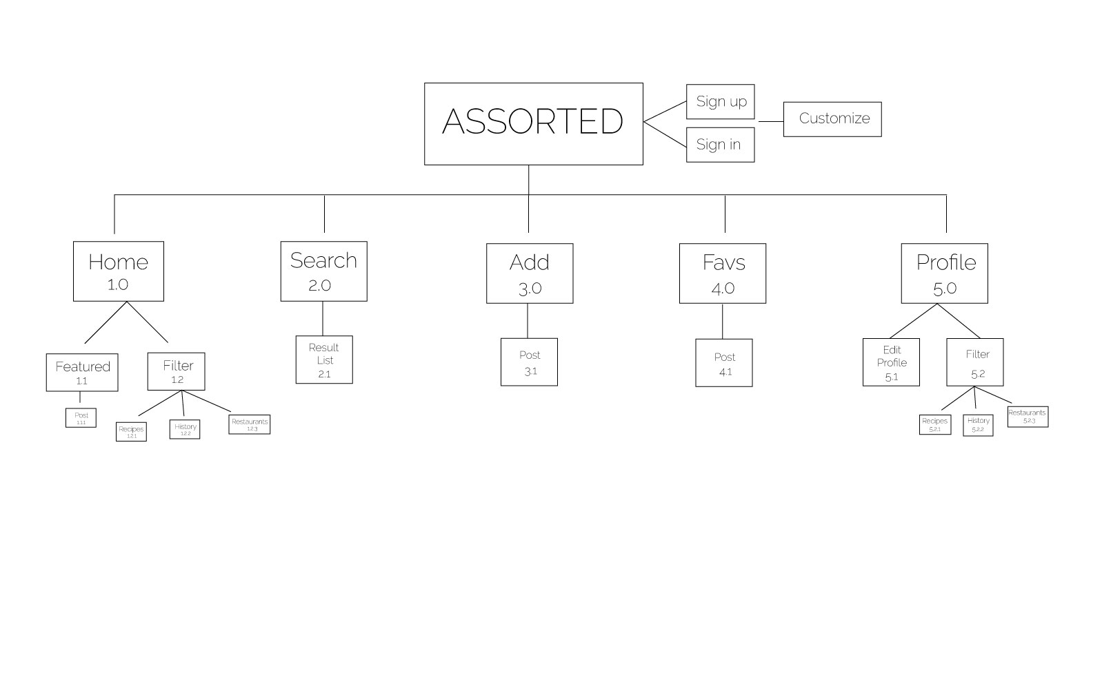
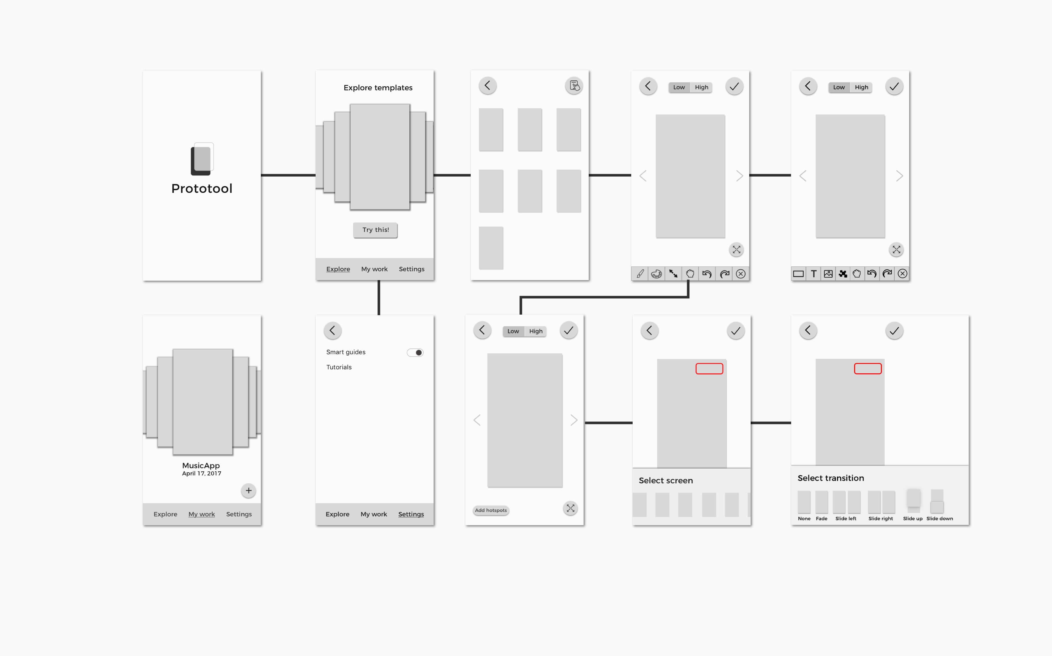
LATEST APP MAP:

LATEST IWATCH PROTOTYPE

3 THINGS WE LEARNED FROM DIGITAL PROTOTYPING: (to improve on our prototype)

  1. While we prototyped on paper, we thought the wheel interface would be effective. Once we implemented it digitally and tested it out – we were wondering about how effective the wheel interface for timeline/projects would be. We started asking questions such as: What if a user had too many projects? Can they search through the wheel? This digital prototyping session and user testing session helped us understand our needs and functionality better.
  2. We also realized that High fidelity prototyping would be too detailed to perform on the iPhone.. The main functionality of the the application is to mark ideas and prototype low fidelity screens. High fidelity would require attention to detail which can be tiny on the iPhone. So we are sticking to low fidelity prototypes + sketches with Daily UI Challenges and hotspots.
  3. Explore/Community functionalities not necessary

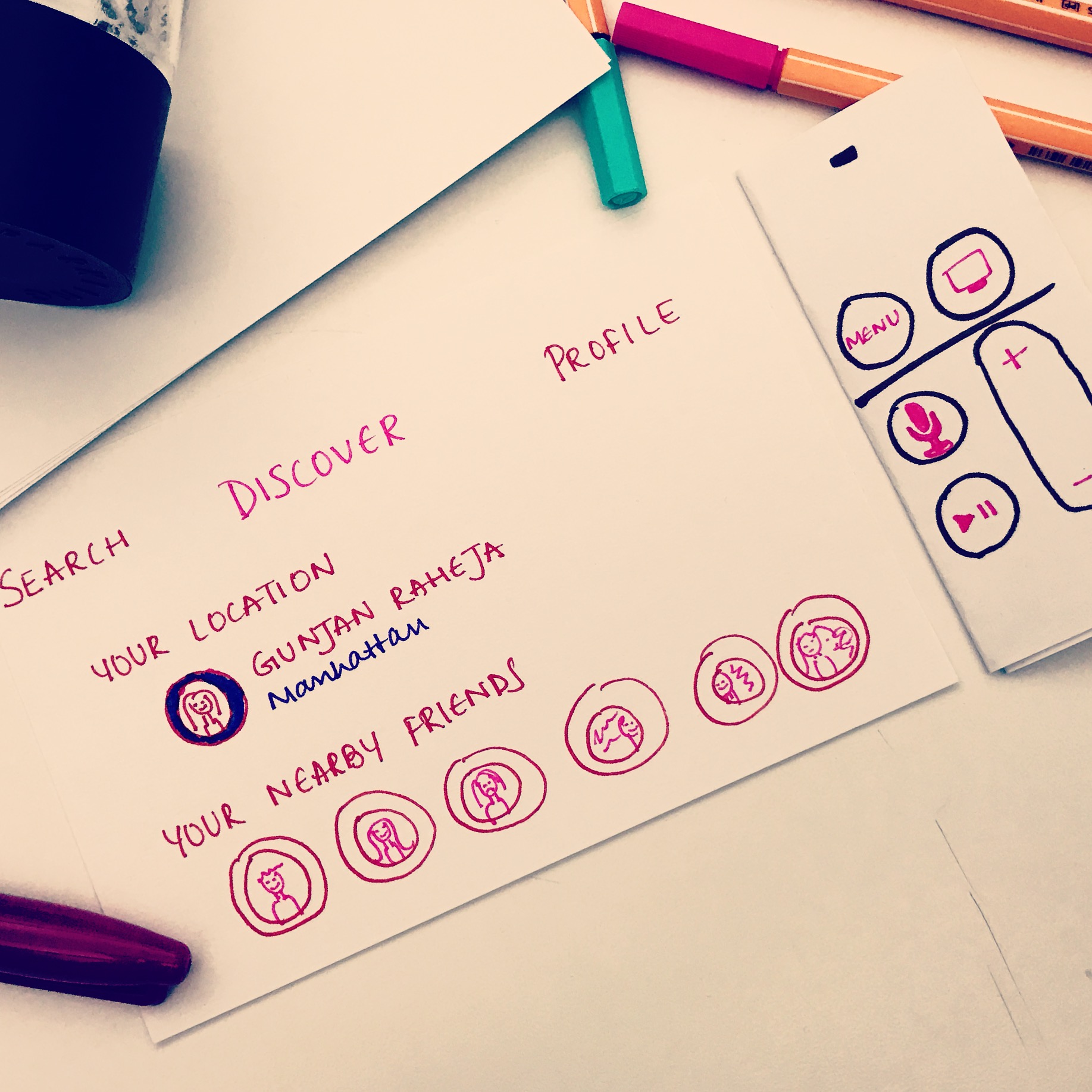
3 THINGS WE LEARNED FROM PAPER PROTOTYPING:

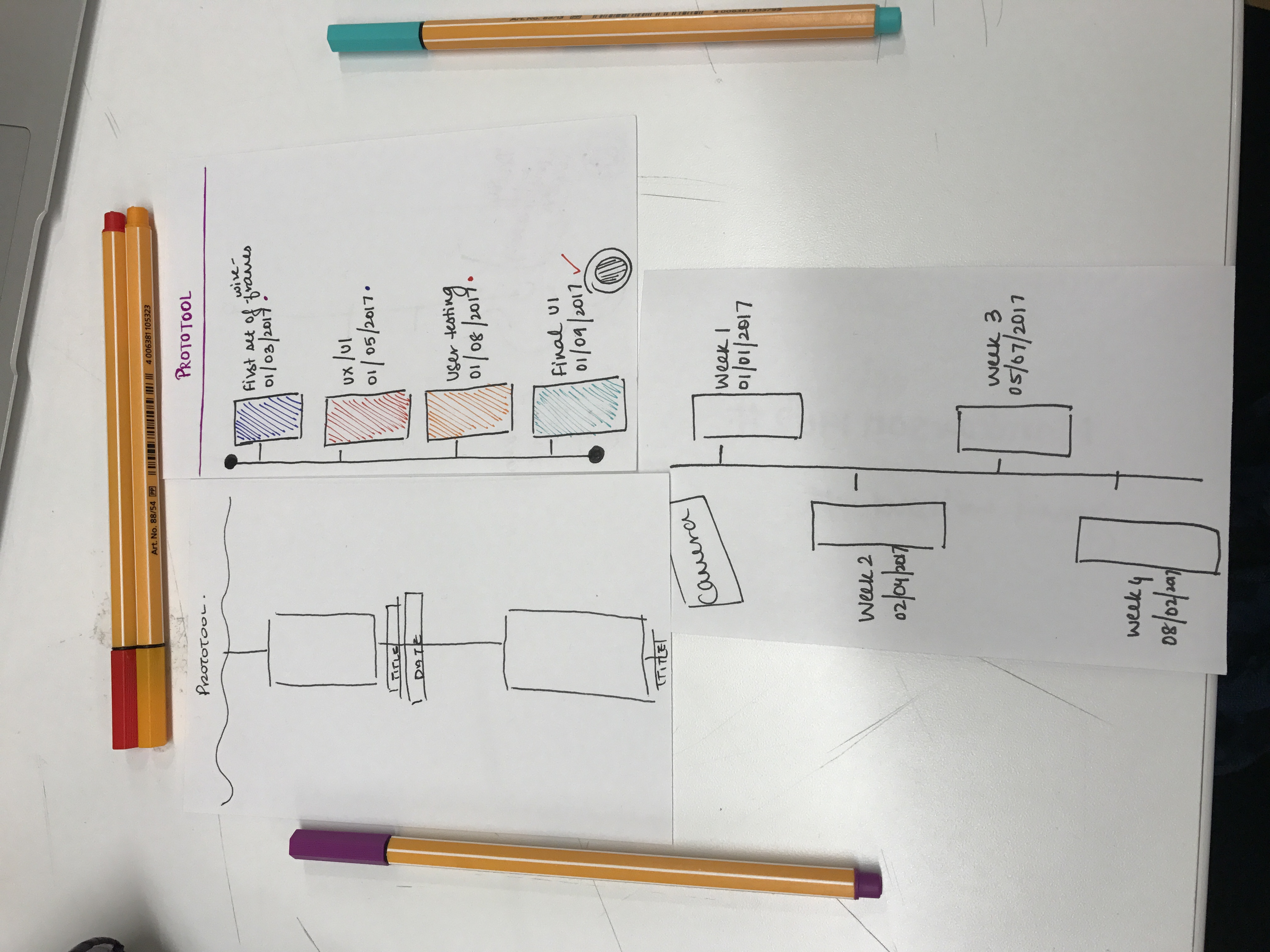
  1. We learned the importance of hierarchy and functionality of every icon. We prototyped, sketched, designed digitally and came back to the drawing board and paper to paper prototype again. The main idea was to understand each TAP, each function and also understand how clear the icons were.
  2. Would the timeline be week based, day based or project based?
  3. Enabling less number of taps and more interactions while sketching, etc.

Watch prototype:

https://marvelapp.com/22jg28j/screen/28043174

PRECEDENTS + DESCRIPTIONS

  1. ADOBE COMP CC

2. GOOGLE AUTODRAW

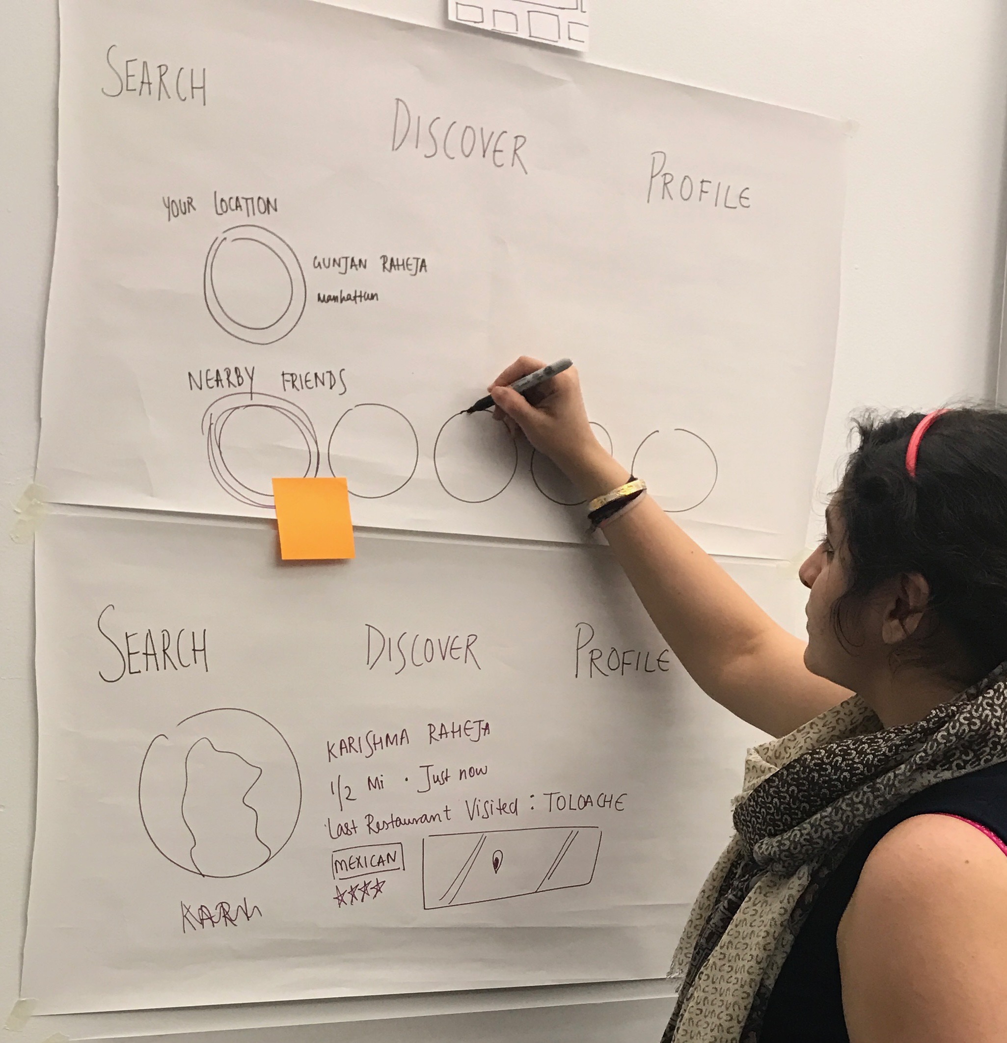
USER PERSONAS + INSTANCES

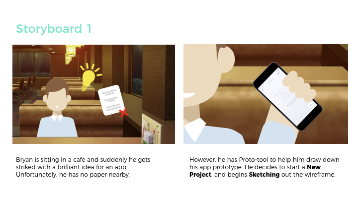
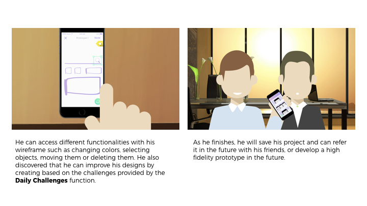
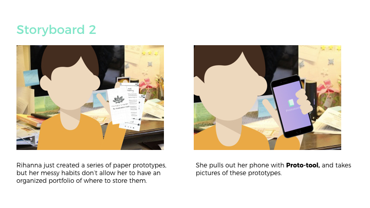
USER SCENARIO + STORYBOARD

App Interaction videos:

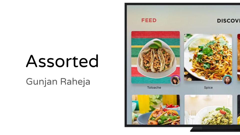
homepage from gunjan raheja on Vimeo.

delete from gunjan raheja on Vimeo.

daily UI PAGINATION from gunjan raheja on Vimeo.

daily ui challenges_1 (Converted) from gunjan raheja on Vimeo.

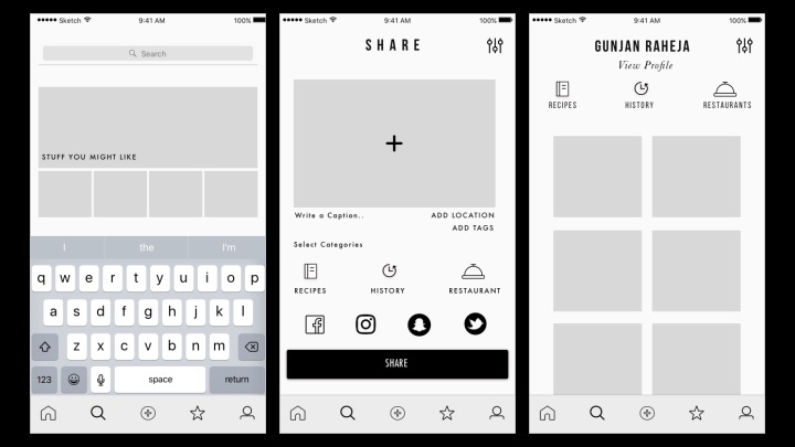
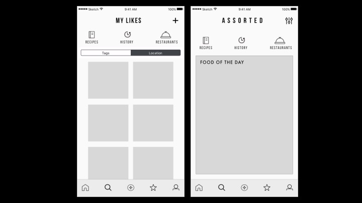
LATEST VISUAL DESIGN + HERO SCREENS:
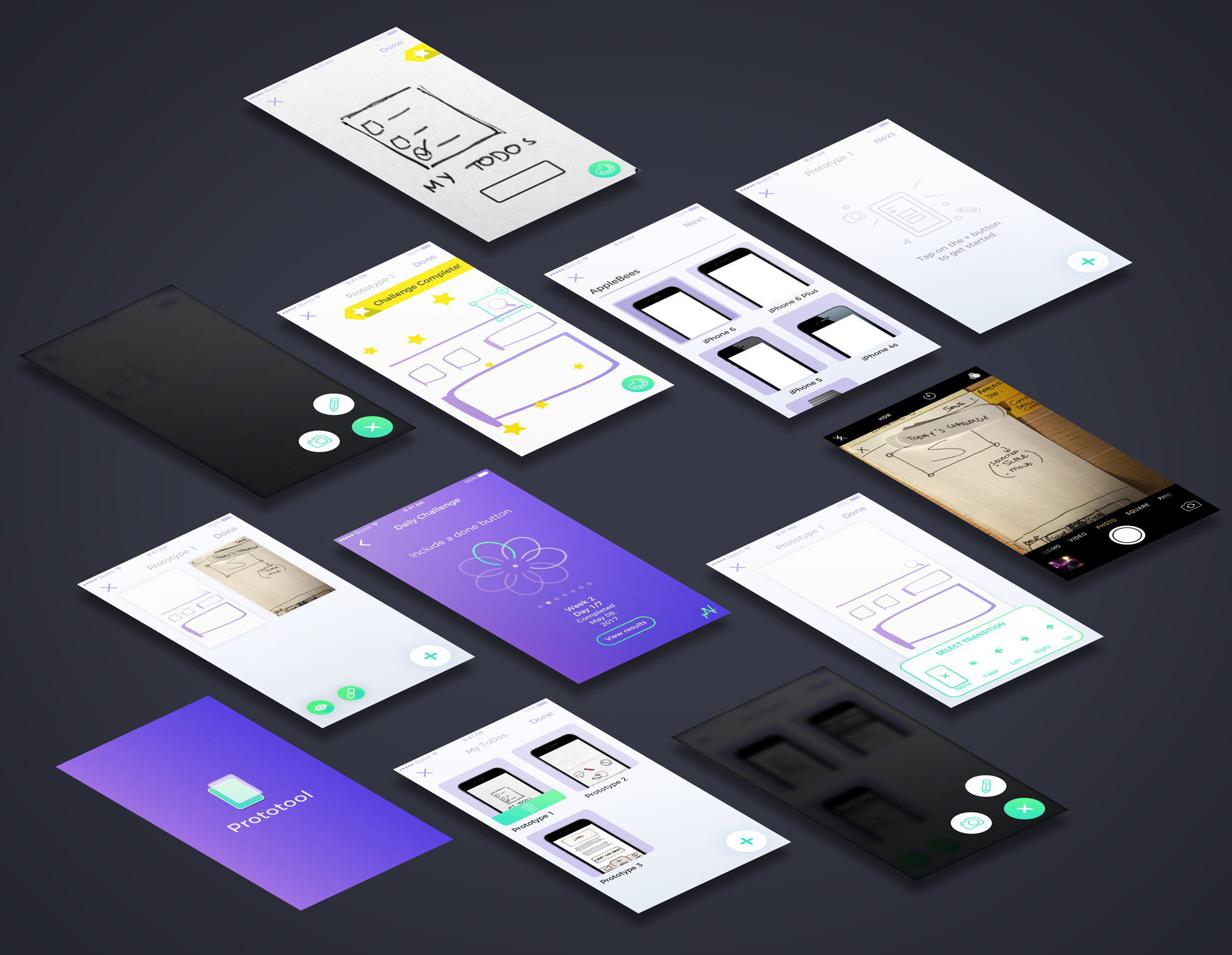
VISUAL DESIGN 1:

LINK TO MARVEL

LINK TO PRESENTATION

User testing & Learnings:

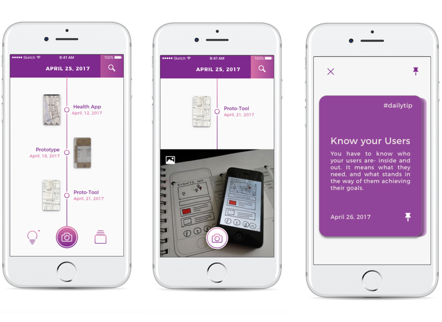
  1. Thinking about the hierarchy and main navigation – What elements are most important? We wanted to experiment with the idea of being able to document work process. We came out with various solutions that could reflect our concept, such as lists, groupings, and narrowed down with organizing projects through a timeline. A problem with this approach though, is that it would be more difficult for users to be able to refer to previous projects. For instance, what if one user prefers to work on different prototypes for different projects at the same time? It would be preferable to organize projects through different names. Would the timeline be week based, day based or project based? 
  2. Another issue that rose from this prototype was the iconography and language that was employed. Some icons were misleading and difficult to understand, causing the users to get lost when using the application.
  3. User flow was also another issue that was not worked on well in this prototype. The UI gave more emphasis for users to record their prototypes with the phone even though the sketching option was equally as important.


POINTS WE NOTED DOWN AND CHANGED IN THIS STAGE:

TIMELINE – Design use, Main Navigation and Hierarchy, Date on Header and UI Tips to UI Challenges

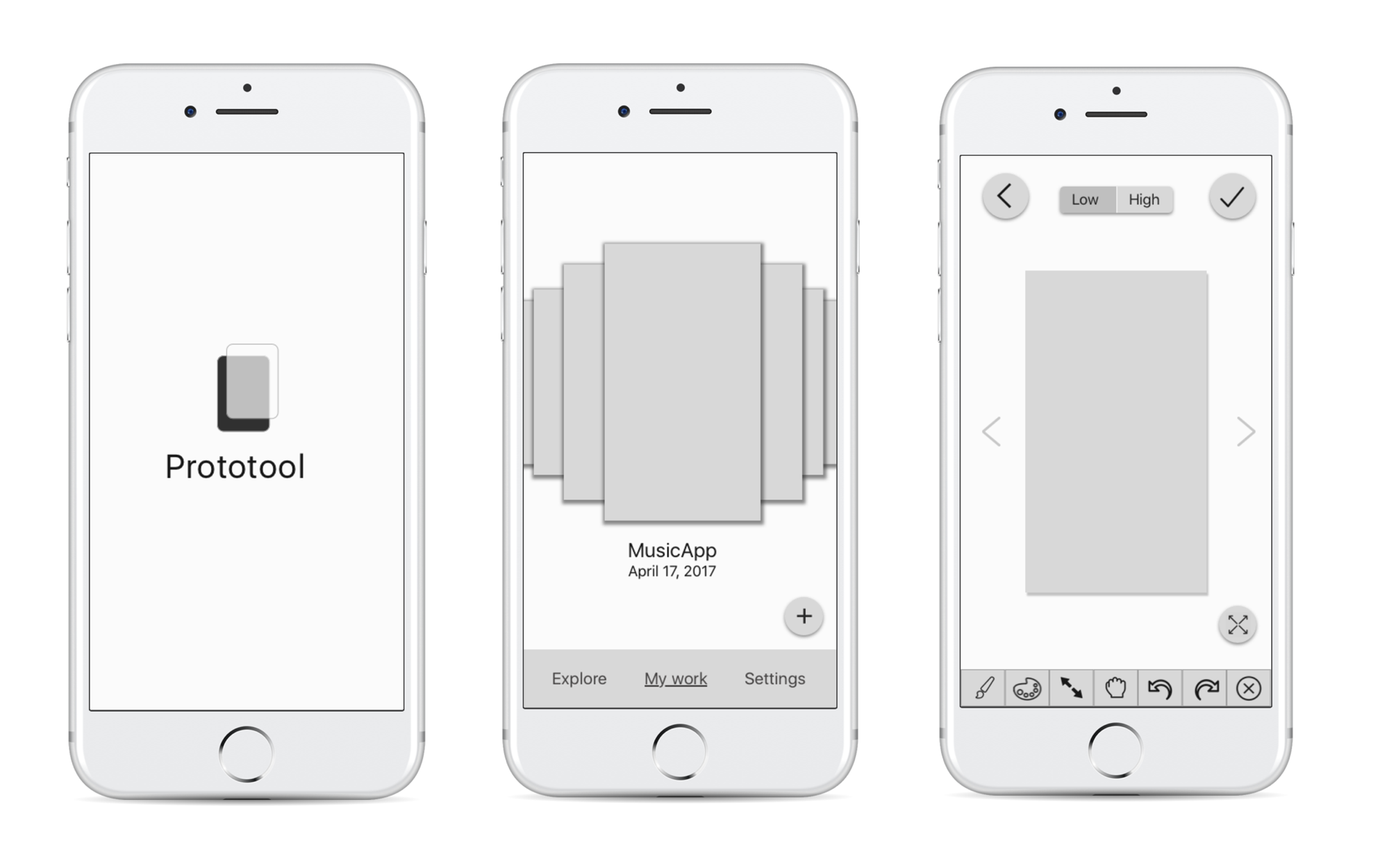
WIREFRAMES + FIRST PRESENTATION:

Link to Marvel

Link to Presentation

User testing & Learnings:

  1. While we prototyped on paper, we thought the wheel interface would be effective. Once we implemented it digitally and tested it out – we were wondering about how effective the wheel interface for timeline/projects would be. We started asking questions such as: What if a user had too many projects? Can they search through the wheel? This digital prototyping session and user testing session helped us understand our needs and functionality better.
  2. We also realized that high fidelity prototyping would be too detailed to perform on the iPhone. The main functionality of the application is to mark ideas and prototype low fidelity screens. High fidelity would require attention to detail which can be tiny on the iPhone. So we are sticking to low fidelity prototypes + sketches with Daily UI Challenges and hotspots.
  3. Explore/Community functionalities with including themes might not be necessary as most of the cases designers would not want to share their prototypes with the community.
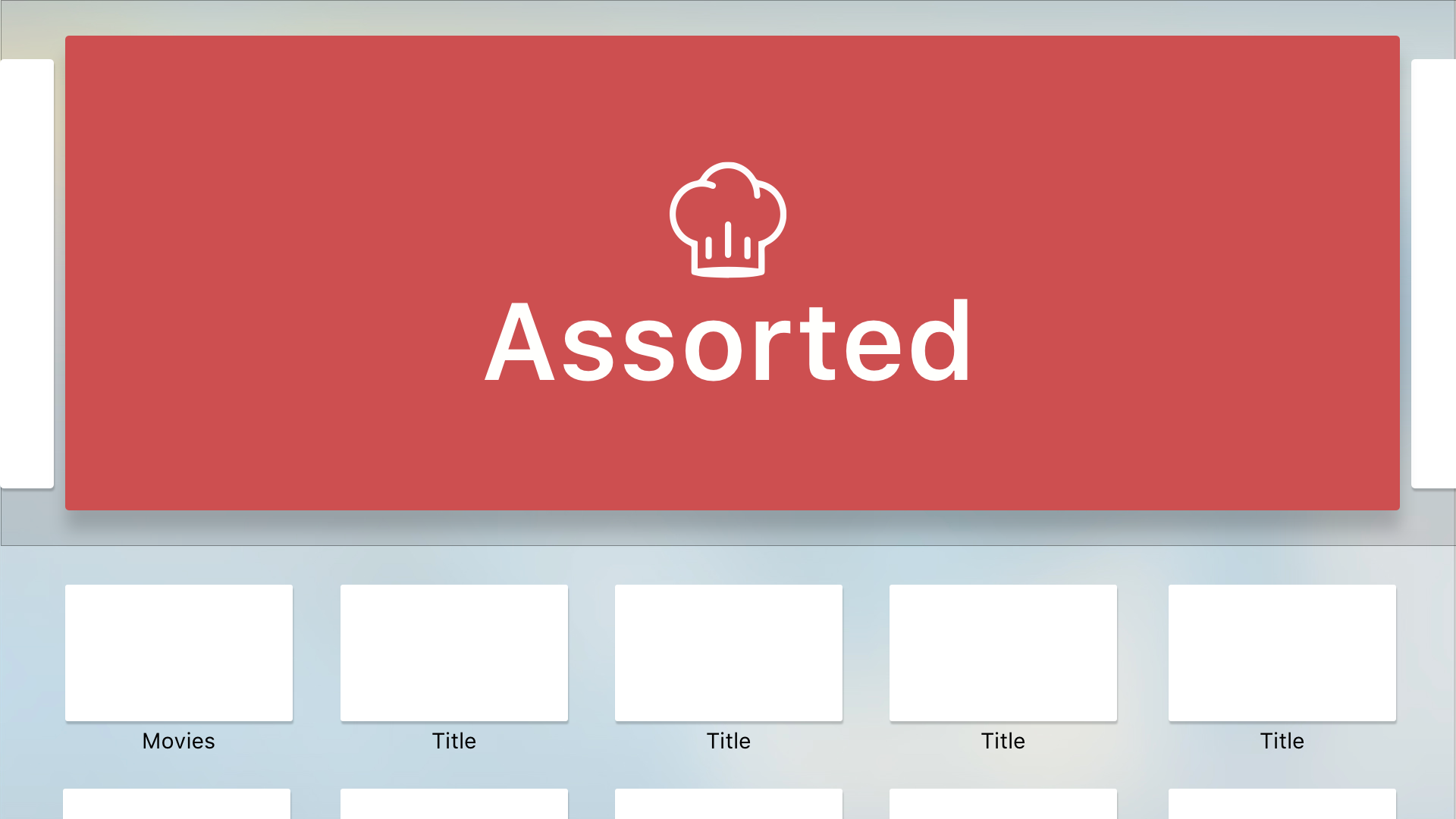
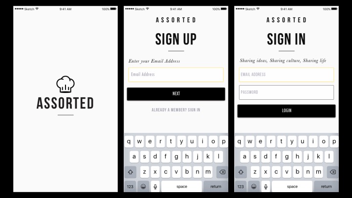
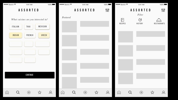
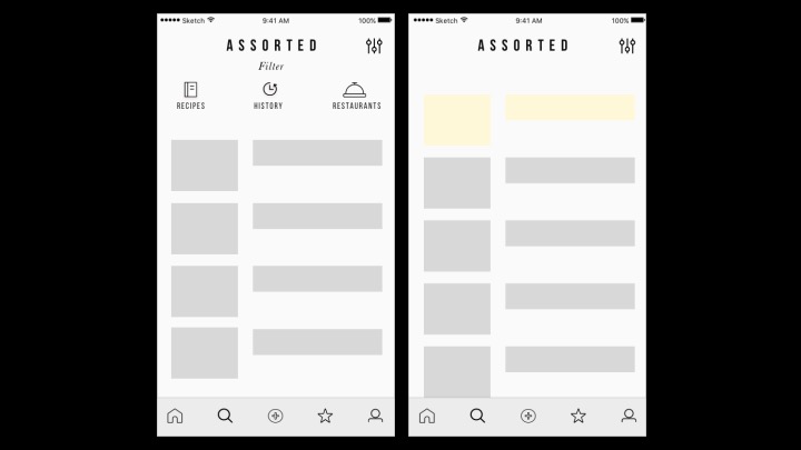
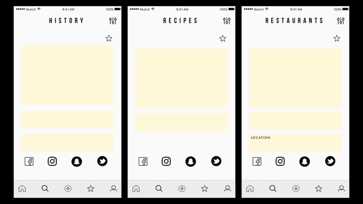
SCREENS:

Thank you 🙂

Thursday Apps 2_Gunjan_Raheja

FUN THURSDAY APPS!!

Square Cash – Send Money for Free


WHAT IS CASH?

Cash is a mobile application to send or request money in less than 3 taps. Their tagline is “Exchange Money Quickly,

They work the same way Venmo does – to send and receive money BUT-

-Cash’s interface is intuitive and minimalistic

-Cash is faster

-Cash is easy and free

The minimalism and intuitivity of the application makes it more interesting to use. I love Cash and would recommend anyone or everyone to download it!

TvOS Prototype_Gunjan_Raheja

CONCEPT:

Assorted is an application to grab a meal with nearby friends.  You login through facebook, find nearby friends and grab food! On the TV OS app, you can also Discover Food from different restaurants nearby based on your food preferences and ratings from your close friends. 

EARLY IDEATION AND SKETCHES:

3 THINGS I LEARNED FROM PAPER PROTOTYPING:

  1. Understanding the main interaction – What is the main function of the app that you want to cover in a few taps?
  2. Hierarchy – Which elements are most important for the Navigation..
  3. Map Navigation doesn’t exist in tvOS – thinking about different ways to organize the feed


FEEDBACK AND QUESTIONS RECEIVED:

So the Mobile app matches you with someone to eat with but in the Apple TV you can select and click? YES

Because there are no maps navigation in TvOS – think about different ways to depict nearby friends


Assorted Final Presentation

Concept:

Assorted is a mobile application to grab a meal with nearby friends.  You login through facebook, find nearby friends and get matched!

Audience:

Students and Working people who want to grab meals quickly with friends.

Precedence:

Snapchat

Facebook (Nearby friends)

Presentation:

https://docs.google.com/presentation/d/1N-gmAwt6RvHw8S-221tDlLJX7qVFy6Fv1GsY4cXhfIY/edit?usp=sharing

Marvel Prototype (Please click on the link):

https://marvelapp.com/2508ega

Feedback:

  1. Work on the Chef’s button. How does a user get back to the map view?
  2. The user and friends have gradient circles around them. Does it signify something? For now – no. It can signify close friends, etc.
  3. Thinking about setting up images for restaurants, etc.

#Thursdayapps

Color Switch

Color Switch is a challenging game where you tap a ball and must follow the color pattern to cross or move forward.

The game is interactive and changes colors every second. It consists of many levels which you unlock as you go.

This challenging game reminds me of my favorite game – Bounce.

Bounce is a very challenging game that I’ve loved and mastered with time. It helps me concentrate and relieve stress. You climb to the top, take down enemies and grab powers! My high score is 63. What is yours? Download both apps now!


Color Switch: https://itunes.apple.com/us/app/color-switch/id1053533457?mt=8

Bounce: https://itunes.apple.com/us/app/bounce/id951346457?mt=8

-Gunjan

Digital Prototype – Assorted

Please click on the links below to check out my digital prototypes.

Link to PDF: Assorted HD

Link to marvel demo: https://marvelapp.com/53h31fh

Feedback:

  • This is only a one to one connection. What is there was a way to have a group chat/meal?
  • Is there a way for users to add/remove friends to show up?

Three things that I changed from my paper prototype:

-Narrowed down and focused on One Concept. The concept is to eat or grab a meal with a nearby friend. This is map based and you can immediately choose a time/restaurant.

– Simpler navigation and fewer pages. My previous prototype had many components and many pages. With narrowing down my concept and by focussing on one idea, I achieved a simpler navigation.

-Sign in through Facebook to identify nearby friends. To avoid the whole sign up and sign in effect, the user would have to sign in through Facebook to find nearby friends and dine with them.

Thanks! 🙂

Introduction

3 Interesting things about iOS Human Interface Guidelines 

  1. Apps integration with Imessage

Apps can integrate with Imessage by an extension. It lets users share specific content – text, photos, videos, stickers, games etc. Here is an Imessage stickers app made by me. It is a series of peacock stickers with text. https://itunes.apple.com/us/app/pealets/id1195799309?mt=8


2. Integrating Widgets on the search and home screen

Users can add widgets to the search screen by swiping left. You can also access a widget by using 3 D touch to press your app icon on your home screen.

3. Peek and Pop:

Use 3 D touch to preview an item – mail, image, message, link – anything. Simply apply a little pressure to fill the screen and lift your finger to exit the peek. In some, you can also swipe up to reveal buttons.

Selfie and Intro:

Hello, I’m Gunjan. My first and everyday rule in life is “Inspire and get inspired”. I believe that we learn the best things from people. I love creating instant rapid prototypes and iterating. I also love designing social platforms. My background is in Electronic Media. I am a currently a designer creative technologist studying MFA Design and Technology at Parsons, The New School for Design, New York.