ThursdayApp_Night Sky

Night Sky is a stargazing reference APP. It allows users to explore a virtual representation of the night sky to identify stars, planets, constellations, and satellites.

After the onboarding view, the users will be asked if they allow the app to use their GPS location.

By using the phone to scan the sky, users can identify stars, planets, constellations, and satellites. The idea is cool and I also like the beautiful visual effect of the interface.


ThursdayApp_GOAT

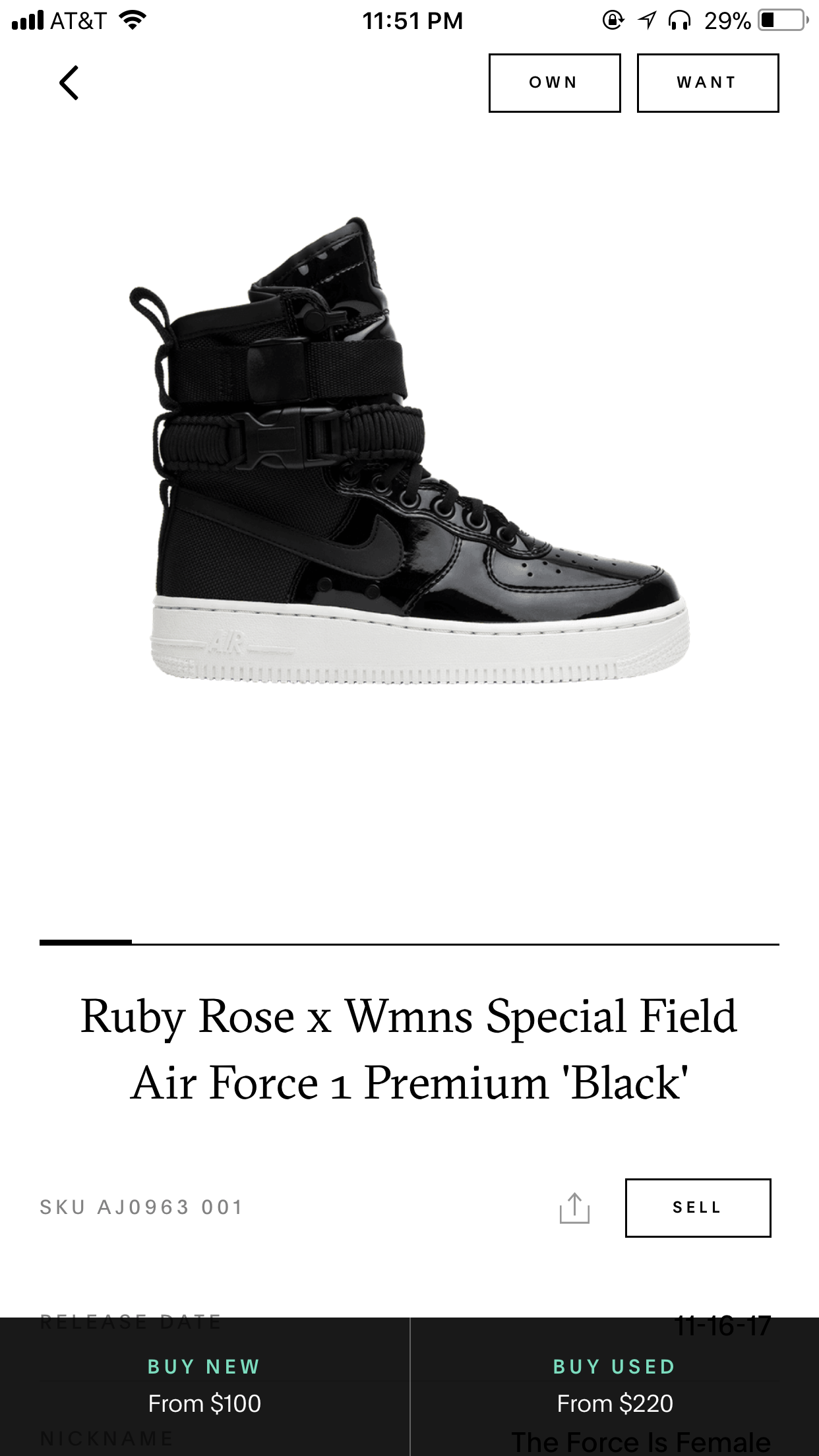
GOAT is the App that provides a platform for users to buy or sell sneakers. Since that there are more and more fake sneakers now, users are afraid of buying fake sneakers on the Internet. What GOAT does is to build a reliable connection between sellers and buyers. Sellers who want to sell sneakers have to send their sneakers to GOAT first. After verifying that the sneakers are authentic, GOAT will deliver the sneakers to the buyers.

I really like the mechanism of GOAT. It’s a great way to protect the rights of buyers and sellers. Here is UI of the APP.

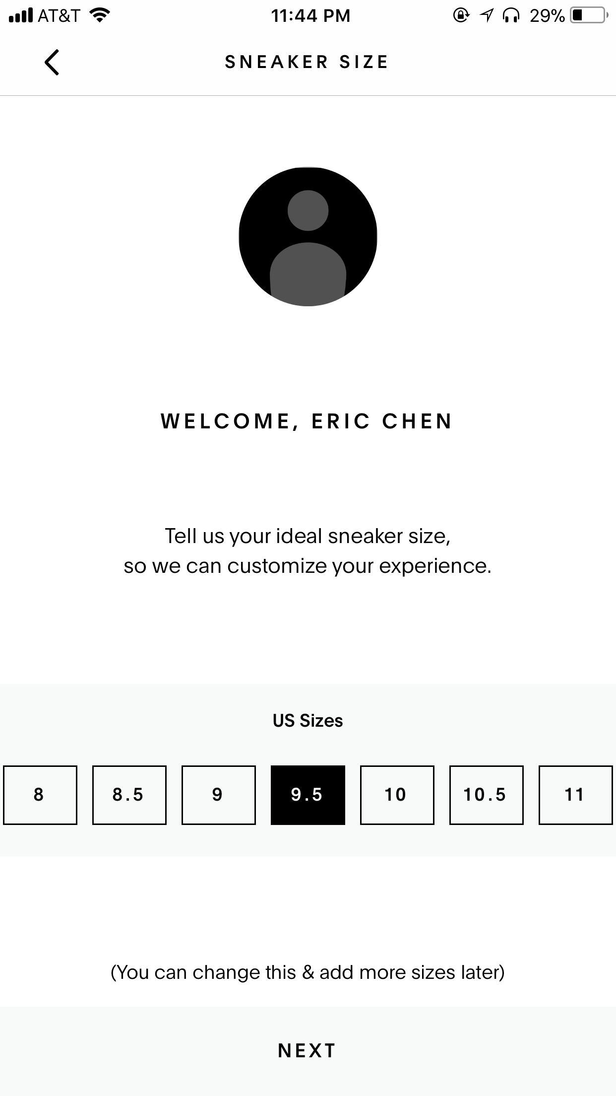
After signing up, users are required to choose their shoe size, which helps users to escape the inconvenience of choosing shoe size every time.

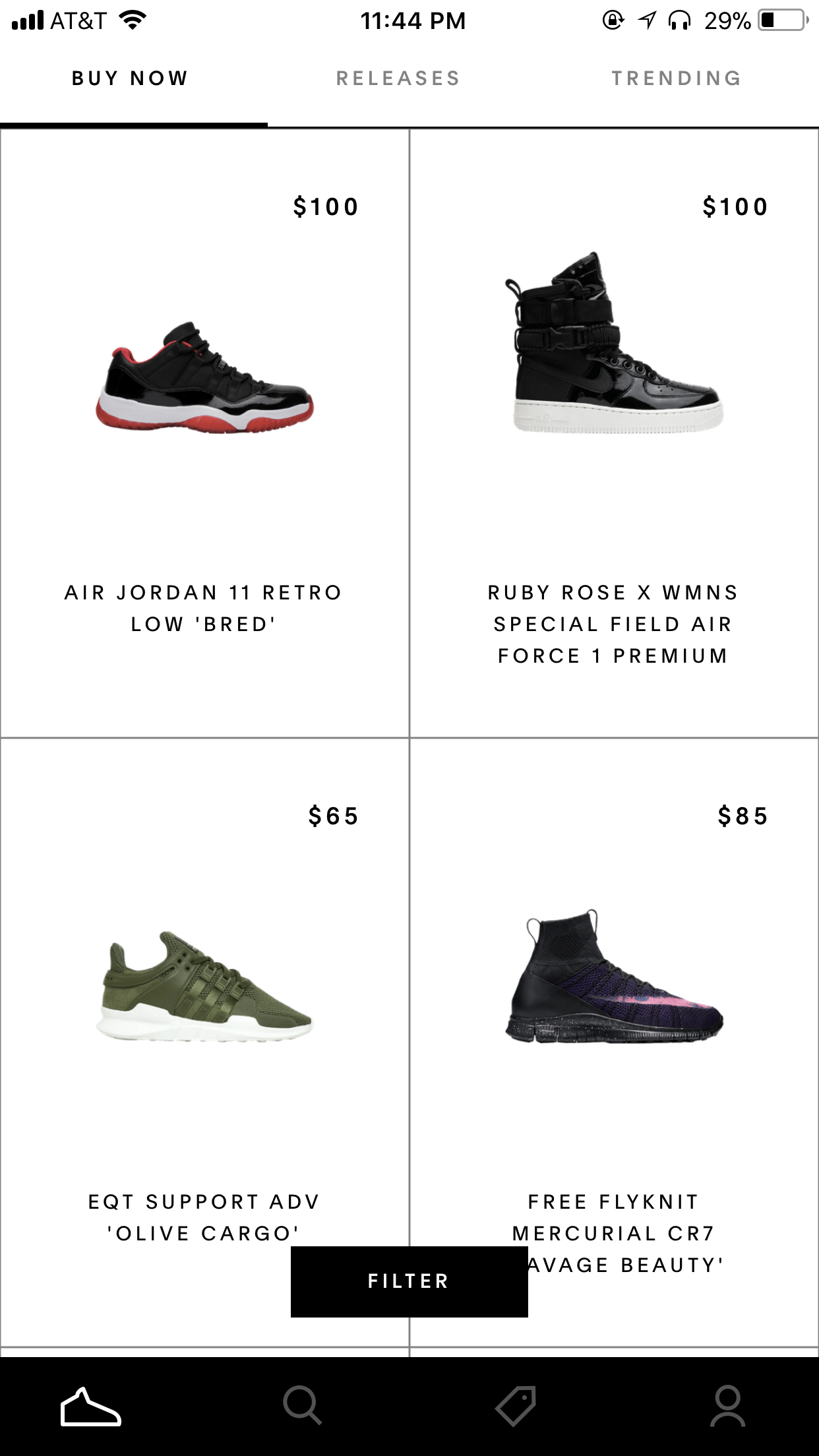
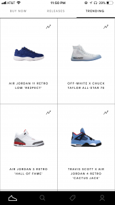
There are four icons in the tap bar: buy, search, sell, profile.


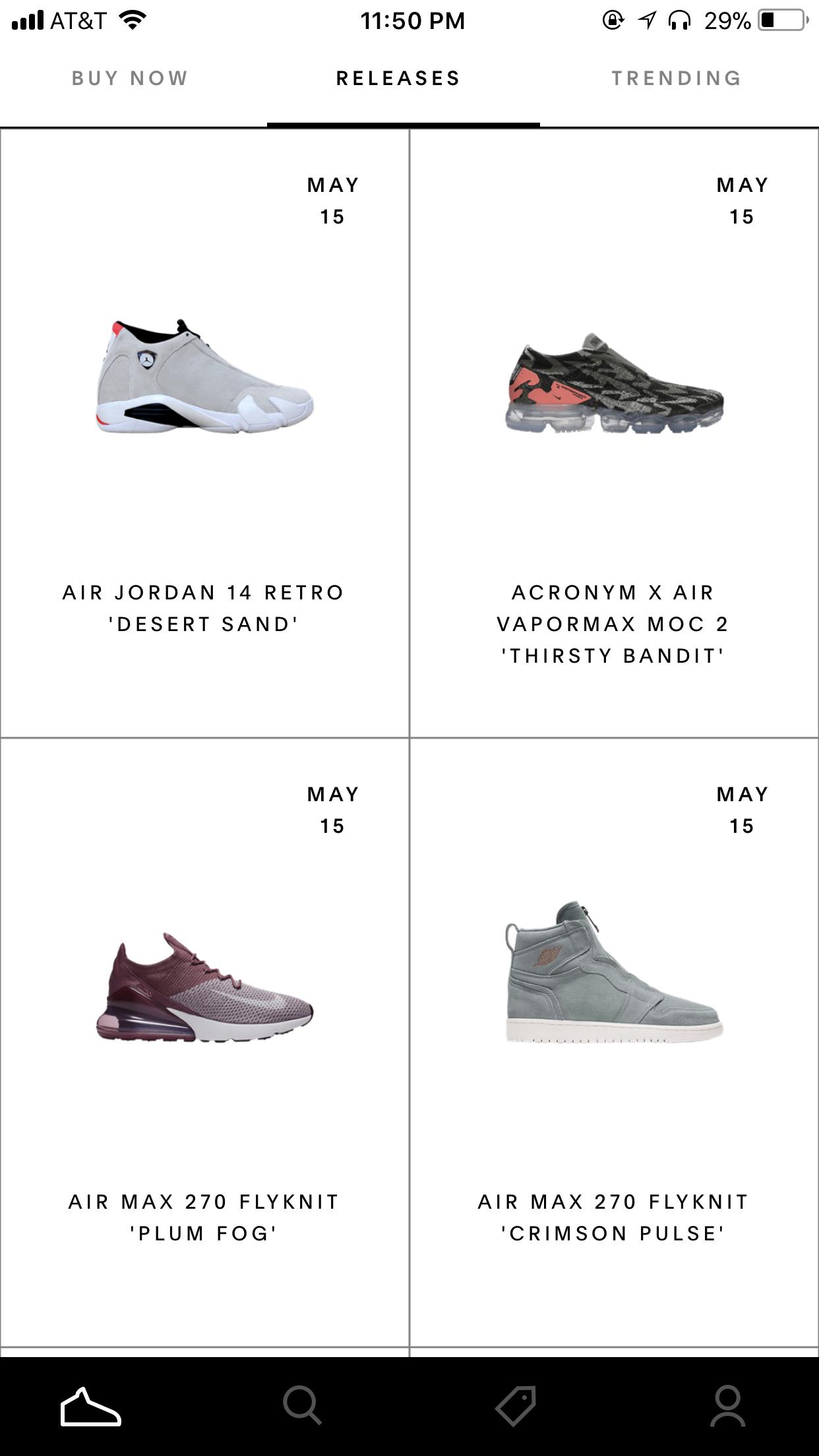
In the buy view, there are three icons in the navigation bar: BUY NOW, RELEASES and TRENDING, which is another flash point of this APP. The “Trending”  choice enable buyers to see the price variation curve and the tendency of the price, which helps buyers to compare the price and helps them to make decisions.


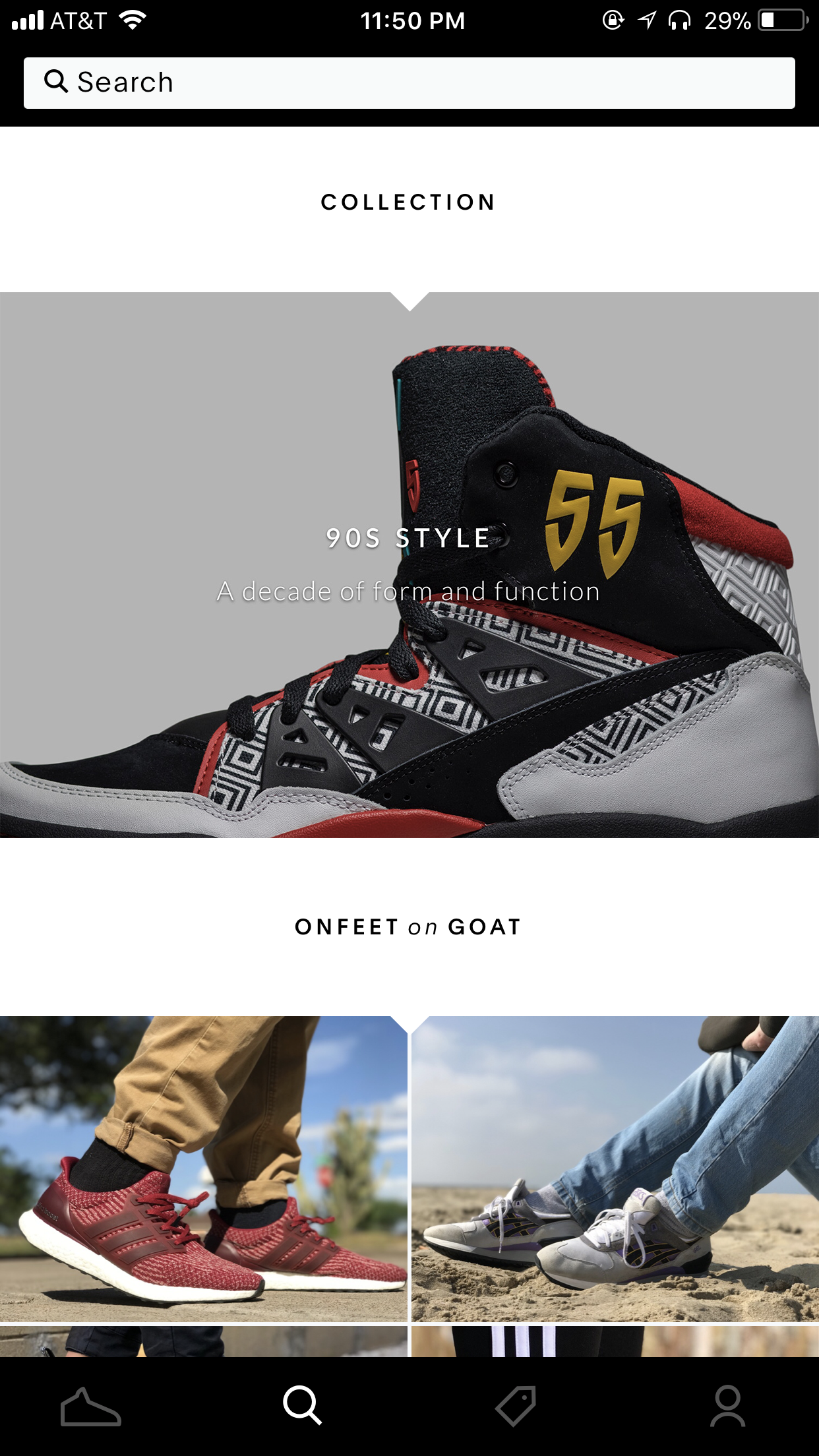
For me, I love the visual style of this app. It is clean and clear, which allow users to interact with easily. What’s more, the black block gives users instant feedback during the interaction and tells them where they are.

Week 15_Eric & Chris

For our final version:

  1. We identified the dominant color of our application and improved our the UI of our dating app.
  2. We modified the “calendar” interface.
  3. We changed the way to show the remaining advice.
  4. We added the searching bar in the interests picking view.


Digital Prototype:

https://marvelapp.com/168i3bag


Add-on:

Presentation:

https://www.canva.com/design/DAC3X05AEwQ/share?role=EDITOR&token=_fzfXIcXdezWQdLSE8KKvQ&utm_content=DAC3X05AEwQ&utm_campaign=designshare&utm_medium=link&utm_source=sharebutton


The feedback we got from the presentation:

  1. The scenario is inappropriate. The “lying” scenario is easy to make users feel uncomfortable.
  2. The advice is too specific.

Week 14_Eric & Chris

This week, we design an add-on for our dating app. The add-on we chose was Apple Watch. Since that the screen of Apple Watch is quite small, the interaction between users and the interface is limited. Therefore, we tried to use Apple Watch as the supplement of our app.

In the application on Apple Watch, users are able to see the profile of other users and slide left or right to “like” or “dislike” people from the matching list. What’s more, if the users are connected with others successfully, the application will send notifications to users to remind them.


The feedback we got from the presentation:

  1. The function of the add-on is limited, try to explore more function and use AI in it.
  2. The notification view does not look real. We should refer to the HIG of the Apple Watch and make it looks real.

Week13_Eric & Chris

User testing:


Insights from user testing:

  1. The tone of the AI is too strange; it doesn’t sound like a human. There will be cool f the AI can give suggestion and advice like a close friend.
  2. Showing different kinds of situations of using AI advice will be beneficial for idea presenting.
  3. It’s better to have no more than 9 activities in the interest choosing part. Too many activities make users hard to focus on.
  4. Gender preference should be considered about.


Week12_Eric & Chris

User testing:


Insight from user testing:

  1. The step for uploading profile part is too early, which is not a good user experience. Try to show users what can the app do first and then let them upload their profile.
  2. Since there are lots of interest, the category of interest should be thought carefully.
  3. The outline of the calendar is strange, make users fell confusing.
  4. The interface is confusing. It makes users misunderstand how AI work.  Users thought that the AI will help them send the message instead, which is not what we plan to do.
  5. Sexual choice is worth considering.
  6. Many female users feel uncomfortable with the app because they thought that it felt like they are talking to a machine instead of a real male. Using AI to communicate with each other make them feel insincere.
  7. How do we know who is actually speaking since everyone is using AI as a relationship coach?
  8. Users want to see more pictures in the profile.
  9. Do we need to consider about people from different ages?


Modified Version of the app

Week8_Qizhao(Eric)

Last week, I made a paper prototype and did a user test. Here is some feedback I got from user testing:

  1. Since that AppleTV doesn’t have the API to connect to Facebook and Twitter, the login part of the app may be tricky;
  2. The position of the image of the restaurant gives users the illusion that it is clickable. Why not make it clickable and try to add more detail to it.
  3. The function of sending invitation is hard to realize in AppleTV.

So I change my concept a little bit. In this version, the main value of the app will be searching interesting restaurants and enable users to see the 360-degree images of the restaurants so that they can know if the environment of the restaurants is good or not. What’s more, users can also check the menu and see the food intuitively.

Here are the wireframe and the visual interface.


Week6

What I learned from the guidelines:

  1. Top Shelf

    The top shelf is a content showcase area above the top row of apps on the Apple TV Home screen. The user can decide which apps are in the top row. When one of these apps is brought into focus, the top shelf displays featured content specific to that app.

  2. animation:

    1. Use animation only in response to a user action.
    2. Avoid animations with excessive movement.
    3. Strive for realism and credibility.
    4. Make animations optional.


App Map:

Wireframe: