Misung & Nan | Litterati | Final Presentation | iOS & AppleTV

Final Presentation Slides:

Redesign Litterati App

Final Feedback:

iOS

https://marvelapp.com/382fhjh

what we’ve learned from the last critique was that

  • “Review my cleanup” is not that clear for first users

tvOS

https://marvelapp.com/45h0593

We were trying to be more creative but we don’t know that our initial design may against the tvOS Human Interface guidelines. Therefore, we end up changing the “scroll down” function on the main view, but instead, we keep three tabs on top so that the TV interface structure could be more easy to navigate.

For the background on the main view, we will definitely use videos as background because it will add more dynamic dimension to its experience that would ultimately lead to longer engagement.

#thursdayapps | LIFELINE | NanHuang

Related image

Related image

Link: http://store.steampowered.com/app/585290/Lifeline/
Lifeline is an immersive story of survival and perseverance, with many possible outcomes. Basically, this is a text-adventure based game that an astronaut named Taylor who is the only person survive a plane crash onto an undiscovered moon. As a player, your must guide him through this whole journey and your goal is to keep him alive as long as possible. In addition, the game is heavily based on your decision, and that your decisions could either save or kill Taylor in the game.

The moment when I started to talk to Taylor I felt like the character was real. The App plays out in “real time” which means that sometimes Taylor goes off to do something else and you don’t hear from him for a while. That really makes me feel that I am interacting with a real person. Personally, I don’t hate waiting because I don’t have much time to play the game. But for the game person and you do not have patient, this is not the game you are looking for.

However, text only communication can be also a really boring aspect. you only have two answers to choose from at a time, and sometimes I just don’t want to choose any of them. and the game has too many texts which I really hate reading too much, and especially Taylor talk fast then I can read which is also quite annoying. But overall, I think it is worth to play it!

Litterati App redesign Wireframe and Concept (Nan and Misung)

Concept:

A global community that is eradicating litter one piece at a time.

How it works: 

* Take a photo of each piece of litter that you collect and dispose
* Add tags to each litter photo for item and/or brand type
* Upload the photos so the data can be tracked in the Digital Landfill database
* Track your personal impact and that of the Litterati community

Target users: Environmental Advocates/Marine Conservation Organizations

Pain points: 

  1. Not able to see other people’s collected items
  2. Users only can upload one image at a time
  3. Users are not able to get a full analysis of litter they’ve collected or feedback after doing it

Insights

While using the Litterati app, we found out that to give users better experiences, showing how much and what kind of contribution they made to save the environment based on the time and category of litter they collected. Furthermore, let them share it within the app and also virally through posting on social media so that other people also get interested in participating with them.

What we’ve learned from feedback

  • Reward system: considering how to encourage to collect litter, and take photos on it 
  • Why people curious what the garbage collected by others? (Apparently, most garbage images are not attractive, why people want to see it?)

TV OS_Visual DesignFinal

AppleTV Visual Design

What I’ve learned from the class feedback and user testing

  • Each step has too many descriptions which is not that readable,  so I think it is better to break down the whole paragraph into short several lists
  • Increasing the line space so that users can easily read the description from a distance
  •  Make the focused item more obvious on Direction pages, I understand it is crucial to make sure they always know which item is in focus. so I changed the position of the text “Step one” from bottom to the top in order to make each step more noticeable


tvOS – Wireframe

tvOS wireframe

  • Direction: it seems that not easy to scroll horizontally from step 1 to step 2, so probably i need to add two clickable left and right arrow button that allows the user to interact more smoothly
  • Should i combine recipes tab and categories tab together?
  • I was wondering if there are anyway i can add preferences on Main page or some other places so that the main recommendation recipes page will be truly personalized to the target users’ specific needs. (such as vegetarian diet types, allergy restrictions..etc)


QuickMeals Final Prototype

https://marvelapp.com/7hba879/screen/25718242

Things learned from Final presentation critique:

  • Preferences page – personalized your recipes recommendation based on your choices (now my preferences page has food type and food restriction section since my food recipes provided based on the time period, it would be better that I can also add a time period selection, such as 15 mins quick meals, 30 mins…etc. )
  • Direction section – I realized that I got some problem with the structure. it seems I hide some secondary information (direction section)  inside of the food details, because this is the important part in my app features that allows the user to learn how to cook a quick, simple and healthy food, probably I may think about an alternative way to make the user feel that they do not need to take the extra steps to achieve that goal.


Visual Design Prototype

Prototype visual design demo:

https://marvelapp.com/fci5big 

Things I’ve learned from last class feedback and user testing

The first thing I noticed was that there is no need to have a log in page. From the class feedback, I got to know that favorites and recently viewed can be saved locally since the app will run locally. So I get rid of the log in/sign up view compared to last time prototype.

In addition, I agree that there is no need to shop ingredients based on each dishes. Once you type Grocery lists view, there are two separate dishes shown up, I agree it is better to combine all the ingredients on the same view since some needed ingredients may overlap. For example, salmon dishes needs salt and oil so does chicken fajitas; hence, there is no need to purchase twice in terms of the list.

Other than that, I realized that it seems more logical to put ingredients first then direction behind it because users are supposed to collect ingredients first and then do the rest of steps. So I think it is better to switch the position so that the recipes looks more engaging.


#thursdayapp

Scream Go: 8分音符ちゃん

https://itunes.apple.com/us/app/%EF%BC%98%E5%88%86%E9%9F%B3%E7%AC%A6%E3%81%A1%E3%82%83%E3%82%93-%E4%BC%91%E3%82%80%E3%81%AA-scream-go-8-note/id1208078539?mt=8

Scream Go is a sound control mini game. At first, I saw lots of people play this game on the PC version. Then I immediately downloaded it because it looks fun to play with. To be honest, this is my first time use voice to control the character in the game, which is fascinating and super hilarious while you watch someone screaming to the screen. Basically, users need to use the sound to control the character to avoid obstacles on their way. You need to change your pitch of your voice frequently through the game, if you have a higher pitched voice then you can jump higher so that you will not end up falling down to the gap. I feel like this game also can be seen as a tool for singer’s vocal warm-up as well, if you have a performance later you probably can play this game first so that you can use to get your voice ready and performing at its peak in the show.

But it still has some buggy, at first, it is nice to play around with it. But when I ended up the game and want to restart the game. It turns out to the black screen and keeps my phone on hanging. If they can fix that, the game will run smoother without lagging while playing it.


things learn from the Apple HIG


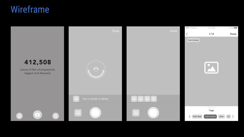
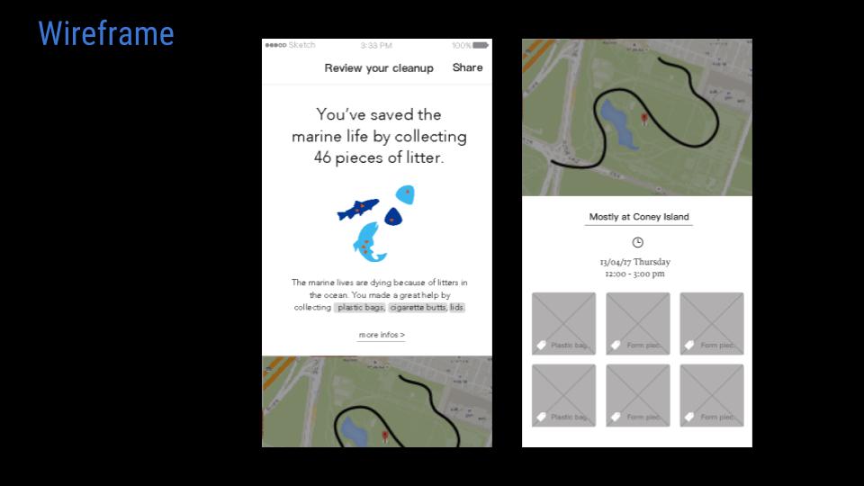
User control and metaphors

That reminds me that the “golden rules” of UI/UX design, which are place users in control, reduce user’s memory load and make the interface consistent. The principle taught us that allow the user to customize the interface, and users can directly manipulate interface objects, and in some situation, it is better to display descriptive messages and text to help users to move to next. The user should initiate and control actions, but this could be a little bit challenging in terms of different levels users. For instance, novice users often want apps that can direct lead them to complete a certain task but experienced users tend to more need fully control the app.

Interaction – Navigation

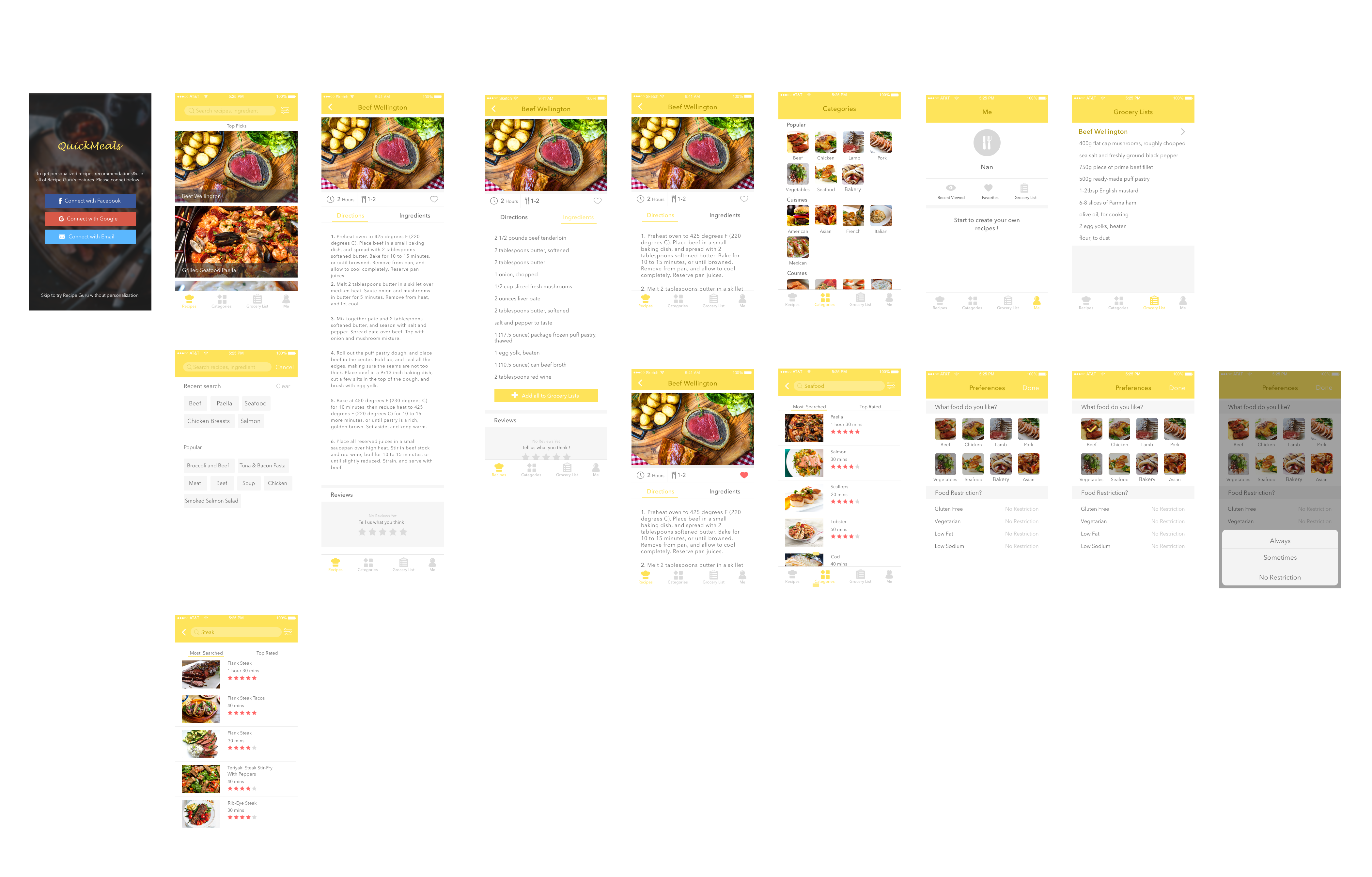
It is crucial to designers to understand the various categories of apps their work and ensure the navigation between app views is logical and natural with the input given and the information displayed. As a designer, we need to find the right design flow for users so that they can easily follow and know exactly where they are in your app, and how to move to next step. In iOS, there are three main styles of navigation, hierarchical navigation, flat navigation and content-driven navigation. In general, navigation bars are able to help navigation through a series of hierarchical app screens whereas a tab bar helps to organize information at the app level.


Nav. bar                                                            Tab bar

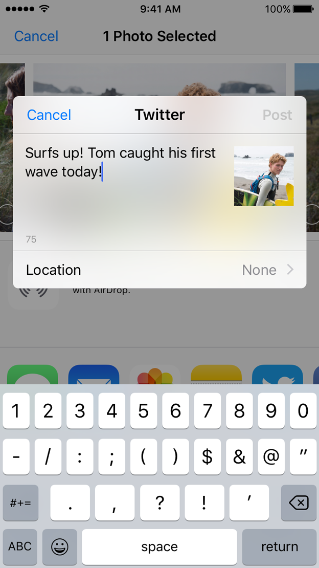
Technologies – Social Media

I just realized how unbelievably easy it would be to share content or pictures to our social media accounts without requiring authentication because iOS employs a single sign-on model for accessing social media services. It helps the user to save time and make sharing easier. I really like that feature because it quite similar to users register or log in page, just don’t ask people to sign up in the first place.

Group2 – Prototype1 & App map


Quick Meals

Quick Meals app is a growing database of quick and easy recipes that can be made in few minutes. Search for a recipe by using categories like 15-min quick meals, 30-min quick meals, popular, cuisines and dish type and even occasion. All recipes come with photos, timing, directions and ingredient lists. Find one you like and you can add favorite it so you can find it later. You can also view a grocery list for each one and check all the things you need. This will be saved to one of the tab lists you can check while shopping in the market. In addition, you can search for certain foods like steak or seafood and the app will give you a list of various ways of cooking steak or seafood, and then you can look at the step-by-step instructions on how to prepare it and get to know for how long it will take.

App Map

Prototype 1