- Final Presentation Slides MobileMedia_FinalPresentation
- Mobile Marvel Prototype – https://marvelapp.com/1j6c71h#12106212
- Apple Watch Marvel Prototype – https://marvelapp.com/200i7ch
Author: Yu Zhang
TurnitUp_Eilana&Yu
Wireframe Presentation – MobileMediaGroupPresentation1
User Interface Presentation – MobileMediaGroupPresentation2
User Insights:
1. Sign-In should have Sign-In options other than Facebook Sign-In, in case users do not have Facebook Account.
2. Add friends should have the option to add ALL friends, instead of adding one by one.
3. On profile page, there needs to be a button to “scan other people’s code”.
4. On chat window, the other person’s and your chats should be reverse.
#thursdayapps_Artifact Uprising
“Artifact Uprising App (AU Mobile) is an app can make custom, quality photo books, photo albums, cards, and print photos online. Inspired by the disappearing beauty of the tangible.”
Since almost everything is getting more and more digitalized nowadays, photos are taking by phones instead of taking by cameras, and people get used to save their photos in their phones. The reason why I love this app is not only because it’s really well-designed, clean and simple for users, but also the concept of this app is bringing people back to the “physical era”, which means photos are supposed to be printed out and share with friends in person. So the great things about this app are combing the digital software with physical/tangible things, and people who love taking photos by phones still can print out their pictures without so complicated steps by the camera. With this app you can just simply send the photos through either your camera roll or instagram or even VSCO cam.
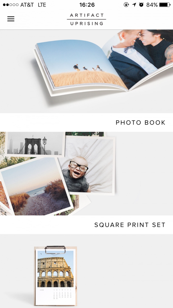
The first view is really simple and clean. It also provides the outcomes of the products for users to explore in different styles. Also, the kerning of the font makes the whole view looking very elegant.
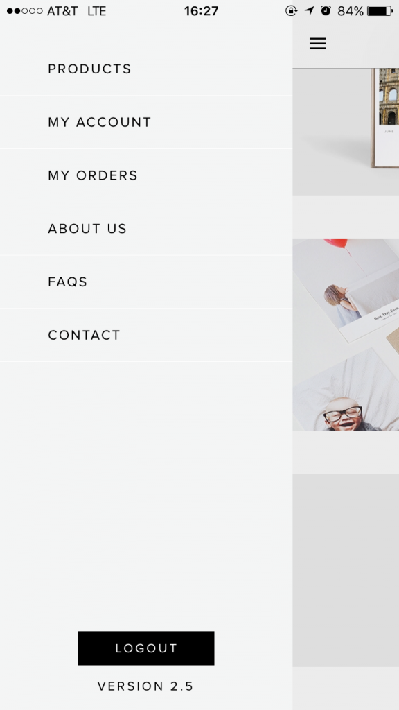
The side bar is very simple and easy to understand. It is obvious to see the “log out” is doing totally different things with the buttons on the top, so users won’t accidentally tap on the wrong one. However, personally speaking, I will combine “my account” with “my orders” if I’m the designer. Because even though they’re doing two different things, they are still under the same category.
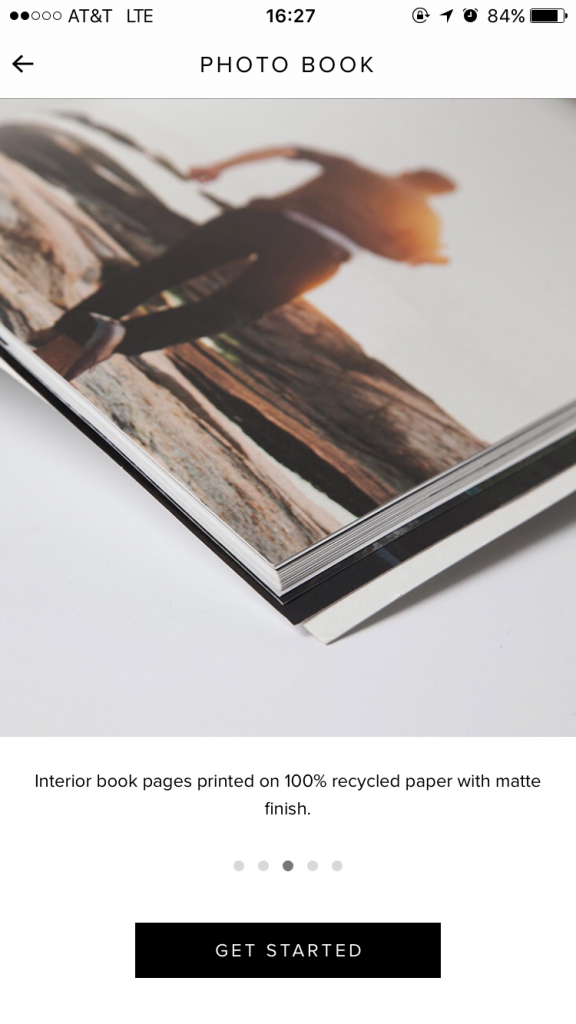
One simple key sentence to show the style and also price, which can let users to catch the most important information in a short time.
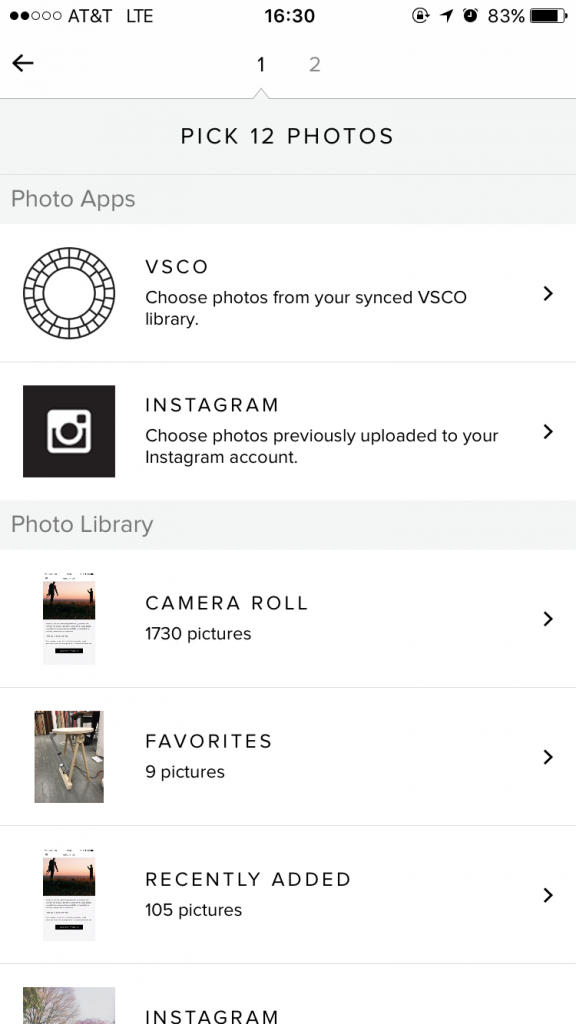
When you tap “get started”, it will lead you to the picking process, which allows you to pick photos through either photo apps or your photo library. This is very thoughtful to consider those filter lovers, also there are the commercial benefits inside(work with other companies).
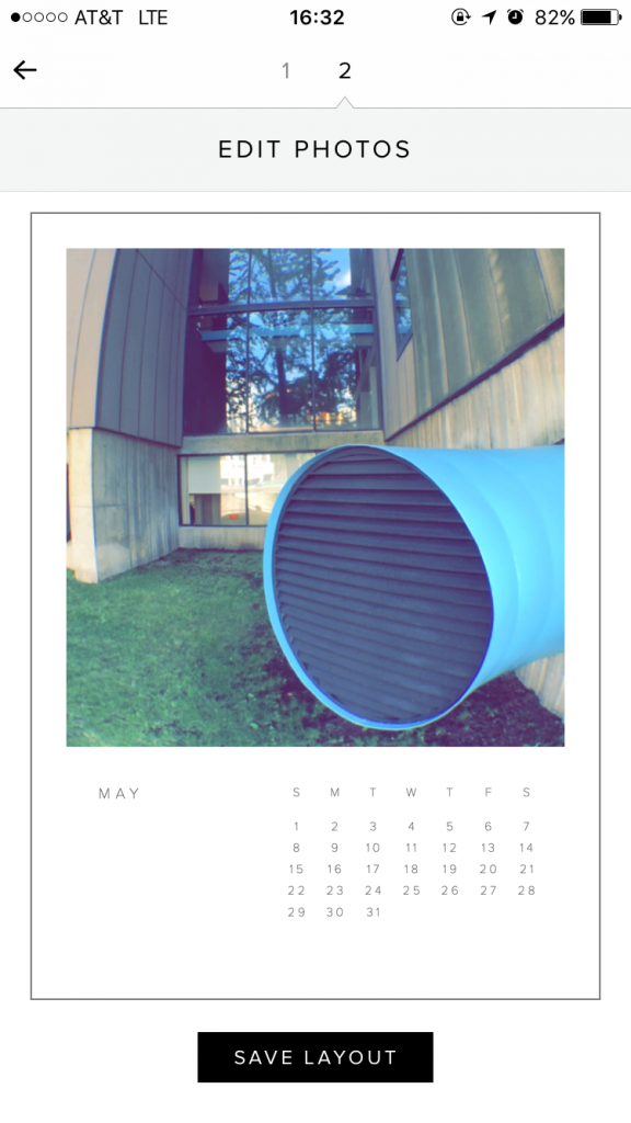
After picking the photos, which is the first step, users can edit the photos that they picked into the perfect position and inside of the frame by moving around the picture. Meanwhile, the nice thing about this view is the mock-up style, which allows users can view what the final product will look like.
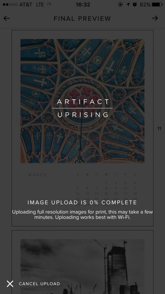
When users finish processing each step above, the system will automatically upload the photos for you, which is very convenient. Also the “Cancel Upload” locates on lower left side, so users won’t accidentally tap on it to cancel, or very hard to reach if it locates on top side.
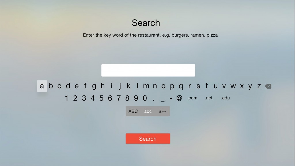
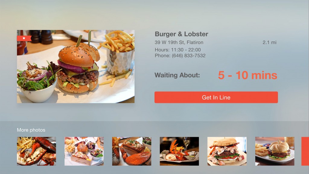
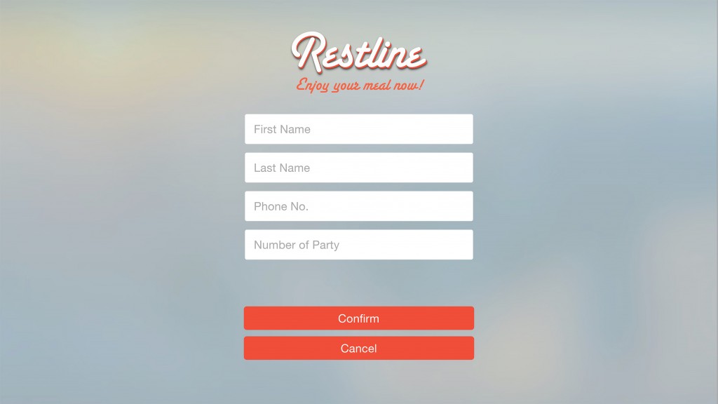
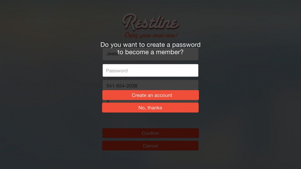
ProjectOne_“Restline”_tvOS_Version2
ProjectOne_“Restline”_tvOS_Version1
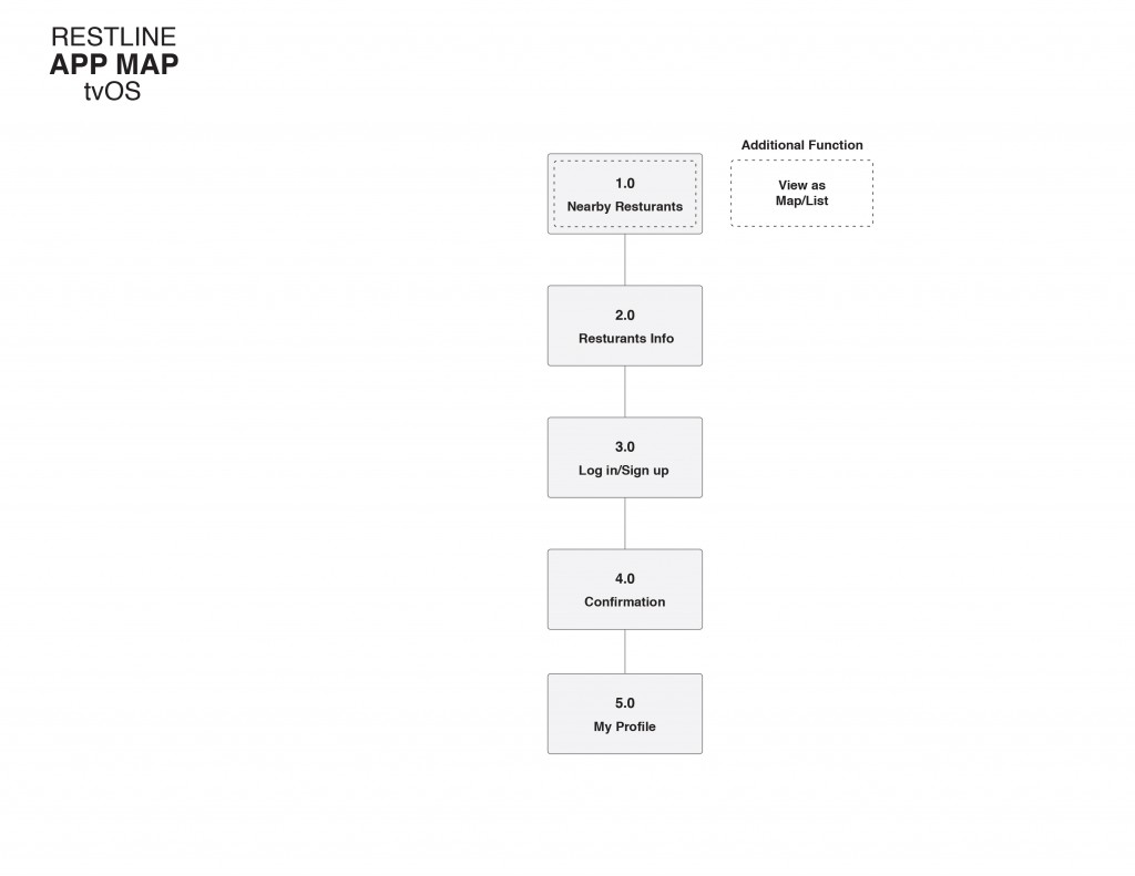
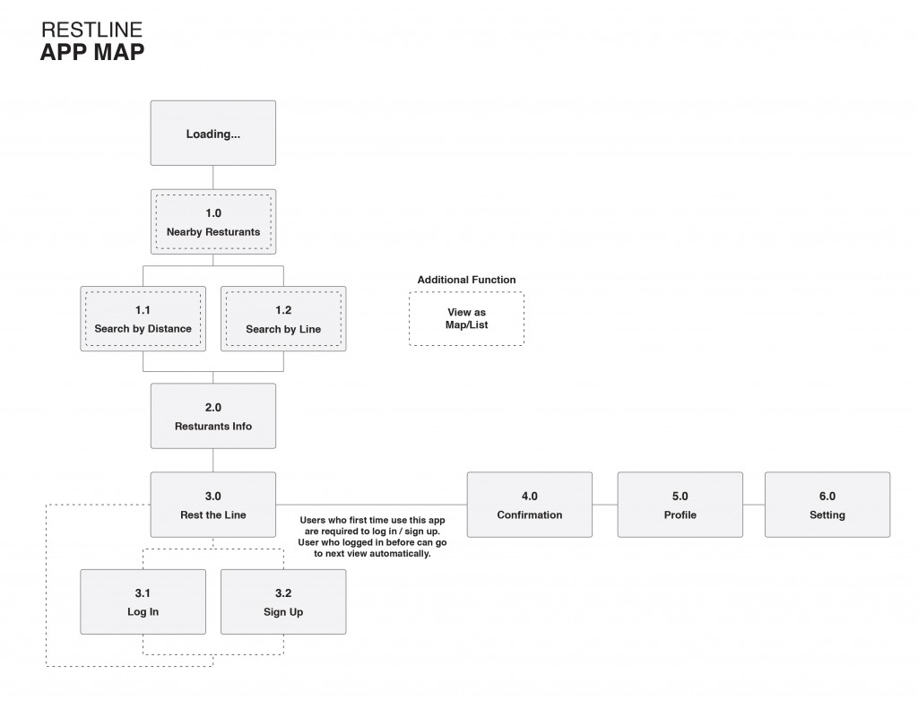
App Map
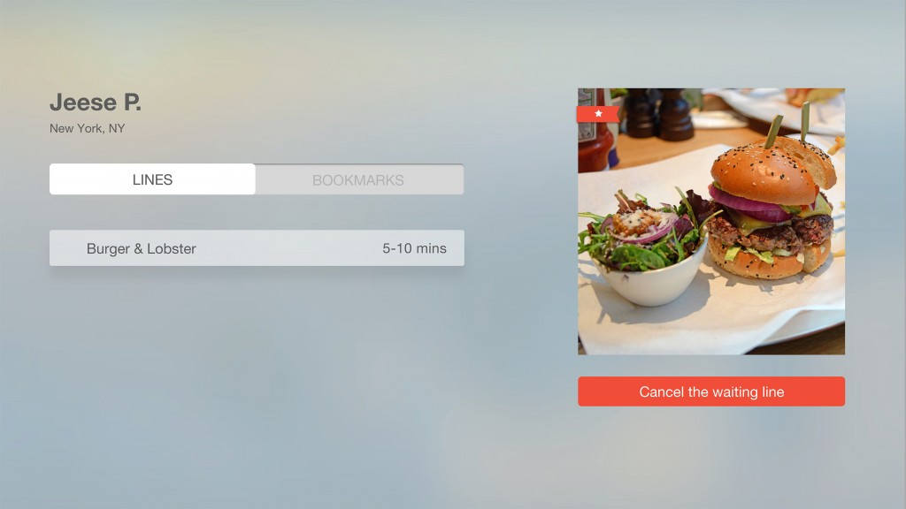
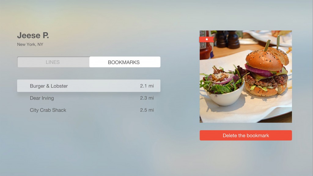
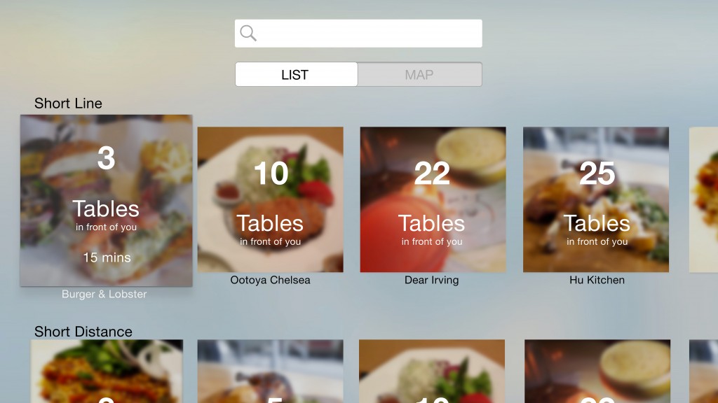
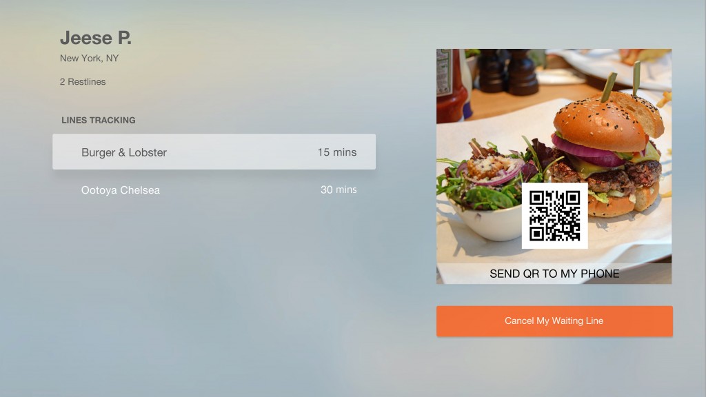
UI Comps
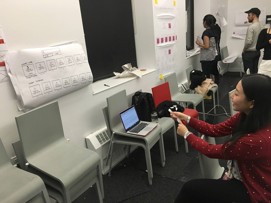
Paper Prototype – User Testing In Class
After I did the paper prototype for apple tv..
- It is more real and helpful to have the user testing on the full-scale paper prototype. Because the size really does matter for users to have a try, and the design could be very different from the version on the phone. It does make more sense for users to sit in a little far distance to have the experience.
- One of my users asked me about if the line tracking disappears after the waiting time, and what will happen if customers do not go to that restaurant. Is it going to expire or send the message to customers phone?
- People think QR code is a fancy way to get confirmation, but they concerned about how to get the QR code through message on their phones. Or maybe just a simple text is fine, and show the message when they get there.
- Some people think the button “Restline” is not a common word for people to understand, so they got confused by that. Maybe “add to my waiting list”?
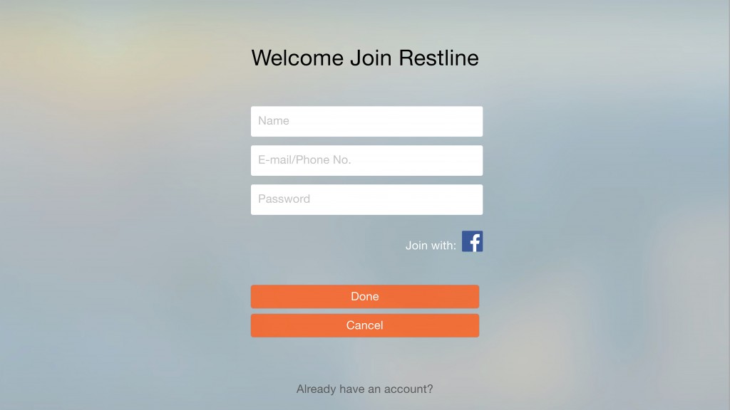
- Also, one of my users suggest that customers can log in through restaurant info view directly in stead of a whole different view for they to log in.
ProjectOne_“Restline”_Version4
User Insights:
- If users want to wait for several restaurants, the app shouldn’t charge customers. (maybe from restaurants, but not customers)
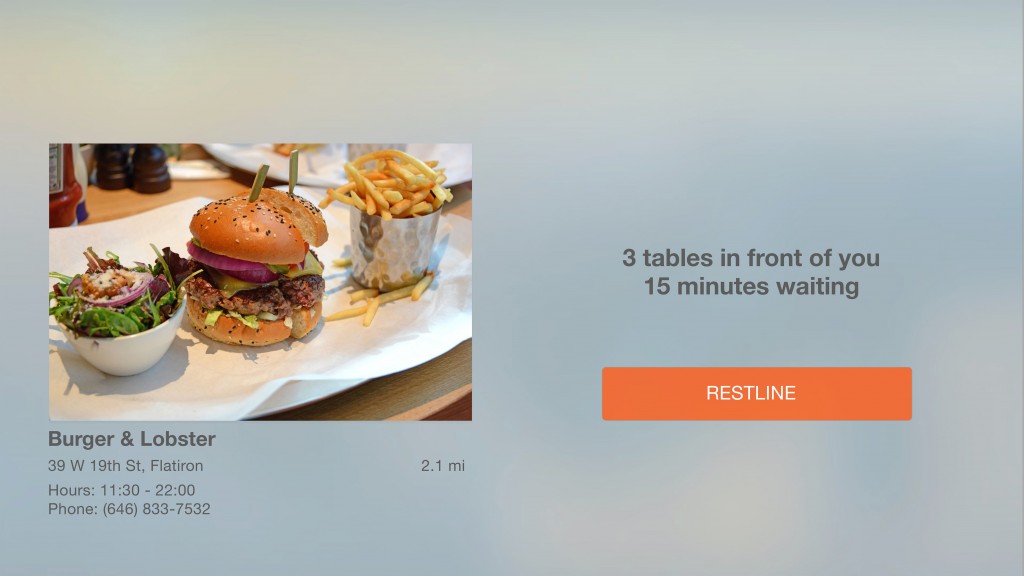
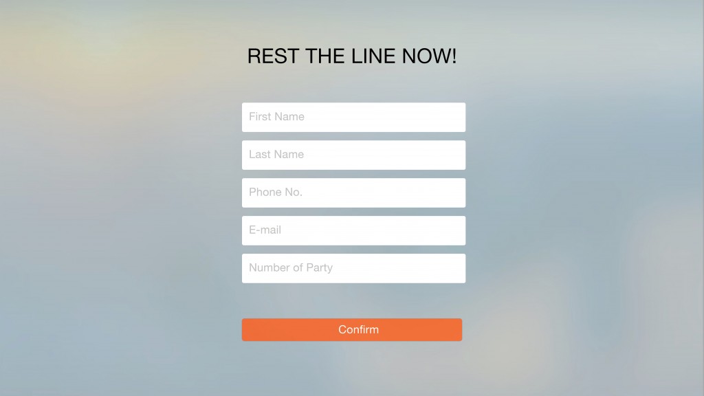
- Consider number of people in one party, which will determine how many tables in front of you.
- The table icon of percentage seems very confusing.
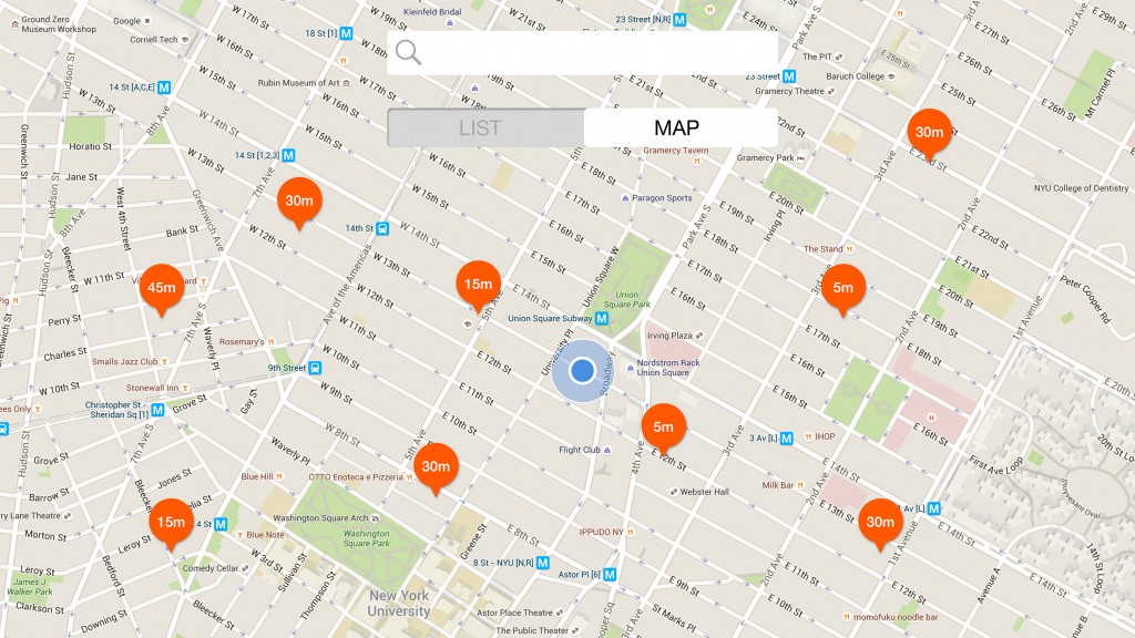
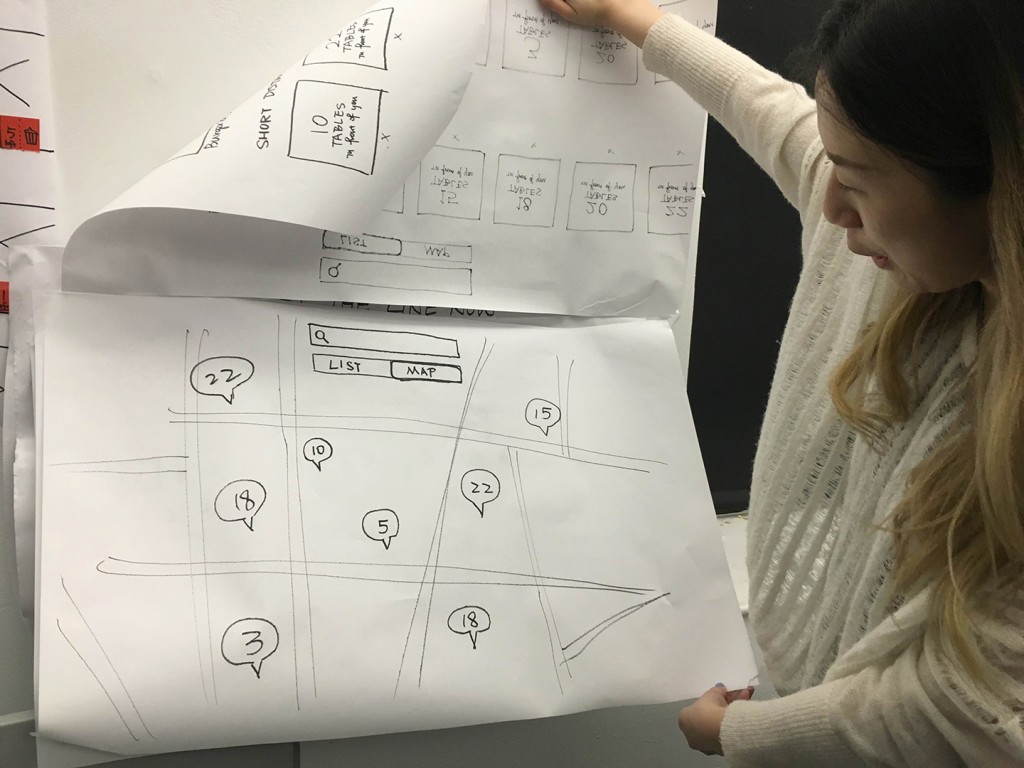
- The transition from line view to map view should be coherent with other transitions.
- Restline_Final_Slides
- Final UI Comps ->>> https://marvelapp.com/13g495g#10545156
ProjectOne_“Restline”_Version3
ProjectOne_“Restline”_Version2
Based on the feedback I got from previous presentation and user tests, I improved my wireframe a little bit, and made the function more specific for users.
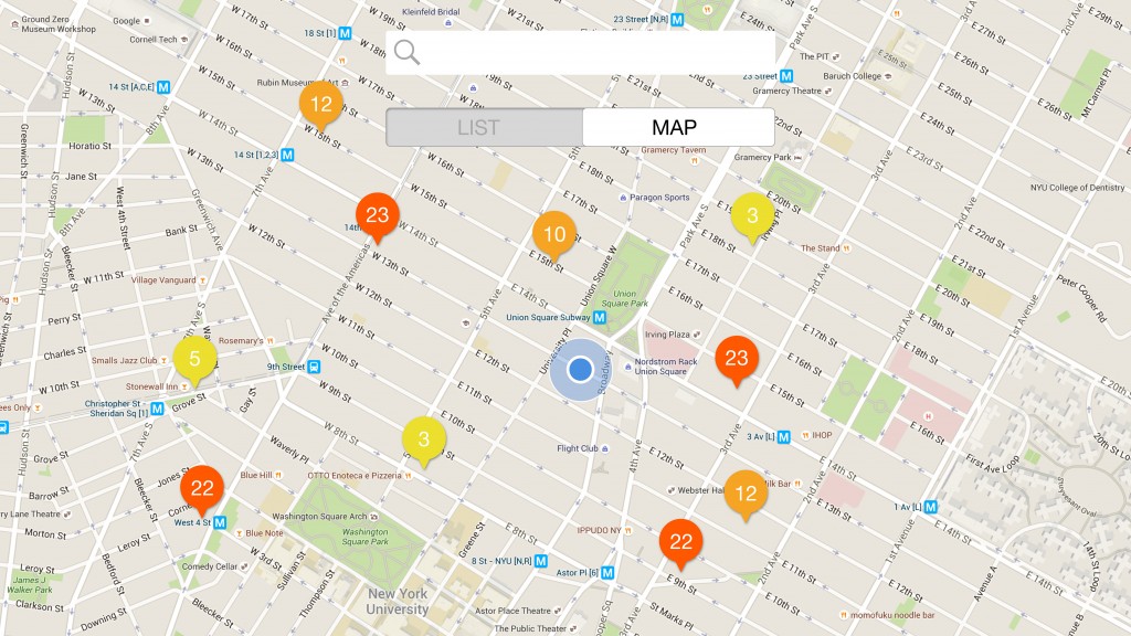
RESTLINE: a waiting line tracking app.
(It only focuses on the restaurants that accept this system.)
- Appmap+Wireframes (version2)
ProjectOne_“Restline”_Feedback
Feedback after Presentation:
- Need an app map.
- Define what’s this app doing for user. (KEY ELEMENT)
- (What problem you’re solving?)
- Consumer buy in / get restaurant buy in?
- Remove reservation function?
- Explore the app first, then let user to sign up.
- Require to sign up(or not), when they need to wait for a certain restaurant.
- Too much options under the filter, which are hard to tap.
- (Filter->Map/List) maybe
- Too much features under the profile. (is it necessary?)
UserInsights (feedback after user testing):
- In first “Log In” view, after users logged in through social media, their name and e-mail/phone number should pop up automatically, so they don’t need to fill that up one more time.
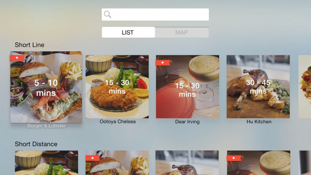
- In “Search” view, users wish to see what’s the distance from the current location to each ideal restaurant.
- Also, either in “Search” view or “Restaurant Info” view, there is no visual to show how many people are waiting in front of you, which makes users hard to make decision to pick a restaurant.
- General question about the app, is the “Restline” function designed to people online (who’s using this app), or people in-store, or people who have got the restaurant already?

