Author: pengpengyu
Stamped (iOS & watch OS)_ Pengpeng and Douglas
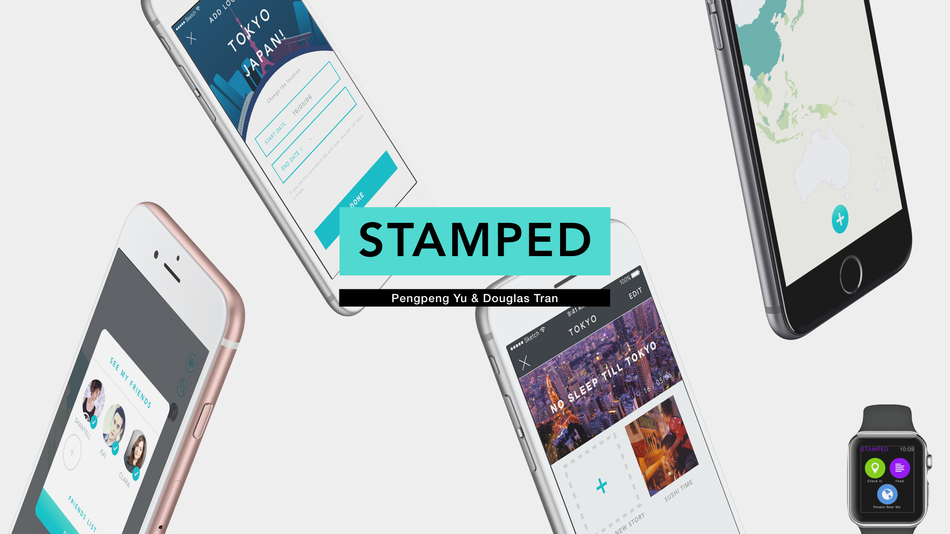
This is our final version of Stamped.
Slides are here: STAMPED PRESENTATION WITH VIDEO
The marvel prototype for iOS is here: https://marvelapp.com/5fiaicg
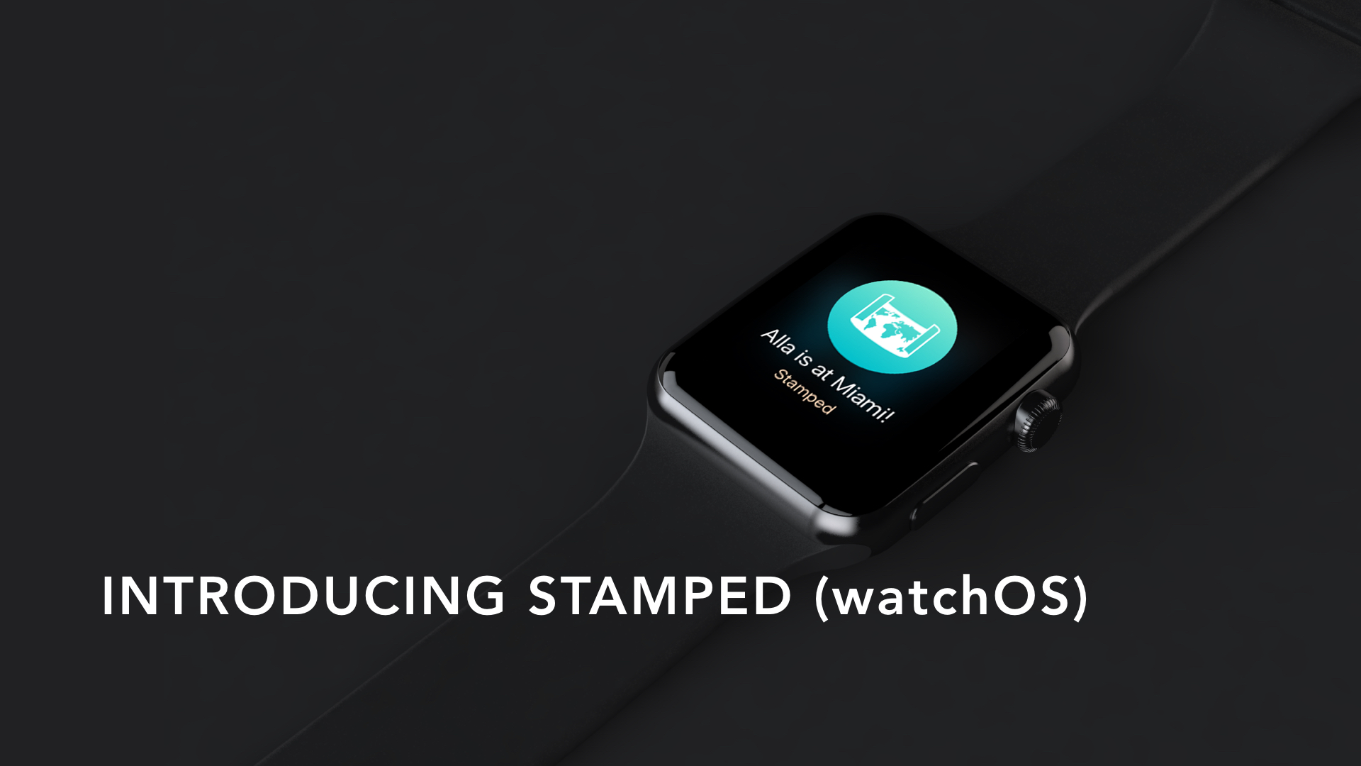
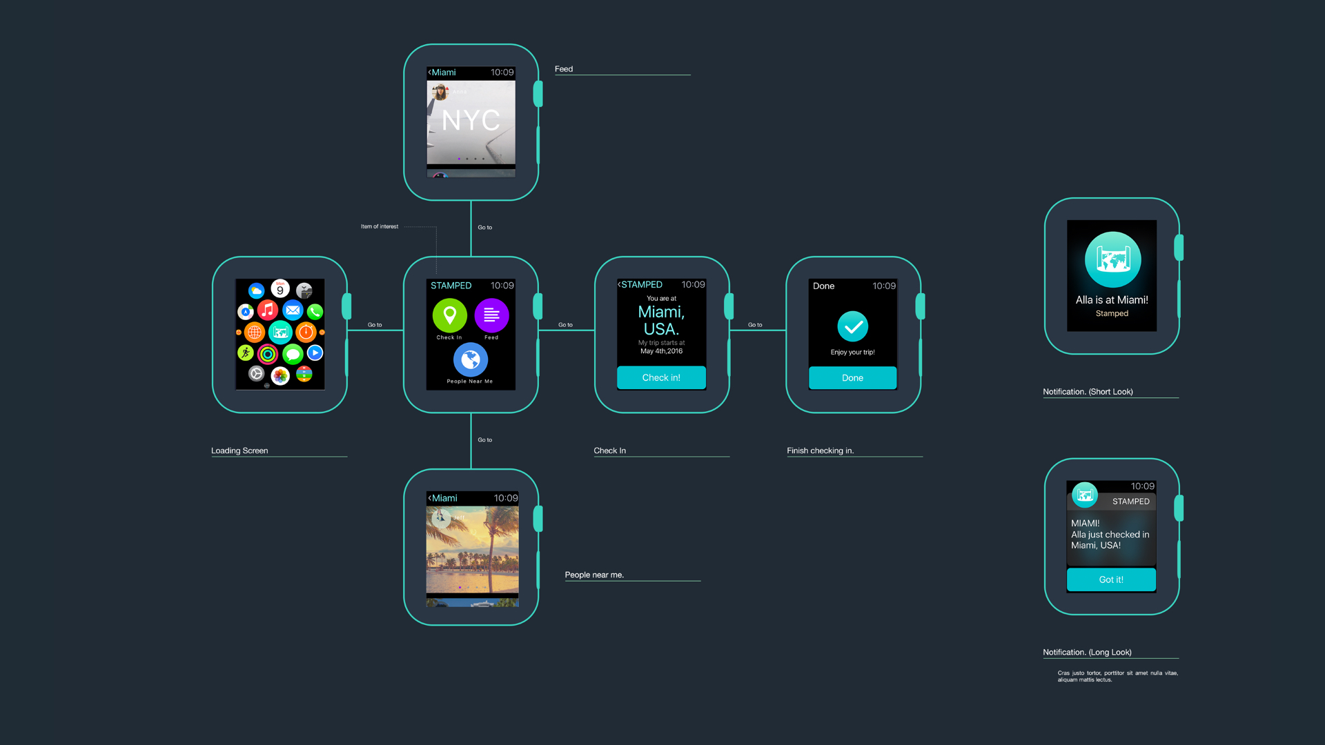
The one for watchOS is here: https://marvelapp.com/ggjhhd
Thank you guys for all the feedback and help!
Pengpeng and Douglas
Douglas and Pengpeng: Stamped
Hi everyone!
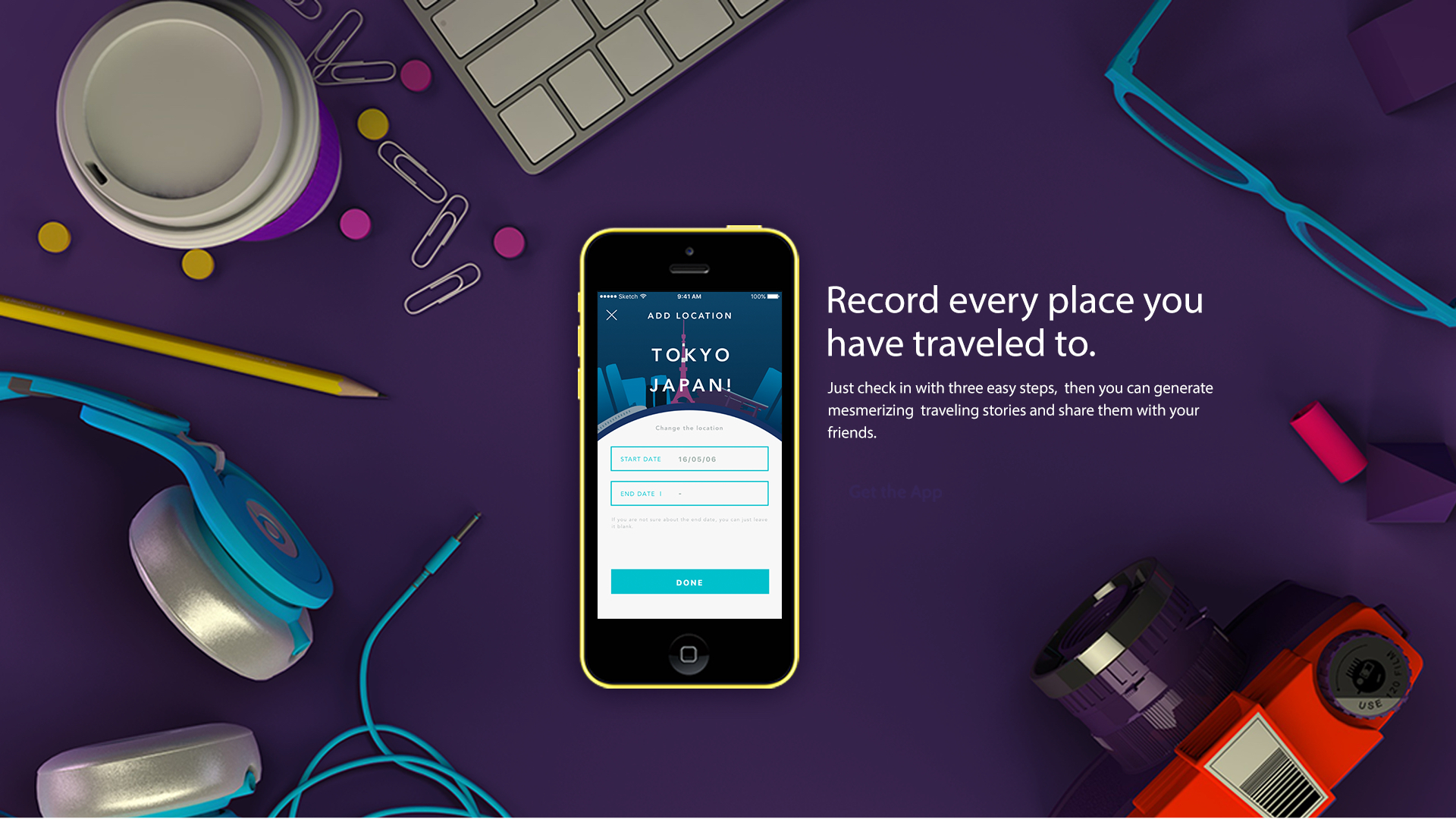
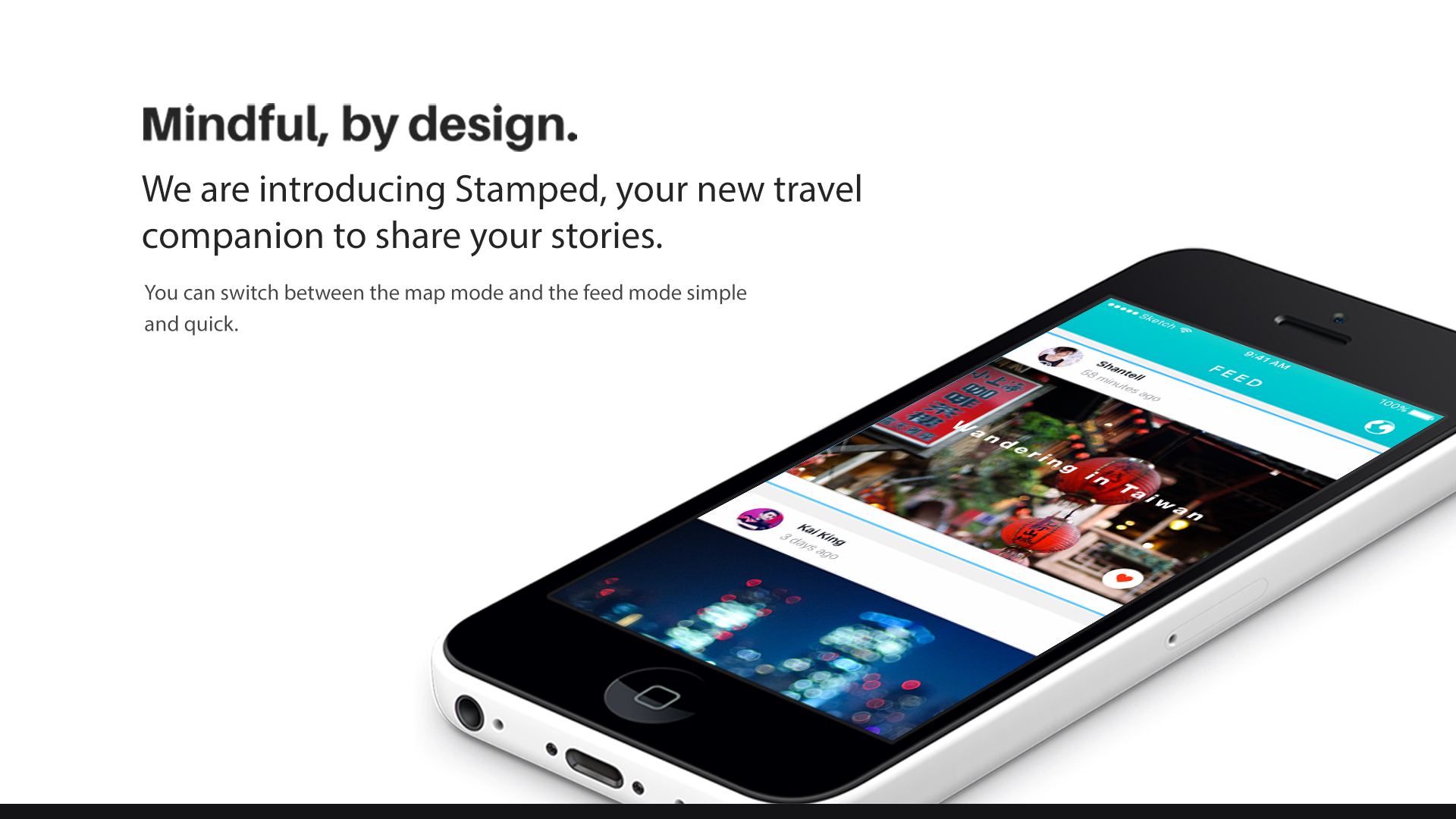
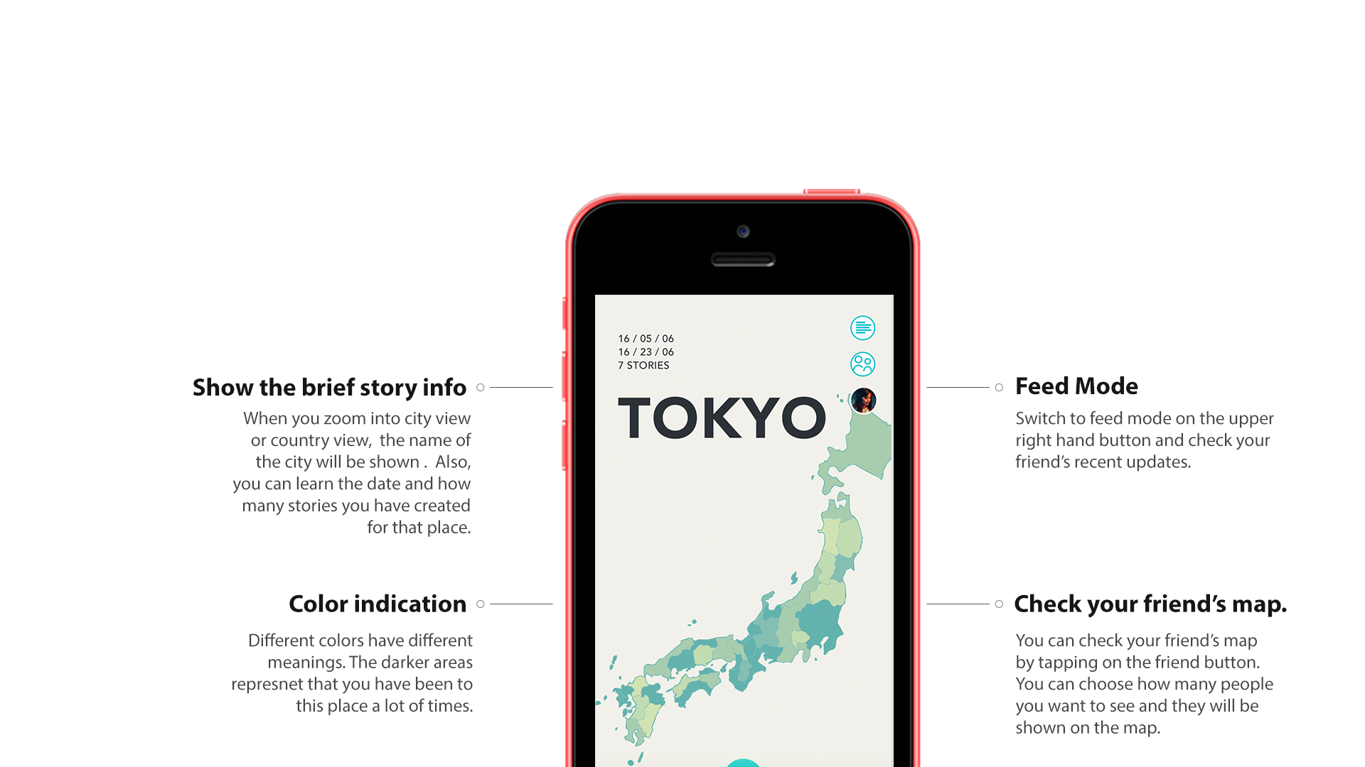
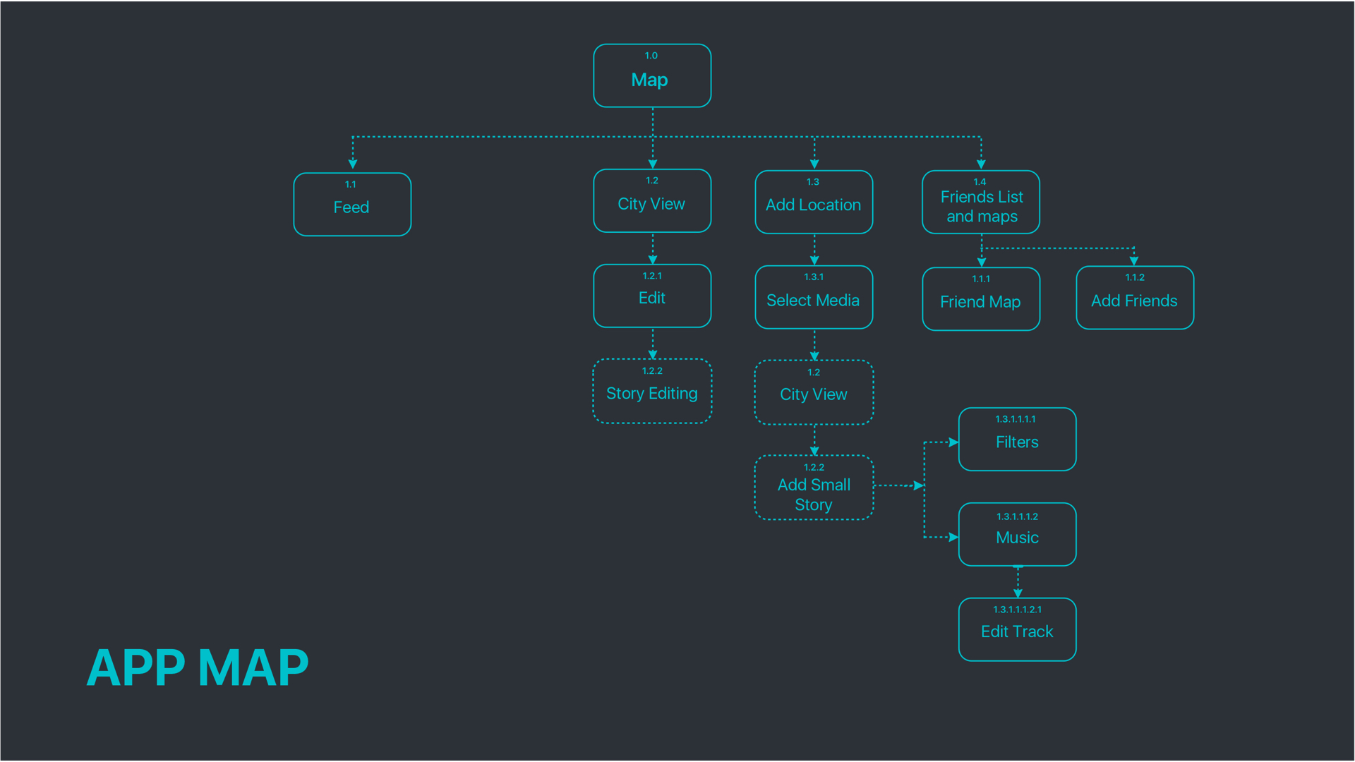
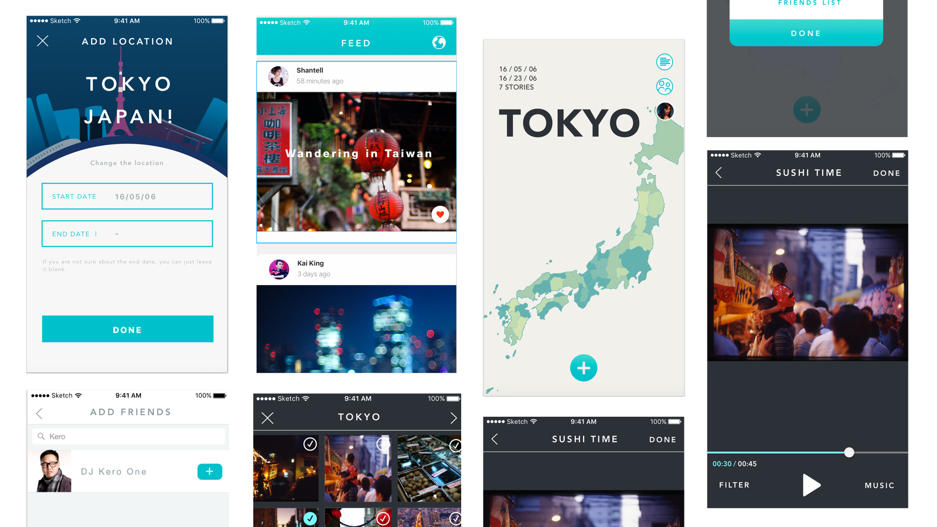
Our app is called Stamped,an iPhone app for travelers that allows them to record all the places they have been to and create stories through their camera photo and video library to evoke wanderlust.
These are our first sketches. Sketches
You can find our wireframes in here: Wireframe Pre
These are things and problems we learned from user tests.
1. For the view of adding locations, what if the user wants to enter a period of time?
2. minimum pictures? what if I just have one? What if I don’t have any? Can I upload them later?
3. The length of the video. What if I choose only 3 photos? How long the video will be? What if I have 100 photos? How long will that be?
4. How to make it simple and light?
5. After editing one small story video, the user got confusing that they don’t know where to tap next. “How can I know that the videos are edited? I can not know if my editing is working. I also do not know I can skip editing.”
6. How to show the friends that have been to this city? How to show the number? What if there are 30 of my friends have been to London? Will there be a list?
7. How to teach users the difference between big story and small story?
#thursdayplay Rusty Lake Hotel
Hi guys! I just found a nice puzzle game called Rusty Lake Hotel. If you enjoy puzzle games and detective stories like me, you definitely should try this one!
The game tells a weird story that five guests visits the Rusty Lake Hotel. The player is the waiter of the hotel. Every night, you need to solve puzzles to find tools and ways to kill one guest so that other guests can have meat to eat the next day. The style is beautiful too!


Pengpeng
Food Story (tvOS)
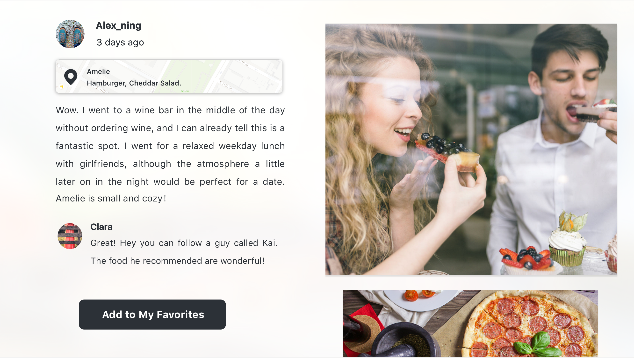
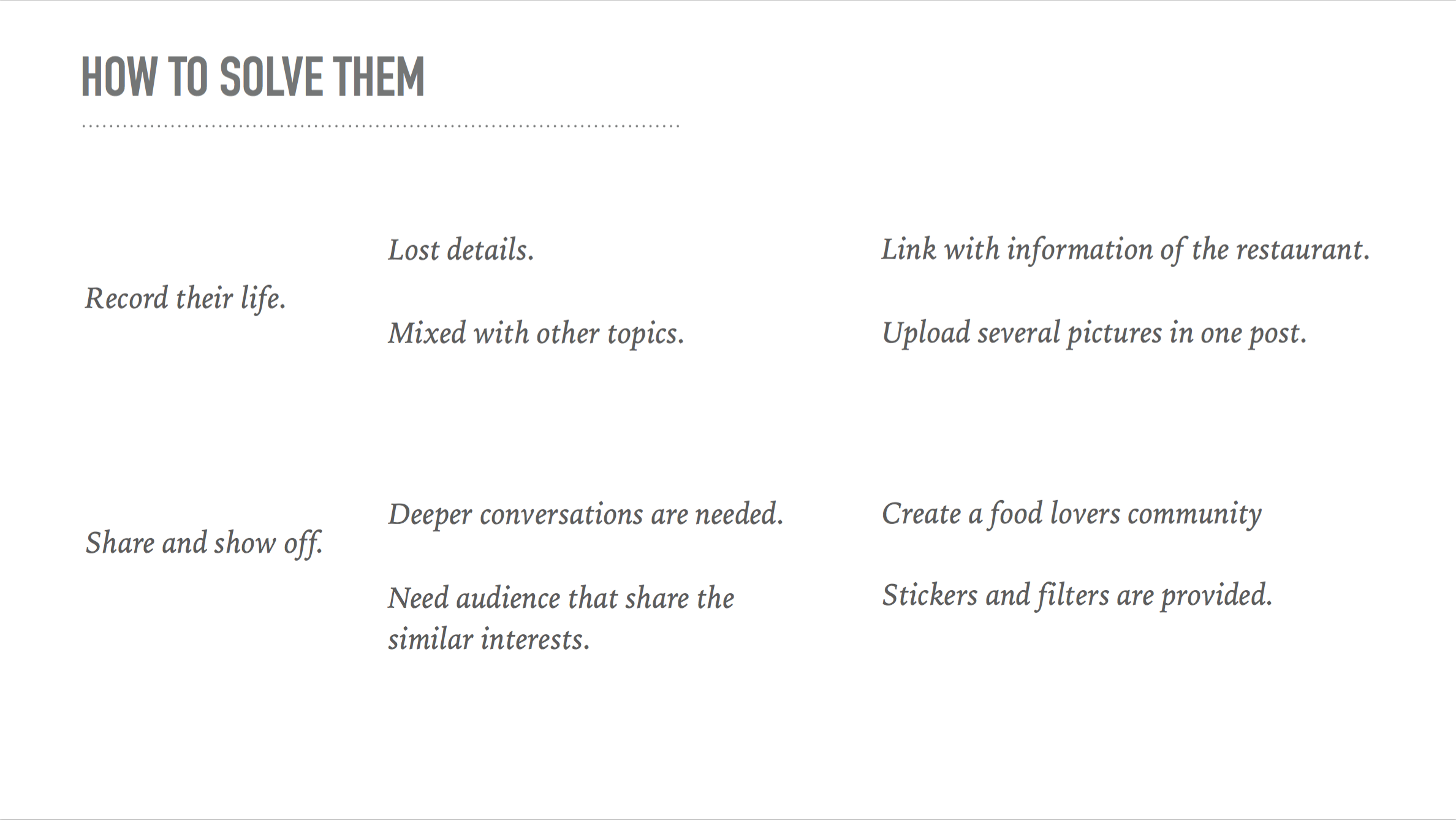
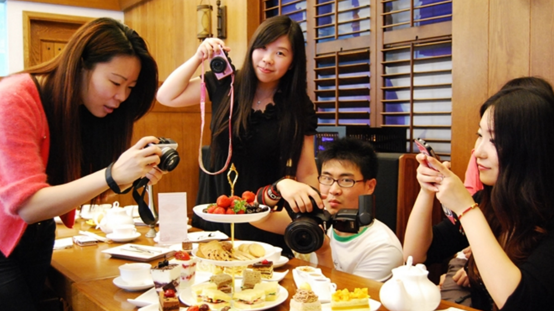
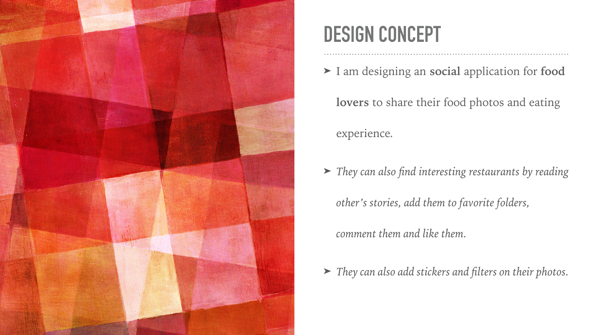
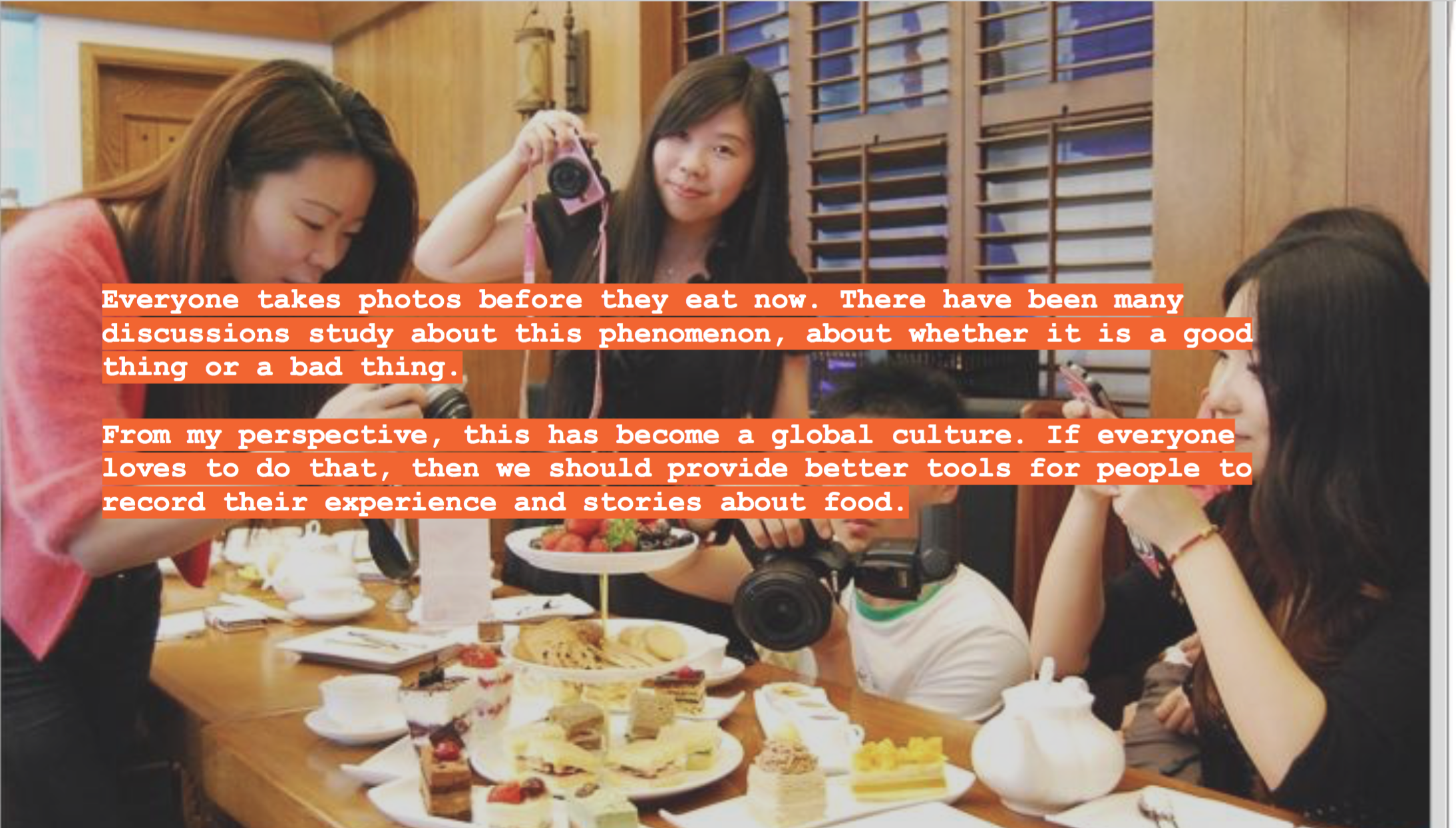
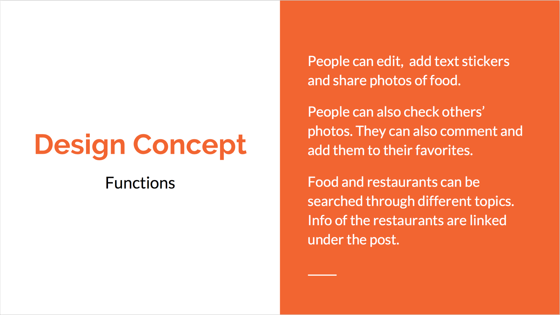
Food Story, a social platform where you can share your food eating experience and stories. You can also find interesting restaurants and dishes through other people ‘s stories.
As I mentioned in my presentation last time, the main scenarios for the tvOS version are:
- Families are sitting together in the living room, sharing each other’s eating experiences.
- Families are discussing about where to eat.
- One person looks through the feeds quickly to pass the time.
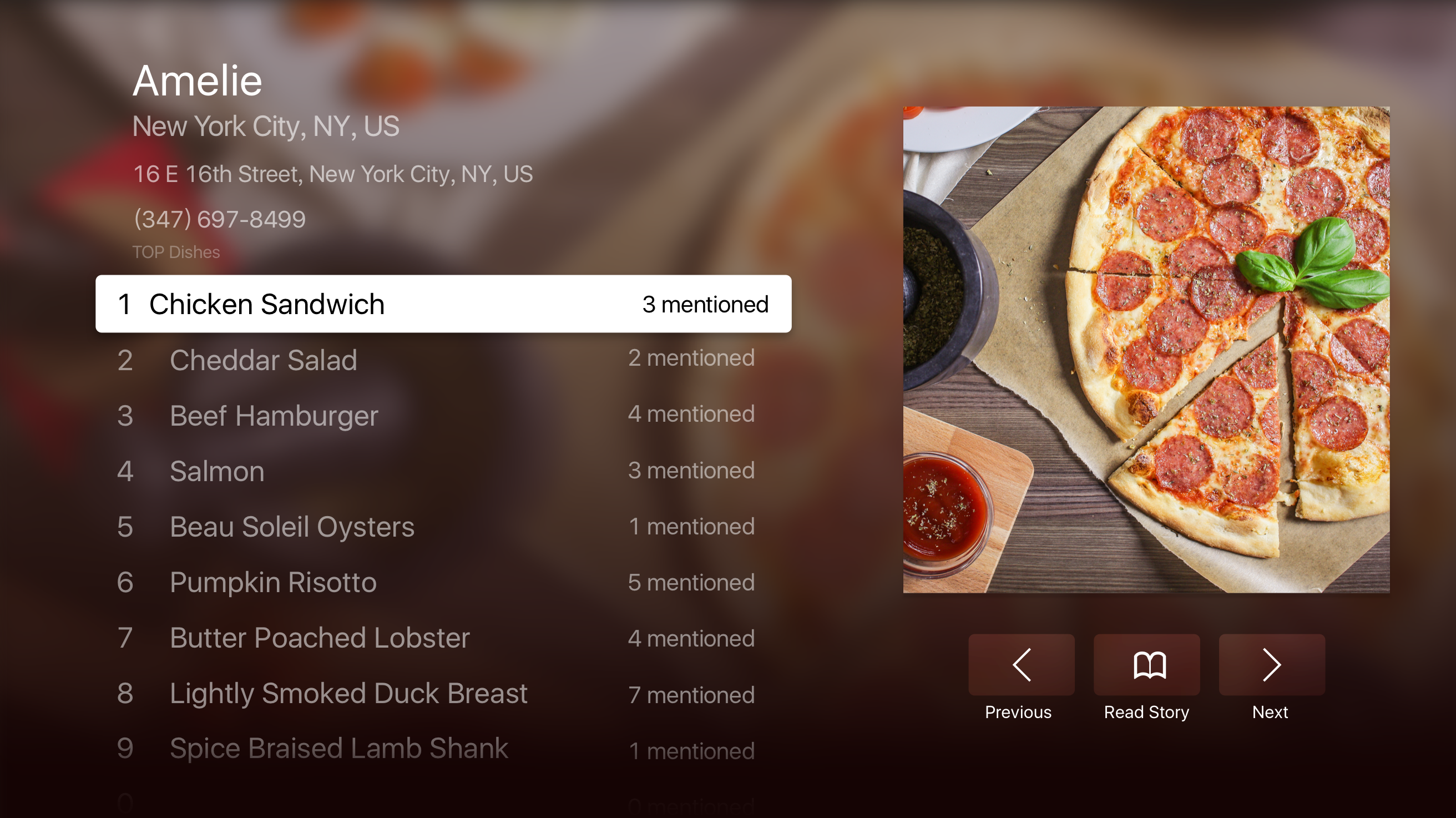
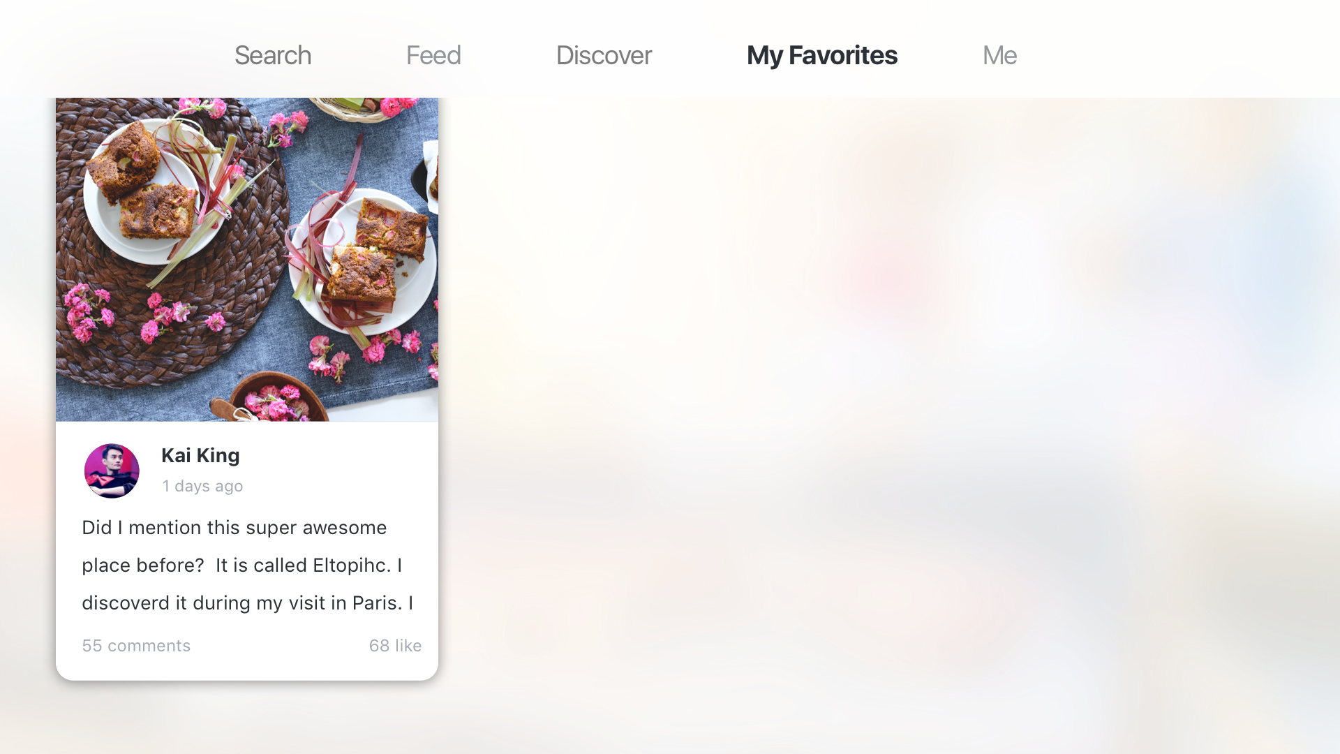
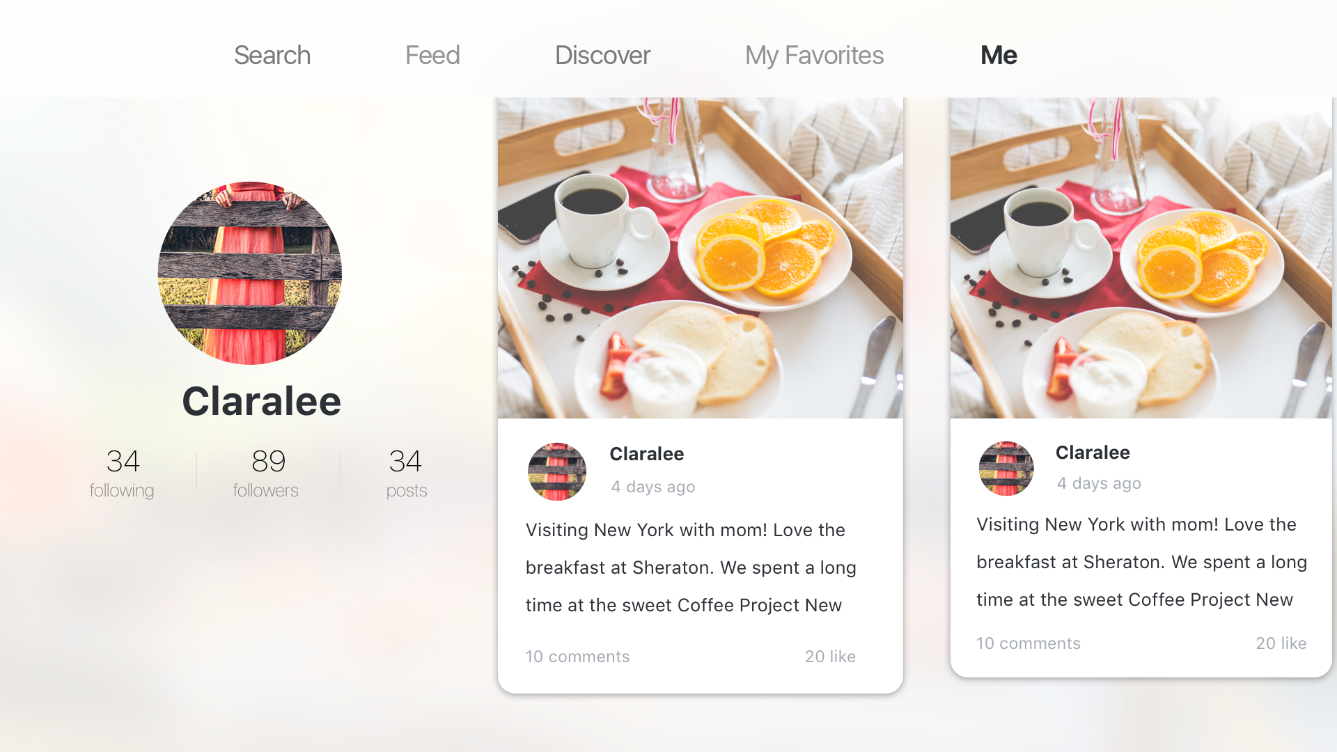
Considering the special scenarios and the features of a TV, I cut off the social functions including comments, like, and following. I also raise the level of “My favorites”, which plays an important part during the sharing process.
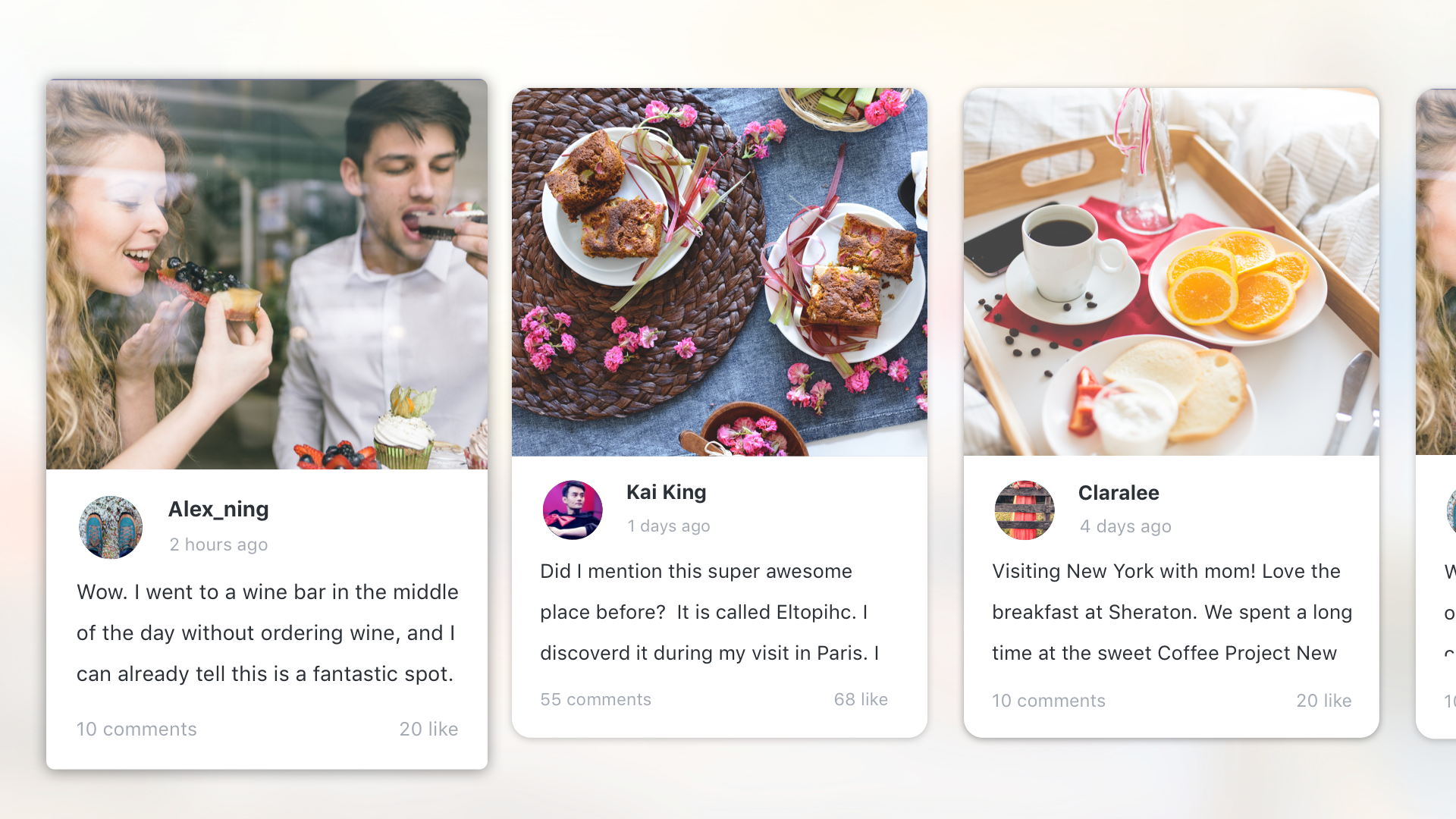
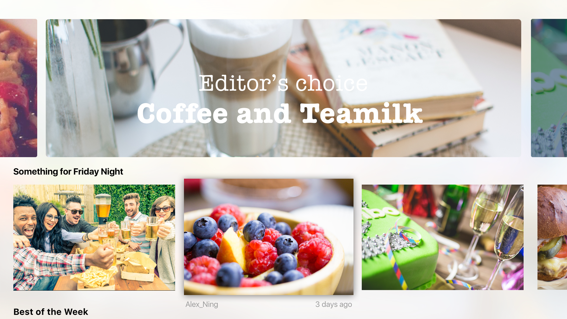
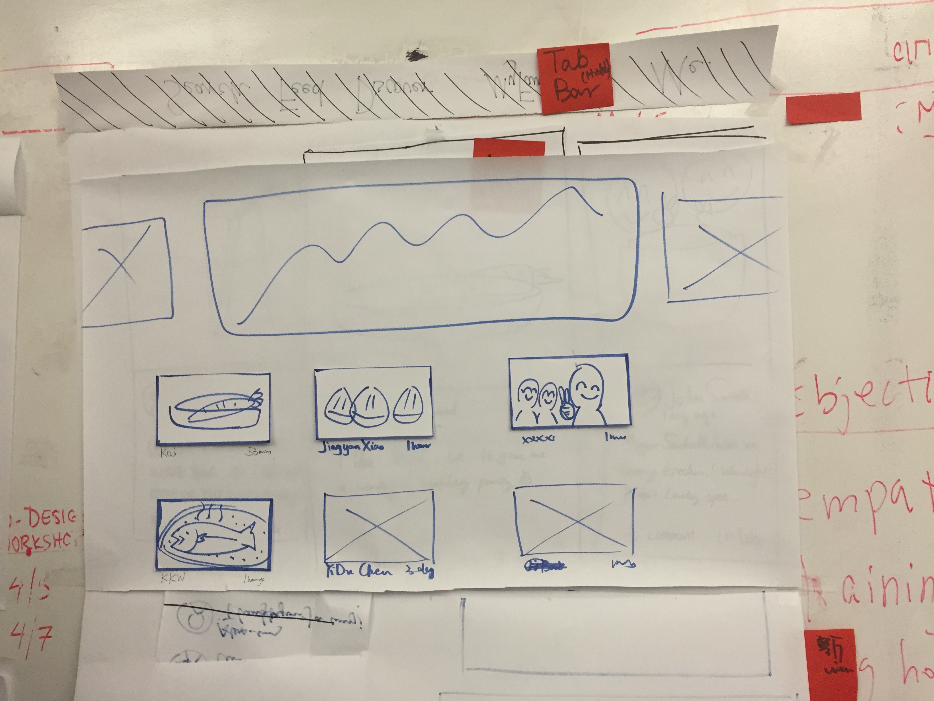
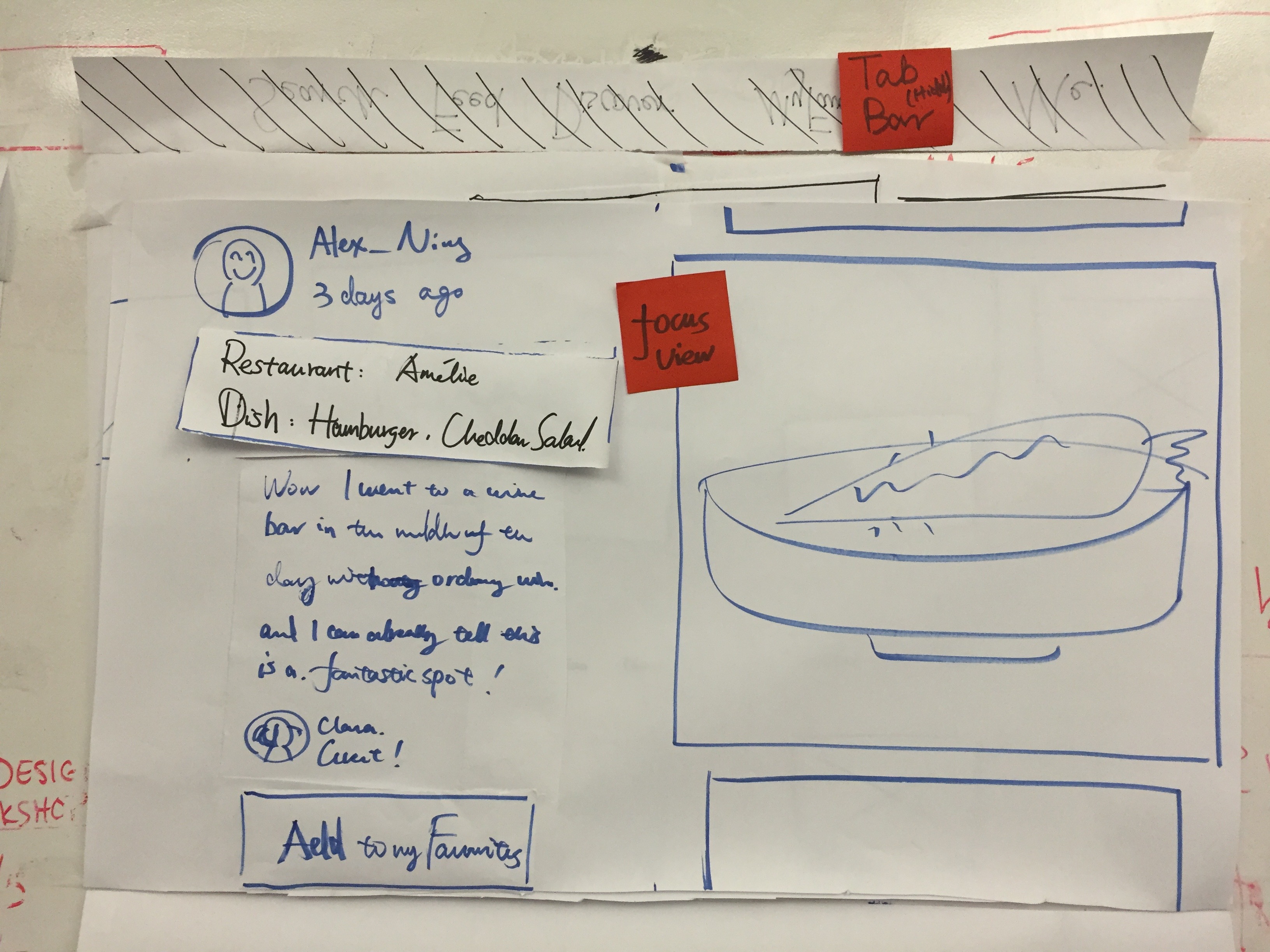
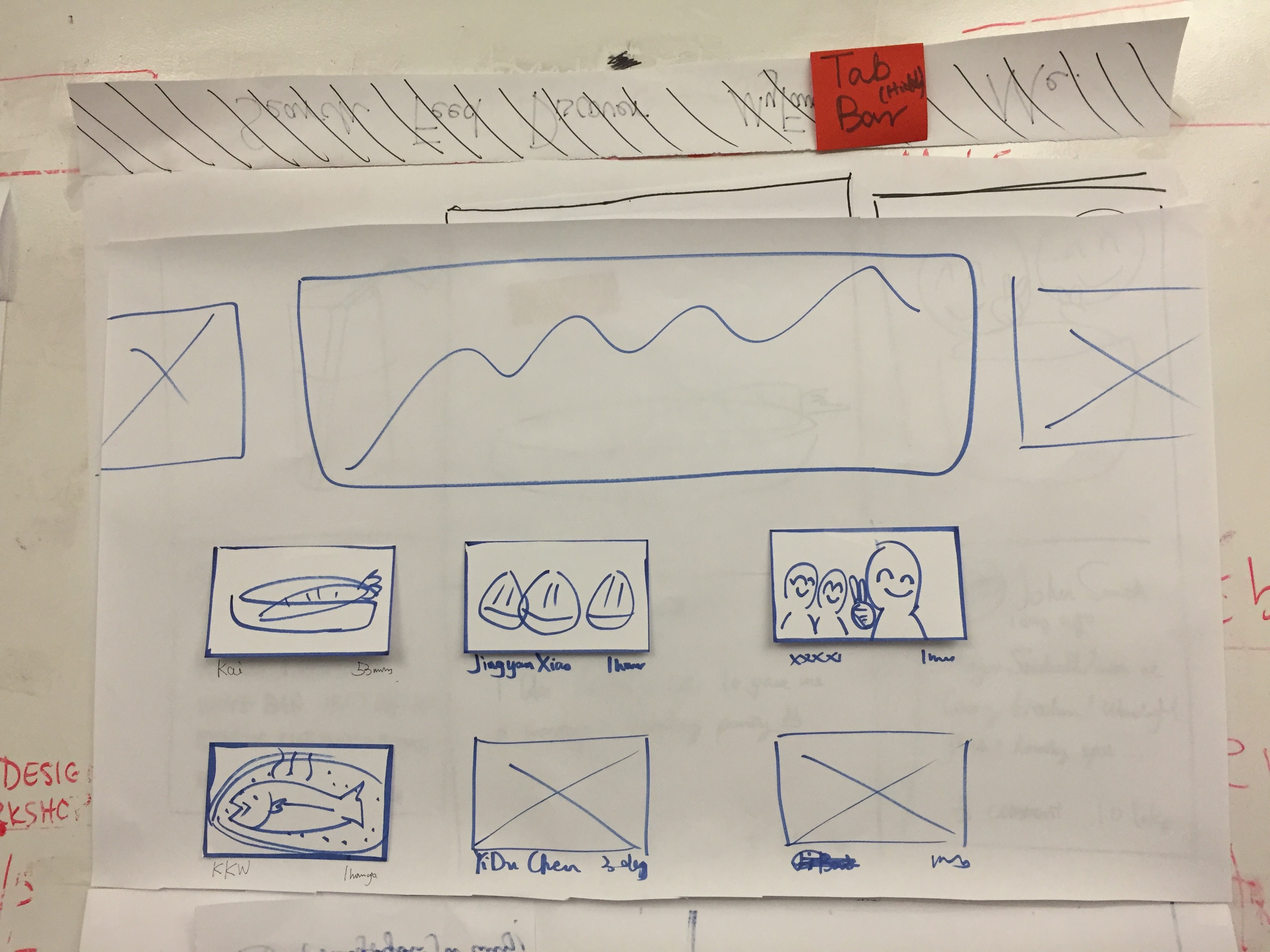
There are also lots of design considerations for “feed” and “popular”. Feed is the place you can see stories posted by the people you follow, which means that the one who posts it matters. So I designed it in a card shape, which you can know the stories, the photos and the person at a glance. “Popular” is the place you can see stories that are very quality, and have lots of comments and likes, like the editor’s choice. For stories like these, you care more about the content than the person who post it. Also, stories like that usually have good pictures, which are very attractive to users. So the stories in “popular” section are shown in just pictures. When you focus on the story, you can learn about the people and the date.
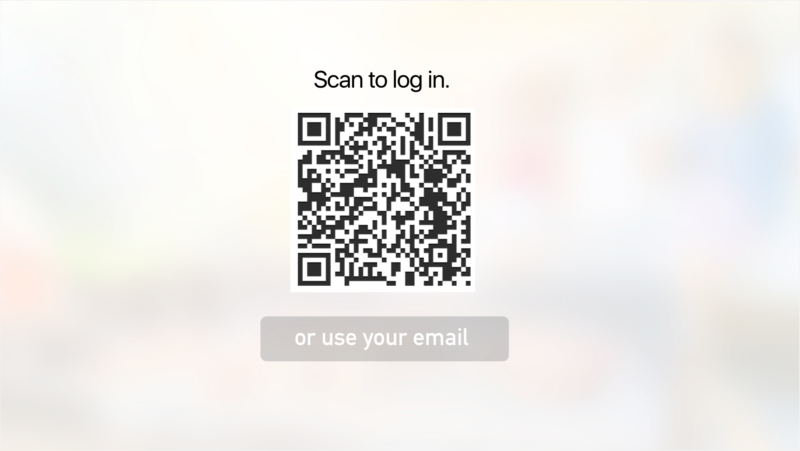
I encourage my users to use it not only on TV but also on their phone. And I think that it is very annoying to open my safari, type in the address (what if the user is aged and hates typing!) and also type the code. So I use the QR code to sign in. The TV will show you a big QR code, and you can just simply open the app on your phone and scan it. This method of signing in is accepted and very popular in China. Thanks to Wechat, Chinese people are used to scanning almost every QR code they see. However, I realized people in America may have different habits. So I will test more on that.
You can try out the prototype here: https://marvelapp.com/hfcacb
Food Story_version 2.0
Hi guys, sorry I forgot to post this. It was left in the draft box.
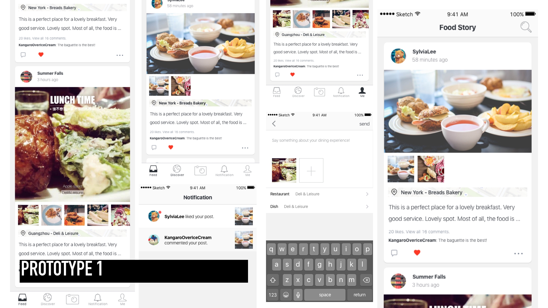
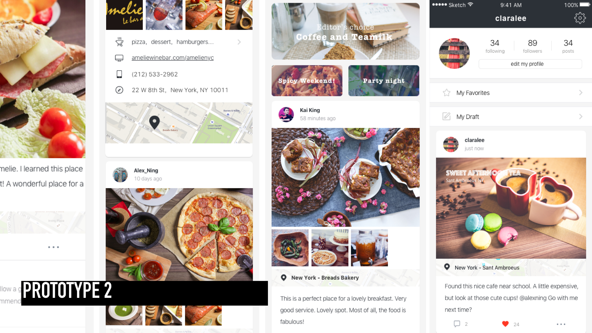
This is the second version of Food Story. Learning from the feedback of the first version (the wireframe), I adjusted the user flow and worked on the visual design.
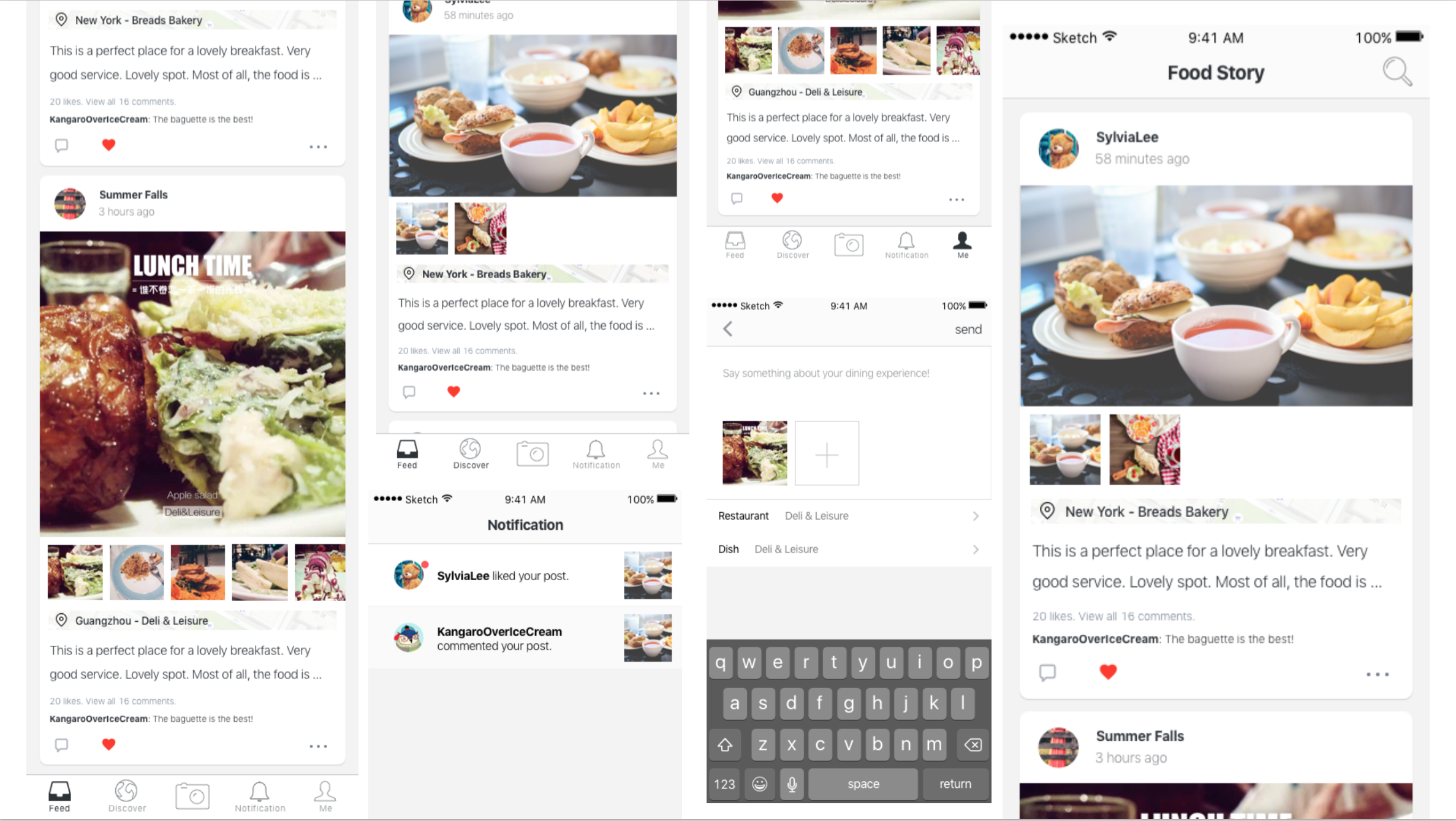
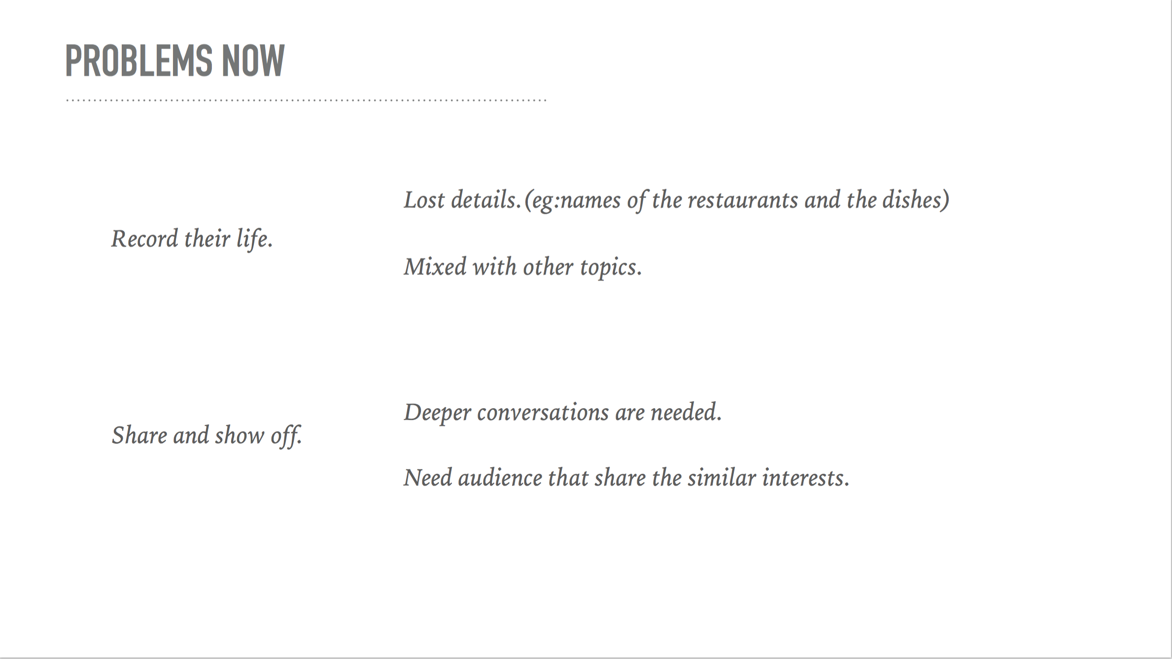
Got great feedback from the class. This is what I learned from the user test.
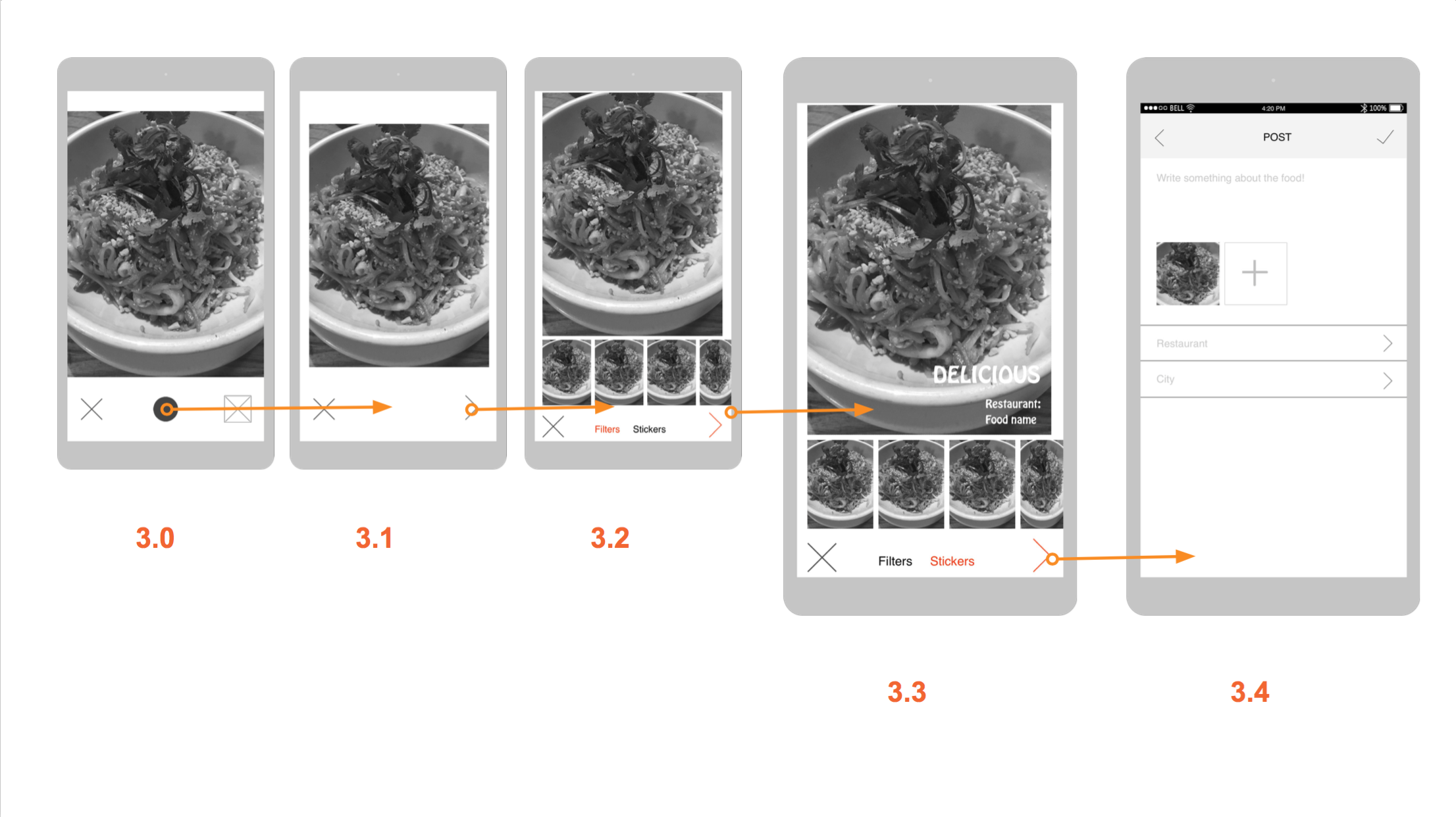
1 . It takes so many steps to add restaurant&dishes informations. Considering the possible scenarios, I will add a function of “draft box” for users to save the stories later. Also I tried to cut down unnecessary steps.
2. There is too much things going on the feed page. A better visual layout is needed because the users don’t know where is more important.
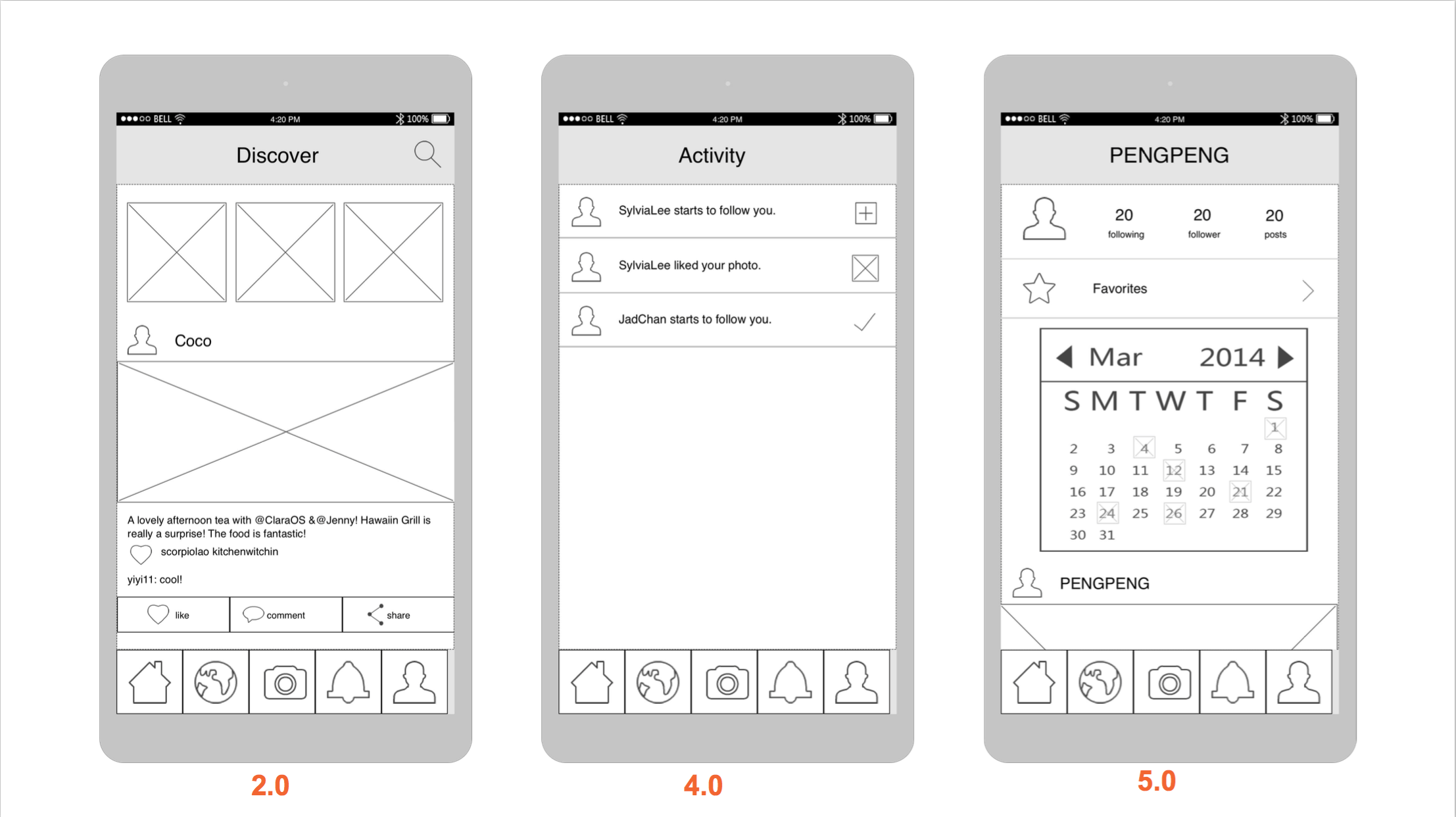
3. Users are confusing about the difference between the “feed” and “discover”. The feed is for the stories that I followed. And the “discover” is for the stories that are very popular. Partly because I used the exactly the same view for both tabs. So I need to design a new view for the “discover”
4. Users are also confusing about the calendar in the “me ” view. The calendar is designed for a clear view to show which day did the user post their stories. Testing reveals that users care little about it. This function will be cut off.
For this version, you can try the prototype below. Please feel to leave comments here about your experience exploring it. https://marvelapp.com/4db87c6
Pengpeng
Food Story( tvOS)
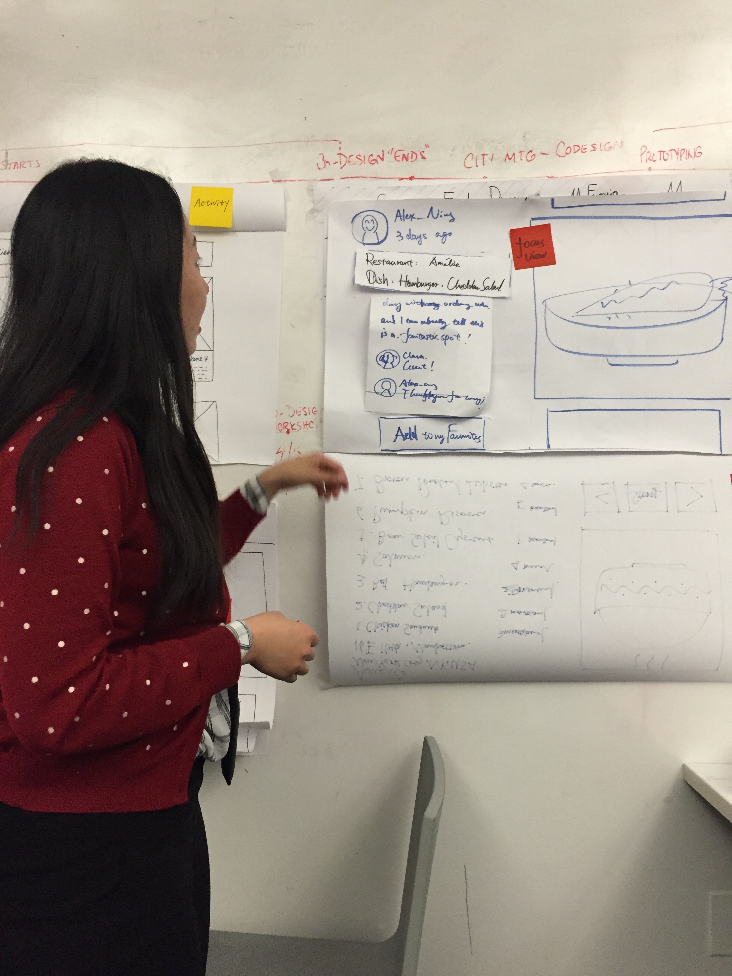
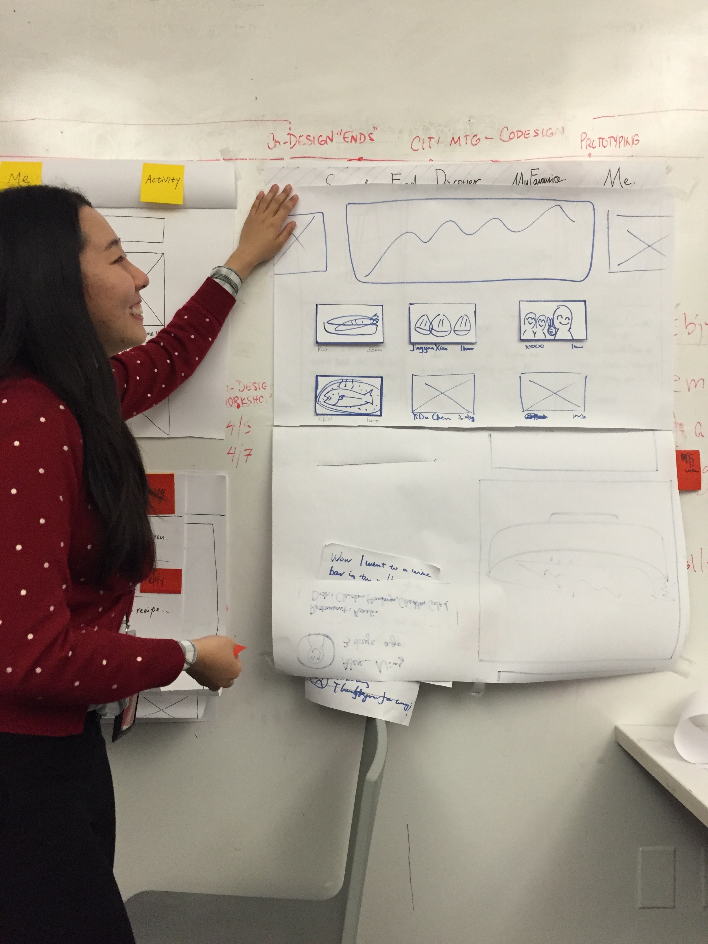
Hey everyone, this my wireframes for Food Story (tvOS).
Pengpeng
This is an update for the paper prototype.
User insights:
- The users and I have discussions about “feed”,”discover” and “my favorities”. They all have similar views. Although their functions are clearly different and their scenarios are different, I can see confusion from users’ eyes. After carefully thinking about the scenarios and the features of the tvOS, I combined the “feed” and the “discover” together.
- One user mentioned that she preferred to add to her favorites at the restaurant view instead of the story view. And she had a very good reason that she paid more attention on the restaurant than the story. This conversation reveals another type of the users who focus more on the the restaurant. Although the platform is about stories, it is also very important to provide tools for people to add the restaurant into their folders, which actually fit the scenarios.
- One of the users felt upset about the locked social functions. For the recent experience with apple TV, which it is still very difficult to type on, social functions are less necessary.
Project1 final: Food Stories
Tengami #thursdayplays
Tengami is a very elegant puzzle game with a beautiful Japanese style. The whole scene is a crafted pop-up book. You need to solve puzzles to move on, and during the process, you can experience stories and mystery.
Every screenshots is as beautiful as a painting!


Well, maybe some puzzles are a little too difficult and I need to find solutions online. But over all, it is a perfect experience!
Project 1: Food Story
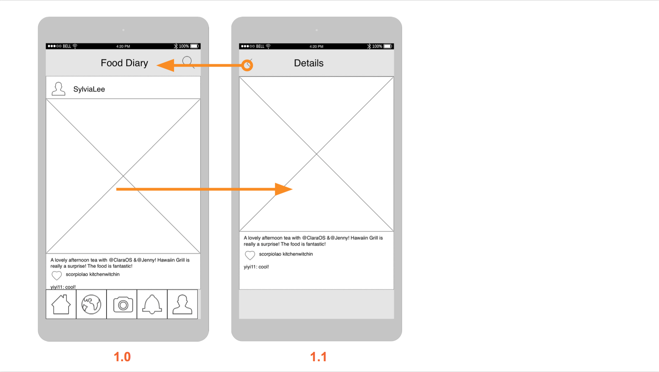
Food Story_wireframes_MobileMedia
Pengpeng Yu
Thank you guys for the feedback, this is an update for the user insights learning from the paper prototype.
- The name of the tab is very important. And so it the icon. Testing with users, I found out that some of them can not fully understand all these icons. So I will add text under it.
- Though I want to link the restaurant info onto the story, it is not shown in this prototype. The content and the format are both needed to consider about.
- It is important to use the correct icon in the paper prototype. I used a circle to represent the icon of taking photos, which made the user confused.
- Users are confused about how to add the story into their favorites. And talking with them, I found out the share button is relatively useless in the possible contexts. So I will move it into the detail page.
