Thursday App

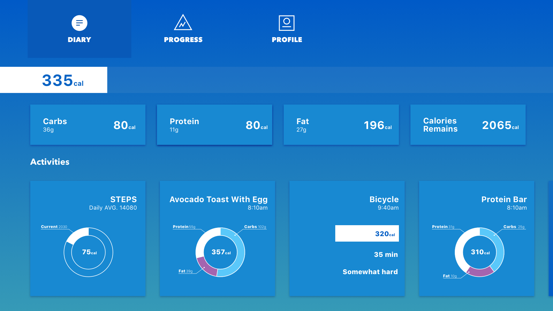
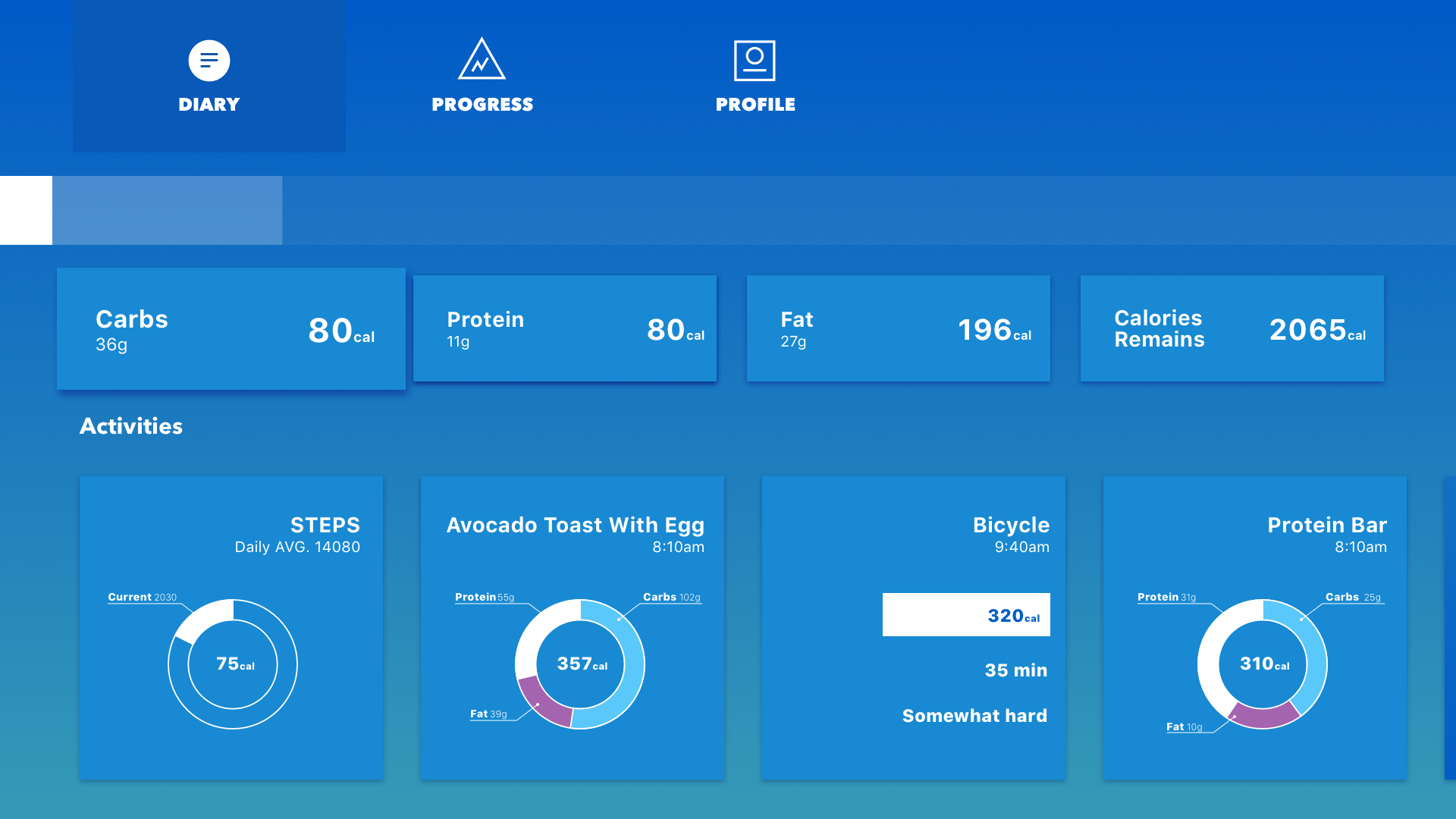
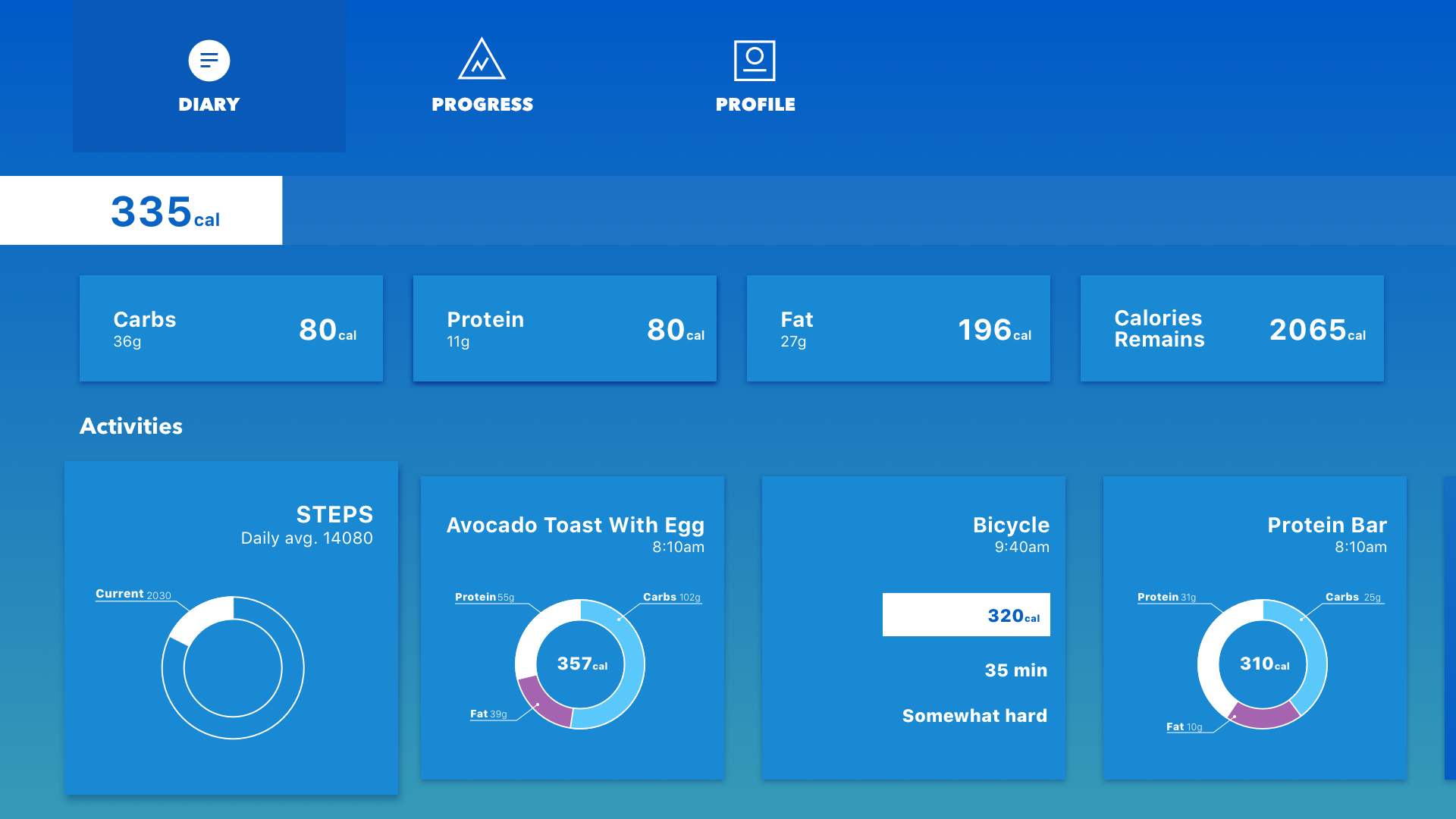
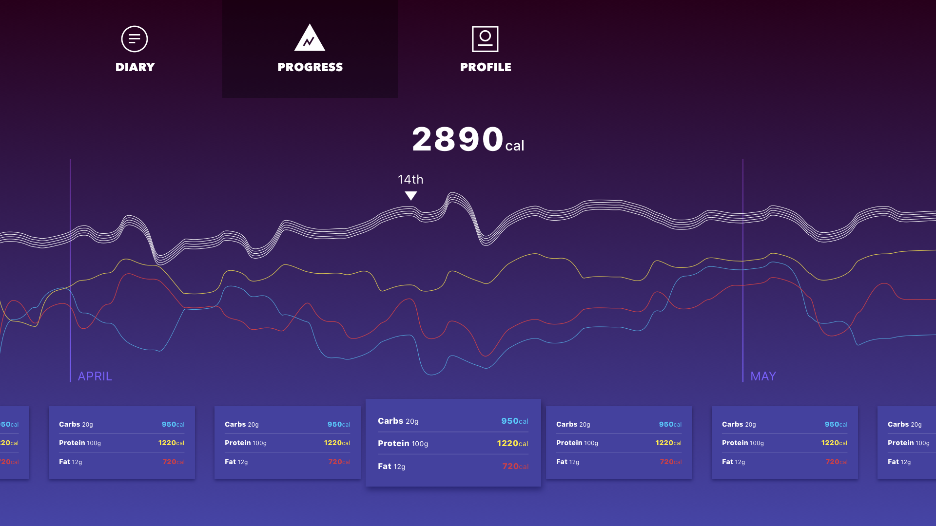
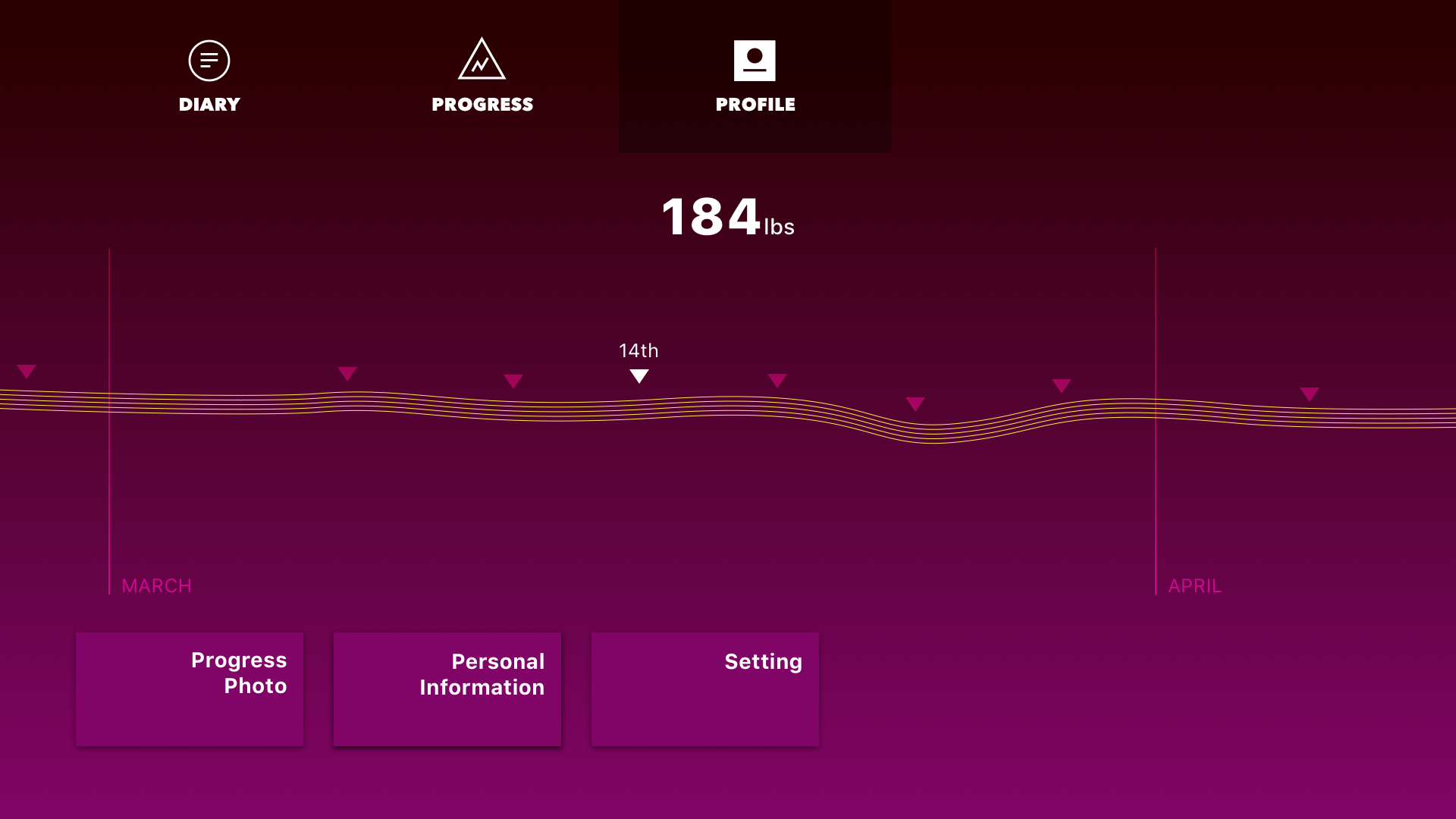
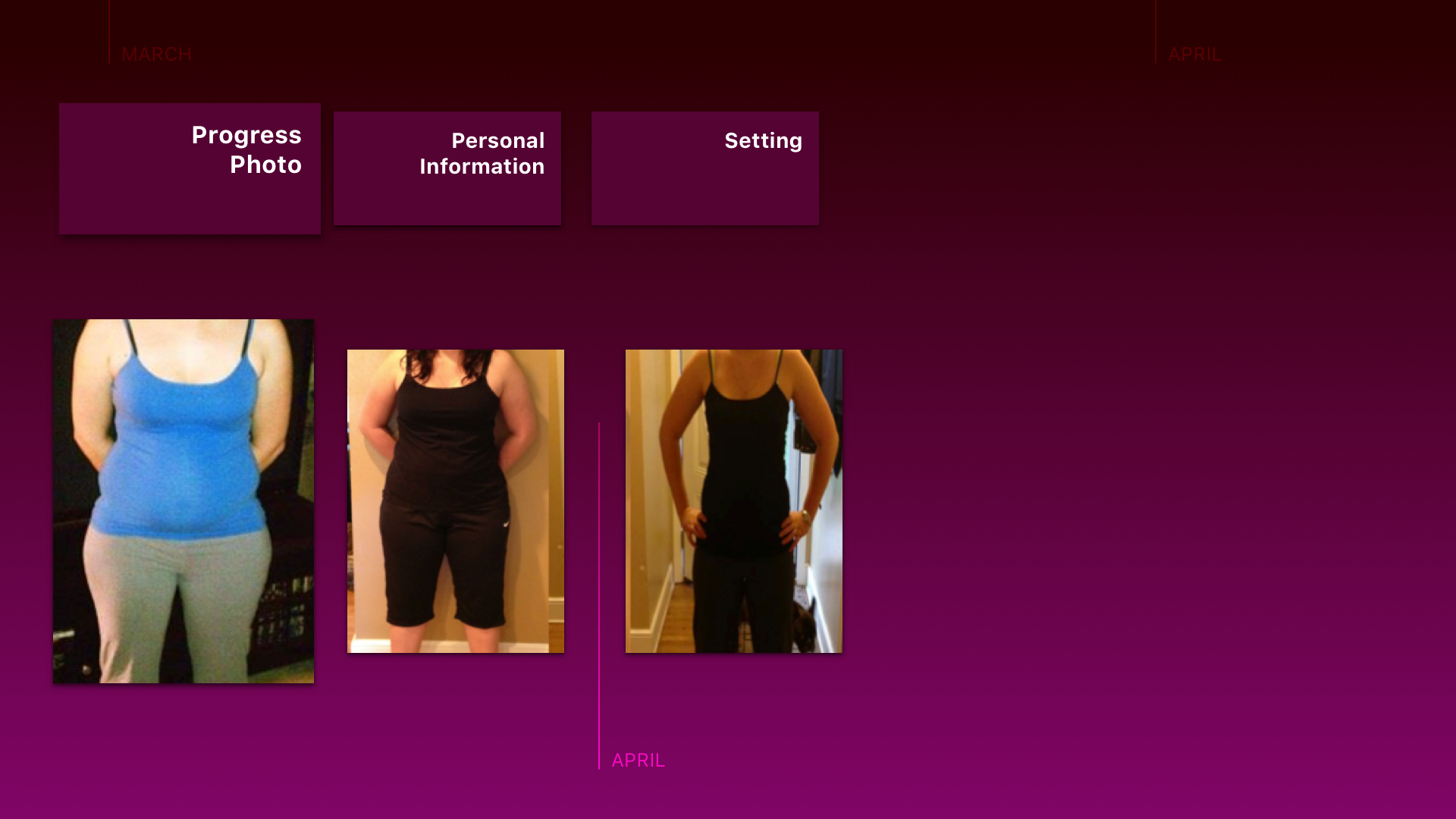
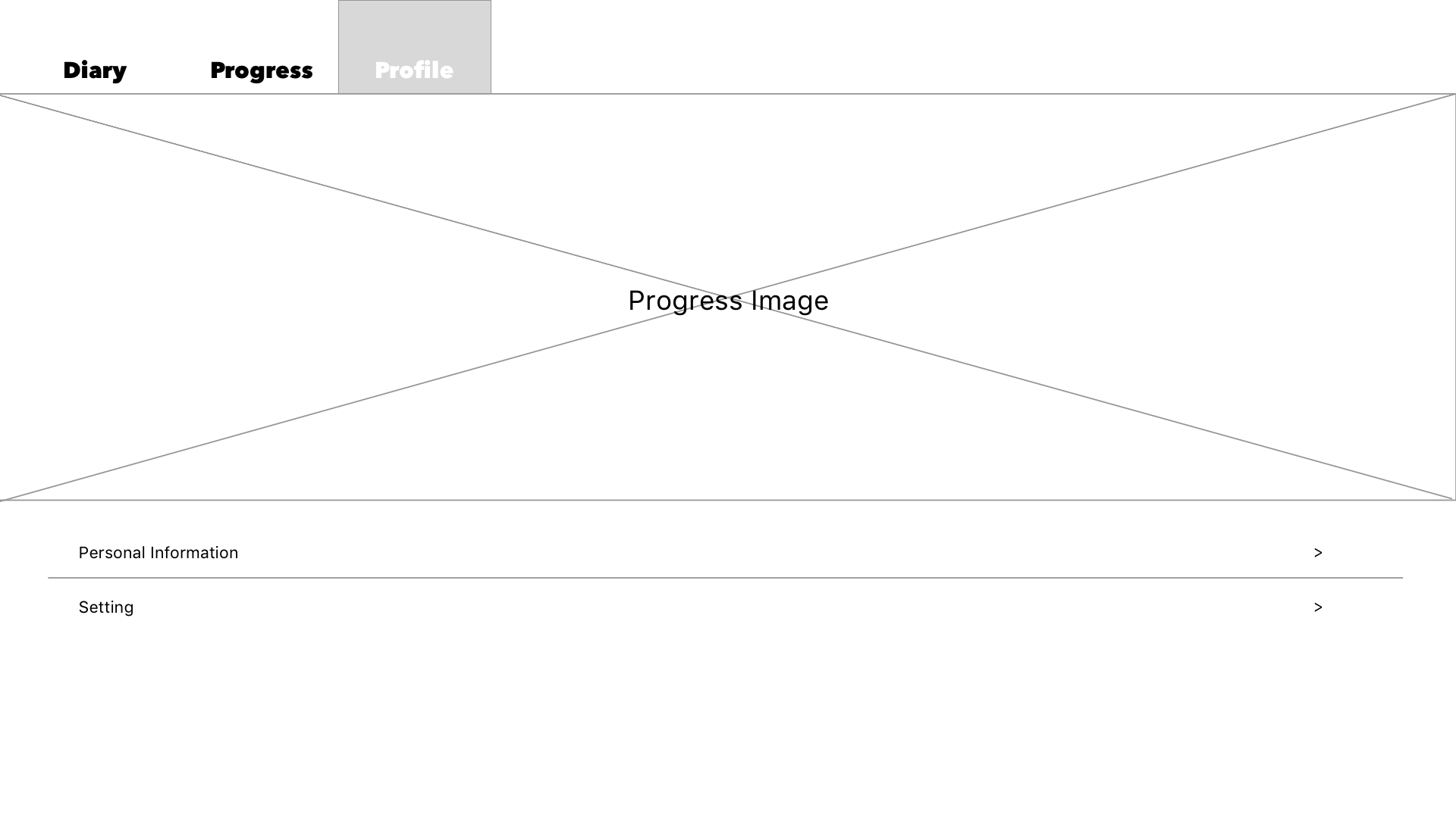
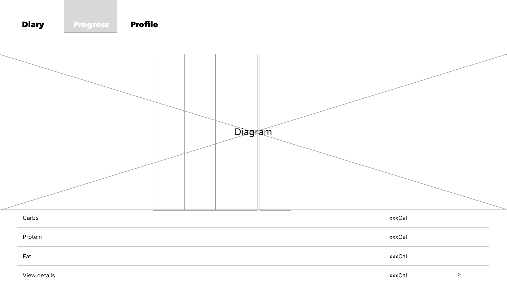
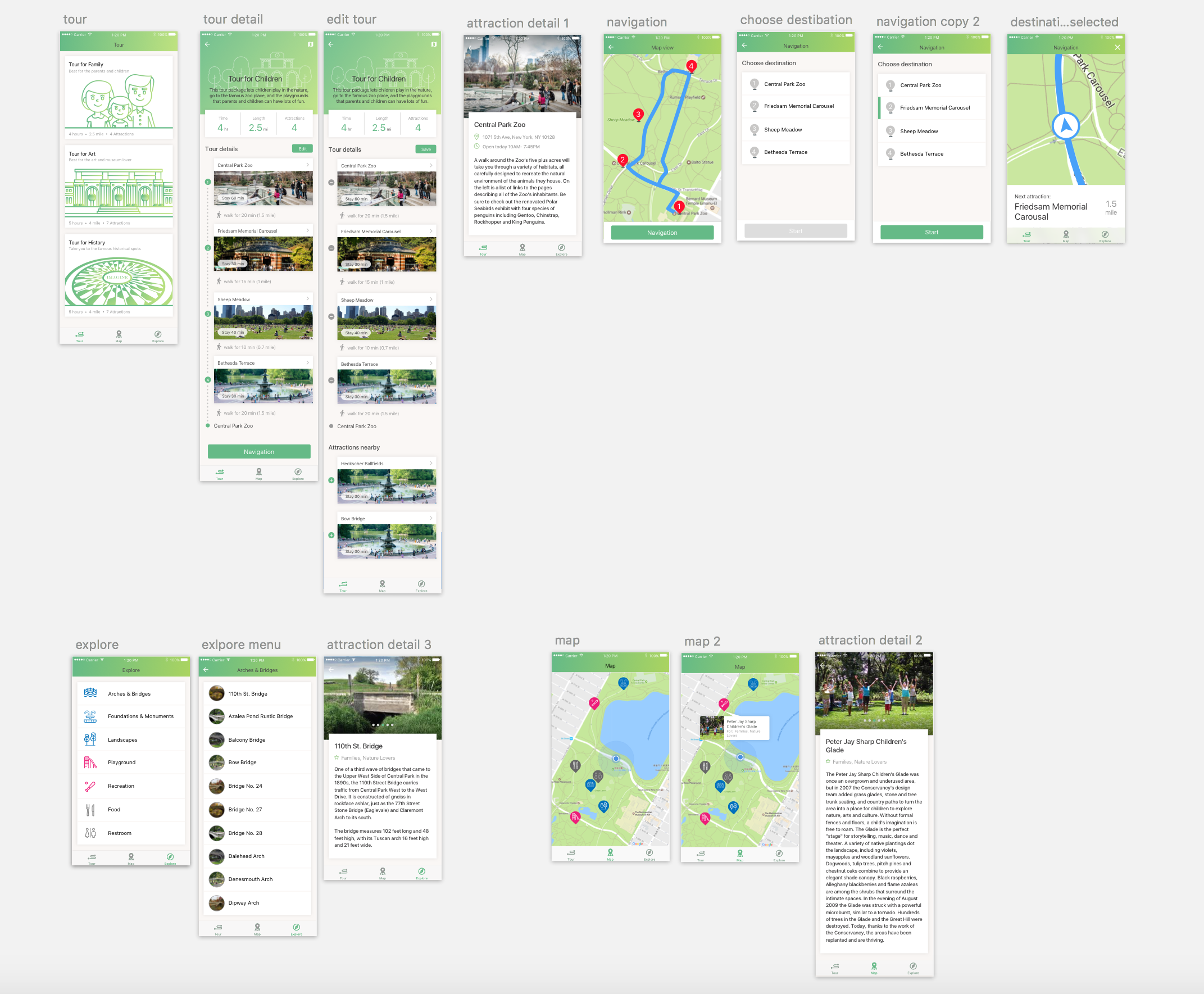
The app I want to introduce is Ada. It is a personal health companion that uses AI and machine learning to help people to understand and manage their health. Designed by a team of 100 doctors, data scientists and engineers, Ada helps audiences access to high quality, personalised health information and care.  It provides earlier health information and informing clinical decision making. The most interesting aspect of this app is the dynamic UI, which the UI component will be changed followed by the content & intent. 

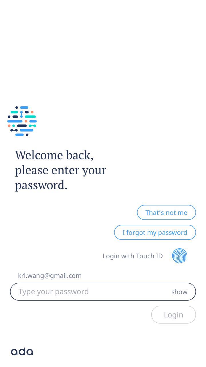
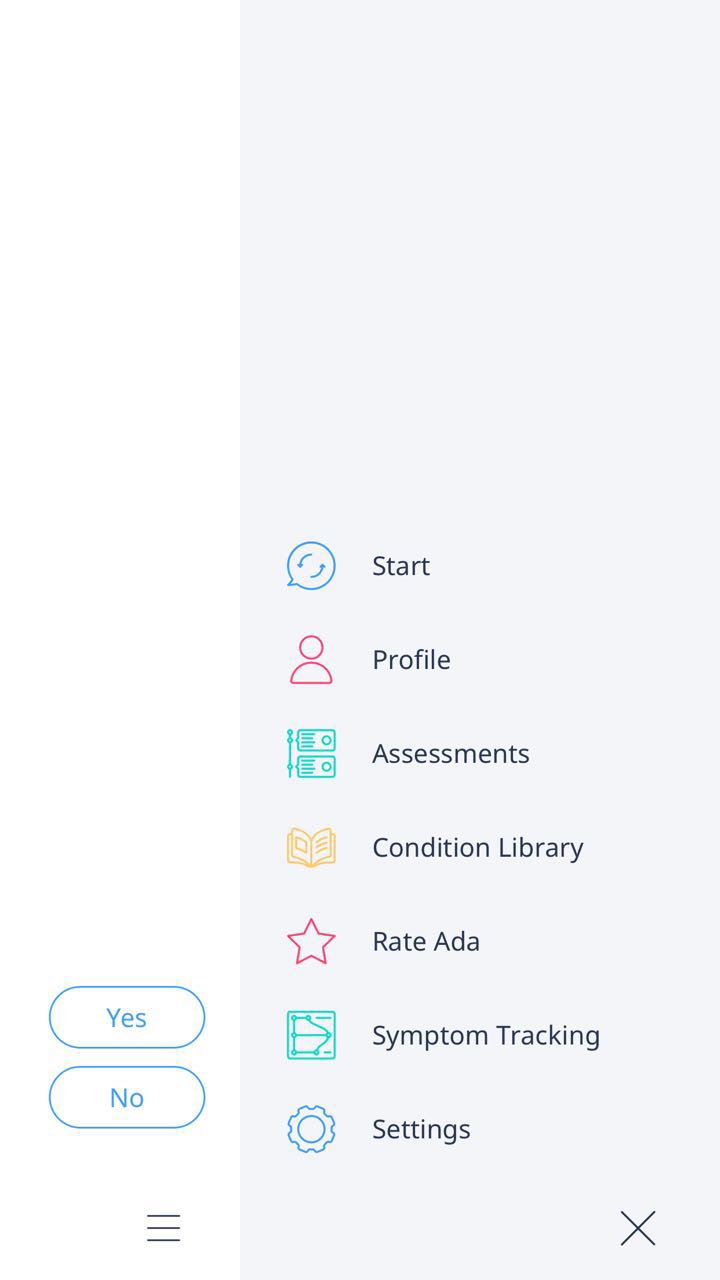
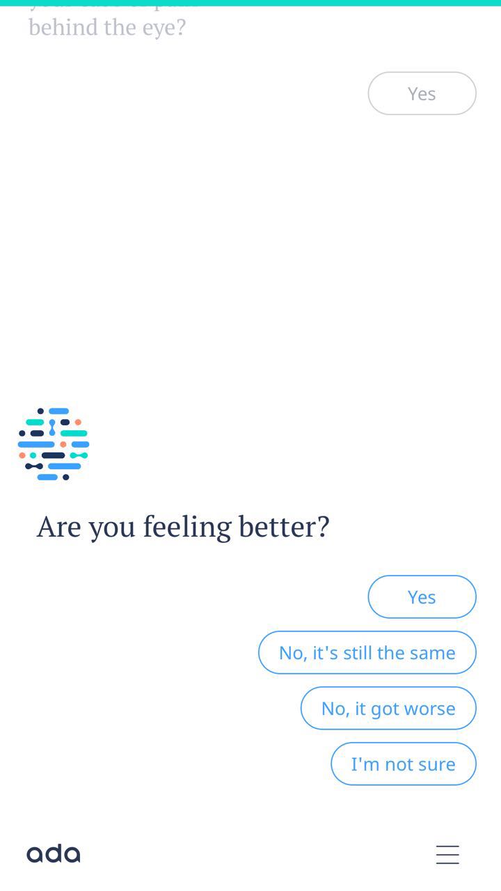
It makes me rethink the UI design of next generation. The whole UI layout will not need to be designed based on each page. The only thing design need to make sure is the UI component must to consistent to the context, so users will have the expectation of the UI.

Central Park App_ Final Iteration_ Elly, Rosa

Concept

We are designing an app for Central Park which have the tour packages that can help people to explore the Central Park in different routes. For the app on iPhone, the three main pages are tour package page, explore page, and map page. On the other hand, for the apple watch add on, we focus on the function of navigation.

Main Functions

  • Choice on tour packages
  • Customize your own route
  • Introductions of the place
  • Central park map
  • Explore new place
  • Navigation

Scenario


Final Design

Three things we have changed:

  1. In apple watch, we put a DONE button instead of push over.
  2. In apple watch, when start navigation, we show the place “Central Park Reservoir”.
  3. In iphone, we fix minor graphic design and layout.


ThursdayApp_Liang

Mend-Breakup Trainer

Mend is an app targeting those who need help to recover from a breakup. It is creating an experience that feeling like a friend helping you through your breakup.

  • It features a conversational interface which can guide users through the Mending journey
  • The app offers an everyday audio guide to help the user get through.
  • Each day the user can get a task to do in the app such as writing. The app also asks the user to check in their emotional situation every day.
  • The app tracks the data like days since breakup and days since last EX contact.
  • The user can find much relevant advice and many stories as well.
  • The look and feel is very calming!

Central Park App_ Elly, Rosa


Wireframe:


In this final presentation, we redesign the icons and the tour packages graphics to make our app more attractive and clear.

For the flow in iPhone, the most thing we have changed is make the hierarchy clear in the tour package. Clearly states the distance and time people would have spend in each tour.

Also, We get rid off the function of bike riding. We replaced it to the function of exploring the central park by categories. And what’s more, we have the function of map which can show where you are, and what are the things nearby.

For the flow in Apple Watch, we get rid of the order number of the graphics and add the next stop under the bottom of the map. Also, we made the navigation bar clearer in words.


Digital Prototype on iPhone: https://marvelapp.com/45jb5hi/screen/28042385

Digital Prototype on AppleWatch: https://marvelapp.com/1i452eh/screen/28042730


What we have learnt in the final presentation:

iPhone:

  1. Is that possible to save the plan already done?

Apple Watch:

  1. cannot do back and forth (push over)
  2. add audio