Week 8 Feedback and Paper Prototype_Jean

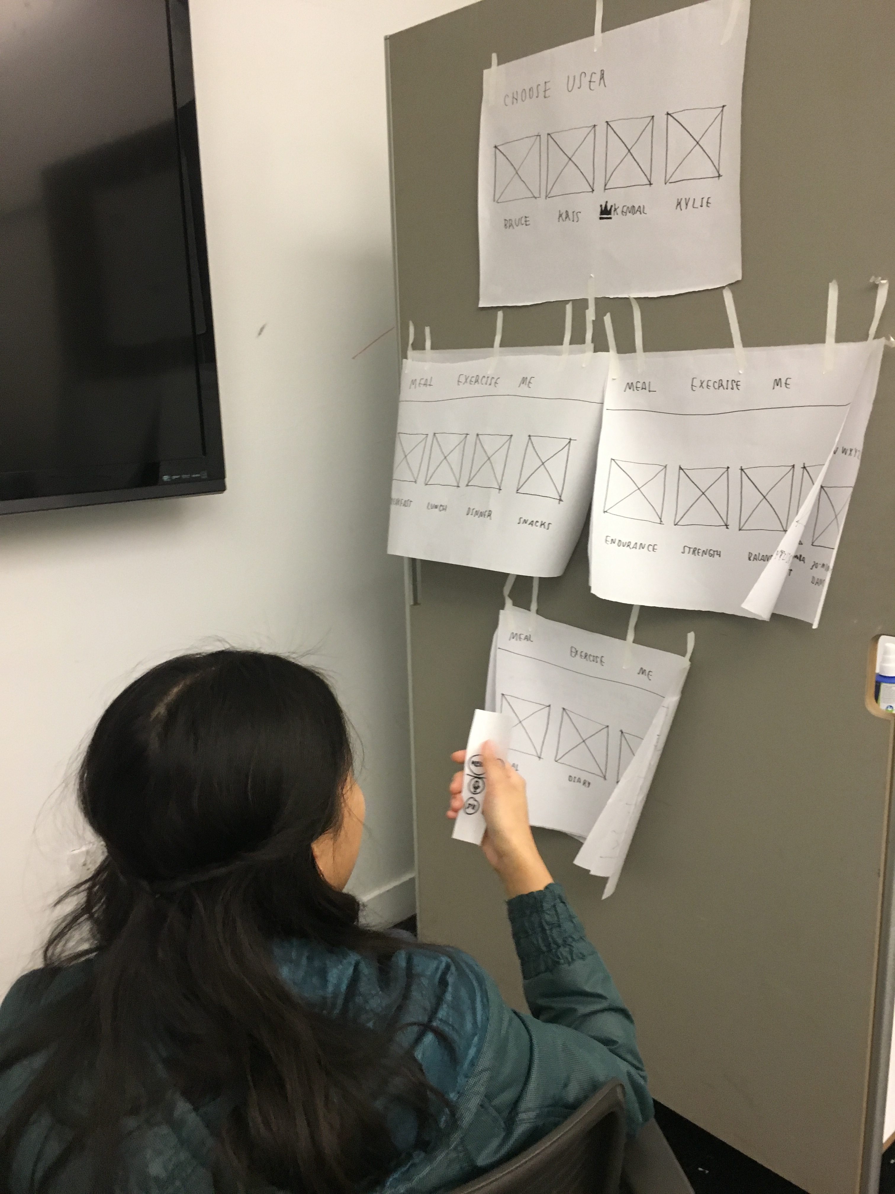
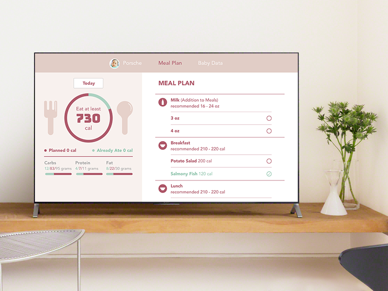
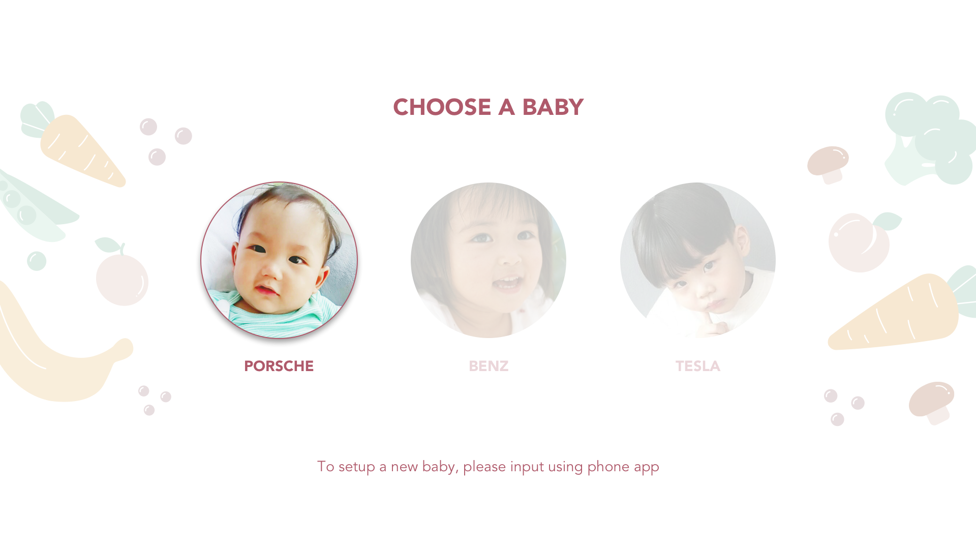
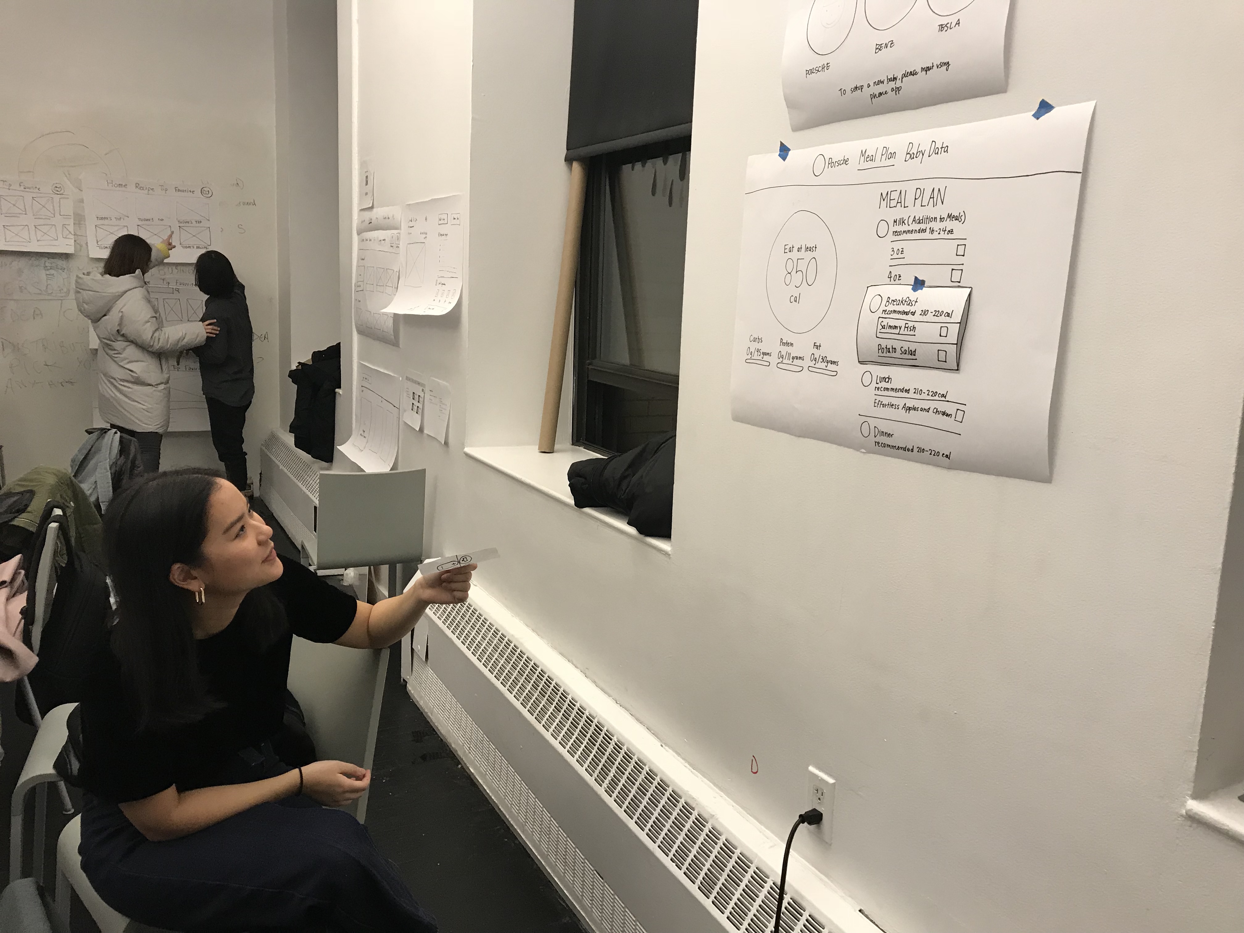
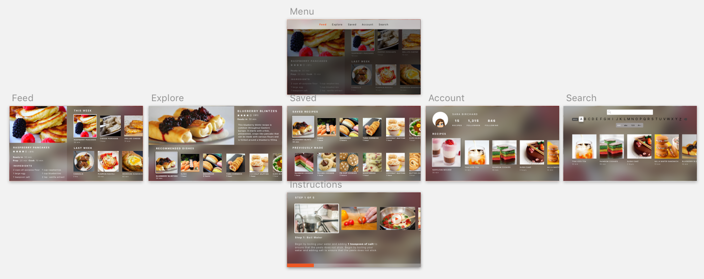
Feedback from the first prototype and user testing

  1. In the “Data Input” part, it should be input from other devices like iPhone app, because it is hard for the users to input all the data in the TV.
  2. In the Exercise part, there should be an option to add other family members, because there might be the exercise that they wanted to play together.
  3. Many of the headers look like the menu bar, try to differentiate it.

Week8_Qizhao(Eric)

Last week, I made a paper prototype and did a user test. Here is some feedback I got from user testing:

  1. Since that AppleTV doesn’t have the API to connect to Facebook and Twitter, the login part of the app may be tricky;
  2. The position of the image of the restaurant gives users the illusion that it is clickable. Why not make it clickable and try to add more detail to it.
  3. The function of sending invitation is hard to realize in AppleTV.

So I change my concept a little bit. In this version, the main value of the app will be searching interesting restaurants and enable users to see the 360-degree images of the restaurants so that they can know if the environment of the restaurants is good or not. What’s more, users can also check the menu and see the food intuitively.

Here are the wireframe and the visual interface.


WEEK 9:

User test feedback

  1.  The users tried to select the profile picture in the upper right corner but the profile picture was not selectable. so I decide to delete it.
  2. The users want to see more contents on the homepage.
  3. The users were confused about the categories.

Final prototype: https://marvelapp.com/62851b1/screen/40297763


Apple TV Final


In this Baby Balanced Apple TV version, the emphasis is on the viewing part which will help parents prepare the food for the baby easier when viewed from the TV.

From the first prototype, I changed the Baby Data content for Apple TV because if there is too much unnecessary information. My assumptions are parents will only want to see the progress of the baby in the Apple TV and not the details of what the baby has eaten since they will not be able to plan meals from the Apple TV anyways.

Final Prototype

User Insight Apple TV

Insights after presentation

  • Baby data page is confusing. Don’t know how to move to places, should be an easier and faster way to move in the screen
  • There should be a scale on the side of the Data visualization
  • In the recipe detail page, there should be a section for ingredients and a section for instructions because if not it may be difficult to navigate when there is more content
  • For the meal plan, needs to really check if the interaction makes sense or not

Insights after the paper prototype

  • It’s hard to understand that you can move from menu to checkbox
  • The graph in the meal plan looks too important when the user can not even interact with it