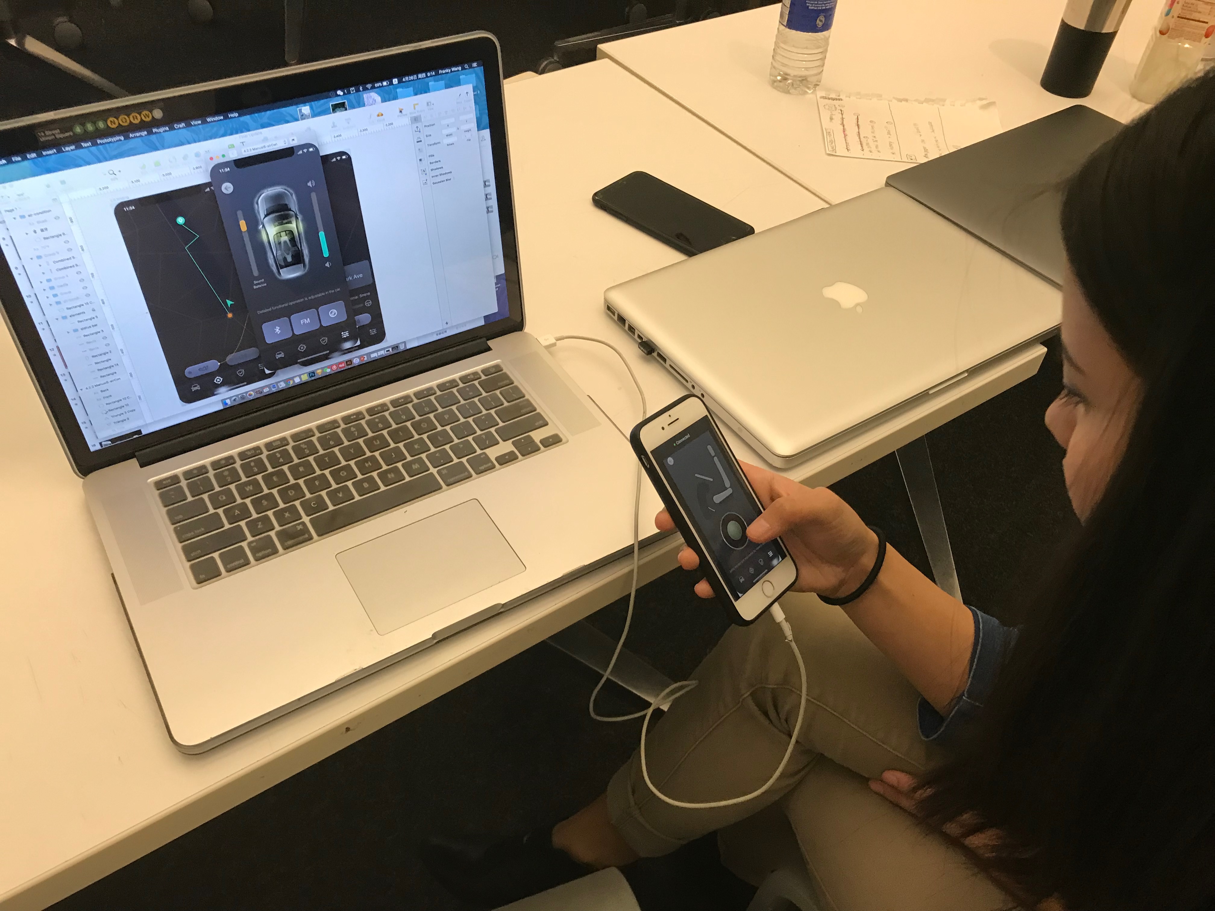
+++ Group work with Yin Hu +++

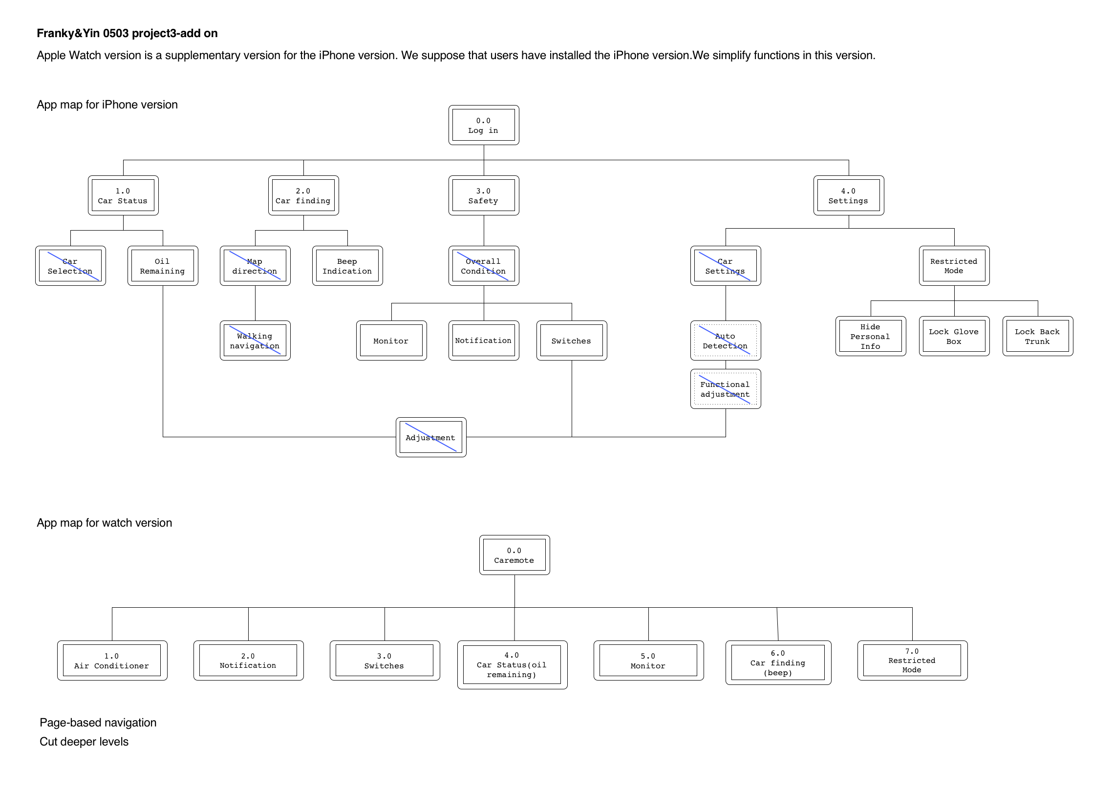
CAREMOTE – App design for smart cars
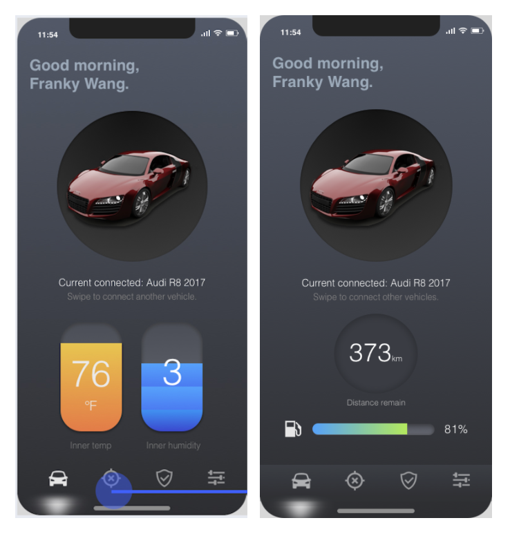
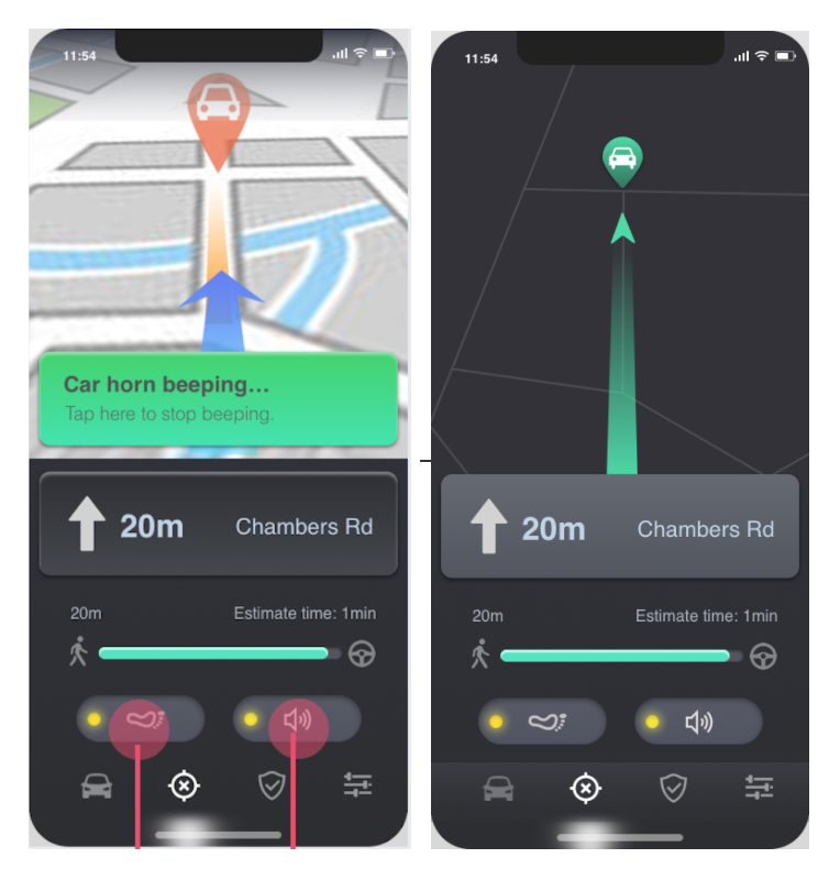
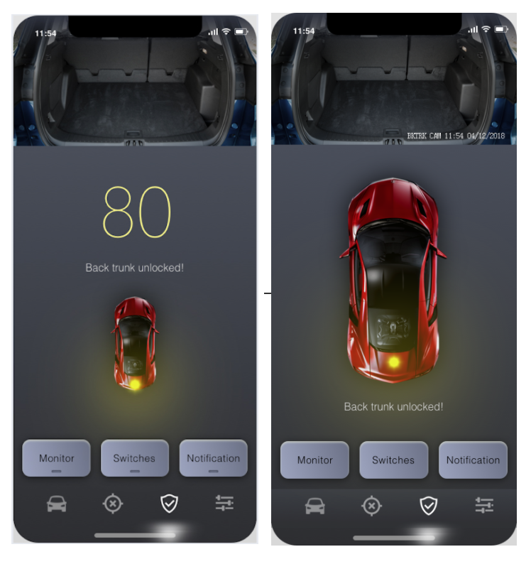
+++ The final version of iOS app +++

Main updates:
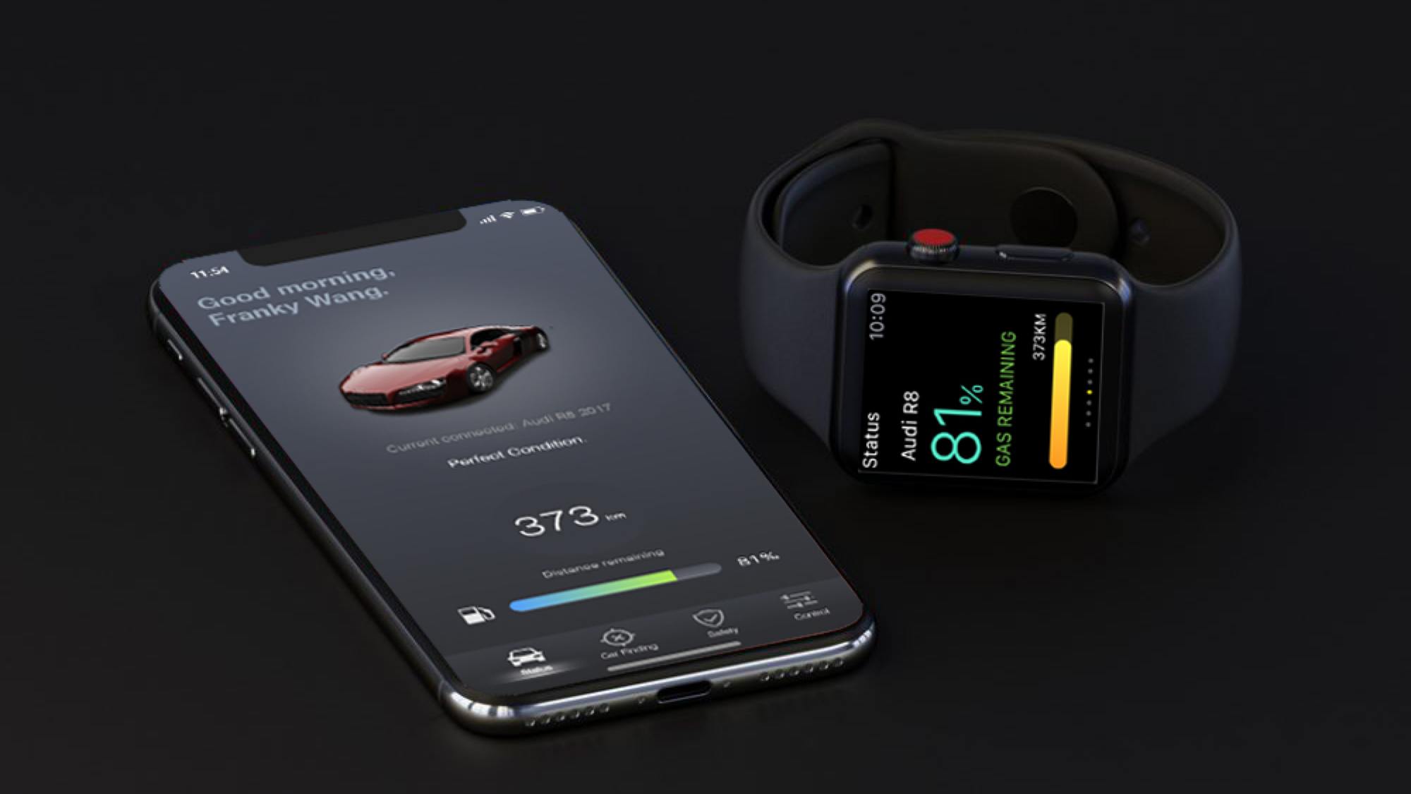
1 – Display the car status on the main page, deleted the unnecessary status information from the safety page.
2 – Changed the visual style of the map view. Included the glowing visual effects of the route for a better view.
3 – In the machine learning process, updated the visual design of progression into step indications.
4 – Deleted the entire switch of the security mode. (Change the name from restricted mode to the security mode.)
5 – Added the name of icons under the navigation bar.

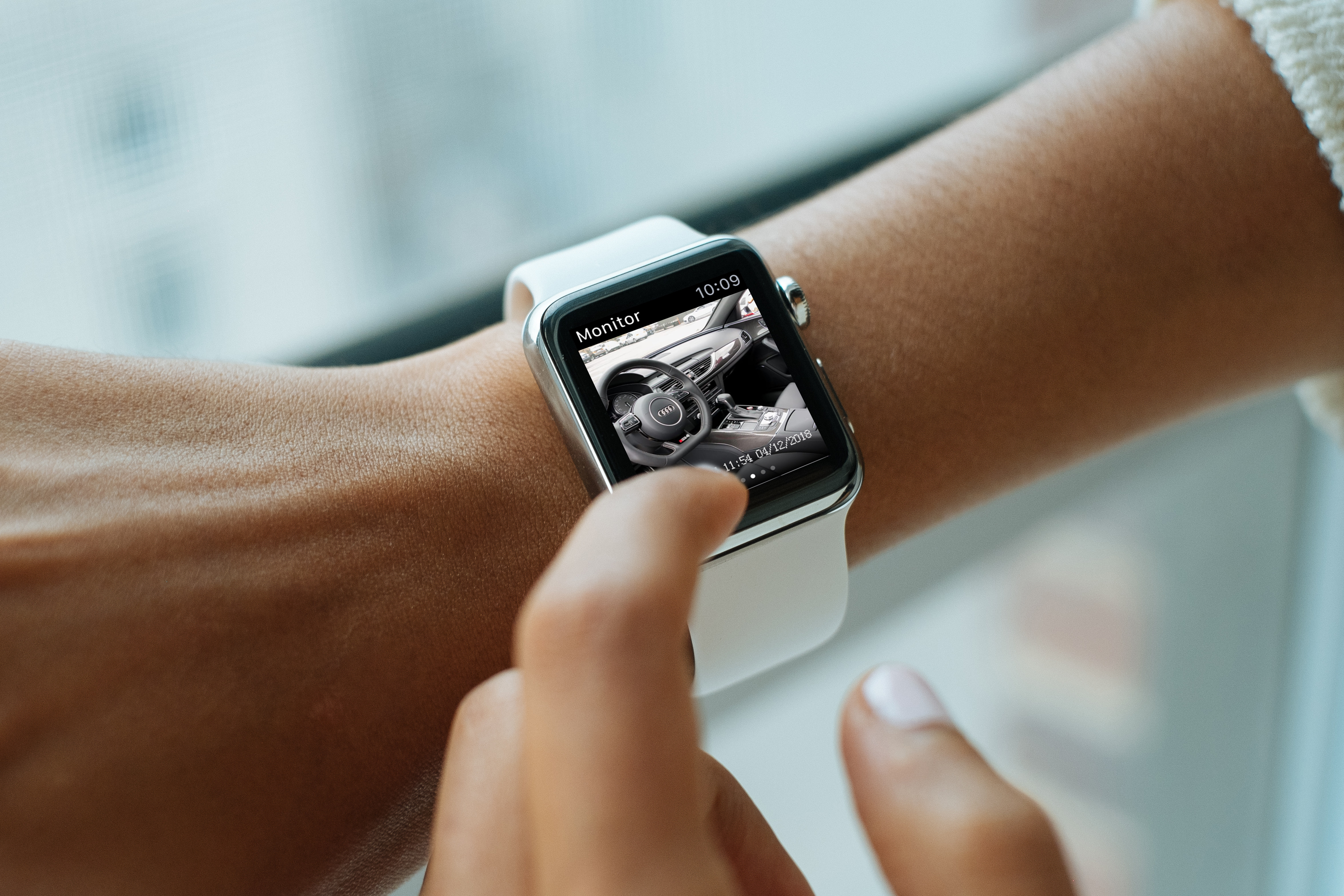
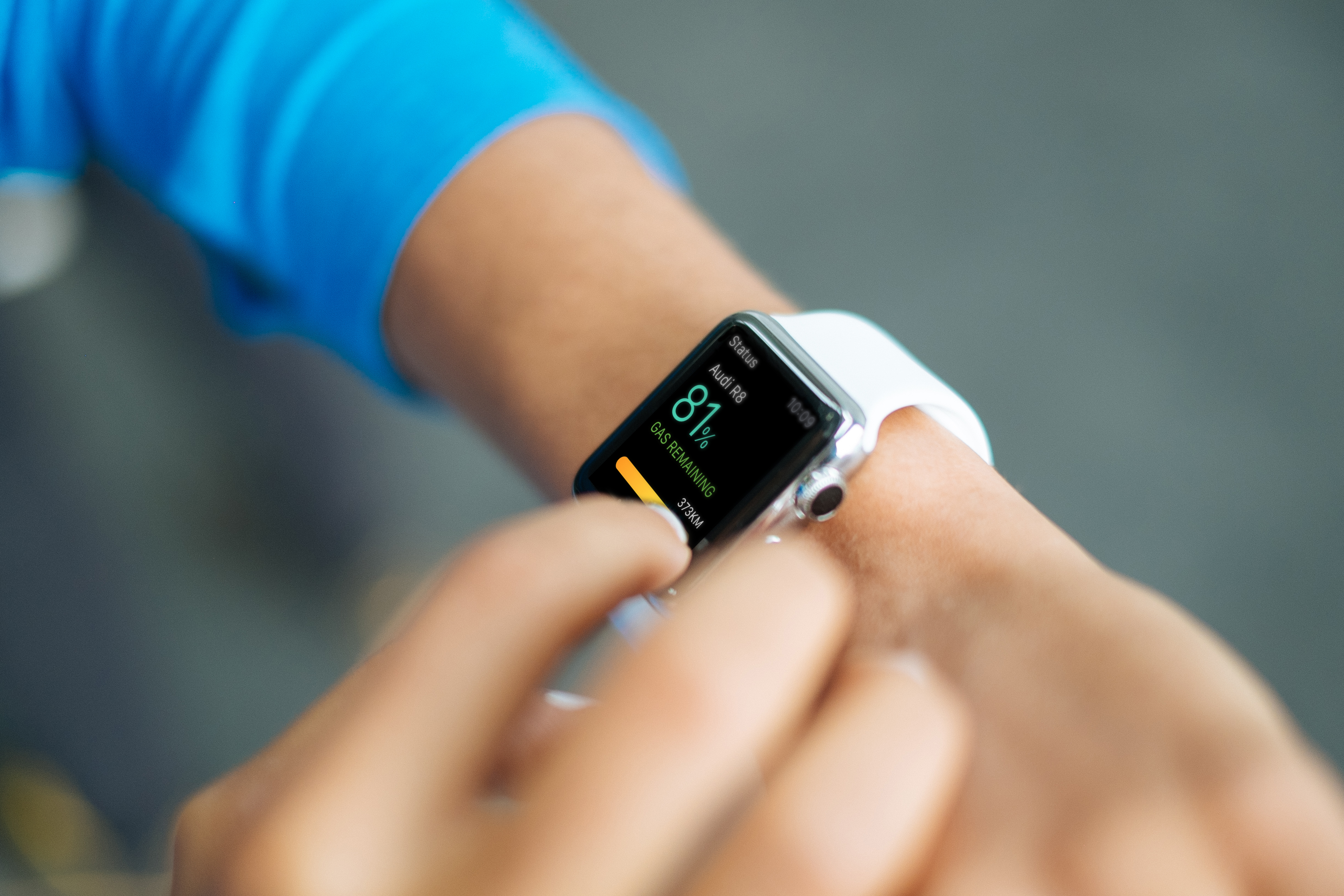
+++ The final version of watch app +++
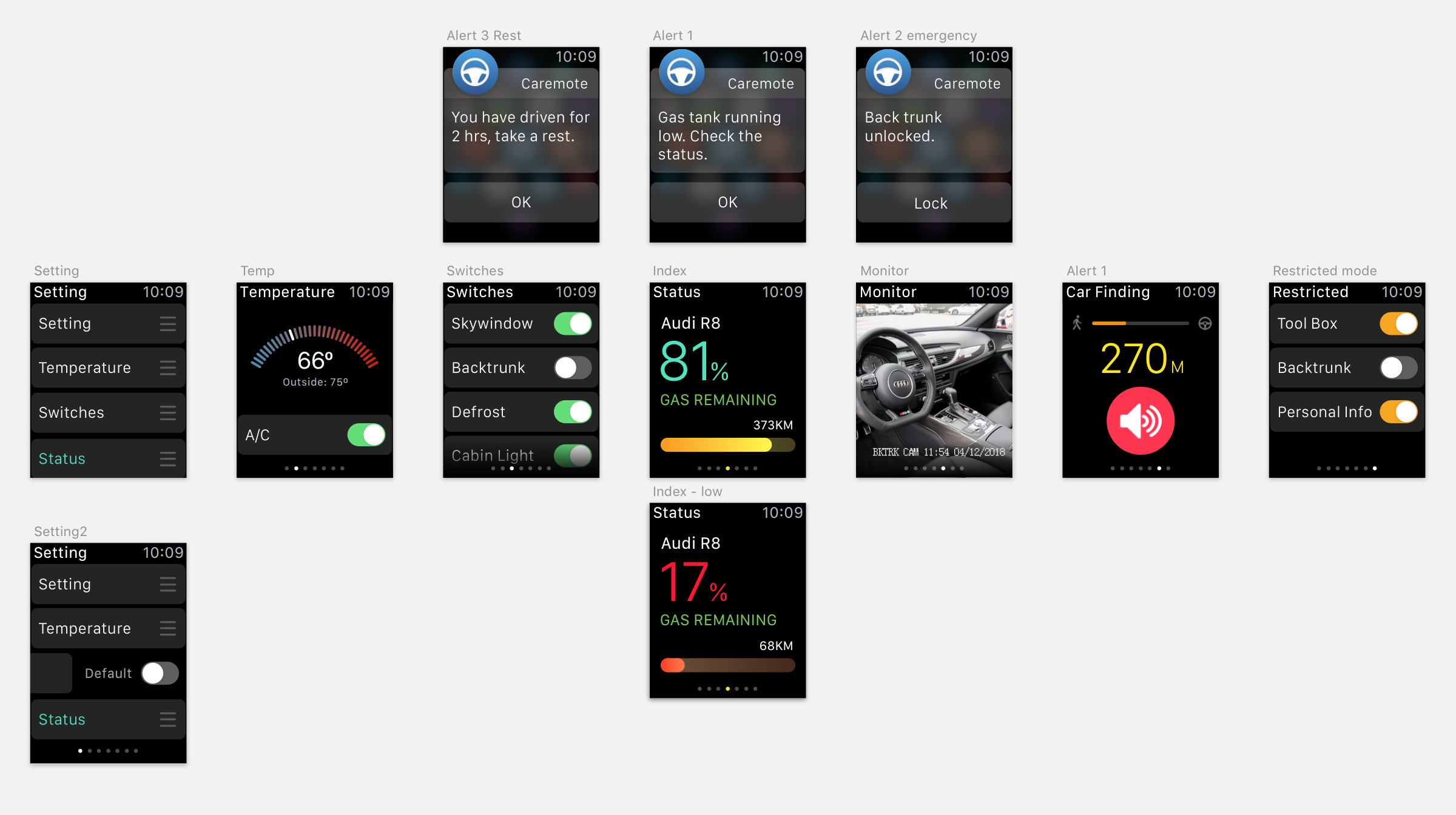
Main updates:
1 – Changed the information layouts on the index page, increase the font size of the percentage and zoom out the remaining distance.
2 – Deleted the notification page and replace with the setting page for users to customize the order of pages based on their own preferences.
Visual Effects


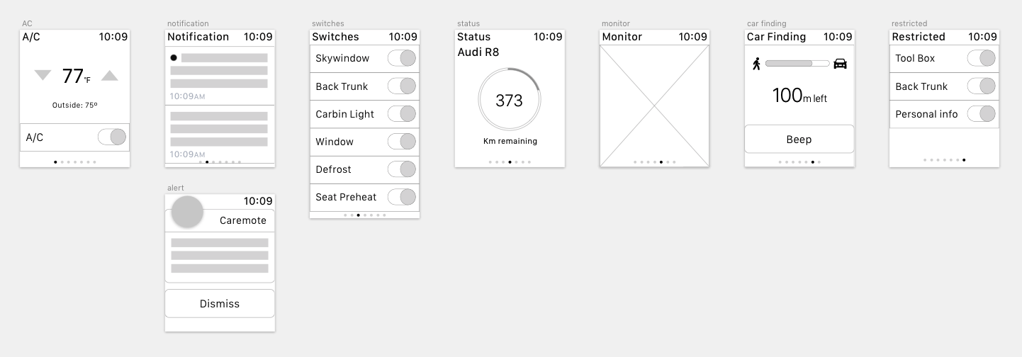


 Wireframe


