#Final Presentation: Lens_Cathy & Jin

In order to have more people watching more VR videos, we presented LENS for iOS and for Apple Watch:

LENS for iOS is an app for user to search, watch VR videos. LENS for Apple watch is an additional accessibility app in order to prevent users from taking their phones out of Google Cardboard often.

Changes we have made based on the last two user tests/presentations:

  1. Changed the hamburger menu to a bottom bar.
  2. Improved watch app, instead of using digital crown to enable voice control function, we are designing the ui view to a “full-screen” button. People can tap twice on any current view to enable voice control.
  3. Some small visual improvements on previous ui design.

Presentation slides

Marvel Demo


Thanks Drew! For a great semester!! 🙂 Enjoyed your class a lot!

Cathy & Jin

#ThursdayPlay Stack

I want to introduce a simple, aesthetically pleasing and fun game called Stack. Rule is simple: there are blocks coming from 2 directions in a 3d environment, when user taps the screen, the block will stop to pile up. Stack up the blocks as high as you can by tapping the screen at the right time to get a high score.

The game mechanism is simple, and people love stacking blocks. This game is addictive, my original goal was to score over 50, once my score reached, I got even more motivation to continue to play.


Lens for Apple Watch_Group: Cathy Sun, Jin Huang

LENS for Apple Watch allows users to control, remote the ios LENS app when you are watching VR videos without taking your phone out of Google Cardboard.  

It also enables notifications to keep user updated with their following publishers.  

Presentation Slides 

Feedback: Better not use Digital Crown, can design the entire interface as a button to realize the same function.

Digital Prototype: Lens_Cathy & Jin

LENS is a video search, watch, and share app. It allows users to watch videos in three-dimensional space (Virtual Reality)  

Slides

Marvel 

Feedback:

  1. Hamburger menu is not strong for the purpose of letting people see more videos
  2. More detailed classifications for companies, like Disney junior
  3. Renaming “Subscription”, because it leads to confusion (channel subscription or subscribe the app); we are deciding to rename the channel subscription to “Following”

Final Project: VR Video App by Cathy & Jin

A video search, watch, and share app. Video watch form in three-dimensional space (Virtual Reality). It is designed for professional virtual reality video production companies. 

Here is the slides

User insights:

  1. Add premium video content/account so people can subscribe to the app.
  2. Not everyone can upload VR videos, upload features only open to professional companies such as Disney, Samsung and so on.
  3. Search function doesn’t need to be separated, it can appear on the home view.
  4. Activity view/function is not necessary

Cookgram for Apple TV: Wireframe & Final Prototype

Cookgram for Apple TV is a recipe app where users can browse their recipes as well-designed recipe album (gif form) on Apple TV as well as explore more recipes from other users’. It will be a community to explore, collect and share recipes.

Wireframe & App Map Slides

Feedbacks & Critics from 1st presentation:

1. Horizontal design of apple tv version is not very effective. Use two sides and vertical view.

2. Top bar should follow the apple tv HIG

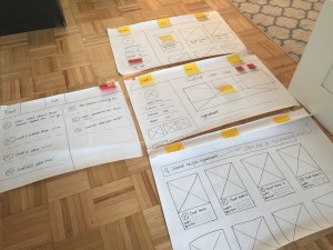
Paper Prototype:

Based on the feedbacks from the first presentation, I prototyped a new version of Cookgram for Apple TV.

PaperPrototype2 some user insights that I got from the paper prototype are: 1. Search function can be an independent section on the top menu.

2. Shopping list section doesn’t make sense for user to use in apple tv version.

3. Login view is missing.

So in my final prototype, I redesigned the UI and changed some of my UX flow. Here is the Final Prototype Slides

User Insights from the final prototype:

Under the detailed recipe view, the focus is default on “Followers”, while the right part of the screen shows the detailed recipe, which is confusing. Should use left side as a navigation section consistently like the one that I designed under “Me” section.

Marvel Prototype

#ThursdayPlays Email Apps: CloudMagic & Spark

I have used lots of alternative email apps and I found CloudMagic is very powerful and user friendly no matter in functions or visuals. It has clear and simple designs, ux flows. It works on different platforms like Mac, iOS, Android. CloudMagic can share team contacts, as well as integrating with other productivity apps such as keynote, Outlook notebook. Other very useful function is it allows you to get and reply Gmail emails in mainland China where we all know that gmail is blocked.

But after using it for a very long time, I found that iPhone version Cloud Magic doesn’t support Chinese language reply. You can get emails in Chinese, but you can only type in English when you reply it on your phone. But for non-Chinese speakers, it didn’t really matter. But once I need to translate some emails into Chinese and send it back, then I found I can’t type in Chinese on my phone app.

I started to discover another email app: Spark. It is featured in Smart Inbox, which can filter your emails into different categorizes, and this app allows Chinese replies on phone. Another feature is Snooze and Task, you can put your to do list and set notification time to remind you. It is very customizable, widgets and swipes can be personalized to match user’s work flow.

Those are two email apps that I recommend to try if you are looking for alternatives.


Cookgram: Final Presentation & Prototype

Presentation Slides

Concept: Cookgram is a recipe app where users can post their recipes as well-designed recipe album. All they need to do is take a picture every step, and then add texts.

It will be a community to explore, collect, make your own, and share recipes.

I didn’t quite happy with the previous ui design, so I redesigned the UI for the final presentation. Previous prototype can be found in my last post. 

Prototype 

Feedbacks from critics:

  1. Nice & clean UI design
  2. State the goal of the app: everyone can make pretty interactive
  3. Design the “camera” bigger and more popped up because the camera function is a bigger one in this app.
  4. Rename the “Home” icon to “Account/Profile”

Cookgram: Wireframe & first UI

Concept Statement: Cookgram is an interactive recipe app where users can post their recipes as well-designed recipe album. All they need to do is take a picture every step, and then add texts after. It will be a place to explore, collect, make your own, and share recipes.

Based on some user feedbacks from Wireframe presentation and paper prototype, I have updated some of the ux flow in this version.

User Insights (from Wireframe & paper prototype):

  1. Category view:the design looks like users can type in not choose from lists
  2. Add Text View:  Better to have an overall instruction in mind for user after taking the picture. Now the view is not clear about what’s the next step. 
  3. Can corporte with iPhone 6S live photo function
  4. Can be a community for people to like, share, upload recipes.

Presentation Slides: https://docs.google.com/a/newschool.edu/presentation/d/1ZVXjphTBUieI36Nth3COheS0gaTt7iOpuhys-FMxBBI/edit?usp=sharing

Prototype

User Insights (from this presentation):

  1. Text size is small, hard to see. Need to prototype on the phone
  2.  The aim of category? “Cooking steps” is confusing in “category”, after taking pictures and add text, is repetitive with the “cooking steps”. Cooking steps better be called “instructions” (The camera – text – post part ux need to be simplify and cleared)

Apple HIG Learning Notes

  1. Use depth to communicate: phone screen has small and limited design area, iOS uses depth to emphasize the importance of different layers which helps users understand the relationships among onscreen objects. This detailed design is a smart, clear, efficient to communicate with phone users. For example, when you open a folder on the home screen, the folder and its content float up with a translucent background.
  2. User control: iOS UI/UX is clean and simple, straightforward for users to understand and remember how to use the function. When the user feels more in control of an app, the app can be a good one, especially when users know how to correctly respond to different designs, which means the ui/ux design is successfully meet designers’ expectations.
  3. Consider hiding the navigation bar when users want to focus on content: I didn’t pay attention to this detail before, I thought the navigation bar was always there as default. But here is a design that let users focus on content, and hide the navigation bar.