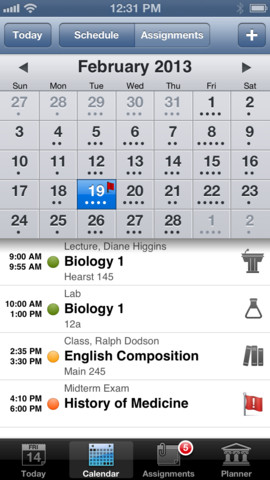
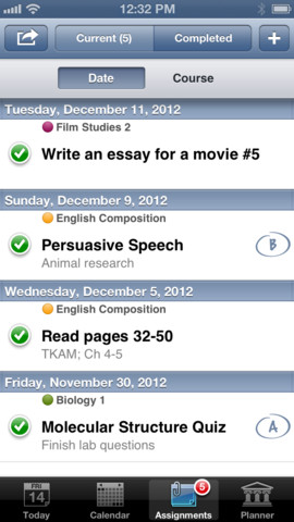
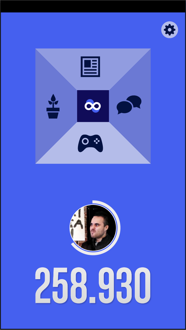
The main focus of the app design was the navigation system.
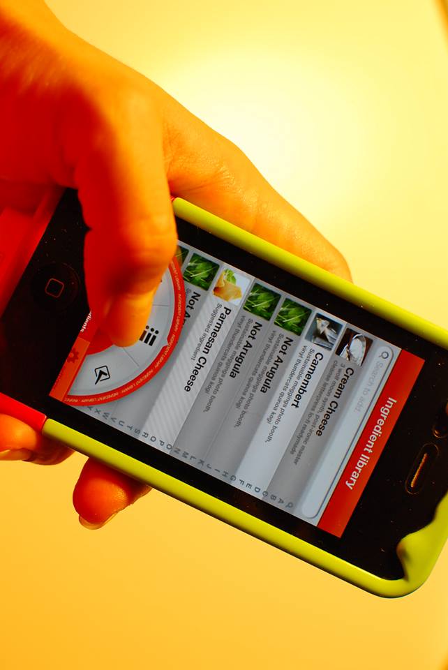
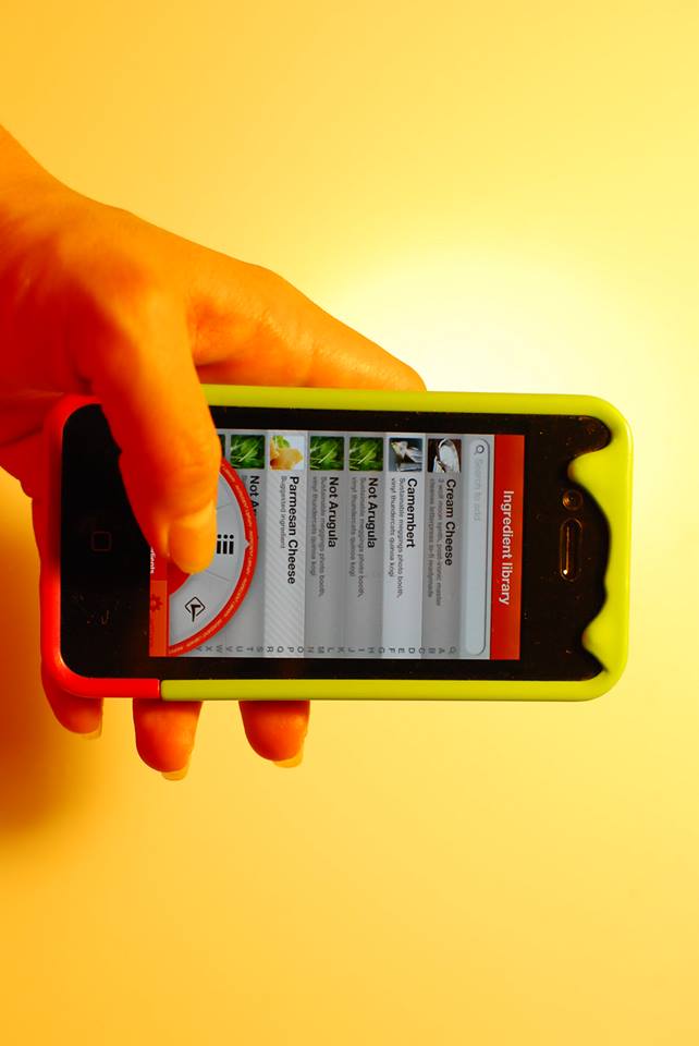
A few iPhone rough prototypes were developed and 2 of them were rendered for testing purposes outside the group.
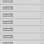

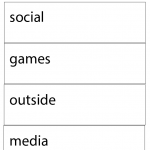
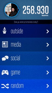
The list view render was designed to make a joke on clear.app. sadly for that joke, the selected interfaces is way better aesthetically and in functionality.
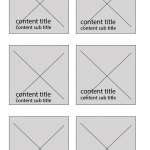
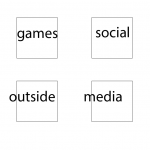
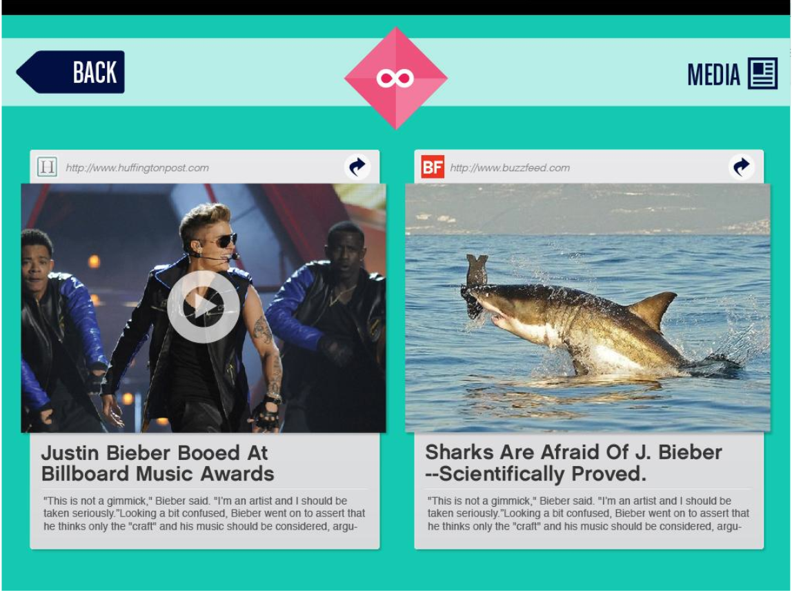
The iPad design took a dent of the defunct “thumbnail” view, thanks to the extra space.
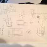
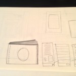
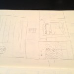
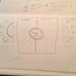
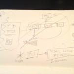
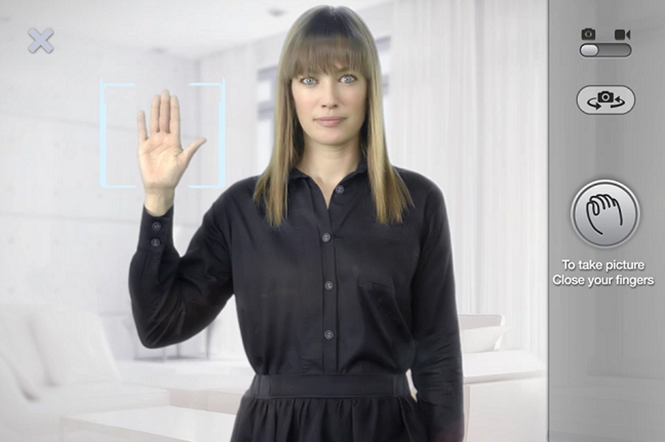
This is the gallery of sketches that never came to fruition// specially interesting is the skeuomorphism based one .