#thursdayplays _ DuoLingo

DuoLingo is the #1 language learning app on Apple Store. Users can choose the language(s) and their desired study goal(s) for each language. DuoLingo taps into humans’ intrinsic motivation to complete goals by inviting users to set the goals for their intended languages at their own pace; every time when uses feeling the itch that they have left tasks unfinished, they would return to DuoLingo. DuoLingo also sends external trigger – task/goal reminder; these external triggers are owned triggers, meaning users can turn them on/off as they wish. If users keep missing their daily goals, instead of constantly sending reminders, DuoLingo would send out an email reminder, which is less invasive. Users accumulate “experience points” as they learn languages by gaining one point for a correct answer and losing one point for an error. The “experience points” could be considered as variable rewards because users could potentially lose points. The more interesting design of DuoLingo in my opinion is that users would have to complete the easier courses in order to advance and unlock more difficult course, which invites users to invest and store values in their apps, and makes it less desirable for users to switch into other language learning apps.

IMG_2026
View1
IMG_2027
View2
IMG_2028
View3


IMG_2032
View4


IMG_2031
View5


IMG_2029
View6


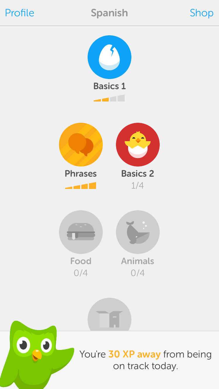
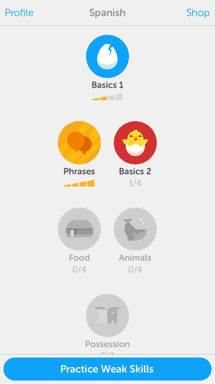
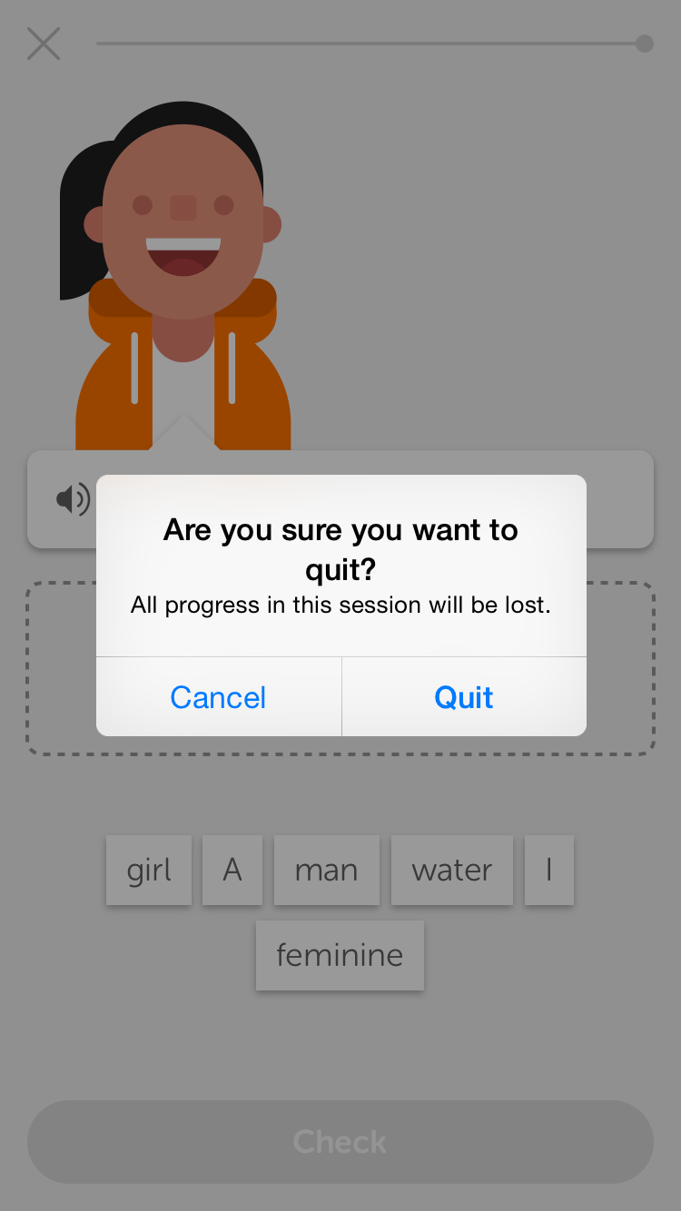
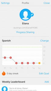
View1 shows what happens when users open the app. A banner pops up at the bottom that reminds users of their daily goals, and the banner disappears after a few seconds, revealing View2. View2 shows a clean and clear interface where the primary button is distinctive, and system buttons in the navigation bar have a key blue color that implies interactivity. The contents on View2 are minimized to heighten the core functionality; no unnecessary texts/images or annoying ads. The app uses visual layers to express depth. When users tap into each course, they can swipe between different lessons or views within each course, shown in View3. View4 shows that an alert pops out when users try to quit in the middle of a lesson; the alert message is short and precise, clearly stating the action and the consequence. Users can also access in-app purchases (View5) and user profile (View6) from the navigation bar on View2. Overall, the app follows the principles of deference, clarity and depth.


IOS HIG Three pointers

  1. Let content and functionality motivate every design decision: This is a very important guideline that helps create a clean and clear application. Every piece of UI element, interaction, gesture, imagery, animation, video etc.  should be deliberately considered, and the app should not be crowded with unnecessary information that users do not need. This goes back to one of the three principles of IOS designs: Deference (the UI helps people understand and interact with the content, but never competes with it).
  2. App should interact with users just like how human interacts with human: a lot of the IOS principles of how an app should be designed goes back to the natural way how a human interacts with another human. For example, an app should maintain a sense of give and take that helps people feel they are making progress as they move through the app. The app should show users the value of the app before asking for login information, and delay login as much as possible. In addition, the app should ask users’ permission before accessing their private data, and clearly state the reason. All of these principles follow a sense of give and take, mutual respect for each other’s privacy and total control.
  3. An important point of the iterating process of conceptualizing an application: (1). first brainstorm and come up with a list of app features  (2). Define target users and user characteristics  (3). Go back to the list of app features and based on the user characteristics, cross out features that do not meet user characteristics  (4). Based on the polished list of app features and user characteristics, draft the app definition statement that clearly defines the target users and the core functionality of the app.

Tips for getting wireframes out of Omnigraffle

  • Create (or edit doc settings) to make your canvas auto-resizing:Screen Shot 2016-01-30 at 4.48.51 PM
  • Create an Omnigraffle iPhone template to copy and paste out the phone: Screen Shot 2016-01-30 at 4.47.41 PM
  • Make each view and the app map their own canvas.
  • When you are done and want to create a pdf, manually select the canvases that you want to put on different pages of a pdf by command-clicking on all the canvases you want to export: Screen Shot 2016-01-30 at 4.51.18 PM
  •  Go to File > Export: Screen Shot 2016-01-30 at 4.49.51 PM
  • Change the format to PDF vector image: Screen Shot 2016-01-30 at 4.50.04 PM
  • Push save

Please let me know if you have any issues with this or any other parts of the Omnigraffle interface.

For February 4

  • Review the syllabus to understand class expectations and what we’re doing this semester.
  • Read the Apple HIG or the Android Design Guidelines and post 3 things you didn’t know.
  • Think up an app to make for Project 1. Your app should be for android phones or iPhones, and it needs to be about food.
  • Create an app map and wireframe for your app. Group 1 will present. Each person will have about 10 minutes to present and get feedback.
  • Both groups should create paper prototypes to test next week

From class today:

Class protocol things:

  • Start posting #thursdayplays. You need to post at least one before midterm, and one between midterm and the end of the semester.
  • Make your blog username your real name
  • Your work only counts if it’s on the blog.