Author: Vivian Wei
iOS HIG notes
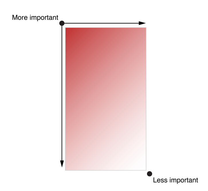
The overall design of an app’s interface needs to distinguish content’s importance by placing them differently. The most important content would usually be placed on the top left corner, whereas the less important content would be placed on the bottom right corner.
“As much as possible, avoid displaying a splash screen or other startup experience”. Users would expect to be able to use the app immediately after they launch the application. Any kind of information or introduction to the app’s features need to be added with caution; because this might lose users’ interests, and prevent them from exploring more.
If an “onboarding experience” must be added to the app, then use animation or interactivity to improve users’ engagement, or be sure to design a way to exit or dismiss this part.
If certain tasks require a hierarchy of modal view, make sure the “Done” button does what users would expect it to do.
When design an app interface, be sure to consider color blindness when using colors as visual cues.
#thursdayplays – .Pause.
I want to talk about an game app that is somewhat different from others. It is developed by ustwo, the studio who created Monument Valley, and PauseAble. It is said to “bring ancient Tai Chi and mindfulness practice” to the users. In spite of its efficiency in bringing “mindfulness” to whoever plays the app, Pause does a great job in terms of simplifying UI and UX, and create an concentration on what it claims to do.
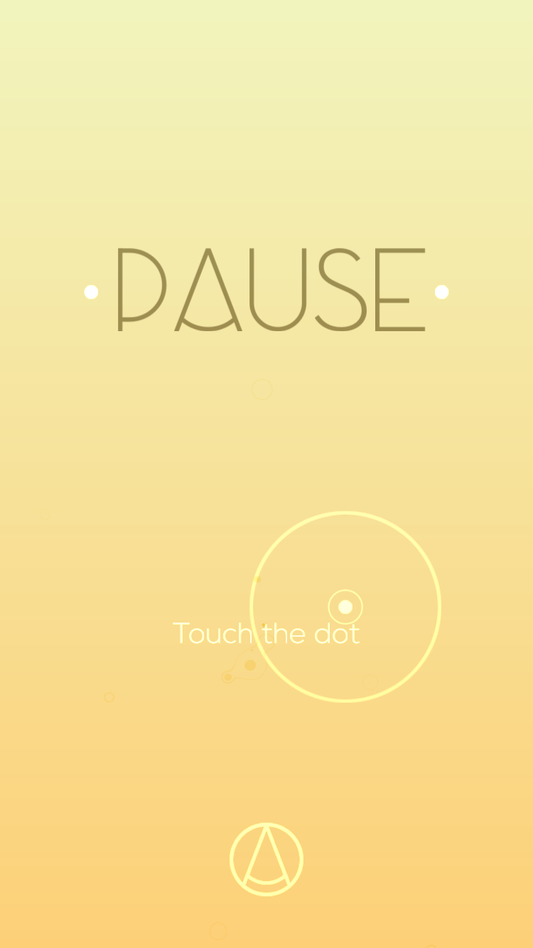
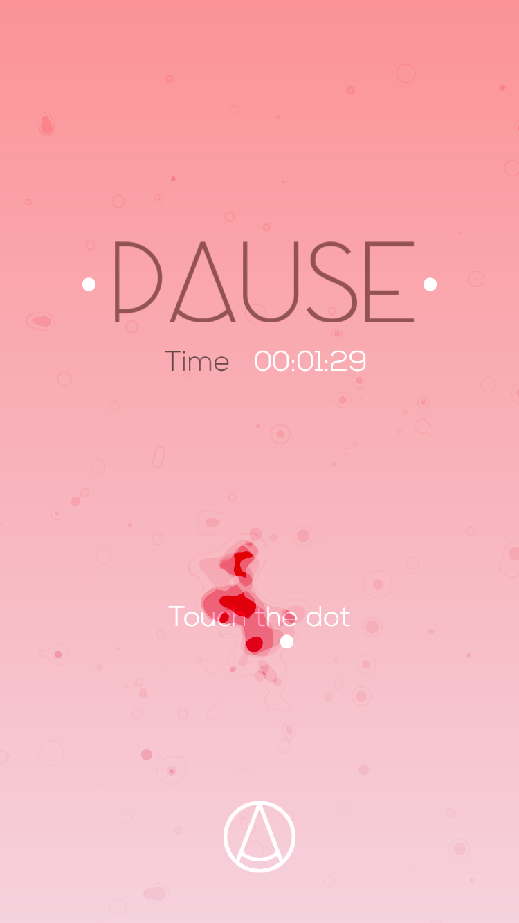
The starting page is very simple, with only two options: to start the game, or to go into the setting.
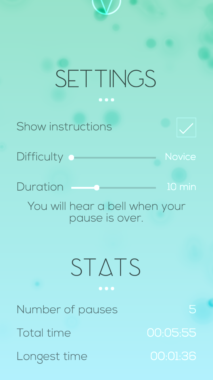
Setting page has limited options for users to adjust, which helps the user to avoid spending too much time on studying this part. With corresponding text, each option shows clear sign of how to adjust, and how much could it be adjusted.

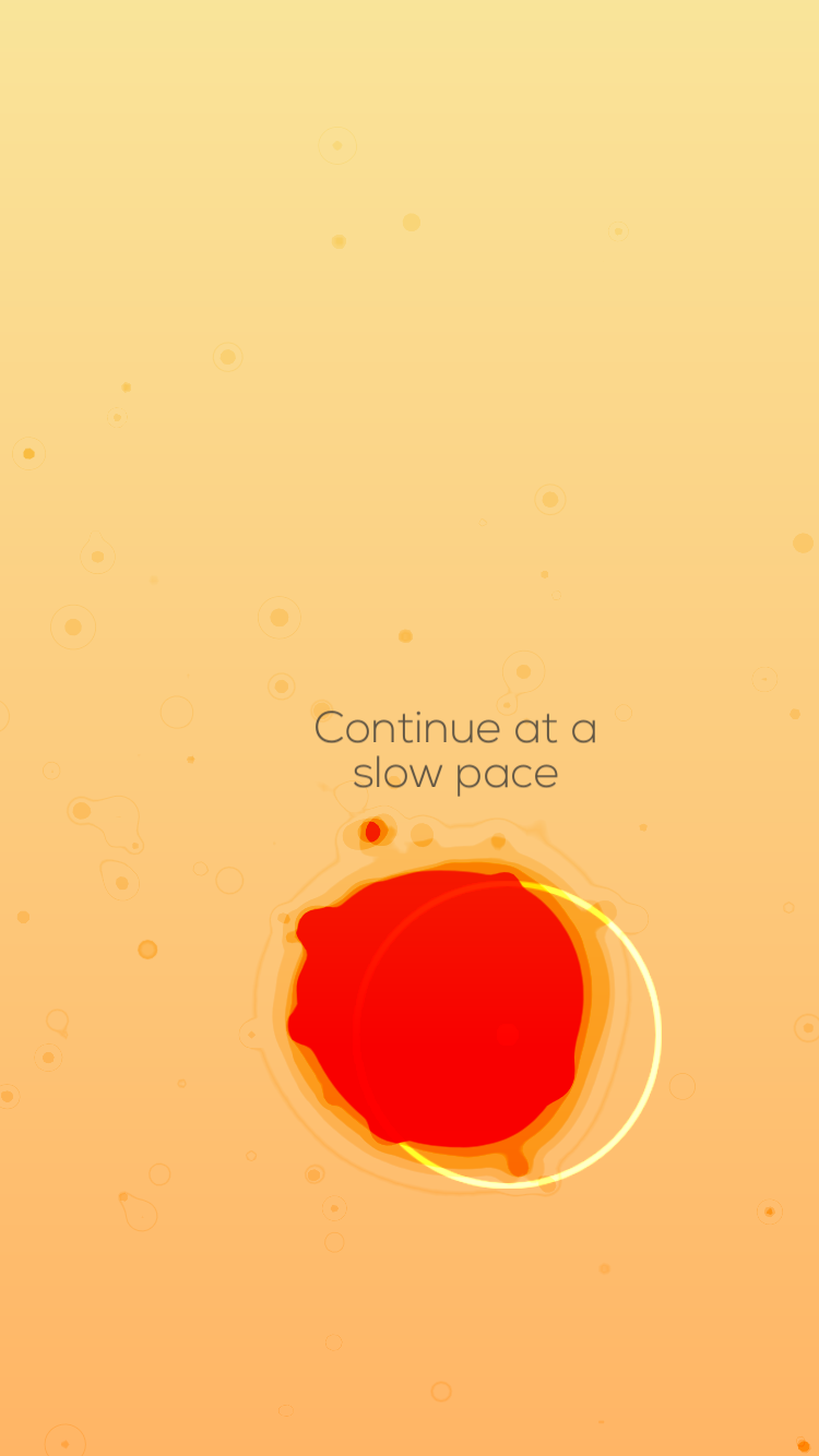

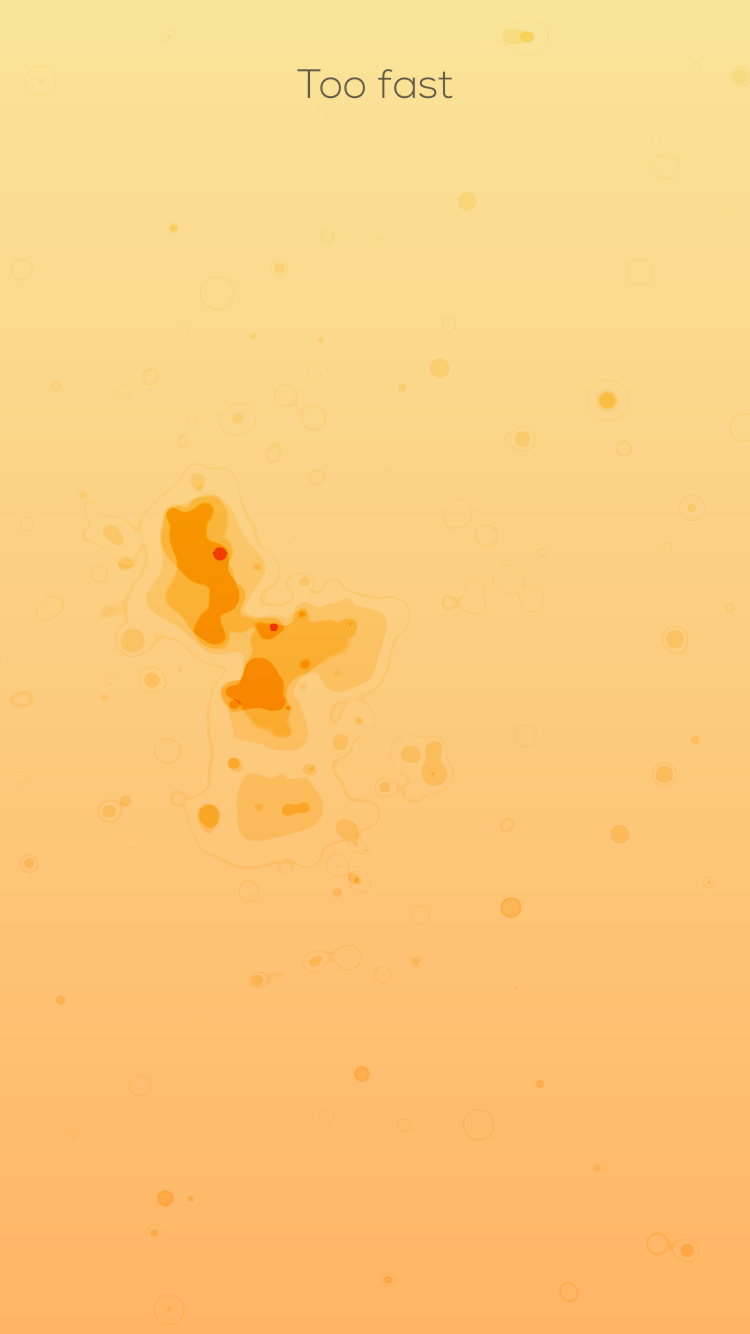

The gaming part is pretty clear as well. The only thing that the user has to do is to follow the hold his or her finger on the screen, and follow the dot. Corresponding instruction would appear besides the dot to help users to navigate through the initial stage. When the user passes the initial stage, he or she will be given more control to the dot. However, reminding text would appear on the top of the screen to instruct the user about their movements. The text is clear enough for users to notice, yet not overpowering the design of the game. With a fluid motion design, as well as an elegant color palette, the user would definitely be able to enjoy the process.
When the user finishes the game, a summary would appear on the screen, along with the exact option to re-start the game again.
Overall, I think the best part about this game is its simplified UI and UX, to allow the users enjoy a rather relaxing process while playing it. And the elegant and beautiful design of its graphics gives me another reason to keep playing it.