Final Week_Aim & Jean

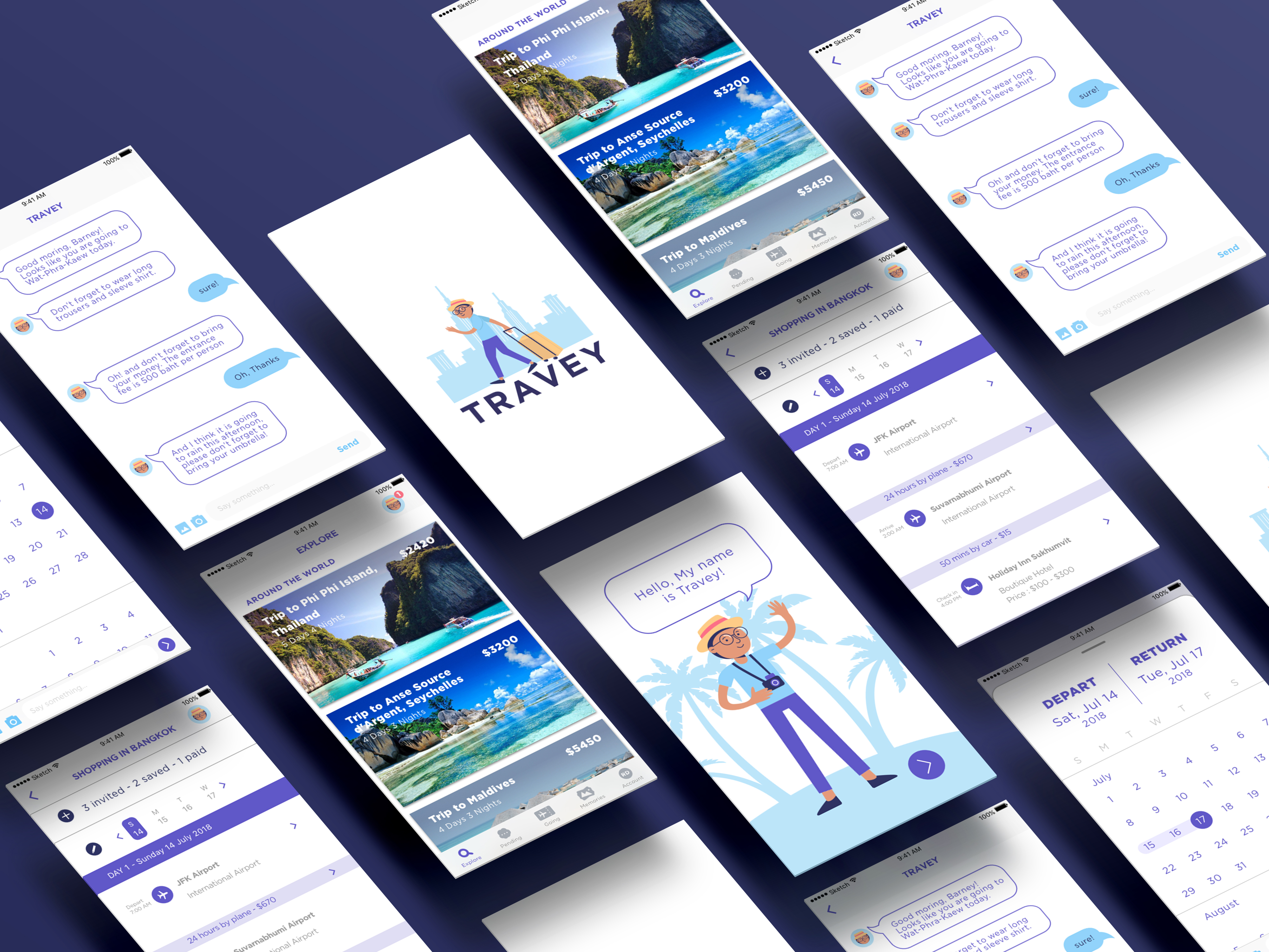
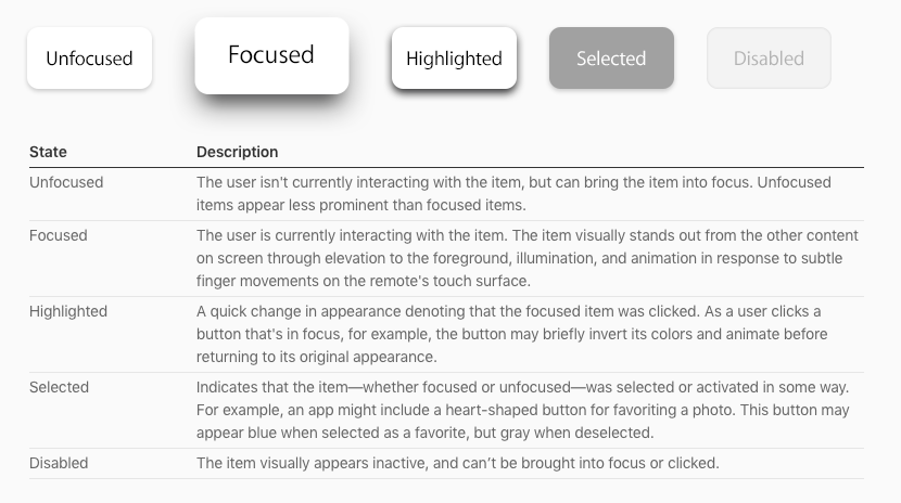
For our final prototype:

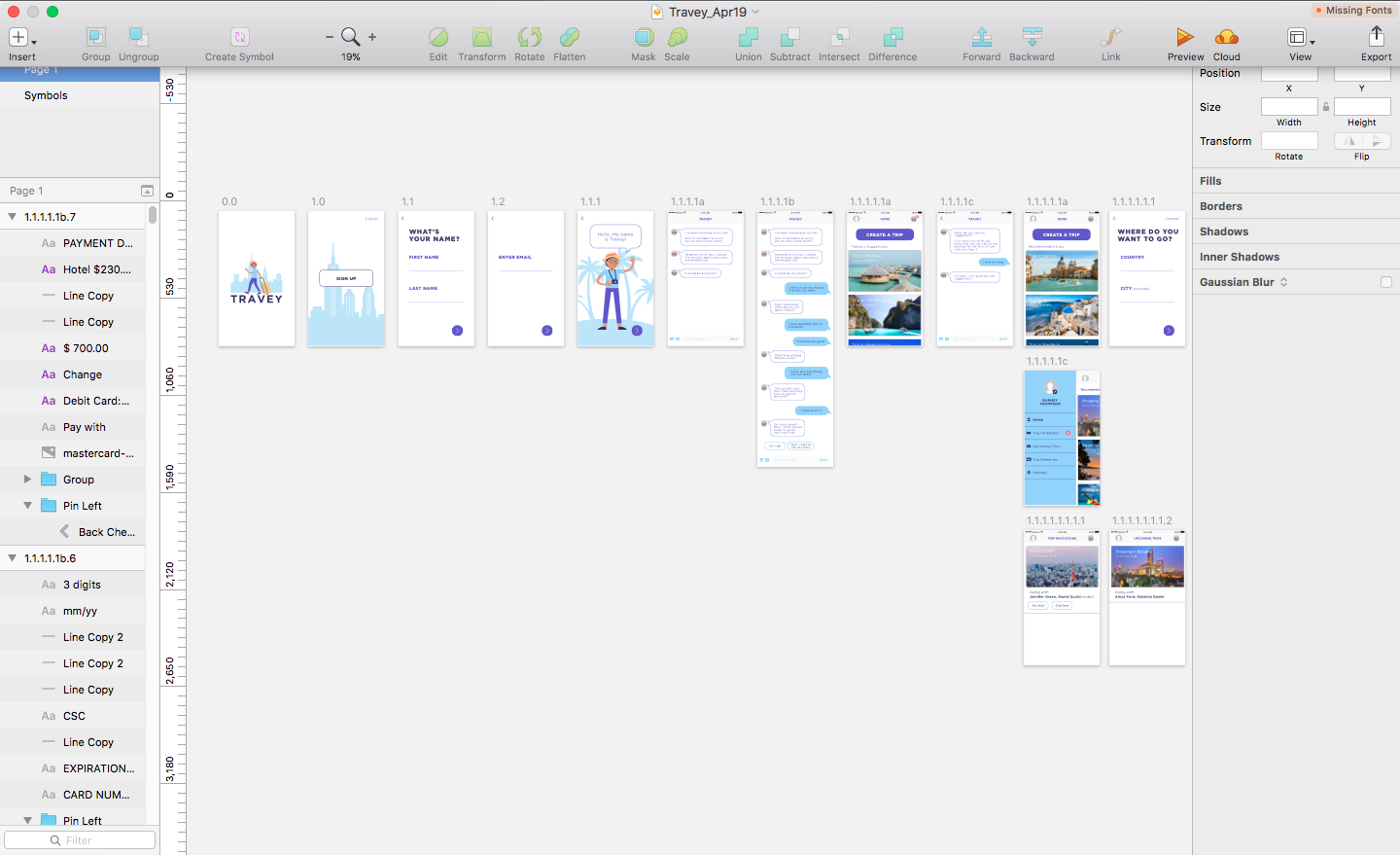
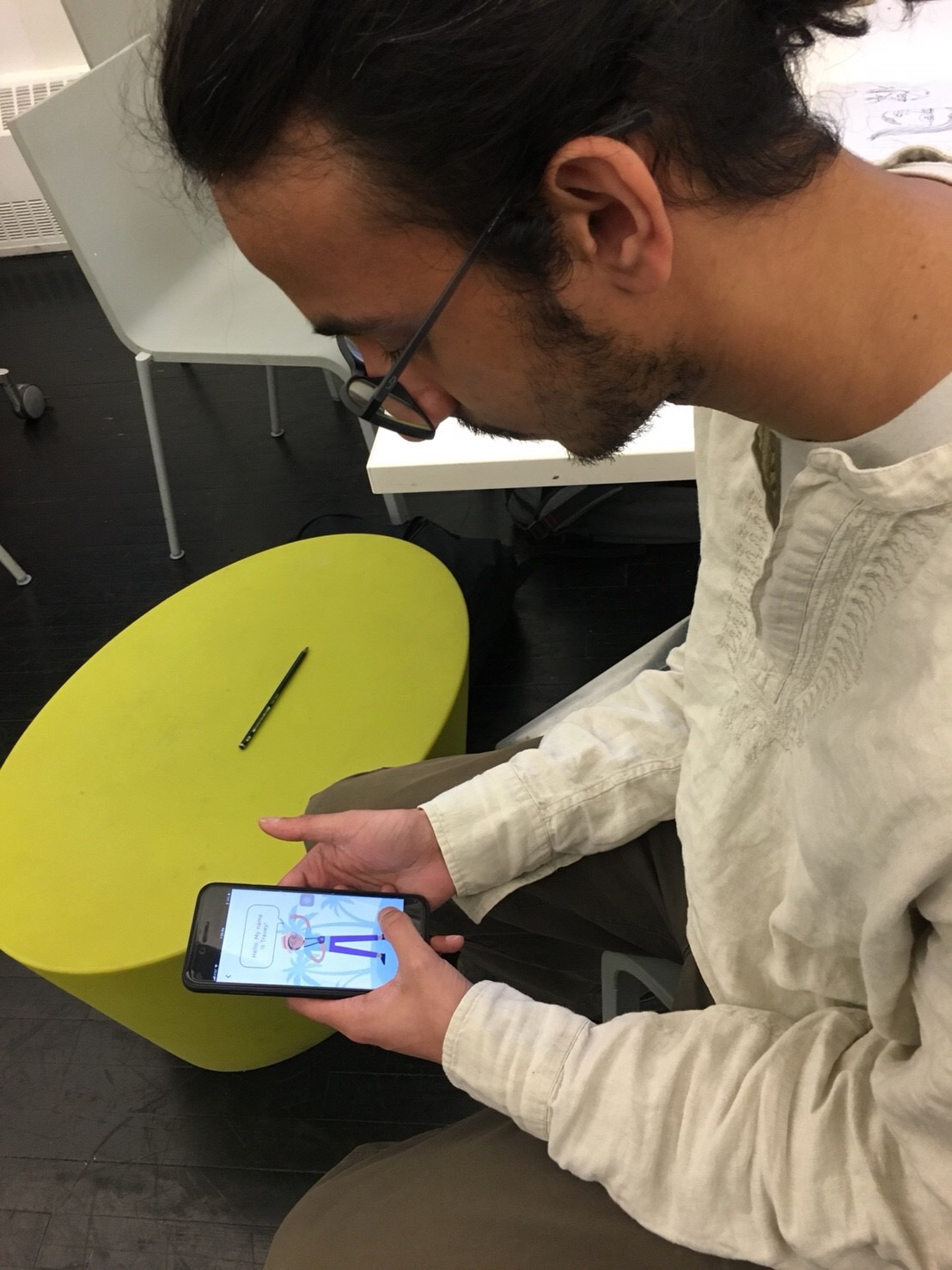
  • We change to make users fill the form through interacting with Travey
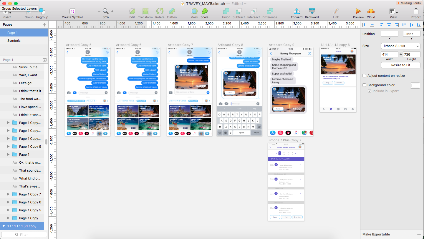
  • We put the saved, invite others, others invite to the same page in the pending tab
  • We put in the itinerary when users 3d touch the trip plan on iMessage
  • We added conversations that Travey assist users during the trip
  • We created a function where users can link their photos album took during the trip to Travey
  • We added the function for users to be able to edit the dates and the companion on the itinerary

Final Digital Prototype

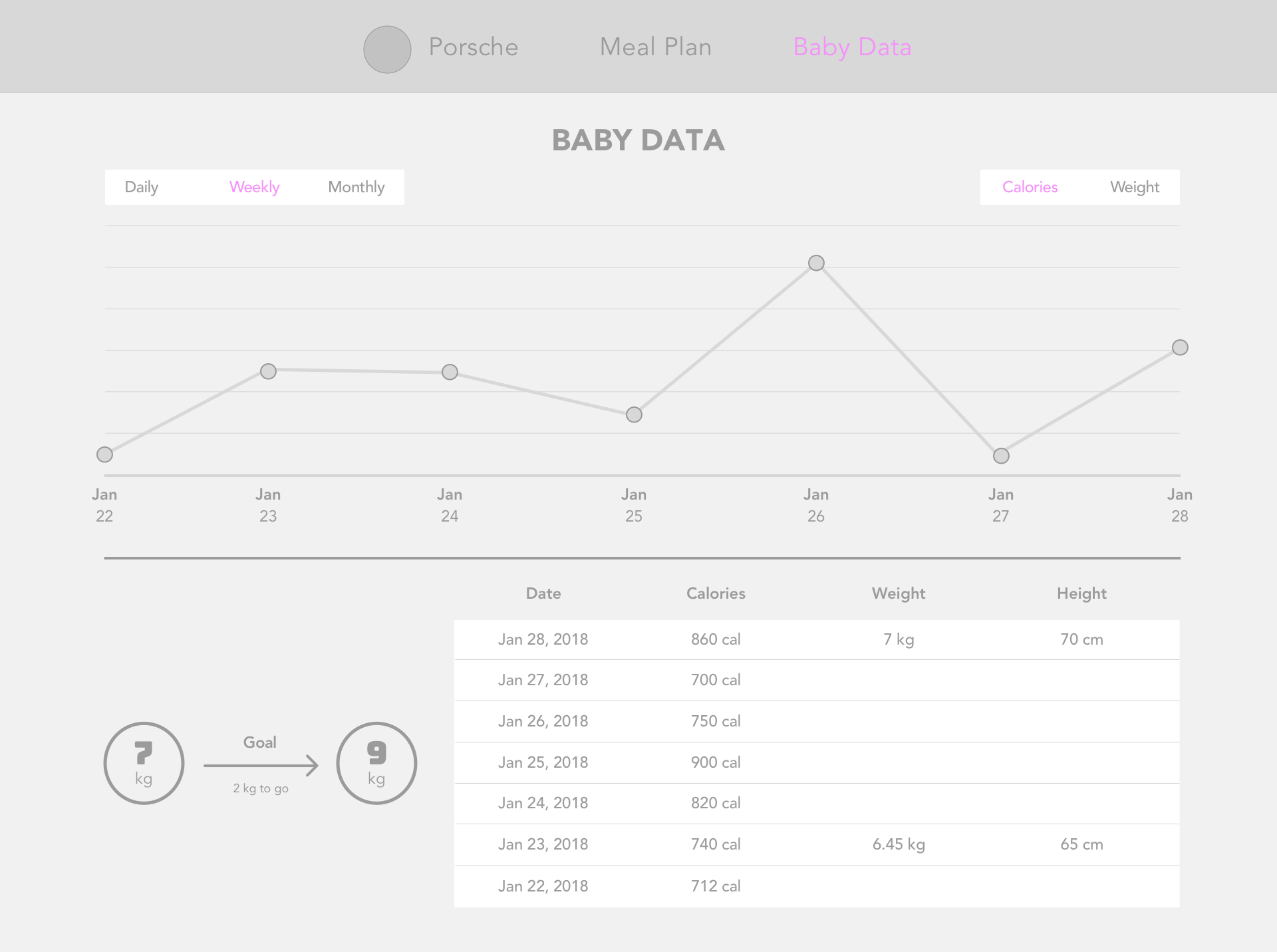
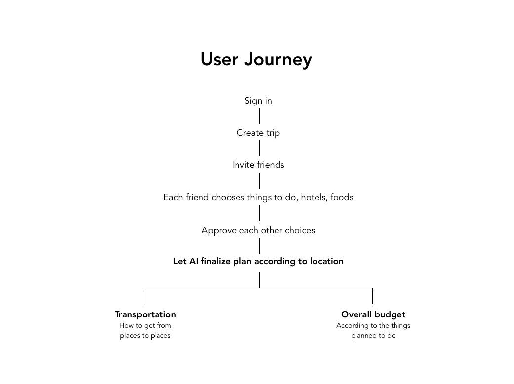
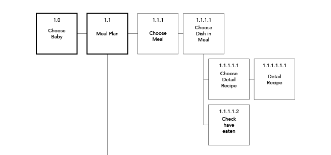
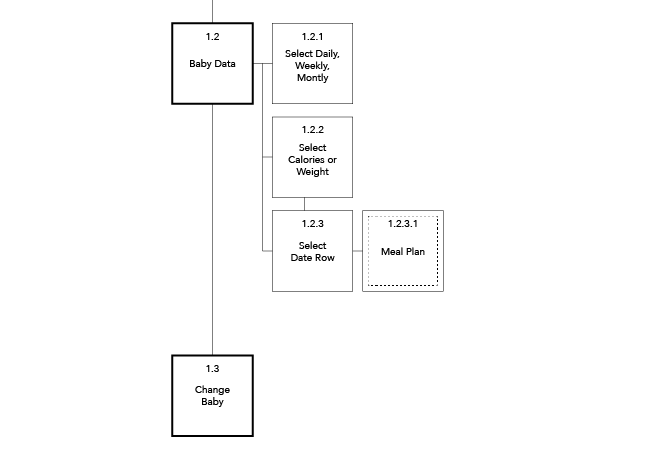
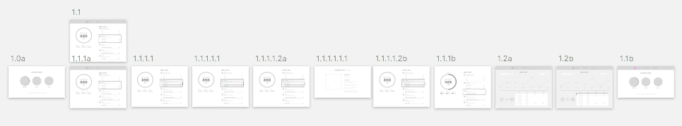
This is how the preferences that Travey use to calculate and plan user’s trip :


Week 11&13_Aim & Jean

We were more focused on how might AI assist people with planning a trip and we created Travey, a trip agent. Travey will be a friend to assist users to create a trip that goes along with user’s preference.

In the experience, users will talk to Travey about their most memorable trip and from then Travey can generate out future trips that the users will possibly like to go.

When the users are traveling, Travey can guide and assist the travellers on what they eat, how to dress up, what’s the weather is like and at the same time users can update Travey about the trip what they like or dislike and also share images with Travey where other people in the trip can also access.

We tested the conversation with Travey where we act as him and talked through iMessage.

Our insights:

-The conversations should be more specific

-Why are forms to fill out separated from Travey’s chat

-The whole experience should be centered around the interaction with Travey

-People don’t know who put in those photos in the memories should have a symbol

-Should be able to input Budget with numbers

Week 9_Aim & Jean

For our final project we decided to create a trip planner app aimed for a group of friends to plan their trips together. Every traveler has their own preferences when it comes to traveling so how might we create a trip that is suitable for everybody to go in one trip. Our idea is to make everybody in the trip be able to select what they want to do and later vote and the computer will generate a plan out for the trip. 

App Map


Comments:

How is it using AI

Should find a way to make trip planning smarter

It’s still too complicated to use


Apple TV Final


In this Baby Balanced Apple TV version, the emphasis is on the viewing part which will help parents prepare the food for the baby easier when viewed from the TV.

From the first prototype, I changed the Baby Data content for Apple TV because if there is too much unnecessary information. My assumptions are parents will only want to see the progress of the baby in the Apple TV and not the details of what the baby has eaten since they will not be able to plan meals from the Apple TV anyways.

Final Prototype

User Insight Apple TV

Insights after presentation

  • Baby data page is confusing. Don’t know how to move to places, should be an easier and faster way to move in the screen
  • There should be a scale on the side of the Data visualization
  • In the recipe detail page, there should be a section for ingredients and a section for instructions because if not it may be difficult to navigate when there is more content
  • For the meal plan, needs to really check if the interaction makes sense or not

Insights after the paper prototype

  • It’s hard to understand that you can move from menu to checkbox
  • The graph in the meal plan looks too important when the user can not even interact with it


#thursdayapps_Aim

Exploding Kittens, the card game now has an app version. Since I’ve never played the card game I want to experience the gameplay from the app. I thought the instruction was hard to understand at first but after playing for the second round it became more clear of how to strategize the game. I was playing against the AI and the whole goal of the game is to not be exploded. I thought they captured the art direction from the card game and transformed it into an app version very well.

Week 7

Apple TV 

  1. The different visual cues that are critical for users to understand where they are focused

2. Apple TV has a disability mode where the layout has more contrast

3. Does not need a back button in the view because users can press the menu in the remote that takes them back to the previous screen

App Map

Wireframe

______________________________________________________

____________________________________________________________________________________________________________

____________________________________________________________________________________________________________

Final Version Baby Balanced

Insights from Week 5 presentation and user test:

  • Login is not the right word
  • Maybe more special symbols to resemble the baby
  • Maybe the baby is not underweight should have space to input doctor’s recommendation
  • Why can milk be planned like other meals
  • If the family has more than one baby there should be an easier way to swap the baby’s data
  • Missing tab bars in many views
  • The color of text is hard to read
  • Planning the meal is too heavy, should be more simple
  • Recipe list confusing
  • Easier way to check if the meal was already eaten

Final Version:

https://marvelapp.com/c1efe2j/screen/38996736

After Presentation Insights:

  • The baby icon can be a baby picture
  • Red psychologically seems to be unfinished and green is finished so the colors in the meal plan should be swapped
  • The switch is not a common use for checkbox because it signifies on/off when the baby already ate the meal it can actually be a checkbox instead
  • The snacks should still be there, babies eat a lot of meals
  • The sign up should be broken down into three screens so it’s not very overwhelming at once
  • Not sure of the differences between back button, done, and cancel button