Dump Cook – Apple TV v.2

2nd iteration of the Apple TV app was based on findings from testing my paper prototype.Because the user only has the remote to interact with the Tv app, it was very helpful for me and the testers to visualize where the focus point was in each view with a coloured sticky note.

dumpCook_AppleTv_PaperPrototype1

dumpCook_AppleTv_PaperPrototype2 dumpCook_AppleTv_PaperPrototype3


dumpCook_AppleTv_PaperPrototype4


Some changes in this 2nd iteration:

  • Made clearer what was in focus
  • Clarified some of the functions by separating it into different views (to view photos inside a recipe, the user now has to click into ‘photos’ before using the left,right to scroll through photos)
  • Added a quick link to the timer directly from Directions view
  • Added new feature of speech to text in Search
  • Sync view informs users how to sync their iPhone app

2nd Marvel Prototype

#thursdayplay

I want to share this simple video editing app ” Quik” (original it was called Replay, they just got new update to this name on May 3rd)


images
images


Originally I was trying to find a simple video editing app on my phone and I have downloaded a few to try. I like this app more than the others because it is very simple to use and make your video look good. You basically just choose a theme you like ( chosen by filter on visual, and a background music goes along with it.) You may not have much accessibility to choose the music or do some adjustment, but I think I would like to use it whenever I don’t have much time to edit on detail. It  just simply makes a theme for you with some good frame transition.

images-1 screen1136x1136

Go!Curry Apple TV oS App (Prototype 2 and Final)

Previous user insights included:
– The UI/UX design of the app (i.e. focus and enlargement of views)
– Make a more seamless flow (from selection to payment to checkout)
– Make a clearly designed flow

My first iteration was completed on Illustrator. The design of my final iteration was completed on Sketch which feels more appropriate for the context of an Apple TV.

Moreover, here is my final Go!Curry Apple TV oS Marvel prototype: https://marvelapp.com/203ac9b

G!C_AppleTVoS

For guidance, I created two scenarios:
1) You are a first time Go!Curry customer.
2) You’re a loyal Go!Curry customer ready to order your usual.

EAT CURRY. BE HAPPY.

Cheers,
J

Yue and Jasmine – 05/06/16 User Feedback

Feedback from last class regarding our second iteration included:

– Button sizes: Tappable buttons for play, pause on video screen
– Consider categories: Although we have been implementing Lynda’s organizational system (way of categorizing and designating titles to videos and paths), we realize that it is quite confusing. For instance, the category of 3D+Animation includes paths, “Become a 2D animator”, “Become a 3D animator”…
– Make it easy for the user by having an edit button (instead of assuming that the user would know to slide the button in order to remove a tab).
– Consider having a special account section that is not LinkedIn’s. Allow users to upload to LinkedIn (seperate app).

To refresh your memory, here is the app:
https://marvelapp.com/1j6b9ee

Yue and Jasmine – Critique of Final Iteration Lynda Learning Path Apps

Hey everyone!

Thanks for an awesome class. Much love.
Anyway, here is our feedback from the critics for our final iteration.

Verbiage:
– Terminology of Bookmarks is quite awkward. Consider something like “My Videos”.

Look and Feel of the learning experience:
– Stock photos look corporate and stale
– Lists are boring (explore and gamify this experience)
– It looks like a podcast list, is the learning experience predominantly through listening, watching? It would be interesting to consider other accessibility points as well (as Lynda.com also has the video transcription to follow along).
– If the video is the main learning experience, consider minimizing list information, and maximize views of video.

Design Intent and User Flow:
– Reexamine user flow as there are some dead ends. We notice that in our app, we give users the option to share their completed learning paths on LinkedIn. There is an opportunity for an auto-share or suggested share, after a learning path is completed.

Next Steps:
Which brings us to the question, how can we make the learning experience fun?
In the future, we want to implement a fun learning experience.We will explore new ways of experiencing these paths (as they range from 10-68 hours).

_________________________________________________

This was our Apple TV app which was not fully resolved.
https://marvelapp.com/1j6b86b

Our main critique included “in and out of focus” UX/UI of the Apple TV platform, as well as maximizing the video as one of the first screens (reexamining user needs).

Thursday Plays: Tab, bill splitting app

tab-landing

Tab is an app for splitting the bill between multiple people. It super easy to use, and not everyone at the table has to have the app for you to be able to include them in the calculations. But if they do have the app, it’s still super easy to share the bill with them.

I have to admit, I rarely use this app because I don’t often go out to eat with large groups of people and it’s easier to guesstimate bills with close friends. But on those special occasions where I’m eating with a group of tech geeks, I like to pull out this app 🙂 It also looks like they just added a feature to pay your share with a linked Venmo account.

tab-main
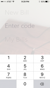
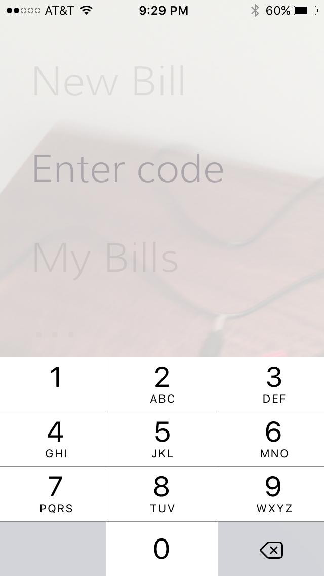
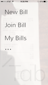
From the main screen, you can add a new bill, join a bill your friend just added, view your history, or go to settings, where you can go show the tutorial, link your Venmo account, or find a lot of ways to review or share their app.


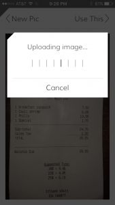
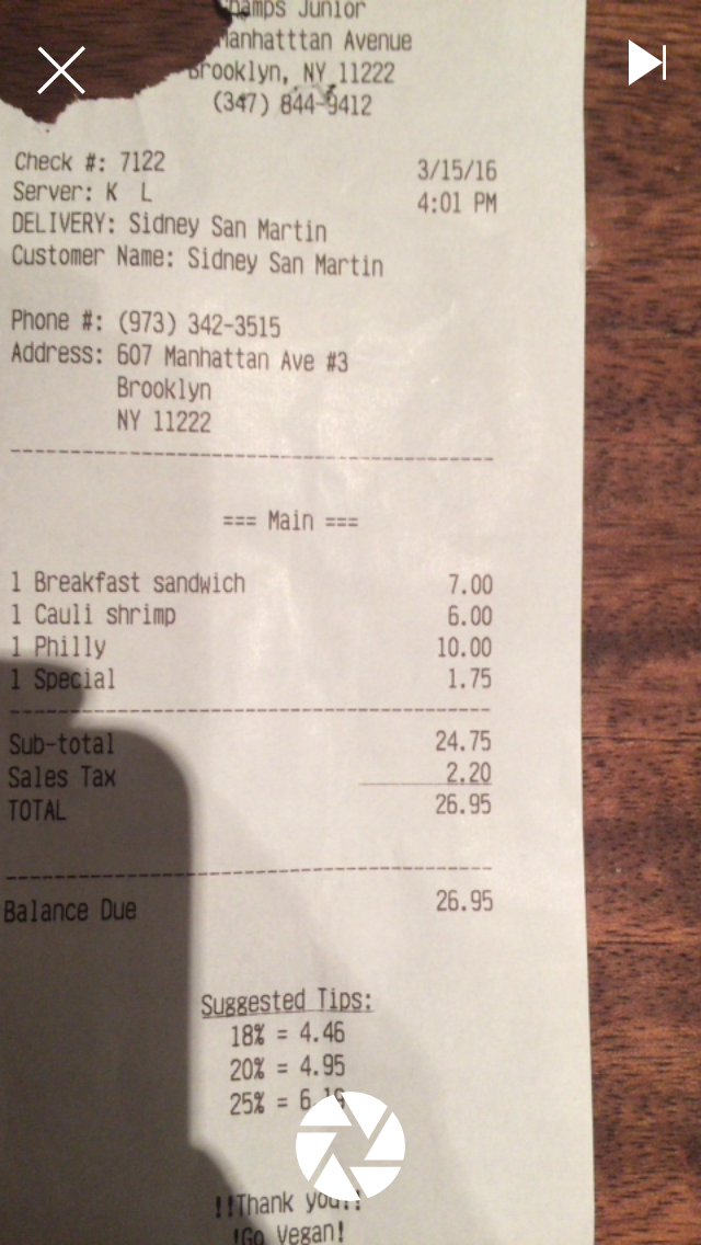
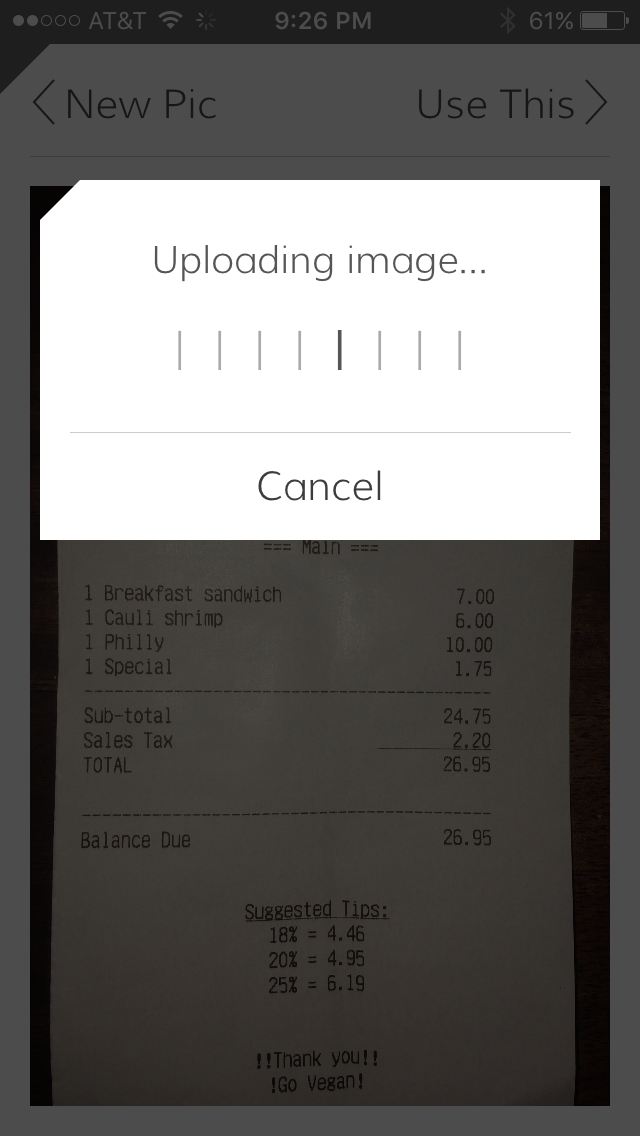
Once you tap New Bill, the camera view comes up to take a picture of the receipt, with pop up alerts to let you know if the photo is unreadable. You can choose the skip the photo and enter the items manually by tapping the button on the top right in the camera view.

tab-newbill1-photo tab-newbill2-loadingtab-newbill3-name


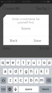
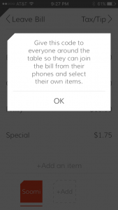
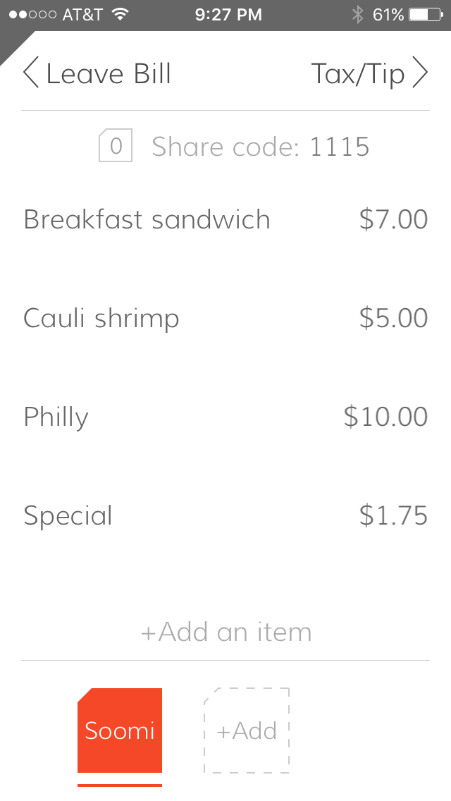
After you enter your name, you come into the bill view. On the top is the ‘share code’ for other Tab users to join so they can help split the bill.


tab-newbill4-billtab-newbill5-sharecode
tab-joinbill


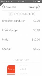
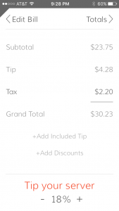
Once all the people have joined, or manually added (bottom right button in the bill view), they go into each person’s tab on the bottom to highlight all the items for that person. You can also change the tip amount that everyone agrees on that will be split into everyone’s totals.

tab-newbill6-selecttab-newbill7-tiptax


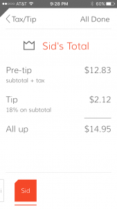
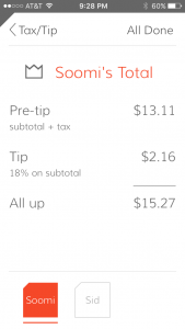
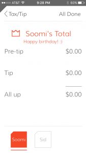
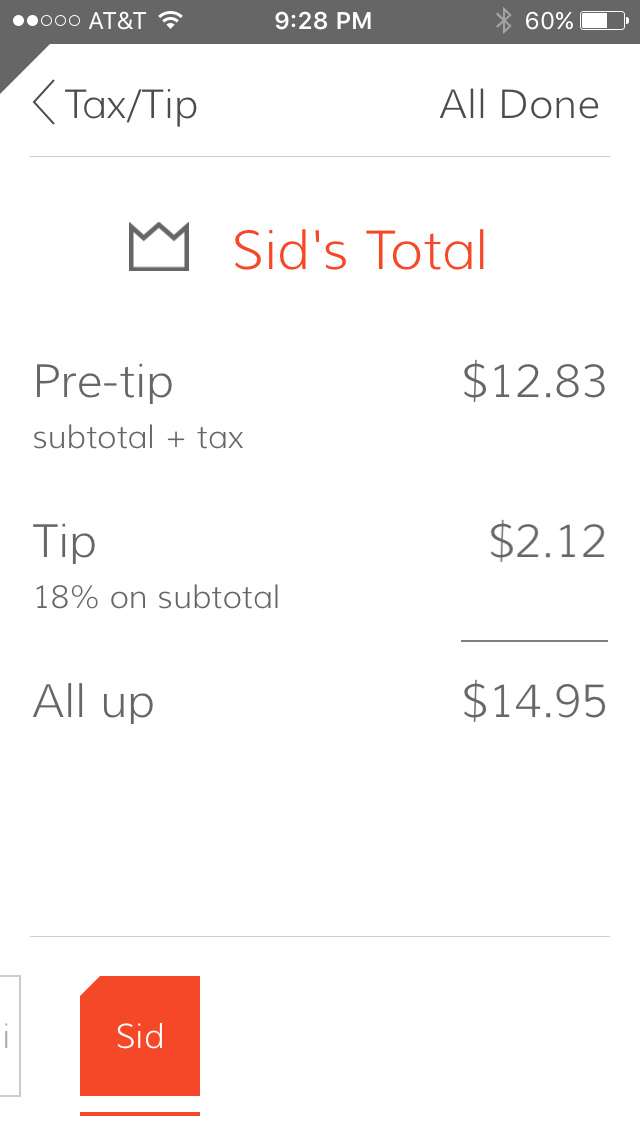
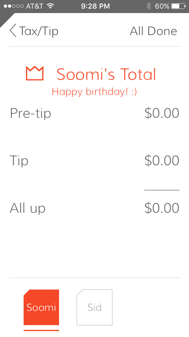
Then each person can see their own total, including tax + tip. There’s also a birthday setting so the birthday person’s total gets divided up by the rest of the party!

tab-newbill8-individualTotal2
tab-newbill8-individualTotal1tab-newbill8-individualTotal3Birthday


Again, I think this is a great app for large groups, especially for birthdays because of the handy birthday feature. They seem to have added all the functions you would need to split a bill with the least amount of inputs. But honestly, the few inputs are still more time consuming than to split a bill between 3-4 people mentally and rounding up.

Freebox 2.0 | Final Presentation

It has been quiet a learning experience for both Dana and me in developing our project Freebox 2.0 by implementing our understand from mobile media and design for usability class , to help us iterate our app design better and to make informed decision in the whole process. You can find more details form the previous post mentioned below.

Final Presentation

Here is the link to the Freebox FinalPresentation

Interactive prototypes 


#Final Presentation: Lens_Cathy & Jin

In order to have more people watching more VR videos, we presented LENS for iOS and for Apple Watch:

LENS for iOS is an app for user to search, watch VR videos. LENS for Apple watch is an additional accessibility app in order to prevent users from taking their phones out of Google Cardboard often.

Changes we have made based on the last two user tests/presentations:

  1. Changed the hamburger menu to a bottom bar.
  2. Improved watch app, instead of using digital crown to enable voice control function, we are designing the ui view to a “full-screen” button. People can tap twice on any current view to enable voice control.
  3. Some small visual improvements on previous ui design.

Presentation slides

Marvel Demo


Thanks Drew! For a great semester!! 🙂 Enjoyed your class a lot!

Cathy & Jin