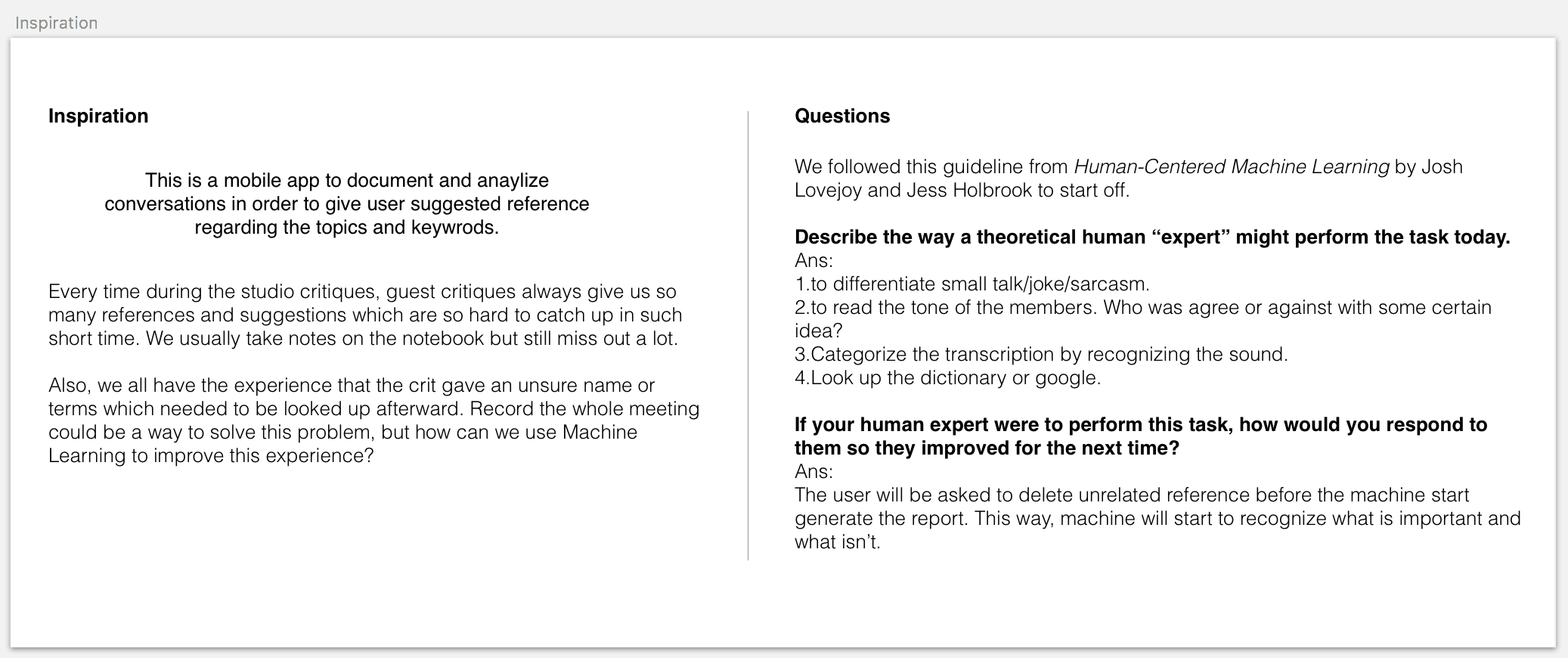
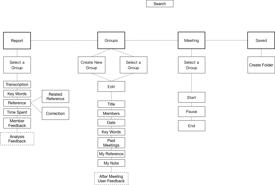
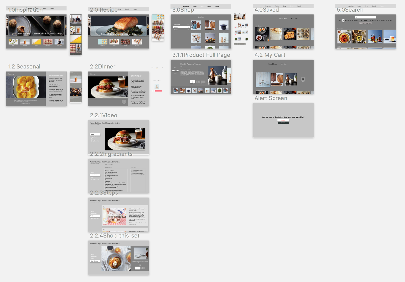
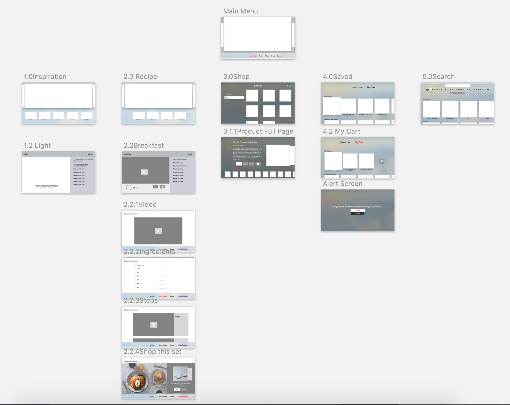
Thursday App

Recently I am really obsessed with my new iPad pro and apple pen.
I downloaded a lot of sketching app but I like this one called Paper the most.
The biggest feature is that it introduces different styles of sketches. You can sketch right next to the example and use their suggested strokes and color scheme.
Compare to other fancy Adobe sketching apps overwhelmed with a bunch of tools, this app is good for beginners to explore their own style.


Ting and Jason Final

Mobile Media Final Presentation

Smart Note is a mobile app to document and analyze conversations in order to give user suggested reference regarding the topics and keywords.

Final Digital Prototype

Motion Demo 1:
When the user is presenting on the stage, she may not be looking carefully at what words did the app captured but some kind of feedback still need to be shown on the screen. Just like the wavy pattern we had when talking to siri, the motion of the keywords implicated that the app is listening, thinking, and searching.

Motion Demo 2:

In the Analysis tab, users have to scroll left to see their different focuses in the past.


Week 12 Jason & Ting

Feedback from last week:
1.Two tabs are super weird. There should be a more convenient way for users to search all the archive.
>We redesign the tabs into Meetings / Saved / Profile.

2.The keyword tracking feedback on the record page looks like a tabbable link.
>Moving texts floating from the bottom to imply the users that the machine is listening.

3.Users should be able to customize the keyword. Scale the text when it is important, delete it when it is irrelevant, and type in keywords machine did not get.
> When hold on the text, it turned into pink and then enter the edit mode.

Week 10 – Ting and Jason

Smart app for meetings.

We are designing an app to record, analyze, and provide related references for group meetings. 

Inspiration:
Every time during the studio critique, guest crits always give us so many references and suggestions which are so hard to catch up in such short time. We usually take notes on the notebook but still miss out a lot. Also, we all have the experience that the crit gave an unsure name or terms which needed to be looked up afterward. Record the whole conversation could be a way to solve this problem, but how can we use Machine Learning to improve this experience?

Questions:
We followed this guideline from Human-Centered Machine Learning by Josh Lovejoy and Jess Holbrook to start off.

  • Describe the way a theoretical human “expert” might perform the task today.
    Ans:
    1.We would expect the expert to check if anyone mentioned incorrect information.
    2.to differentiate small talk/joke/sarcasm.
    3.to read the tone of the members. Who was agree or against with some certain idea?
    4.Categorize the transcription by recognizing the sound.
    5.Look up the dictionary or google.
  • If your human expert were to perform this task, how would you respond to them so they improved for the next time? Do this for all four phases of the confusion matrix.
    Ans:
    1.The user will be asked to delete unrelated reference on the report tab.
  • If a human were to perform this task, what assumptions would the user want them to make?

Week6_Ting

What I learned from Apple TV HIG:

1.Difference between the three gestures
a)swipe – directions, going through large volumes of content.
b)click – triggering actions.
– hold + click = enter an edit mode.
c)tap – directions, going through content one by one.

2.Design for different focusable item states.

3.Parallax is a subtle visual effect used throughout the system to convey depth and dynamism when an element is in focus. Through image layering, transparency, scaling, and motion, parallax produces a 3D effect with a sense of realism and vitality.

tvOS_food_appMap

Week4_Ting

User Feed Back

Structure
1.Two floating buttons are weird. Need to decide whether search or saved item is more important to have an individual tab. In this case, search seems more important; I decide to keep saved item in the profile tab.

2.News tab > Inspairation

3.Missing sub-category page.

4.In the Profile tab, the food preference tags seem unnecessary.

5.Pantone color smoothie: kept only the “Brightness” slider to restrict users picking from yellow, orange, green, and purple color scheme (because not all the colors can be made by smoothies.)

Design
1.The background color for tabs shouldn’t be the same color as the app background, and the highlight color pink is unclear.

2.In the full recipe page, steps instructions in the bottom change to slide show, following step by steps by swiping left.

3.Bigger bigger bigger!

4.The plus sign next to products in shop tab are confusing.

5.Remove the cart logo and show “4 items in cart” with text  on the upper right corner.