Visual Design Prototype 4

From the user testing, I realized that the directions were still unclear for my purpose. To change this, I played around with iconography and incorporated Google map directions in text form. The user can also go back to view the map on the upper right corner if desired.

The new map will display the directions one by one, and as the user reaches the goal, it will turn a different color. The directions will keep scrolling up until the user has reached the destination. The microphone icon I had before seem to confuse people (they thought its function was to speak into the phone), so I changed it to a Speaker.
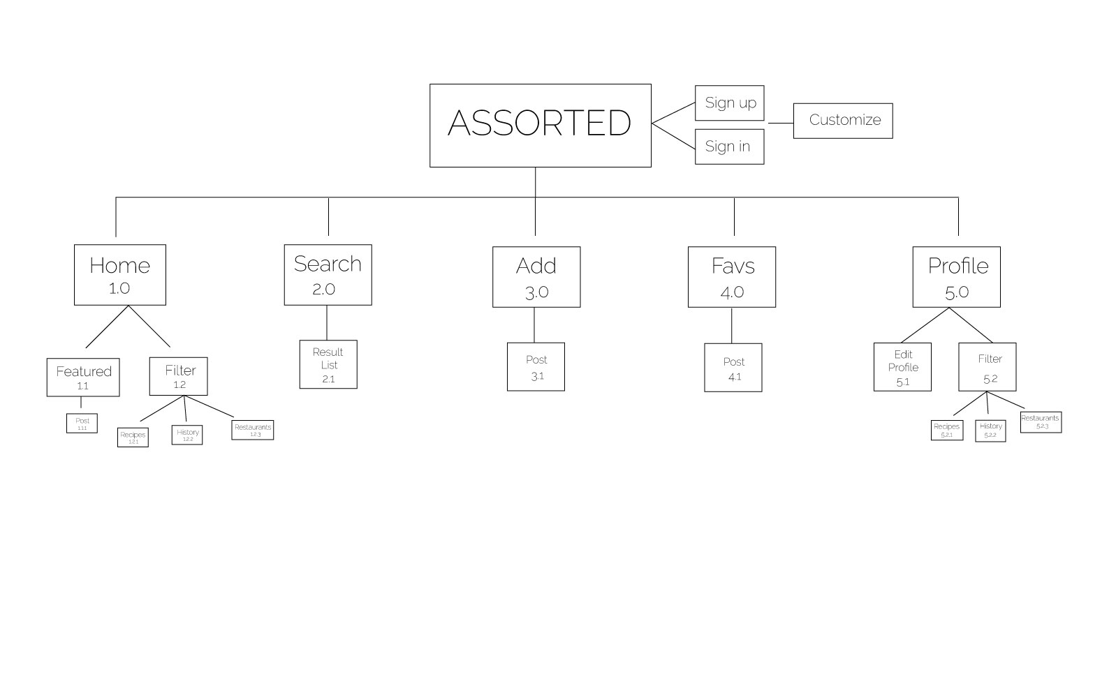
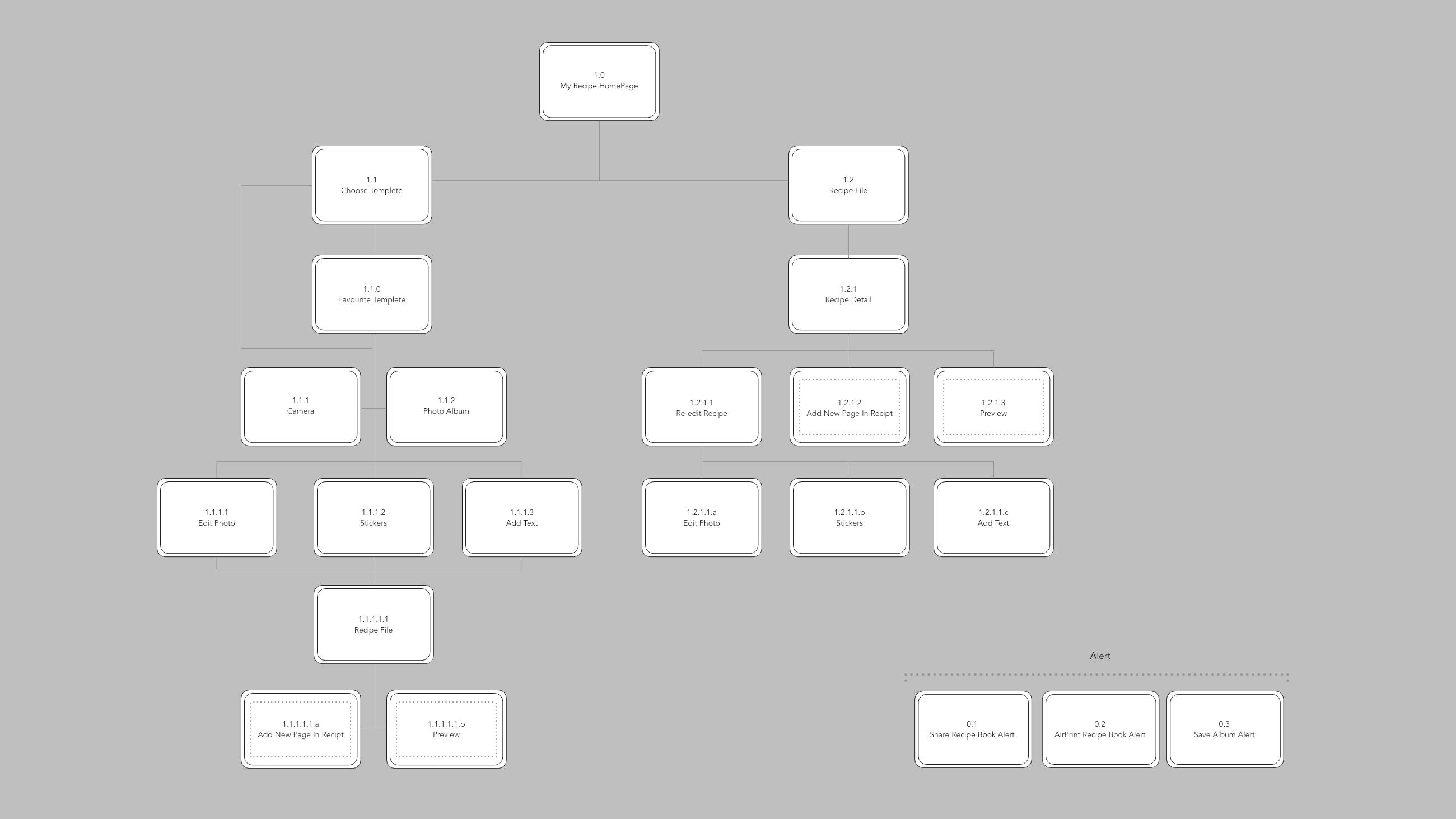
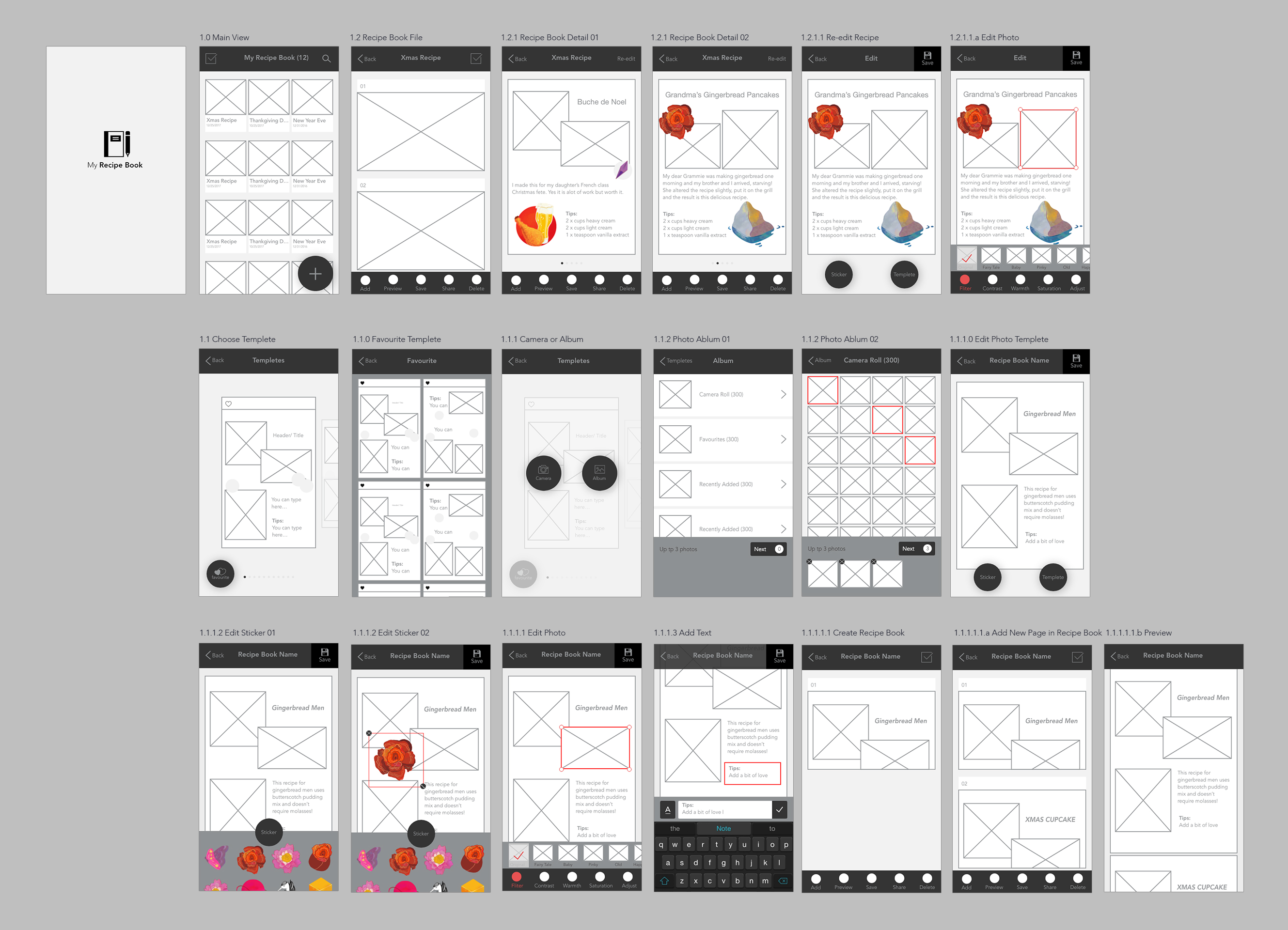
zhant293_prototype4

Digital Prototype:

https://marvelapp.com/3200if5 

Prototype 3 Visual + Interactive prototype

Stamp Stamp:

The thing that I have learned from the feedback:

•       There is no return button, people are not able to go back to the landing page.          – I revised the “Near” button and made it link to the “landing page”.

•       The redeem context is not clear and not obvious.

– I enlarged the text and also make it bold.

•       On the landing page, it will be better to see their stamps. (motivate people to collect the stamps)

– On the landing page, I added some restaurants which they collect the most stamps.

Visual + Interactive prototype :   https://marvelapp.com/1d75771


For March 2, 2017

  • Iterate on your visual design . Group 2 will present their designs in class.
  • Iterate on your digital prototype to test during class using Marvel or another digital prototyping tool of your choice. Please duplicate your prototype instead of editing the original one, that way I can look back at each iteration.
  • If you didn’t do it last week, note 3 things that you changed in this iteration due to things you learned from paper prototyping with users to get credit for doing your paper prototyping.

App Economics Parsons 2017

On March 9, both groups 1 & 2 will present their final iterations of Project 1 for outside critics. The syllabus has been updated to accommodate the snow day.

Prototype 3 visuals + interactive

I shifted my idea to an app for food diary, and it will recommend closed restaurants based on what types of food you ate before.

I got many feedback from my last prototype, for example, people do not like “shake” feature, so I change it to use “swipe” to look at recommended food. They also think that showing closed restaurants on map is unnecessary, so I choose to only show one image of a dish per swipe. The location will show up only when the user is interested and tab on to see more information about the dish.

my food diary

Interactive one on marvel:

https://marvelapp.com/2b8j08i/screen/25207575


Brandon Palmer | IOS & Google Material Design Specifications

Mobile Media:

01/28/17

IOS HIG (Human interface Guidelines)

  • Clarity
    • Icons are created to be subtle and precise
    • Negative space, colors, fonts, graphics, and interface elements highlight importance which convey interactivity
  • Deference
    • Content typically fills the screen
    • Minimal use of bezel, gradients, and drop shadows keep the interface light and airy ,while ensuring that the content is paramount
  • Depth
    • visual layers and realistic motion convoy hierarchy. Transitions provide depth as you navigate through content. 
  • Metaphors
    • People learn quickly when objects and actions are metaphors for familiar experiences. Like flipping through pages of a book. 
  • User Control
    • People are in control. Not the app
    • Apps can make warnings. But the app doesn’t control decision making. 
    • The best apps find a balance between enabling users and avoiding unwanted outcomes. 
    • Apps make people feel like they are in control by keeping interactive elements farmilar and predictable, and making it easy to cancel when operations are underway.  
  • Widgets
    • widgets provide information without needing to open an app
    • people add widgets to the search screen 
  • 3D Touch
    • Pressure sensitive (Peek, Pop, Quick Actions)
    • Accessibility features are created for people with hearing, vision and other disabilities 
  • Authentication 
    • People often abandon apps when they have to sign in first. 
    • If your app requires authentication, display a brief friendly explanation on the login screen that describes the reasons for the requirements and its benefits 
    • When possible present choices. Its important to add options that are easily assessable, instead of typing in responses. 

Android Design Guidelines

  • Environment 
    • Material Design is a three dimensional environment containing light, material, and cast shadows.
    • All materials have an X Y Z dimensions. 
    • Light and Shadows. (Key lights create directional shadows. Ambient light creates soft shadows)
    • Materials are always 1dpi thick
    • Materials cannot pass through each-other
    • Material never bends or folds
    • Material sheets can connect and join together
  • Motion 
    • Material Design is alive, aware, and intentional 
    • Responsive animation to create energy
    • Material Focuses on how fast it moves instead of how long it takes to get there. 
    • Monition shows that an app is organized, and what it can do. 
    • Motion is quick. Shouldn’t keep the user waiting longer than necessary 
    • Motion is clear, simple, and coherent. They should avoid doing much at once
  • Color
    • All color pallets should include sufficient contrast between different UI elements
    • Limit your selection to 3 hues from the primary pallet and 1 accent color from the secondary pallet. 
    • Primary Color should be the most widely used color across all of your screens and components
    • Secondary Pallet can be used to indicate a related action or information
    • Accent Color Should be used for floating action buttons and interactive elements
      • Text fields and cursors
      • Text Selection
      • Progress Bars
      • Selection controls, buttons and sliders
      • Links
    • If your background color is the 500 version, make your accent either white 100% or black 54%
    • Dark text on light backgrounds (Opacity)
      • Primary Text 87%
      • Secondary Text 54%
      • Disabled/Hint text 38%
      • Primary Color 100%
      • Accent Color 100%
    • White text on Dark backgrounds
      • Primary Text 100%
      • Secondary Text 70%
      • Disabled/Hint text 50%
      • Primary Color 100%
      • Accent Color 100%
    • Use opacity instead of grey text. 
    • Icons and other elements work better being black or white at 38% opacity
      • Dark Icons
      • Active Icon 54%
      • Inactive 38%
      • Light Icons
      • Active 100%
      • Inactive 50%
  • Themes
    • Lets you apply a consistent tone to the app 
  • (post on blog one #thursday app before midterm and one after midterm) 
  • You need to write about your critique and iterations on your paper prototypes 

Design Tools for Prototyping 

omnigraffle

Framer

Flint

Marvel 

Point is measurement sequence

4 pixels in every point

packs more information into a smaller size

Zhiyang (Rainie) – App Map & Wireframes for Food App

Concept:

  • An online mobile photo-sharing community that allows people who have fitness goals to share pictures of their DIY meals or meals from restaurants that meet their fitness needs
  • A source for fitness meal inspiration from real people around the world


App Map:

https://drive.google.com/file/d/0Bxu-j9eOkv5XTmJiUi11LWhZU0U/view?usp=sharing


Wireframes:

https://drive.google.com/file/d/0Bxu-j9eOkv5XZEt5TmhkSjIyMmM/view?usp=sharing

Hanyu Zhao | Food App | My Recipe Book

My Recipe Book is an application that allows the user to customize and decorate their recipes with various templates and stickers. Inspired by recipe books that housewives love to write after they finish making delicious meals, My Recipe Book App provides similar functions that allows the users to create their personal and unique recipe books.


Appmap PDF link


Wireframes

Video Link – Wireframing


Three things I learnt from IOS HIG (Human interface Guidelines)

  1. Social Media: Don’t ask people to sign in. iOS employs a single sign-on model for accessing social media accounts, so you can get authorization to access an account without requiring authentication. If the user isn’t signed into an account, you can display a system-provided interface that allows them to do so. (This is something I have strongly common feeling when I was doing the first assignment. It is better to let users at least to try your App first. If users find there are too many requirements or limitations to your App, they will lose interests and even delete your work from their phones )
  2. Notifications: Don’t include your app name or icon. The system automatically shows this information at the top of each notification. (Always to keep the interfaces of  phones clean and neat)
  3. Refresh Content Controls: Perform automatic content updates. Although people appreciate being able to trigger an immediate content refresh, they also expect automatic refreshes to occur periodically. Don’t make users responsible for initiating every update. Keep data fresh by updating it regularly. (How to save time for users and never bother them to do anything “too simple”, therefore, the users would spend more time o gluing to your App)