Feedback from the Digital Protoypes

* Look up Noun Project

* The “List” text should be on the left & “Map” on the right

* Add an extra filter option(Search icon) “Size of Space” -S, M, L

*Add icons to the studio page information like phone, map, amenities etc

*Add detailed info on the studio page

*Instead of the “Home” button on the confirmation page, maybe change it to list of reservations(the saved search icon) have it navigate to that page & have it at the bottom of page

*Add favorites/ratings/starredplaces

*Add a “Heart” & “number of comments” icon on each of the studios on the list view

*Text legibility – look as apple interface guidelines

*Add comments on the studio info page

*change icons to appropriate ios 8 icons (search, saved searches, share icon, back button, arrows, etc)

*include all sub-pages


PON! UI

From last week we learned a lot from paper prototyping.

We decided to put the “adding source” feature before the app sync user data. Based on our A-B test, we realize that our users want to see the prioritized result as soon as possible, so we decided to simplify “adding sources” feature to one step. We did another A-B test of working steps in each single task. The thing we learnt is that every user group has a different opinion on this feature. For students, sometimes they are lack of motivation to finish tasks, so they wish to be motivated by steps. But for these professional people, who have better self management skill, they care more about the priority of tasks. So we decided to allow our user to turn on and off this step feature for their own use. Also, only these complex tasks will be broken down into steps. Some users don’t know how to punch phone. Because punch is the core interaction of this app, so we need a clear introduction to tell users how to interact (punch) with this app. Also, when users finish a single task, they want to have feedback from the app to tell them what they have been finished, so they will get more achievement from the task they finished. So we change the chart after user finish tasks. Sound or vibration feedback is very necessary for punch interaction. Because users can’t look at the screen when they punch the phone, so they need some feedback to let them know they are going to next step.

178_img_01

UI Prototype on Flinto:
https://www.flinto.com/p/eec3a99d

Design Prototype: It Speaks (Pauline/Yihan)

Design Prototype: https://www.flinto.com/p/55003e77

First Round User Testing:

– We should modify the graph system to “rate feelings” (not clear enough)

– We should have the user log in somehow (with Facebook)

– The homepage should be feeds from other people, ordered with most popular post first

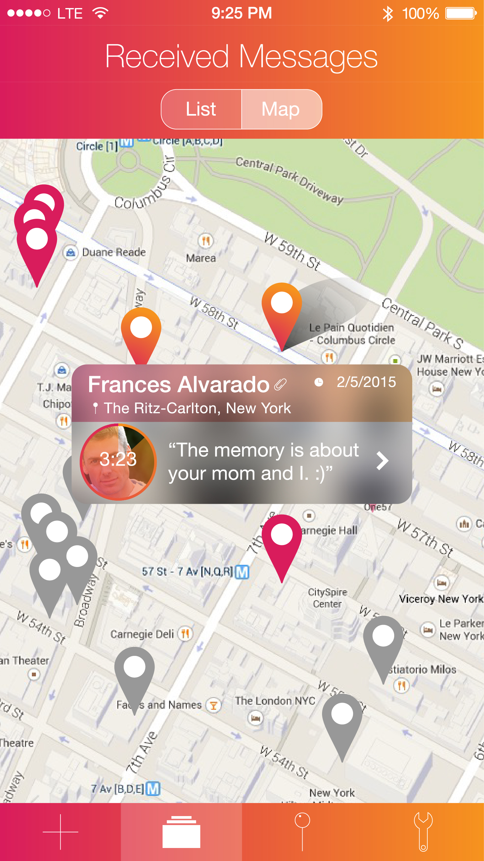
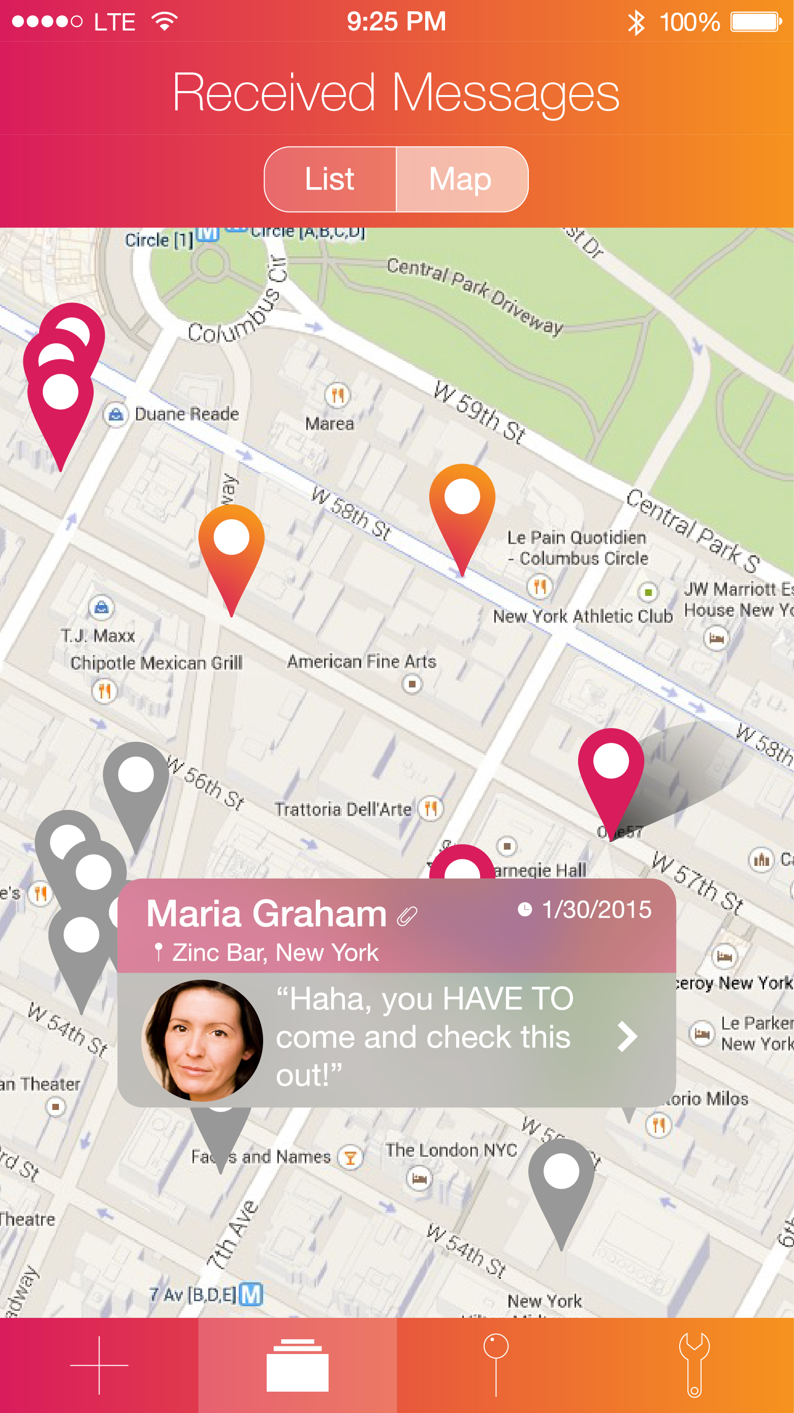
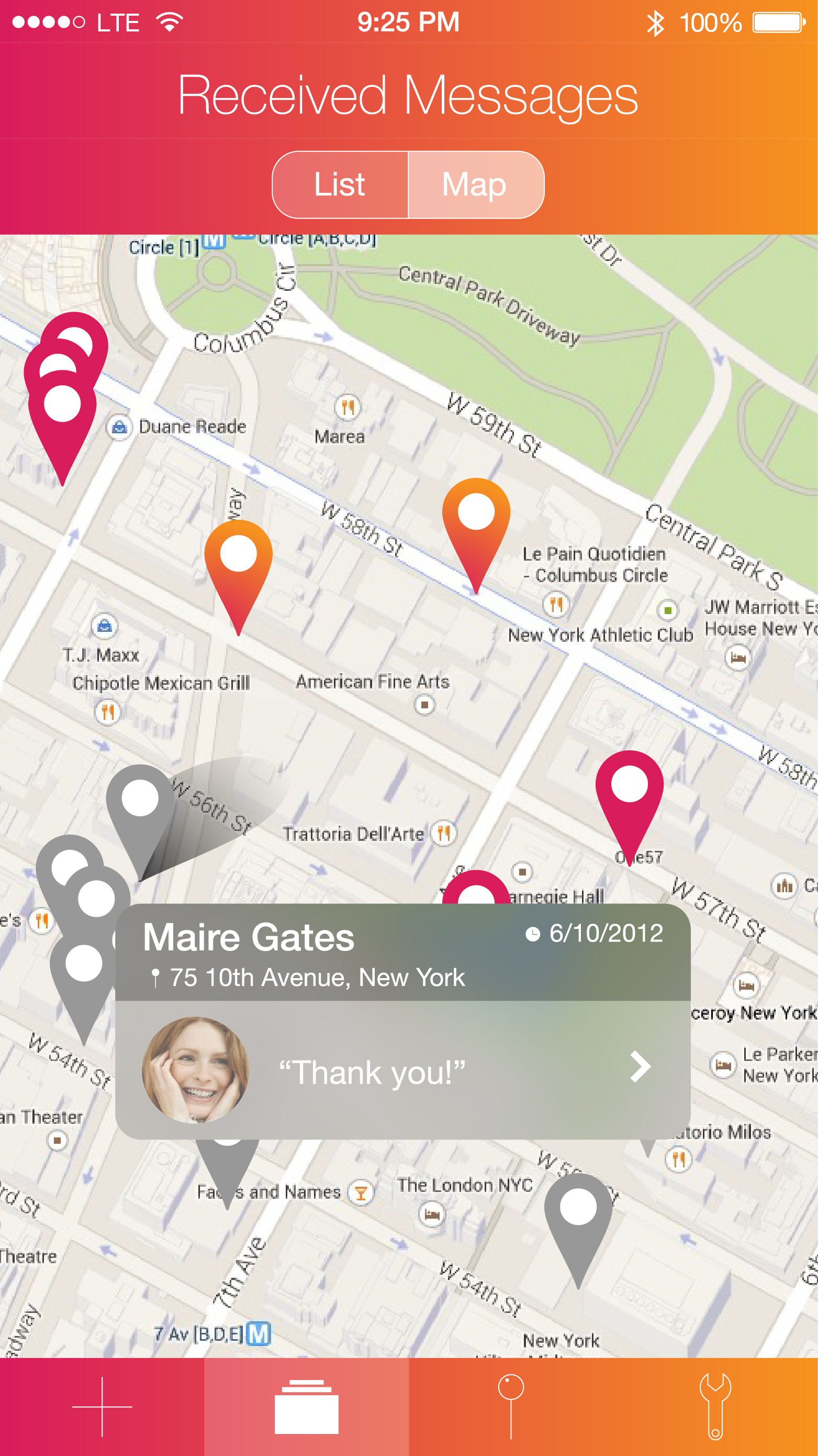
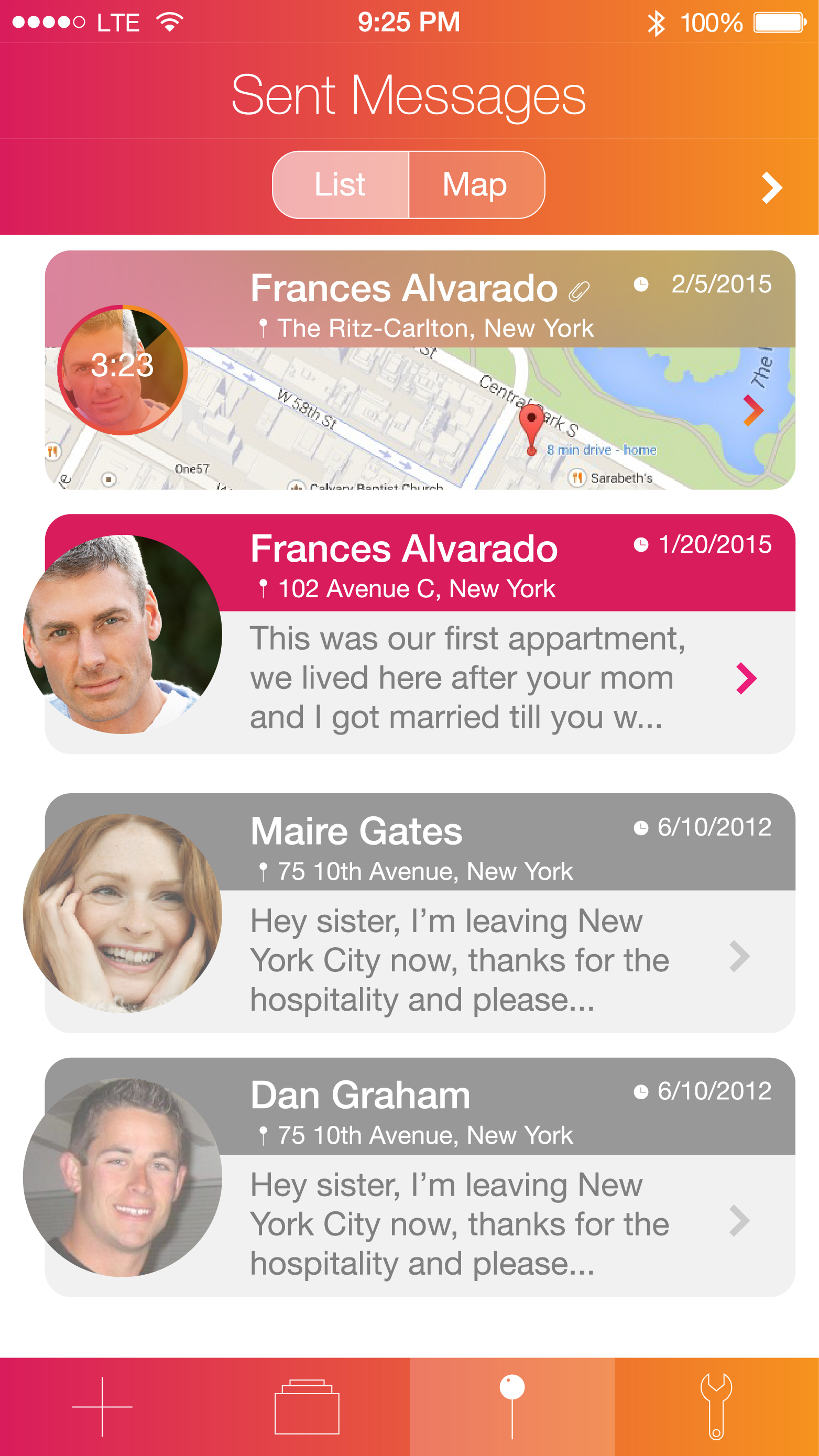
– We should emphasize the interaction between readers and writers, meanwhile give the control of managing the comments back to writer. (Once the readers send a note to writer, this note is only visible to the writer. The writer can choose to make it public.)

– We should make every post public (but anonymous)

We took into account these inputs and modified each of them.


Second Round User Testing:

Structure
– Change show feed from friends and family to show the most popular ranking list.
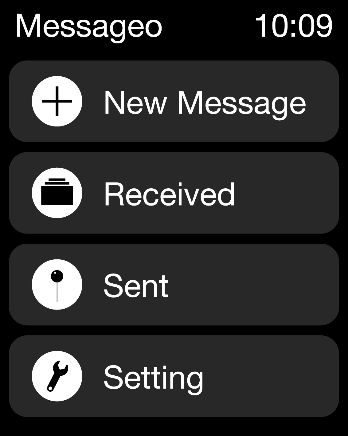
– Reconsidered the main menu, change top to another way: bottom or left
The way to show text
– Change the way of displaying the content for automatically to manually. (Since some people are fast readers, some are slow readers. It will be better to let the reader adjust the reading speed themselves.)
– Redesign the typography of the story to construct a delightful reading environment, and test to see if the user read the story.
– Scrolling down the screen to see the story
Note
– Emphasize the interaction between readers and writers, meanwhile give the control of managing the comments back to writer. (Once the readers send a note to writer, this note is only visible to the writer. The writer can choose to make it public.)
– Design the notes history part
How to measure feeling
– Delete this part to keep the function as simple as possible, as pure as possible.
Some detail problems
– Change recommend it to like it.
– Show how many time this story has been hearted
– Change “speak” to “Publish”
– Delete “group setting” and “I feel lucky”
– Delete the feedback part
– Consider the color pattern
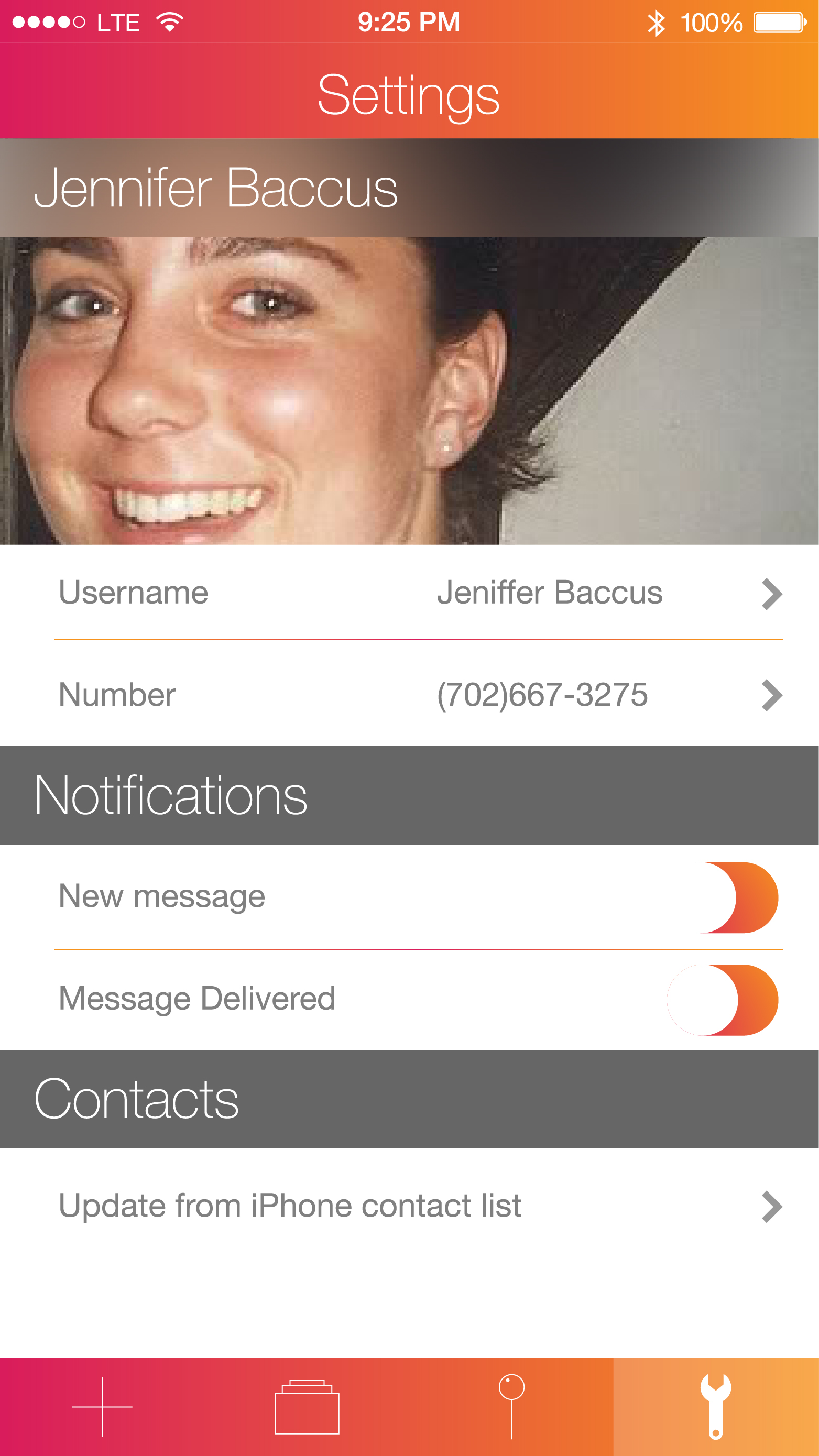
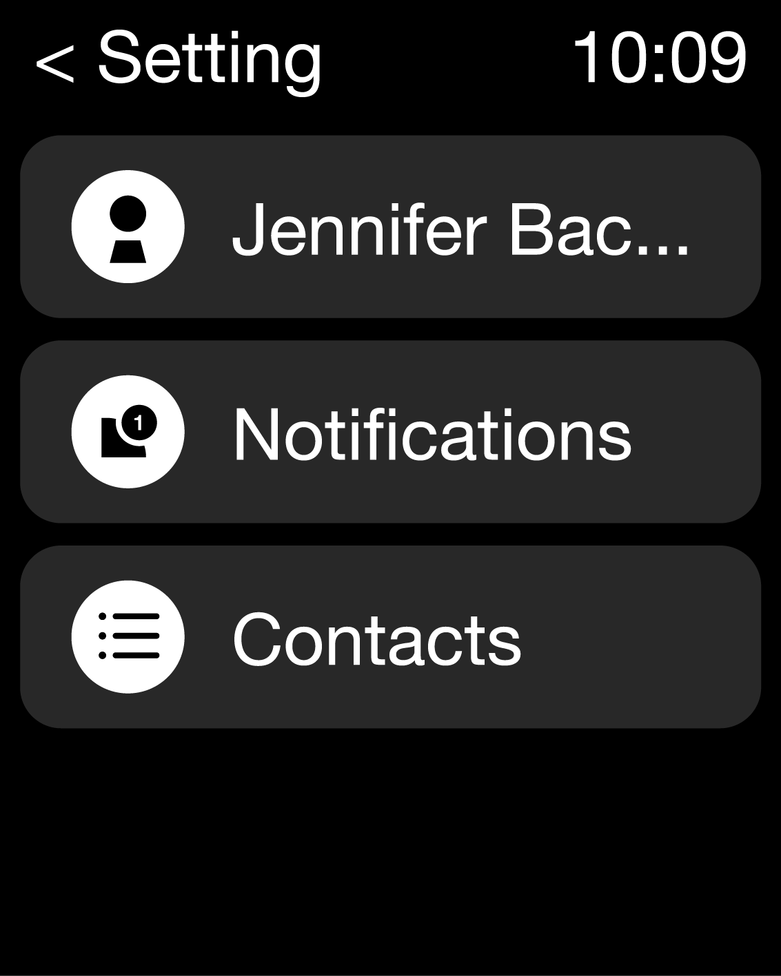
Setting
– Content of the setting: Night model. Adjust the font size. Hearted story.

Third Round User Testing:

Unexpected User Reaction
Solutions or Potential Solutions
Tap on one of the images, but only view the image itself without reading through the whole story
Adjust the image size and leave some space for story’s title. Or add an arrow.
First time users usually do not know the function for each part.
Add a title for each part.
Some users require an easier way to go back to home screen.
Drug up to an certain point and the story screen will jump up and disappear. (Achieve this effect in AE)
Readability of the title for every image on homepage
Adjust contract or add a gradient layer
Try to scroll the homepage.
make the homepage scrollable.

Screen Shot 2015-05-14 at 7.46.53 PM

Screen Shot 2015-05-14 at 8.38.18 PM

Thursday Plays: 7M Workout

IMG_0650 IMG_0647 IMG_0649

7M Workout is an app that gives you workout exercises to do for 7 minutes.

I really like how the app is presented: a movement is explained vocally by a “coach” and visually by an athlete doing the movement. There is also a clock that tells you when to start and stop an exercise.
What I enjoy the most in this app is that it is very easy to use and really straightforward.
The thing I was a bit confused about was the “burger menu” that is on the top left (more a “circular menu”). It isn’t very clear that this is a button as we are not used to this kind of design for a button.

Final project(PATH & Pic)–wireframe and feedback

street.001 street.002 street.003 street.004 street.005 street.006 street.007 street.008 street.009


Feedback from the class:

PATH:

how to generate a route based on users’ preference setting,

the database is the difficult part

newyork is not the perfect place for running this app, because most of people will go to park for running.

Pic:

Change certain fonts

consider having two columns for the price of equipments

Get a feedback notification a day after using the space

making the whole address line tappable

Change map view

work on the buttons on the reservations page

Change the comments icons on the studio’s scroll view, and also work on texts

Maybe having Auto selected time for reservations page