Pooli By Feng and Xueer

Here are our Final Presentation and Digital Prototype.

We got many helpful feedbacks from the first version of digital prototype.

The three ways of searching a product on the main view can be integrated and simplified to take small space, so that room can be made for some editorial content, such as popular/recommended products/orders. A clear finishing moment or confirmation screen is important for users to commit to an order and the purchasing action. For first-time users, it would be great to have some instructions/tutorials or hints to walk them through the flow and get an idea of how the order pool works. Safari sharing plugin can be a possible way to send a product link from a browser to Pooli. Apple Pay and Paypal can be used as payment alternatives.
Order Together? Digital Prototype 1/2 By Feng and Xueer

Please find our first digital prototype here.

Possible names: Porder / Pooli (Pool in Finnish). Vote!

What we learnt from paper prototyping

  • Cart view is redundant for our app. So our tab bar iterated from [Feeds, Cart, Profile, History] to [Buy, Cart, Profile, Orders] to [Buy, Orders, Profile].
  • We reduced the complexity of settings by merging personal info/notification/security settings to a single page.
  • We simplified the process of placing an order by reducing the quantity of confirmations.
  • We found that it is more convenient for users to allow them to scan their cards instead of entering card information. Reference: Uber.

China AQI – What I Learnt From Paper and Digital Prototyping

According to the feedback based on paper prototype, I improve the following aspects in my design:

  • I add the Air Quality Index in the long-look notification view. It was pointed out that it would be better to let user have a brief understanding of basic parameters.
  • In the main view, a user can allow the app to show multiple cities in a list. Some people liked this capability, while others expressed that they might only care about their current location. I keep this function for people to customize, but highlight the current city with an compass icon.
  • Also in the main view, AQIs of different cities have already been color-coded. It was suggested that the city names were not very clear compared to the numbers. So I prioritize the city names by putting them above AQIs and increasing the font size. AQIs remain their colors with a smaller font size.
  • There was a lot of text in detail views for specific cities. I add health advice icons as visual aids and reduce the text to facilitate reading.

Go Foodies! – Digital Prototype 2/2

Please find my second digital prototype at https://www.flinto.com/p/b74505c0.

There were a lot of valuable feedback I got based on the first digital prototype, and I made adjustments accordingly.

  • It was suggested that it would be better to give users an option for searching restaurants by type of cuisine, so I added filters.
  • The restaurant recommendation list on the first view was a bit long, so I reduced the quantity to 2, one for a restaurant that has a last spot very soon, the other for the most popular restaurant near a user’s current location.
  • The use of warm colors in the app was suggested, and using one hue with different shades was said to be more relevant and focused for an app. So I dedicated the overall color theme of the app to shades of red. It is usually considered a color that easily works up people’s appetite.
  • The consideration for color-blinded people was brought up, so I abandoned the previous design of having red button related to unavailability and green button for availability. In the newer version, an unavailable restaurant will not allow to make a reservation.
  • I included a form for credit card information, as for certain restaurants, it was required to have that info when booking a table.
  • The map on the first view was thought to be too zoomed-out, so I modified it to show only the range of all the participating restaurants.

Go Foodies! – Digital Prototype 1/2

Please find my first digital prototype at https://www.flinto.com/p/db9835a0.

Paper prototyping helps me realize that the bottom navigation bar should clearly indicate all the views available in an app. A user should always stay on one of the views. It becomes obvious that a constant navigation bar will keep the interaction flow, i.e. avoid that a user got stuck at some point in the app.

Apart from this, I do have a feeling that paper prototyping for mobile app is becoming less efficient compared to evolving, convenient digital prototyping tools we have today. Because the mobile application is a species born from the very medium of digital screen, a traditional medium is not capable of many of the interactions the mobile screen cultivates.

Capptivate.co

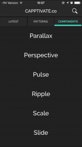
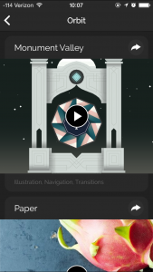
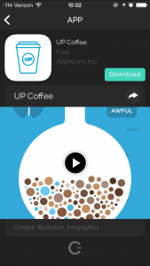
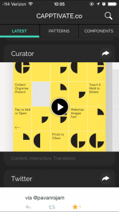
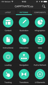
Capptivate.co is originally a website for collecting kinetic iOS UI/UX elements that was launched in June 2013. The author Alli Dryer, together with developer Claude Sutterlin, successfully turned the website to an app in January this year. The app allows users to check short animations showcasing delightful UI/UX design. They are catagorized by patterns and components. You can also view them chronologically. I find it a great asset for interaction designers.

2015-02-10 10.05.16 2015-02-10 10.02.49 2015-02-10 10.08.002015-02-10 10.07.272015-02-10 10.08.132015-02-10 10.02.40