[design iterations] [iphone] meh -> procrastinate! -> infinite

The main focus of the app design was the navigation system.

A few iPhone rough prototypes were developed and 2 of them were rendered for testing purposes outside the group.

Screen Shot 2013-05-29 at 3.34.25 AMmeh2


The list view render was designed to make a joke on clear.app. sadly for that joke, the selected interfaces is way better aesthetically and in functionality.

interface2-05

The iPad design took a dent of the defunct “thumbnail” view, thanks to the extra space.

Screen Shot 2013-05-29 at 3.40.00 AM

This is the gallery of sketches that never came to fruition// specially interesting is the skeuomorphism based one .


[User testing] Fridge.app

Testing the “uberfilter” presented complex challenges of prototyping using pre-made prototyping tools, which eventually force me to “remote” prototype using Skala preview and send the right  images that corresponds to the user actions. // that is the same reason why i have so many images of the app.

The test was applied to 5 testers based on the following premise: “You want to cook something with cheese”, the following conclusions were made after observing the interactions.

  1. The “uberfilter” needs to be bigger and more prominent in the interface // maybe a more engaging color 
  2. While the “uberfilter” apparently works very well as a filter device, is not as strong as a navigation between the 2 main sections of the app. // going back to tabs
  3. Is necessary to add thumbnails of the recipes on the list view 
  4. The search function is poorly implemented as part of the “uberfilter”, it should be permanent and context aware.
  5. A more clear form of labeling sections needs to be developed.

579307_10201270650631274_44708910_n944349_10201270650391268_402277155_nIMG_1021


monday apps !!!

Last post [?]

First, this is an interesting iOS prototype app, definitely expensive but has some nice touches. A way better option is to do some prototypes on quartz composer. [demo] [tutorial].

Second, can we all plz quit instagram? ill give you some options: [dmesh for that DT branded look] ||[glitche for that i haven’t slept thanks to finals look]

Third, how you share documents and links? i use CloudApp and this on my Phone.

FInally, most of you guys have iOS developer accounts, get some VLC glory  // also i like this idea of getting apps that are not accepted by apple without jailbreak.

Bonustrack [not an app] : UX is not UI

[food app][fridge] ultimate edition

Fridge is a recipe book based on the ingredients that are currently available in your kitchen… and by extension a grocery management system.


The concept arises from the problems in the flow of how i cook, and apparently it is a really common flow:

Screen Shot 2013-03-18 at 6.08.20 PM
The black line represents the loop that i tend to get in to thanks to my always empty refrigerator.

The aim of Fridge! [name in progress] is to eliminate that loop making cooking a less frustrating experience for the user. The way to achieve that is to rethink the flow and making it from the bottom up. Instead of looking for recipes we actually look for the ingredients that the user has and match them to a database that trows back the recipes that are possible to make.

Screen Shot 2013-03-18 at 6.12.16 PM
Fridge! is a time saver

Once the infinite resources that we have to make this app create create the database we can do more than just ask for what the user can cook, but suggest ingredients that the user can buy to expand the available recipes.

UX design

My first approach to this was overcomplicating the app trying to create a geofencing around the home of the user to change between functions and a tutorial. //

Screen Shot 2013-03-18 at 6.35.56 PM
BAD IDEA


Thanks to the input of the testers and the various iterations of the app the final flow has a lot more functionality and creates a better experience for the normal vs the power user scenario.

flow baby, flow!
flow baby, flow!

UI Design

My first set of mockups focused on a very specific element of my interface, i consider that the rest of the app was self explanatory but the filtering system required a lot of thinking and research. I was having really big issues with the amount of information that my app require to keep on screen in order to filter the recipes, and I’m not a huge fan of how Seamless fixed the issue. i found this patent and got interested on circular interfaces. There is a huge amount of reseal around circular interfaces, yet very few of them focus on mobile devices and the “self collapsing half circle” //the pattern that i used is really no show. My biggest inspiration was the circular editing interface of the new tablet microsoft office suite. and the experiments by the old Quicksilver.app developers.

quicksilver, i miss you

Some additional reading about circular interfaces


Final design iteration

iTunesArtwork@2x


iphone5-black-white


fridge-final


The internet lately [appsaturation]

app


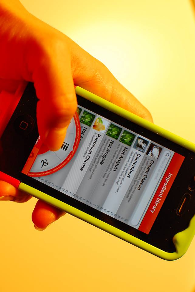
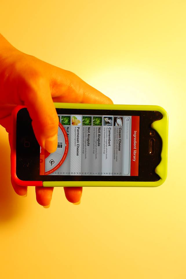
While i love apps, i think that the “appification” of the internet is probably the worst thing that ever happened to the internet. Why i need an App for the Weather Channel? it is so hard to just give the information that i want from the website? i know is not that hard because it used to work that way.

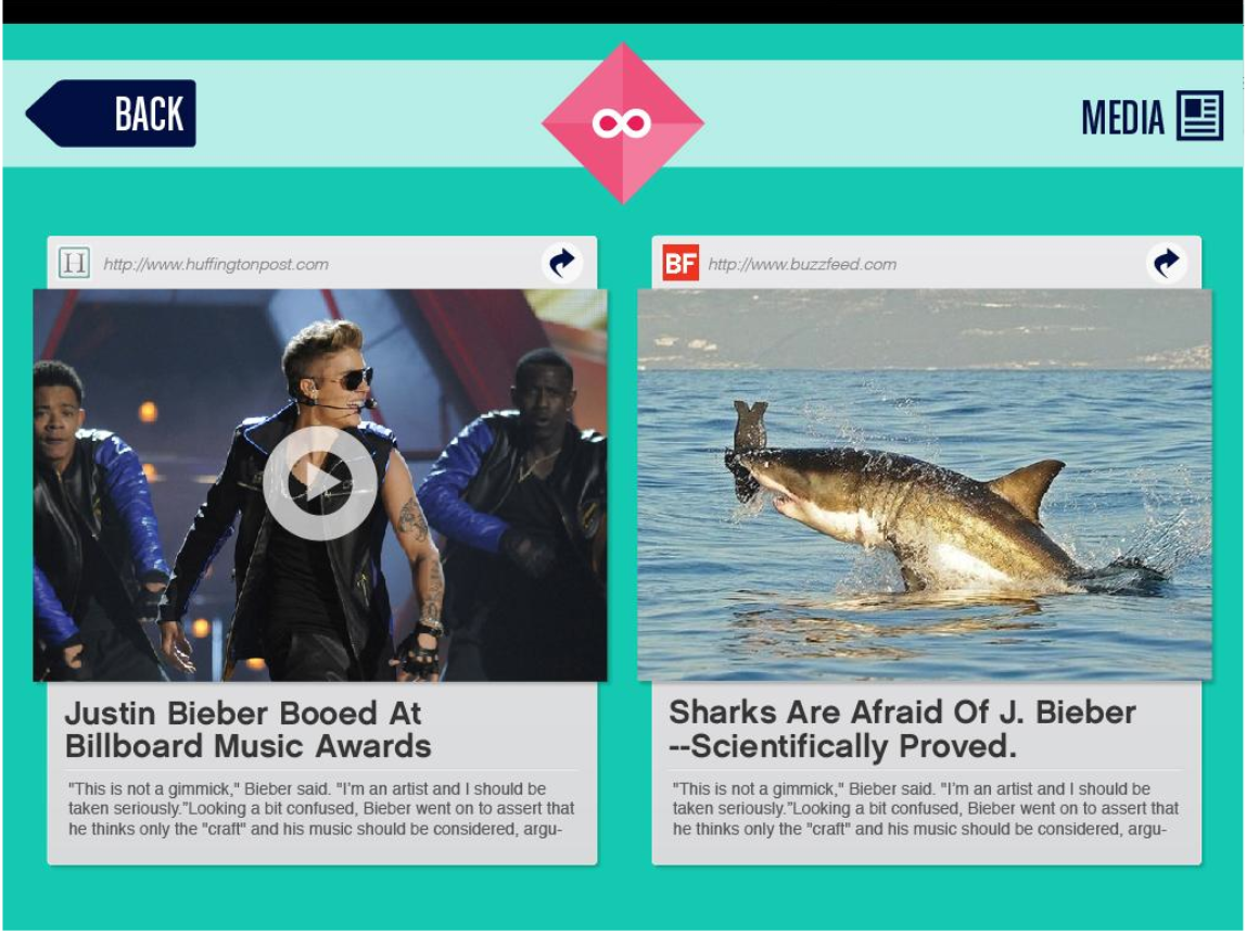
In a related issue, have you tried to read the news on your phone lately, it works like this:

How we used to read the news, back in the era of the Web:

  1. Go to newspaper website.
  2. Click on story.
  3. Read.

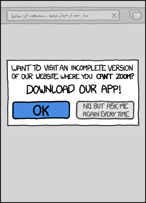
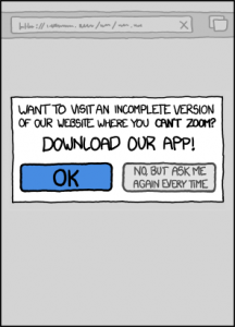
How we read news in the era of fucking stupid pointless iPhone apps.

  1. Go to website.
  2. Be told you aren’t allowed to read the website.
  3. Be redirected to an App Store.
  4. Download the app. (This may involve typing in a password. Which may involve shuffling over to your password manager app to find your password.)
  5. Wait while a multi-megabyte file downloads over your temperamental, expensive 3G connection.
  6. Open the app up.
  7. Familiarise yourself with an interface that has cryptic, weird touch affordances that aren’t actually revealed to the user and behave ever so slightly differently from every other similar app.
  8. Struggle as the badly-implemented statefulness gives you a spinning loading wheel (on iOS) or flashing progress bar (on Android) because you had the audacity to use your mobile device on a slow or unreliable connection.
  9. Attempt to find the story you wanted to read using a layout and information architecture that’s completely different from the layout and information architecture of the website that you’ve grown familiar with, because some arsehole decided that the process of reading the electronic equivalent of a newspaper needs to be “disrupted” because he’s been reading far too much Seth Godin or some other bullshit.
  10. Realise that the app shows you different things depending on whether it’s in landscape or portrait mode. Now you can look like an utter nob on the Tube rotating your iPad around so that you can zoom further into the Page 3 stunna’s tits.
  11. Not be able to share the story with your friends because it’s not a page on the web with a Uniform Resource Indicator. Because why do you need universal addressability when you’ve got shiny spinny touchy magical things to rub your sweaty greasy fingers all over?
  12. Take time to download updated binary files the next time the application is updated in the App Store, that’ll provide you “new functionality”, even though there is no fucking functionality you actually want other than reading the fucking news.
  13. If you are on Android, be sure to install some anti-adware softwarein case the app comes with some delightful bit of creepy privacy-intruding out-of-app advertising.
  14. Give up, go to newsagent, buy paper edition, throw smartphone off a fucking cliff and start a letterbomb campaign against all the idiots who thought that turning newspapers into “apps” was a good idea.

In the “web vs. apps” war, I think you can infer which side I’m on. I wouldn’t download a BBC app or an NPR app for my computer. Why would I want one on my phone? Do I buy a separate radio to listen to different stations? No. The functionality is the same, the only thing that differs is the content. Apps ought to provide some actual functionality, not just blobs of content wrapped up in binary files.

// http://tommorris.org & XKCD