Project3: Haemin, Frannie, Qinwen(Digial Prototype)

User Insights from Iteration

  • How about changing outfit based on the timeline? (Morning and evening temp is different every day.)
  • Saving icon is a little bit confusing. What I am saving, where and what for? – Save icon – change to share icon.
  • Users were confused about which city is first or second. (Think about how to show current city. -the main city)
  • Setting page – notification and refreshing function are unnecessary for users. – Remove it.

App Map

Digital Prototype

https://marvelapp.com/160d039g/screen/41846128

Project3: Haemin, Frannie, Qinwen(Design)

User Insights from testing

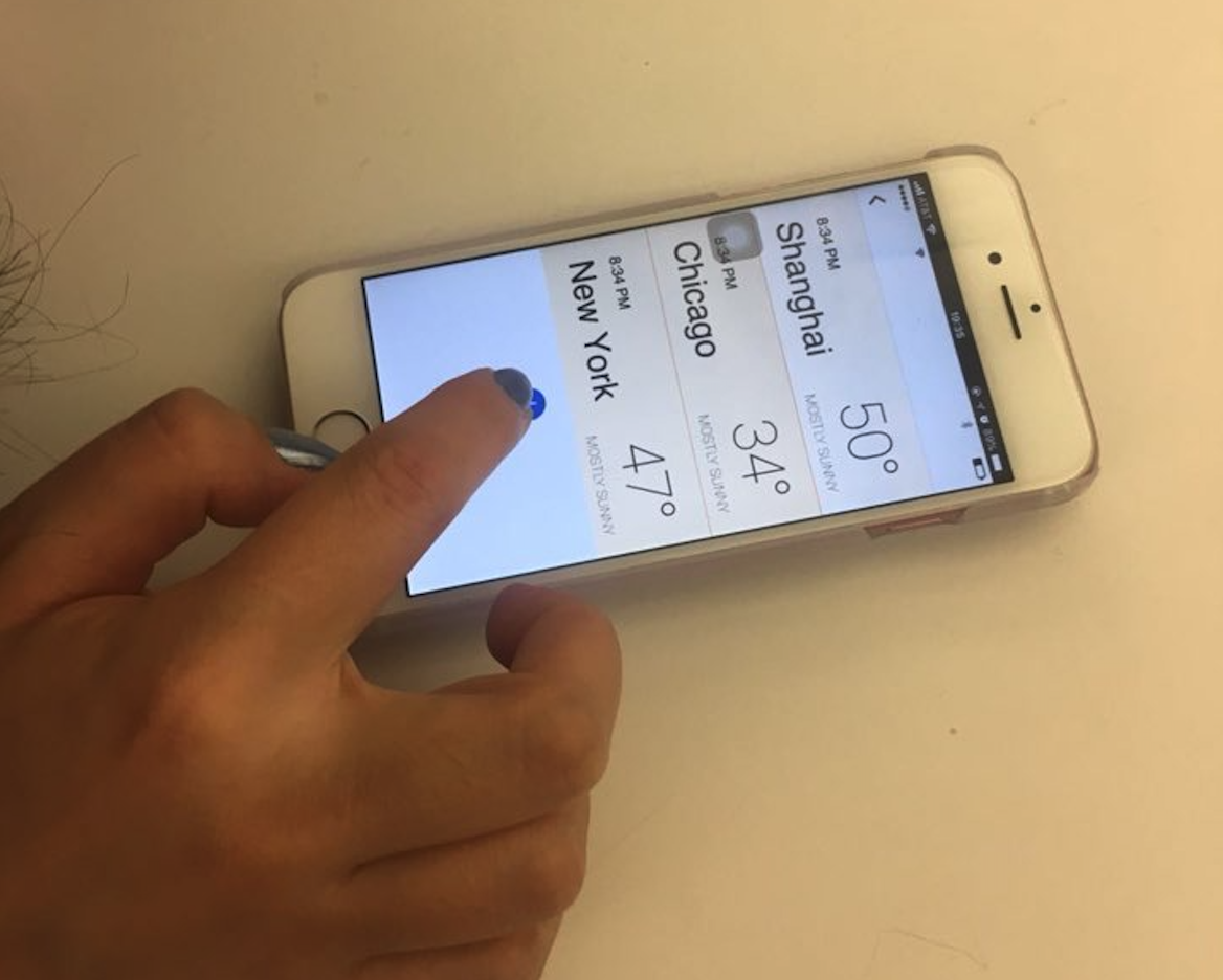
  • People usually first check weather icon on weather app to see if its sunny or raining and then temperature.
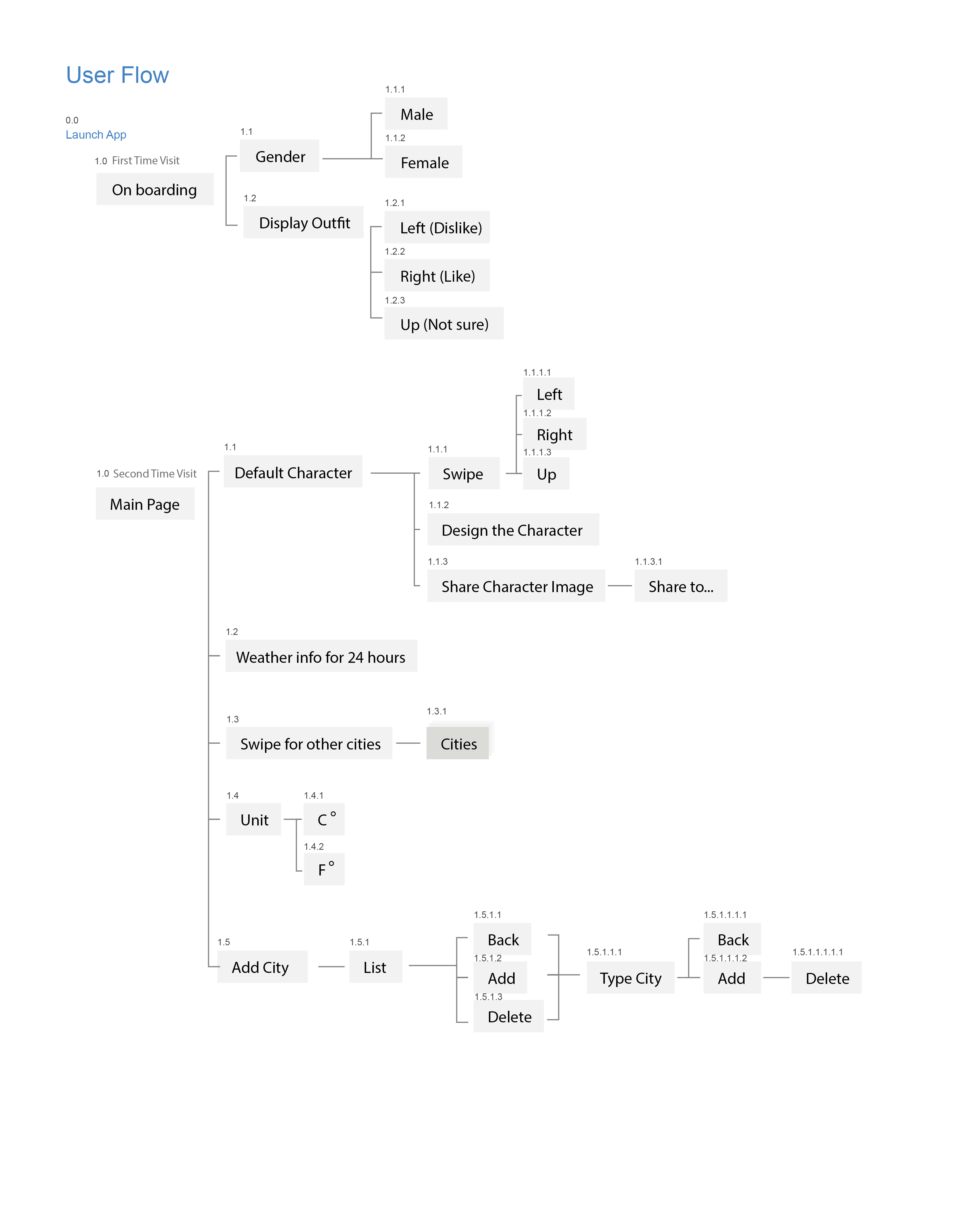
  • Seven days interface should be cut off – to show it is scrollable
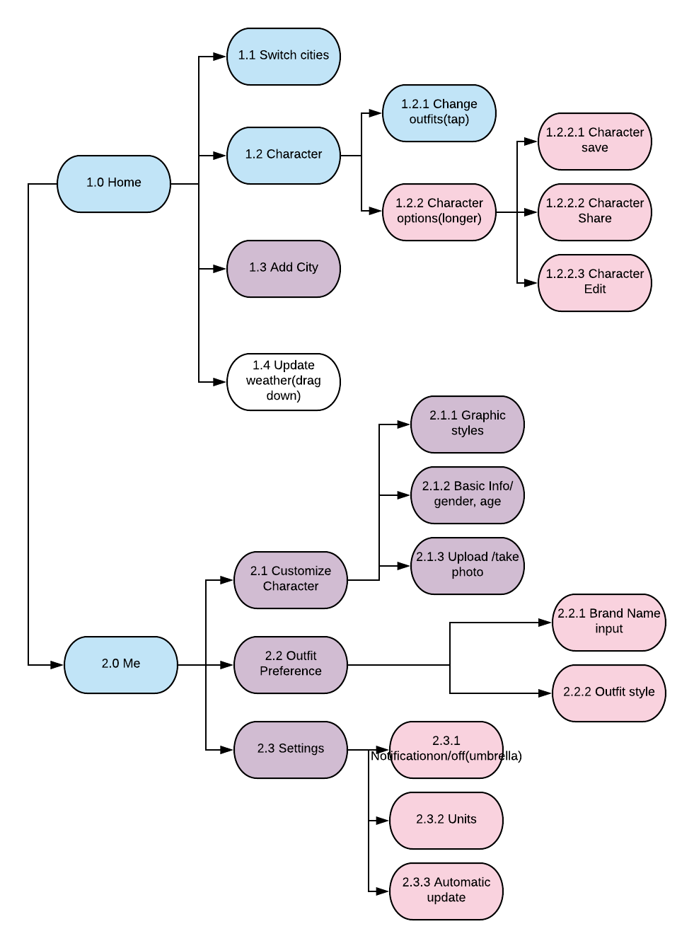
  • Choose brand name for your outfit – how are we going to really help people with this?
  • What if a person personally doesn’t like wearing a jacket or doesn’t like bringing an umbrella or sth? How can AI react to this and how people set these functions?

App map

Wireframe

Project3: Haemin, Frannie, Qinwen(paper prototype)

User Insights from Paper Prototyping

  • Users didn’t know that they can share their characters because they didn’t know they had to tab it for a long time to share.
  • The character looks lonely and sad so it is not easy to get the weather information quickly. (character should reflect the weather condition)
  • Only temp is shown – hard to know the weather immediately and C or F should be next to temp numbers.

WK14 Franky&Yin

The feedback we got from digital prototyping

  1. different button systems!! consistency!!
  2. index page, “distance remaining”
  3. car finding page, a. beep button pop back automatically. b. the arrow at the map, the street name? gear icon and car icon?
  4. safety tab, add the window in the switch
  5. think about the condition to trigger different states / the technique support
  6. Add text under the icon in the fixed bottom tab, the icon of setting looks like filter
  7. preference page, add more text to explain detecting process
  8. restricted mode, the button is not necessary?
  9. air-conditioner, hierarchy issue, adjust by seats,
  10. media, the sound balance, research

Project3 Add-on   Apple Watch

Notes for apple watch human interface guideline

navigation: hierarchical/ page-based. Avoid creating hierarchies deeper than 2-3 levels.

Do not use long-press gestures in interfaces that have Force Touch menus.

The system font specifically omits the ultra light and thin weights below 20 points because they are not legible at small sizes.

Always include a Cancel button.

Do not use black for your icon’s background.

Prefer buttons that span the width of the screen.


App map

Wireframe and Visual design


Week 13 – Franky Wang

App design for smart cars

+++ Group work with Yin Hu +++

The updated version of the app on Apr 26th

+++User testing on digital prototype+++

In this week, we made the following updates:

  1. Slightly differentiate the background color of the bottom navigation bar.
  2. Change the temperature and humidity into the remaining gas status, due to its necessity, and canceled all the interactive elements on the index page.

Changed visual style of the map and deleted the text indication for car beep.

  1. Deleted the rating criterion on car safety,
  2. Changed the style of the functional button, since they are not switched on/off buttons, there is no need to indicate with red lights.