apple watch app
the app is mostly focused on notification of your events and it will remind you when the event will start.
prototype and app map!
prototype link
https://marvelapp.com/1j692g7
apple watch app
the app is mostly focused on notification of your events and it will remind you when the event will start.
prototype and app map!
prototype link
https://marvelapp.com/1j692g7
Marvel academy app!
it’s a review for game app, league of war, mercenaries
my design for the apple tv app(updated)
this is my second wireframe, fixed
apple tv second wireframe
after prototype in class,
apple tv prototype
user insights
the presentation pdf includes first app map, second app map, and final app map with detail pages
iphone prototype
User Insights:
some of the questions that came up while testing :
– does people look at video more or photo? videos
– can they edit video properly?
– who will use this app?
for the thursdayplay, I’m reviewing an app called “Penny”,
it’s a finance app that shows you how much money you spent and all that finance stuff by messaging. It’s more Interesting than “Mint”, mint just shows you statistics but “Penny” makes a conversation with you.
homepage and an article about Penny
https://www.pennyapp.io/
Penny Is A Chat-Based Personal Finance Coach
I did the user-testing and here’s what I found
What I learned from making paper prototype is that before I design details, I can show the interface and the app flow. For example, where the icons are, what will be the user flow or user experience of having the app and navigate. So it is better for designers to do user test before going into full detail page, in this way, we don’t lose time.
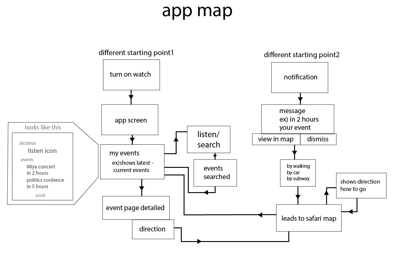
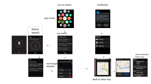
this is my app map and detail views![]()
my app( only tapping..)
https://marvelapp.com/a8db02
This is a prototype tool, it didn’t allow me to add “swipe up” and “swipe down” at the same location so I just made everything tappable to make it simpler. However, I found that was frustrating for the users because they were looking for normal behavior like swiping up and down, right and left.(I need to change that)