Final Presentation – Pauline/Yihan

It Speaks: https://www.flinto.com/p/bf9db561splash page-1804
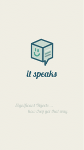
Since the last prototype, we learned and improved:

– hard to understand main functions of app: we added a splash screen with a short explanation


– tab icon to add a new entry and My Objects were not straight-forward enough: we changed the design of it

unpressed-filtered-2192


unpressed-2179


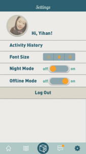
– if no connection, good to have an offline mode: we added an offline mode in the settings

setting-1921

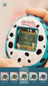
– users expected more creative elements after taking a picture of an objects: we added filters options

Take a picture  2-1335

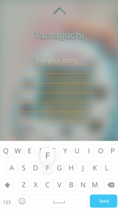
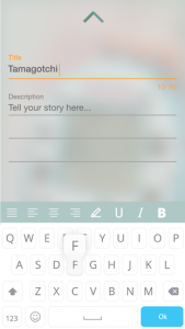
– users wanted more personal options when writing a story: we added more choices when writing a story (bold, centered,…)

Tell a story -2403      Tell a story  2-1342

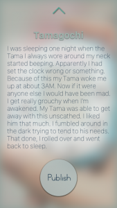
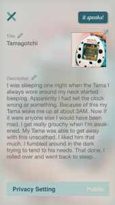
– reading environment needs to be enhanced and more clear to see: we added a gradient layer to show the text more clearly, and added a “review before publishing” step.

Story-2441    Story-1351

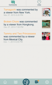
– in notifications, it is not clear when my personal history is mixed with other people’s likes: we put our own history (what I liked and commented on) in the settings and in the notification page, we only display what other people like or commented on my objects.

Screen Shot 2015-05-14 at 18.32.55

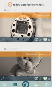
– the timeline of your own object is confusing (most recent last): we changed the order to most recent first (on top)

Screen Shot 2015-05-14 at 18.33.57

– there should be a link to social media: we added a share button in the story page to share on social media

Screen Shot 2015-05-14 at 18.34.32

– there should be a way to delete and edit a story on my objects: created these two options on the object’s page
Screen Shot 2015-05-14 at 18.35.06

Design Prototype: It Speaks (Pauline/Yihan)

Design Prototype: https://www.flinto.com/p/55003e77

First Round User Testing:

– We should modify the graph system to “rate feelings” (not clear enough)

– We should have the user log in somehow (with Facebook)

– The homepage should be feeds from other people, ordered with most popular post first

– We should emphasize the interaction between readers and writers, meanwhile give the control of managing the comments back to writer. (Once the readers send a note to writer, this note is only visible to the writer. The writer can choose to make it public.)

– We should make every post public (but anonymous)

We took into account these inputs and modified each of them.


Second Round User Testing:

Structure
– Change show feed from friends and family to show the most popular ranking list.
– Reconsidered the main menu, change top to another way: bottom or left
The way to show text
– Change the way of displaying the content for automatically to manually. (Since some people are fast readers, some are slow readers. It will be better to let the reader adjust the reading speed themselves.)
– Redesign the typography of the story to construct a delightful reading environment, and test to see if the user read the story.
– Scrolling down the screen to see the story
Note
– Emphasize the interaction between readers and writers, meanwhile give the control of managing the comments back to writer. (Once the readers send a note to writer, this note is only visible to the writer. The writer can choose to make it public.)
– Design the notes history part
How to measure feeling
– Delete this part to keep the function as simple as possible, as pure as possible.
Some detail problems
– Change recommend it to like it.
– Show how many time this story has been hearted
– Change “speak” to “Publish”
– Delete “group setting” and “I feel lucky”
– Delete the feedback part
– Consider the color pattern
Setting
– Content of the setting: Night model. Adjust the font size. Hearted story.

Third Round User Testing:

Unexpected User Reaction
Solutions or Potential Solutions
Tap on one of the images, but only view the image itself without reading through the whole story
Adjust the image size and leave some space for story’s title. Or add an arrow.
First time users usually do not know the function for each part.
Add a title for each part.
Some users require an easier way to go back to home screen.
Drug up to an certain point and the story screen will jump up and disappear. (Achieve this effect in AE)
Readability of the title for every image on homepage
Adjust contract or add a gradient layer
Try to scroll the homepage.
make the homepage scrollable.

Screen Shot 2015-05-14 at 7.46.53 PM

Screen Shot 2015-05-14 at 8.38.18 PM

Thursday Plays: 7M Workout

IMG_0650 IMG_0647 IMG_0649

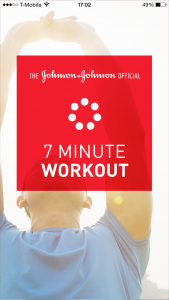
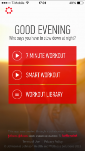
7M Workout is an app that gives you workout exercises to do for 7 minutes.

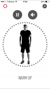
I really like how the app is presented: a movement is explained vocally by a “coach” and visually by an athlete doing the movement. There is also a clock that tells you when to start and stop an exercise.
What I enjoy the most in this app is that it is very easy to use and really straightforward.
The thing I was a bit confused about was the “burger menu” that is on the top left (more a “circular menu”). It isn’t very clear that this is a button as we are not used to this kind of design for a button.

Design Prototype (Apple Watch) – Pauline Hadad

Here is my Design prototype on Flinto: https://www.flinto.com/p/483837bb

From prototyping last week, I learned and changed:

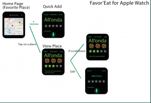
– the map view is replaced with a list view (the watch doesn’t allow its user to play with the map)

– I deleted the “edit” option, replacing it with the “add entry” option, where the user can add a new entry on a new date for an existing place

– The view for a given place is modified: the title and rating stays still while we can scroll through the dates for different entries


Apple Watch’s Paper Prototype – Pauline Hadad

Last week’s feedback was about:

– deleting the camera

– adding the “add entry” option to add a new date to an existing place

– make the rating system the exact same one as in the mobile app

– use dictation for comments

I took into account each of these comments to make this new iteration of my Watch app:

Wireframe 2

#thursdayapps – Pauline Hadad – QuizUp

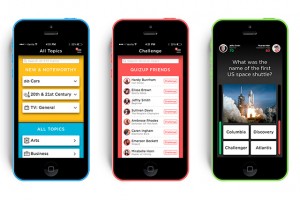
QuizUpThis week, I downloaded the game application called QuizUp where you can play against your friends or random people. I really like that there are so many themes available for the quizzes. The interface is very straight-forward. One thing that caught my attention is the “burger” menu, which is located on the top right of the screen. Usually, burger menus are on the top left.

There are also two options that are a bit confusing: “Messages” and “Discussions”. I think they should have made it clearer for the user what the difference is between the two (I still don’t know).

Other than that, it’s a great app! Very entertaining!


Apple Watch Map + Wireframe

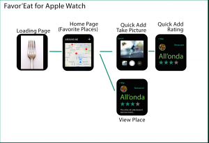
For my Favor’Eat Apple Watch’s app, I plan on only displaying the map view, with the user’s favorite places around where the user is locating. The user can also use the option “Quick Add’ where he/she can take a picture, link it to a Yelp place (according to the map location) and then rate that place.

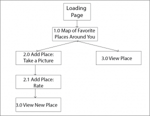
Application’s Map:

App Map


Application’s Wireframe:

Favor'Eat Watch Wireframe

Design – Pauline Hadad

https://www.flinto.com/p/2c345cca

What I learned from Prototyping:

  • In my favorites, I shouldn’t simply have the names of the places but also their ratings
  • For each list of places, I should be able to have a list view and a map view for that same list
  • To rate a place, I should use a horizontal scrolling bar that would highlight the number of stars
  • I shouldn’t have a “Favorites” nor a “More” tab. I can include the favorites in the main page

3 Things I didn’t know about Apple HIG – Pauline Hadad

  1. Negative space: I always considered that less is more, meaning that having more things going on in an app could confuse and annoy its users. However, I never thought of negative spaces as a tool for calm and tranquility. A simple-designed app is definitely more coherent than an app that has too many designs.
  2. iOS App Anatomy: I didn’t know there were different categories of UI elements in an iOS app. I never really thought of the elements as part of a category. I now know that there are four categories: bars, content views, controls and temporary views.
  3. Starting: when thinking of an interface for my future app, I considered having a “welcome/loading page” before actually starting the app. I thought it could add some nice effects and anticipation to the app itself. However, from the HIG, it’s definitely better when users can begin using my app immediately. It does make sense, we all want a fast and easy app.