Thursday App

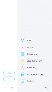
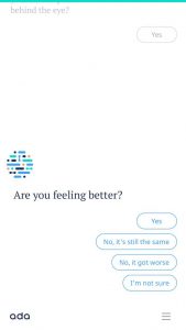
The app I want to introduce is Ada. It is a personal health companion that uses AI and machine learning to help people to understand and manage their health. Designed by a team of 100 doctors, data scientists and engineers, Ada helps audiences access to high quality, personalised health information and care.  It provides earlier health information and informing clinical decision making. The most interesting aspect of this app is the dynamic UI, which the UI component will be changed followed by the content & intent. 

It makes me rethink the UI design of next generation. The whole UI layout will not need to be designed based on each page. The only thing design need to make sure is the UI component must to consistent to the context, so users will have the expectation of the UI.

Thursday App

Image result for limbo

The app I want to talk about is LIMBO, which is a great puzzle game based on IOS platform. Technically, every application should have obvious interaction implication, but LIMBO has no implication at all. The first impression of the game is impressive and confused, because the image is so pretty and I have no idea about how to play this game. After serval attempts, I started to understand the game mechanism. It makes u want to try everything in the game, such as pushing the box, jumping on different item, and grab some unknown things. Moreover, every puzzle is well designed, and you even don’t get board if you play twice. Those unusual things make you doubt about it is a mobile game, which looks really like movie.

After playing the game, it makes me doubt about the principle of interaction. The game destroy those traditional principles totally. I believe we should not simply follow those princple without actual thinking about the story we want to tell. Everything we built should center on the concept/topic/story, even the interaction.

Related image

For March 9, 2017

Here is the link to my final documentation

First digital prototype: here

Final digital prototype: here

Three things I learned from the digital prototype.(Visual Elements will look & feel totally different on the screen with the paper prototype.)

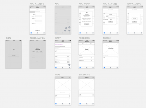
  1. I  change those pages background of adding activities from white to the gradient, which make them consistent with other pages.
  2. Adding unit behind the number of calories progress bar, which clarifies the mean of the number.
  3. Switch the ranking sequence of calories remain on the dairy page, which avoids the confused between calories progress number with the remains.

Shenxun Wang week 1

3 things you didn’t know from the Apple HIG 

  1. live photos(2.1.3)—the interaction way of live photo is pressing.
  2. Audio(2.3)—music will not be disrupted after plug in the earphone, but music will be stopped after you plug out the earphone.
  3. Typography(4.5)—SF UI TEXT is for the size under 19p, and SF UI Display is for the size beyond 20p.

Bio

Shenxun Wang is a designer, technologist, and maker who uses design & technology to enhance our social relationships and physical surroundings. He is a master candidate of Design and Technology in Parsons School of Design. He has a combined experience of sports technology, UI/UX design and design strategy. He is interested in design leadership, making a social impact and creating business profit by using sophisticated design products.

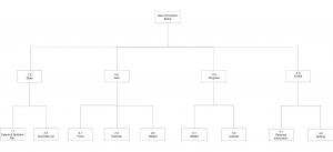
APP MAP


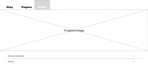
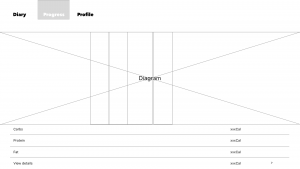
WIREFRAME