Appmap and Prototype of final project

final.003final.004


Feedback from the class:

1,the signup page has a same format as login page

2, the sharing icon is not clear enough

3, the main page should show more details about each space, for example, the distance, how many people liked this place

4 the filter function unfinished,

5,how to confirm the preference setting

6,the icon are all too big

7,the icons are not maintained in one style.

8,there should be a confirm page before the payment


Feedback from the critic:

Focus on imagery and space – think of panoramic views or a 360 view

Text and color contrast – especially on filter page

Consider adding specific equipment options on the filter page – Research

Add prices on the scroll view


I learnt a lot through the whole semester,

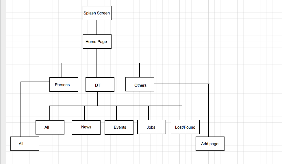
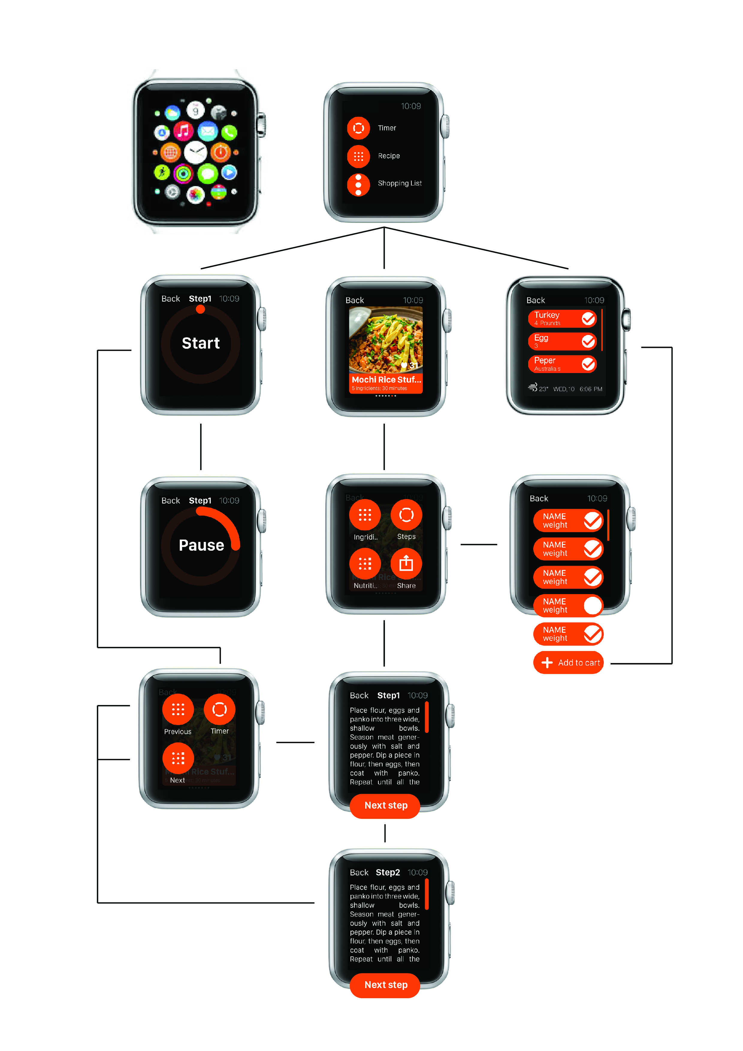
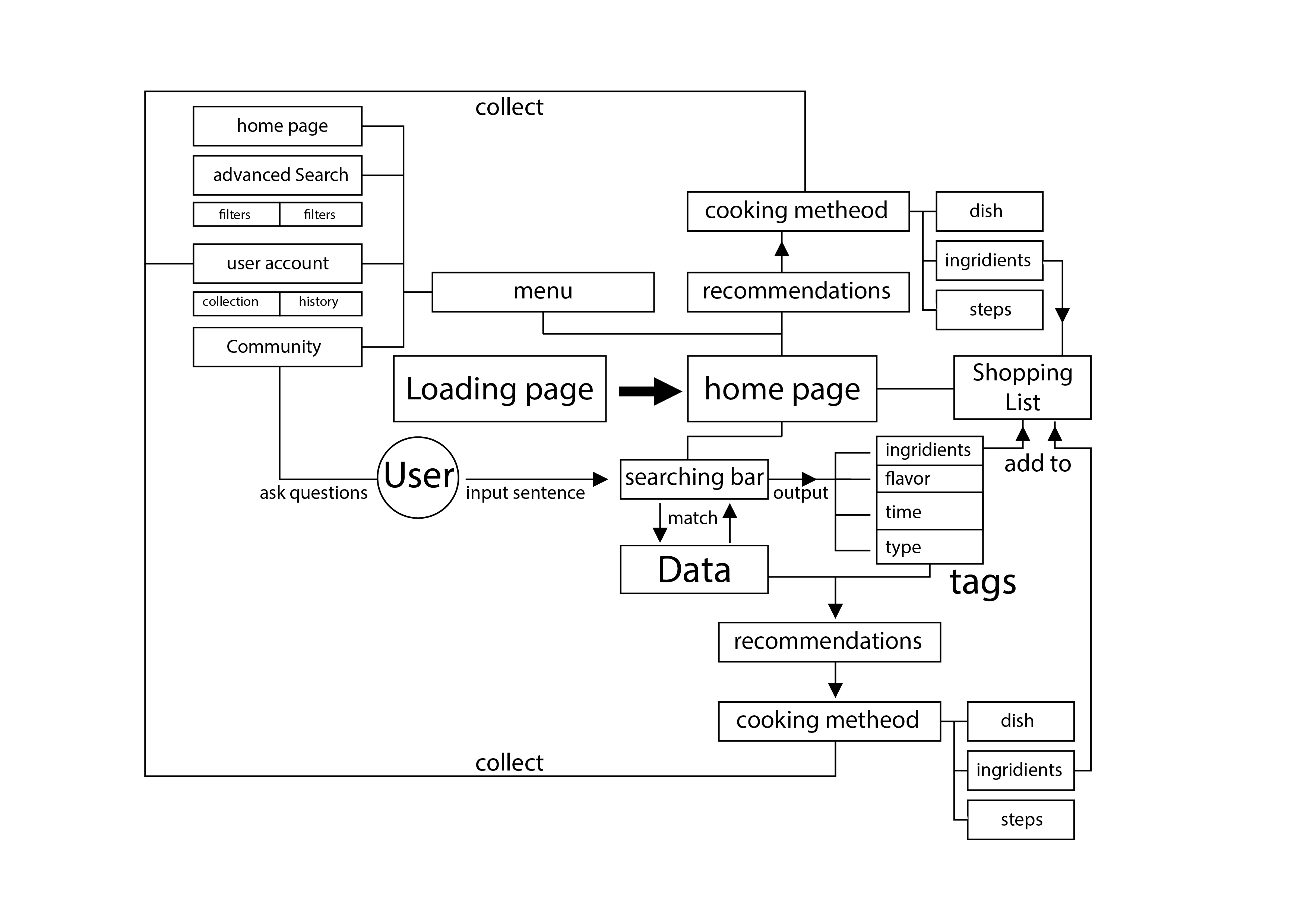
1, how to draw a clear and logical app map, like the app map of this final project.

2.how to use flinto and invison to design a quick prototype

3. I have been trying to use Pixate to design more transition for the prototype, this is one example I have been designing, pixt.io/pd454bce75907

4. I have been trying to use motion graphic to design some transition of interface.https://www.youtube.com/watch?v=BM9_LaQOuEo&feature=youtu.be

5. I learnt a lot about how to do the paper and digital user test, I realized the importance of feedback which would guild the further design.

Thursday APP Sam

wood joints     imgres

This a education app introducing the technique of making a wood product, the different structures of traditional wood joints, there are over 20 different wood joints model inside the app, which would show a lot of details about the structure, also it could tell a lot of tool’s history and some background histories.

https://itunes.apple.com/us/app/wood-joints/id837964581?mt=8

tengami  imgres-1


https://itunes.apple.com/us/app/tengami/id794960248?mt=8

Final project(PATH & Pic)–wireframe and feedback

street.001 street.002 street.003 street.004 street.005 street.006 street.007 street.008 street.009


Feedback from the class:

PATH:

how to generate a route based on users’ preference setting,

the database is the difficult part

newyork is not the perfect place for running this app, because most of people will go to park for running.

Pic:

Change certain fonts

consider having two columns for the price of equipments

Get a feedback notification a day after using the space

making the whole address line tappable

Change map view

work on the buttons on the reservations page

Change the comments icons on the studio’s scroll view, and also work on texts

Maybe having Auto selected time for reservations page


the idea and research about easimenu

https://docs.google.com/presentation/d/1e-jskhvmqThV1g0oblfGB50ues2_DTg_IFEZYCzm5_g/edit?usp=sharing


the feedback from the digital prototype,

1, Some tag is too small to tape.

2. It is unnecessary to add a advanced searching icon in the main menu.

3. hamburger icon at top which is the android style or navigation bar at the bottom(ios).

4. is it necessary to build a community inside a food app, or just offering professional cooking guidance.

5.The chose color is kind of misleading.

Learning from digital prototype:

concept:

When I first design some buttons in Ai, it is very easily to design it too large or too small, some basic principles in the UI design I should know.

Visual is not the only matter, designers should consider more about the user experience not just visual, for different system, there are different principles.

different using habits of users in different operating system.

When I test user behaviors on digital prototype, user behaviors is very unpredictable.

digital prototype is a very efficient way to find potential problems in your design, also, for a real project, google analysis is a good way to track your users behaviors on your app, which could be a guidance for the further design.

About the color in UI, designers should treat them more carefully, different color might represent different meanings in users’ vision. In conclusion, user experience is the core guidance, designers should design user interface from the users’ perspective.