Go!Curry Apple TV oS App (Prototype 2 and Final)

Previous user insights included:
– The UI/UX design of the app (i.e. focus and enlargement of views)
– Make a more seamless flow (from selection to payment to checkout)
– Make a clearly designed flow

My first iteration was completed on Illustrator. The design of my final iteration was completed on Sketch which feels more appropriate for the context of an Apple TV.

Moreover, here is my final Go!Curry Apple TV oS Marvel prototype: https://marvelapp.com/203ac9b

G!C_AppleTVoS

For guidance, I created two scenarios:
1) You are a first time Go!Curry customer.
2) You’re a loyal Go!Curry customer ready to order your usual.

EAT CURRY. BE HAPPY.

Cheers,
J

Yue and Jasmine – 05/06/16 User Feedback

Feedback from last class regarding our second iteration included:

– Button sizes: Tappable buttons for play, pause on video screen
– Consider categories: Although we have been implementing Lynda’s organizational system (way of categorizing and designating titles to videos and paths), we realize that it is quite confusing. For instance, the category of 3D+Animation includes paths, “Become a 2D animator”, “Become a 3D animator”…
– Make it easy for the user by having an edit button (instead of assuming that the user would know to slide the button in order to remove a tab).
– Consider having a special account section that is not LinkedIn’s. Allow users to upload to LinkedIn (seperate app).

To refresh your memory, here is the app:
https://marvelapp.com/1j6b9ee

Yue and Jasmine – Critique of Final Iteration Lynda Learning Path Apps

Hey everyone!

Thanks for an awesome class. Much love.
Anyway, here is our feedback from the critics for our final iteration.

Verbiage:
– Terminology of Bookmarks is quite awkward. Consider something like “My Videos”.

Look and Feel of the learning experience:
– Stock photos look corporate and stale
– Lists are boring (explore and gamify this experience)
– It looks like a podcast list, is the learning experience predominantly through listening, watching? It would be interesting to consider other accessibility points as well (as Lynda.com also has the video transcription to follow along).
– If the video is the main learning experience, consider minimizing list information, and maximize views of video.

Design Intent and User Flow:
– Reexamine user flow as there are some dead ends. We notice that in our app, we give users the option to share their completed learning paths on LinkedIn. There is an opportunity for an auto-share or suggested share, after a learning path is completed.

Next Steps:
Which brings us to the question, how can we make the learning experience fun?
In the future, we want to implement a fun learning experience.We will explore new ways of experiencing these paths (as they range from 10-68 hours).

_________________________________________________

This was our Apple TV app which was not fully resolved.
https://marvelapp.com/1j6b86b

Our main critique included “in and out of focus” UX/UI of the Apple TV platform, as well as maximizing the video as one of the first screens (reexamining user needs).

Yue and Jasmine – Lynda’s Learning Paths App Prototype 01

This is our first Lynda Learning Path’s App
https://marvelapp.com/5fid0h6

Here are some user insights:
1) Saving individual courses vs. entire learning paths

2) Button sizes should be tappable
– “Add to favorites” button

3) Learning Paths should be prioritized over individual courses, thus it may be beneficial to explore this as our “Home” page.

4) Rewards
– What does this look like?
– Users have a tendency to view their own profile more than others. How can we make this space provide the feeling of accomplishment and encouragement to achieve more (CTA – try more learning paths)

5) Consistent Tab Bar

7) Examine user flow for Free Trial

8) Does “Home” have to be called “Home”? Consider a new verb that instantly associates with what users expect.

9) Streamline the business learning path for an iPhone app, while the programming learning path can be demonstrated in our Apple TV app.

Next steps:
– Improve upon these insights
– Create an Apple TV app

Yue and Jasmine’s User Insights

LinkedIn’s $1.5 billion investment in Lynda’s new Learning Paths excited both of us. Besides music, podcasts are something we listen to as we’re walking around New York.

Our plan is to create an independent Lynda Learning Paths app that would be accessible to Lynda subscription members, and with very limited accessibility to non subscribers.


Learning Path 01


Learning Path 02

Learning Path 03


Learning Path 04


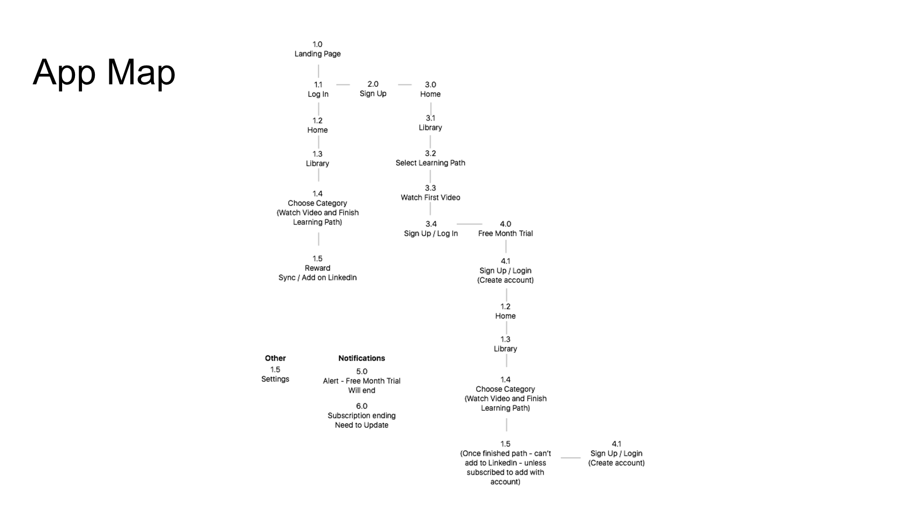
This is our quick prototype: https://marvelapp.com/dhi990

1. Reward System: Explore Experticity, Duolingo

Once the user completes a learning path, they are able to have this as a credential synced to LinkedIn. We are still considering how this “syncing” will happen, and how it would feel like.

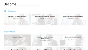
2. Adding Learning Paths vs. Courses

We planned to have the ability to add an entire learning path or individual courses. Initially we identified these two decisions with two different icons. However, it was confusing for the user, so we will reconsider this.

3. Semantics (Bookmarks vs. Favorites)

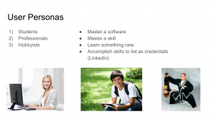
4. Reconsider the User
– IPhone vs. Apple TV vs. Laptop vs. IPad.
– Who is our user that we want to focus on?
Some classmates brought a great point about how they sync their phone to their Apple TV to watch and follow Lynda coding tutorials with their laptops (to code with) and the instructions on the AppleTV (Two screens to increase learning efficiency and productivity).

– IPhone: Perhaps focus on Business Courses etc. (More convenient for people to walk to without needing extra utilities.)
– Yue and I will try a learning path to see what quizzes are needed to complete one.

Note: Automatic resizing is not simple. Focus on one interface on one medium.

5. Redundant Tab
Is it necessary to have a courses tab, when these can be stored in “Home”?


“While it remains to be seen how Lynda.com courses will be seen in the eyes of employers, and to what extent Lynda will boost LinkedIn’s recruiter business, Korcuska said the company is “optimistic.” “Learning Paths” could help boost the number of users taking individual learning courses by doing the work for users of figuring out which courses belong together and how to maximize their value. Korcuska compared the “Learning Paths” to a recipe for a meal, which gives users more reasons to select and purchase grocery ingredients, or Lynda courses, than if they went into a store without an end-game in mind.

“Learning Paths” are available to users who pay for a monthly subscription to Lynda.com. Every week, Lynda users complete more than 50,000 courses on the site and watch about 25 million minutes of video content. Lynda’s catalogue has more than 4,000 courses and growing. “Learning Paths” are available today in English globally (other Lynda courses are also available in Spanish, German, French and Japanese), and LinkedIn plans to continue adding new paths over time. The “Learning Paths” product is geared toward individual professionals, however Lynda is also expanding its enterprise education business, adding courses that help companies train entire workforces in new skills.”

To learn more: http://www.forbes.com/sites/kathleenchaykowski/2016/03/31/linkedin-launches-lynda-com-learning-paths-in-push-to-grow-education-business/#7e7ebdd13d05

Thanks!

We appreciate any other feedback.

Apple tvOS Go!Curry App

Hey everyone!

I present to you Project 2: Go!Curry. Go! Go! Go!

I’m super stoked about this project as designing for the TV is a new experience for me. I used the Apple TV seldom times in Jakarta for watching YouTube videos with family, so it was refreshing to hold the remote and test it out in class. It not only gave me insight to potential users, but also really helped me envision contexts in which users would use this Go!Curry app.

For instance, I could imagine my family or friends sitting on the couch watching TV and wanting to order food because everyone was hangry. With that thought, I considered a feature that I want to continue exploring, (which I also encountered in the Chipotle iOS app), which is the ability to name your orders to ease the customer experience once the food arrives (“Don’t be hangry any longer! This is yours!”)

Although Venmo has made it much easier for us to split the bill, I would say that this scenario seems to be a hassle:

  • You’re in your apartment with seven other friends, hangry and wanting to order food.
  • “Let’s order food! What do you want?”
  • You all order food on your app. You’re responsibile for asking your friend what they want. “Hey, do you want brown rice or white rice…? Chicken teriyaki, salmon teriyaki, sushi etc.? Anyone else?”
  • A big sum is charged under your account.
  • “We’ll Venmo you. Don’t worry”
  • Open the venmo app to notify everyone that they owe you money.
  • Delivery man comes in and hands your bags of food.
  • It gets a bit messy trying to figure out who’s food belongs to which person. “Ok guys, is this yours? Wait… I think I ate someone else’s sushi. This is yours.”
  • You’re too busy eating, time passes and everyone forgets to Venmo you.
  • The next day, you text them saying, “Hey… remember… ?”
  • Process is delayed.

Attached is my first attempt at two quick wire framing directions for translating my Go!Curry app into an Apple tvOS app.

Many preferred the simplicity of the first direction with regards to user flow. With the second direction, I was inspired by viewing my classmate, Sumi’s work. I was explored the functionality and how users would engage with the content on the screen, as also a viewing experience.

Next steps include:

  • Explore a direction further in depth
  • Utilizing design to indicate the user experience (highlighting what is in focus and what is not in focus)
  • I assumed that one day we could use ApplePay to pay for our meal. Another option would be syncing that account information from your phone.

03.10.16_mobilemedia_appletvOSapp


After the paper prototyping exercise, I learned that:

  • I want an Apple TV!
  • A more efficient way of paper prototyping for the TV is preparing all the individual TV screen views that you can flip up, as the user navigates through it, rather than only using sticky notes. Things become less sticky after several user testings! Ha!

Notes: To  be continued in next post along with updates….

Getting the hang of paper prototyping for Apple tvOS!

paperprototype_01 paperprototype_02

Go!Curry App Iteration 3

Go!Curry App: Iteration 3
Feedback from last class:

  • Removing unnecessary pages that interferes with minimizing the ease of user experience and the objective of increasing basket size and chances of checkout.
  • Log In / Sign Up should be moved for later in the consumer journey as 80% of their needs on the app should be met within the first couple of seconds.
  • Ease: Payment with Apple Pay
  • Gamification through points, app personality and animation
  • Icons should be clear and intuitive

#Thursday Plays

#ThursdayPlays: NYTVR

NYTVR New York Times Virtual Reality

Experiencing news and stories in a new way. I always thought VR always required an extension medium, however I realized we could experience nytvr without the Google CardBoard viewer.

Without it, my experience of the story was enriching and very moving. I chose to hear about an Ebola survivor. I was taken to a beach. Text faded in and out, moving images fades to black to transition to another video. I had the ability to scale the video as well, so it was interesting to see how the images are stitched.

I would like to experience this story with the immersive Google CardBoard viewer. I’m quite dizzy after one story, so I could imagine how much more intense it would be with the viewer.

IMG_1292 IMG_1293 IMG_1294 IMG_1295 IMG_1296 IMG_1297 IMG_1298 IMG_1299 IMG_1300 IMG_1301 IMG_1302 IMG_1303 IMG_1304 IMG_1305