Proto-tool | Gunjan & Tong

Powerpoint

Design Question

How might we build a mobile prototyping tool for designers to sketch & create rapid low fidelity prototypes to test?
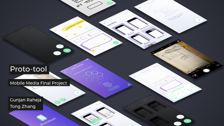
Concept

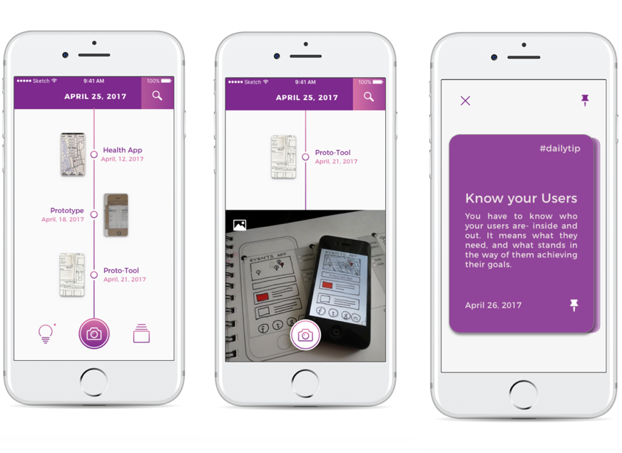
Proto-tool is a mobile application that allows UI/UX designers to quickly sketch and document low fidelity prototypes. It also encourages designers to continue improving and working on their work through daily challenges.

Target Audience

User Interface and User Experience designers who love to prototype on the go, on mobile or just paper prototype/take photos to document work.


Storyboards

Storyboard 1

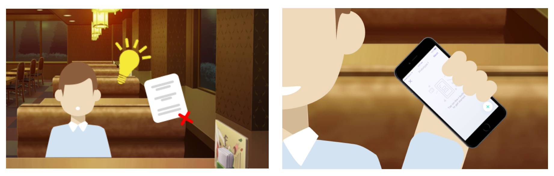
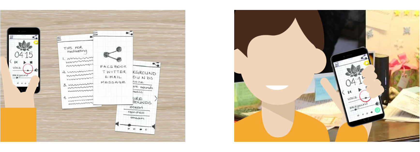
1. Bryan is sitting in a cafe and suddenly he gets stricken with a brilliant idea for an app. Unfortunately, he has no paper nearby.

2. However, he has Proto-tool to help him draw down his app prototype. He decides to start a New Project, and begins Sketching out the wireframe.

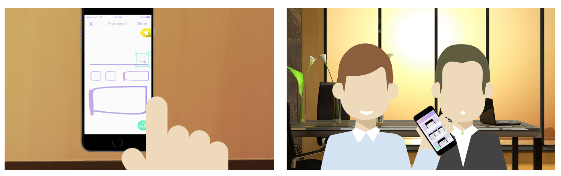
3. He can access different functionalities with his wireframe such as changing colors, selecting objects, moving them or deleting them. He also discovered that he can improve his designs by creating based on the challenges provided by the Daily Challenges function.

4. As he finishes, he will save his project and can refer it in the future with his friends, or develop a high fidelity prototype in the future.

Storyboard 2

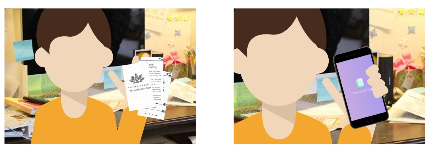
1. Rihanna just created a series of paper prototypes, but her messy habits don’t allow her to have an organized portfolio of where to store them.

2. She pulls out her phone with Proto-tool, and takes pictures of these prototypes.

3. She created a new project and took pictures of her paper prototypes. She also began editing and including additional features.

4. Rihanna can now refer back to her project on the iPhone and without having to keep paper around.

Precedents

1. Adobe Comp CC

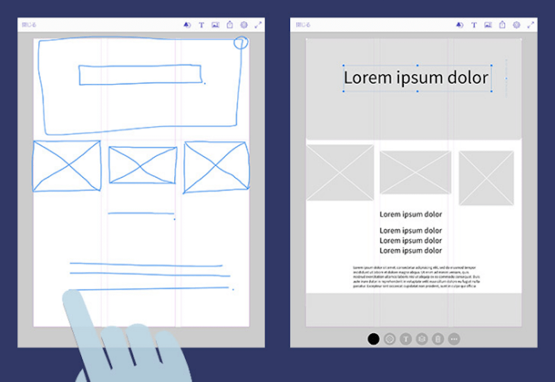
Adobe Comp CC is an Adobe iPad/iPhone app dedicated to rapid low fidelity prototyping.

It is equipped with a drawing gesture dictionary that allows users to rapidly convert their drawings into shapes.

2. Google AutoDraw

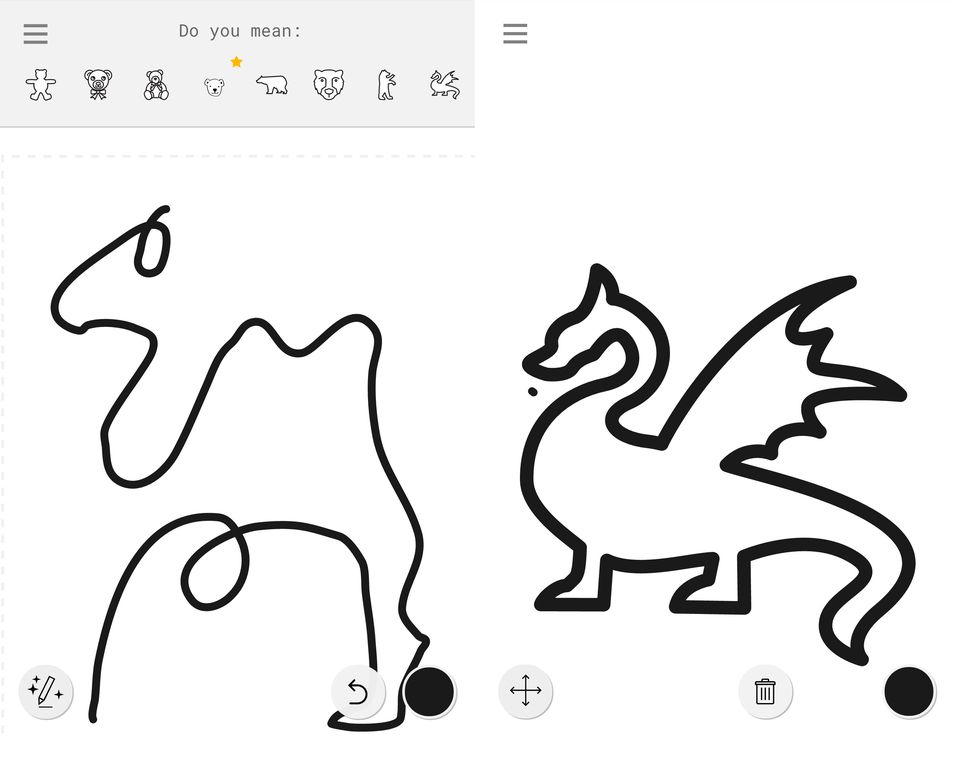
Google’s newest experiment: a website with embedded machine learning that allows you to easily convert doodles into professional drawings.
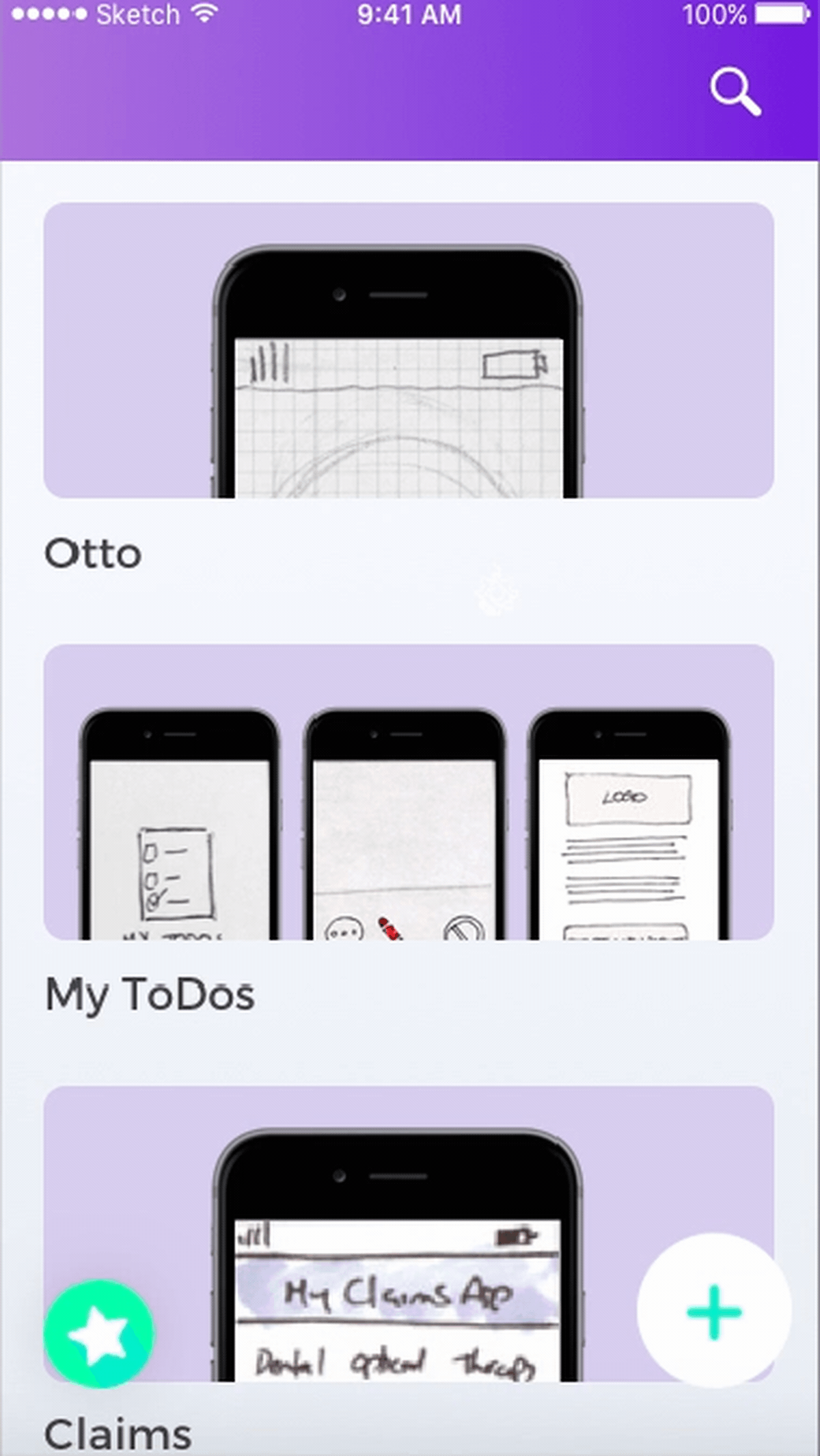
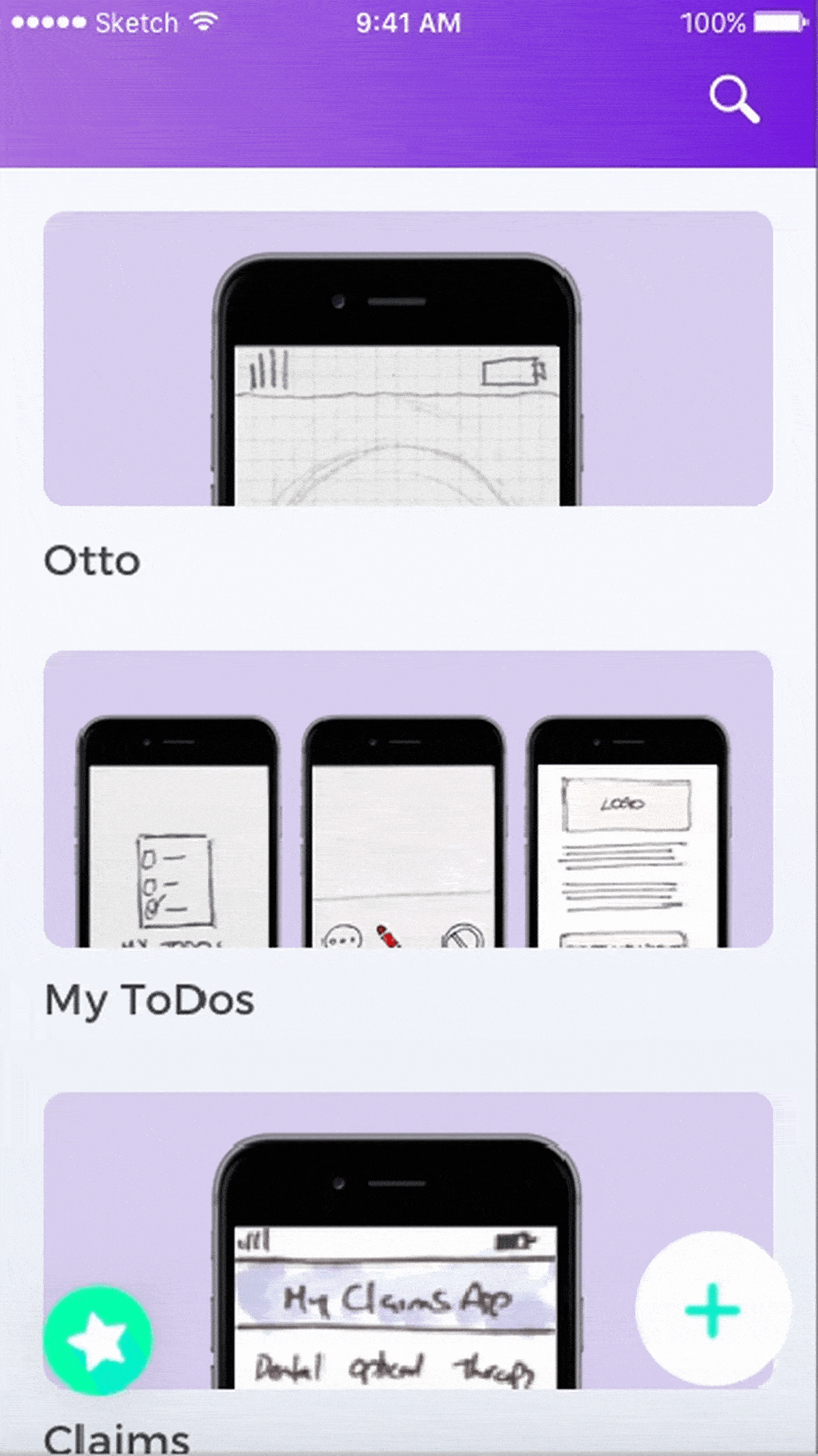
Wireframe

Marvel Prototype

User testing & Learnings:

  1. While we prototyped on paper, we thought the wheel interface would be effective. Once we implemented it digitally and tested it out – we were wondering about how effective the wheel interface for timeline/projects would be. We started asking questions such as: What if a user had too many projects? Can they search through the wheel? This digital prototyping session and user testing session helped us understand our needs and functionality better.
  2. We also realized that high fidelity prototyping would be too detailed to perform on the iPhone. The main functionality of the application is to mark ideas and prototype low fidelity screens. High fidelity would require attention to detail which can be tiny on the iPhone. So we are sticking to low fidelity prototypes + sketches with Daily UI Challenges and hotspots.
  3. Explore/Community functionalities with including themes might not be necessary as most of the cases designers would not want to share their prototypes with the community.
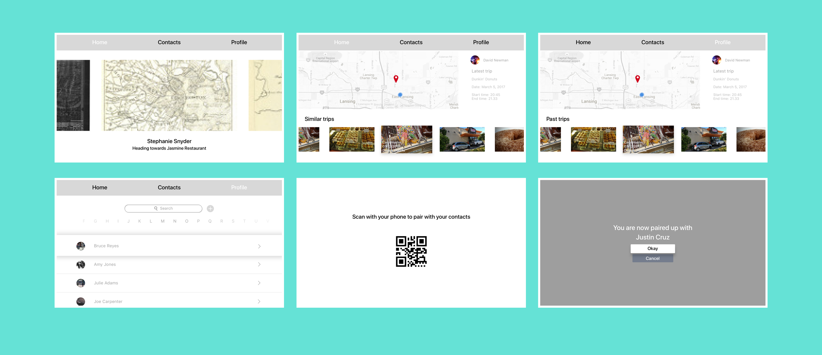
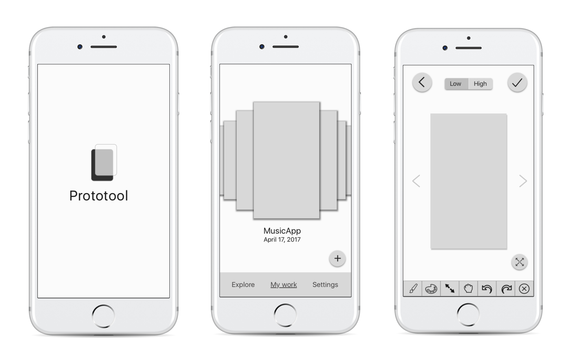
Prototype 2

Marvel Prototype

User testing & Learnings:

  1. Thinking about the hierarchy and main navigation – What elements are most important? We wanted to experiment with the idea of being able to document work process. We came out with various solutions that could reflect our concept, such as lists, groupings, and narrowed down with organizing projects through a timeline. A problem with this approach though, is that it would be more difficult for users to be able to refer to previous projects. For instance, what if one user prefers to work on different prototypes for different projects at the same time? It would be preferable to organize projects through different names. Would the timeline be week based, day based or project based? 
  2. Another issue that rose from this prototype was the iconography and language that was employed. Some icons were misleading and difficult to understand, causing the users to get lost when using the application.
  3. User flow was also another issue that was not worked on well in this prototype. The UI gave more emphasis for users to record their prototypes with the phone even though the sketching option was equally as important.
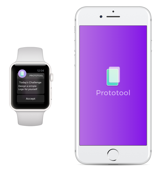
Apple Watch Extension Prototype 1

The Apple Watch extension serves as a way to encourage Proto-tool users to keep designing and thinking of a way to incorporate daily challenges into their UI/UX designs.

User testing & Learnings:

  1. One of the issues that was not taken into consideration was the idea of connectivity between the Apple Watch and the iPhone. Because the Apple Watch served as an incentive for users to continue using the iPhone application, we wanted users to accept challenges through their watch as well. However, the idea of the user having to check in on a daily basis by accepting that they have completed the challenge of the day seemed rather redundant. 
  2. Because the screen of the Watch is rather small, it would be more accessible for users if they were to access their past challenges organized in another way. Instead of viewing daily challenges, one could prefer to see them organized by week.
  3. Reviewing past works could be a feature that not many users would visit. However, we felt complied to keep this as a feature as users might want to revisit their previous work in another device or screen.
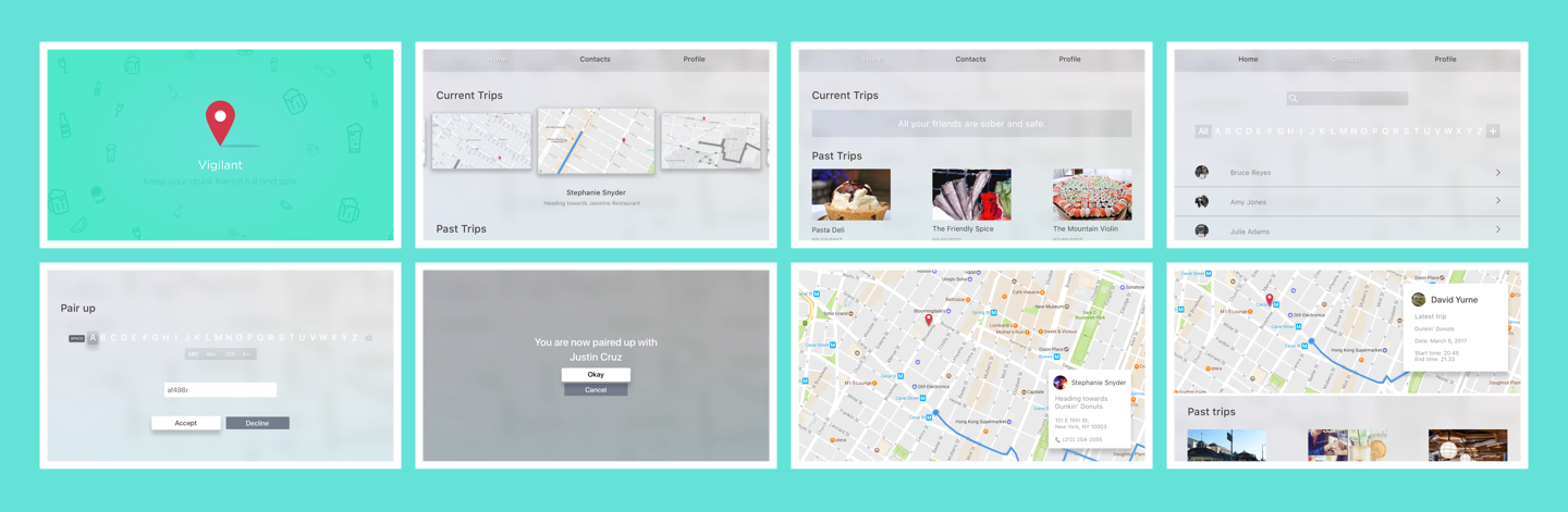
Latest Prototypes

Animations (Principle):


iPhone Marvel Prototype

iPhone Design

Apple Watch Marvel Prototype

AppleWatch Design

#ThursdayApp FastTyping

FastTyping is an iMessage app that allows you to compete against your iMessage friends in typing speeds. The game is fairly simple as it only involves users typing as quickly as they can by following the given prompt (which are usually within the topics of Music).

The user interface is also fairly simple. Each category that the user is given has a background of a different color and the interface only consists of the prompt and a typing text field.

Because of the nature of iMessage always having a text field on top, on my first try I actually ended up typing into the iMessage text field rather than the one given in the app.

The experience of “penalty” is also not as emphasized. Rather than giving me a score that I don’t understand how it was calculated, I would have preferred the application itself displaying some form of error sound or a change in the color of the text. Also, the application also does not show how many points I have earned so far from playing. 

Vigilant | Apple TV app design

Concept:

Vigilant is an Apple TV app that allows users to watch and care for their drunk friends on the road to good food.

This application is meant to be an extension to quik, the iOS app that lets drunk users find the nearest restaurant that satiates their hunger.

App map:

The connection between Vigilant and Quik are through Contacts. A unique 6-digit pairing code will be generated from the Quik iPhone users (each digit code will be unique to each user). This code will be typed into Vigilant’s Pairing view. In turn, a request will be sent into Quik so the Quik user can confirm the acceptance. Once the pairing is done, Vigilant users will be able to watch over their friends whenever they start a new trip.

Prototype 1:

Marvel: https://marvelapp.com/562e5ce

Prototype 2:

PDF: zhant293_prototype2

User insights & solutions

1.Contact List: An essential part of this application is for users to be able to track their friends’ whereabouts through the Apple TV. The initial idea for the first prototype was to have the application access contacts through the phone (Apple ID). However, as this functionality was not possible, I opted for other alternatives for users to connect with each other. For the second prototype, I decided to add a QR code for the user to scan the phone. However, it seemed like the intention of the application is not for the phone to add the TV, but the opposite. For the third prototype, I switched to a pairing passcode (generated by the iPhone user).

2.Trip hierarchy: On the first prototype, the active maps took out almost the entire layer of the home page. Users would be able to switch to different maps by scrolling down through the list on the right. For the second prototype, I decided to change the layout into a wheel format. This would allow for the user to see a more hierarchical view of the maps as well as view all maps available on the same screen. However, considering that the app could be opened when there are no ongoing trips, then the home page would look rather empty. To solve this issue, I decided to add the Past Trip sections in the third prototype.

Design

Marvel: https://marvelapp.com/2ecf0f6 

Powerpoint: zhant293_mobilemedia_project2_appletv zhant293_vigilant_appletv_prototype

Project 1 Final Iteration

Final Presentation: zhant293_mobilemedia_proj1

Marvel prototype: zhant293_project1_digitalprototype


Design challenges/criteria:

  1. Simple and intuitive
  2. Quick access to foods
  3. Minimize text
  4. Reinforcing/Repetition
  5. Easy to navigate through maps/directions

Things I’ve changed:

  1. First view that user will see upon tapping on a restaurant is the map view of his/her current location. This was done because it would be easier to locate directions and orientations for the user.
  2. The map is now using a 3D view rather than 2D, again, this was done so the user could look at the map and feel that it is closer to reality.
  3. Instructions now are accessed only through the “Text” button on the top right corner. This was done to diminish the amount of text on the screen.

Visual Design Prototype 4

From the user testing, I realized that the directions were still unclear for my purpose. To change this, I played around with iconography and incorporated Google map directions in text form. The user can also go back to view the map on the upper right corner if desired.

The new map will display the directions one by one, and as the user reaches the goal, it will turn a different color. The directions will keep scrolling up until the user has reached the destination. The microphone icon I had before seem to confuse people (they thought its function was to speak into the phone), so I changed it to a Speaker.

zhant293_prototype4

Digital Prototype:

https://marvelapp.com/3200if5 

Prototype II

Based on the feedback from last week, several classmates suggested to reconsider the way in which cards are presented in the main view. In the second prototype, I took one of the suggestions to provide the user an overview of the previous and next card so the user can intuitively understand that he/she must slide in order to view the list.

Because of the nature of my app, I decided to not include as much text as possible. Therefore, I used icons to give the user a hint onto what to do to view details of the card. Again, the same method was employed in the detailed restaurant card. The user can now click either the X icon to go back or the Heart icon to continue to the address view.

The feedback on the address view was that the direction rose was a confusing way to indicate address. Many users believed that despite being drunk, they would still be able to follow directions given in Google Map form. Therefore, I chose to replace the screen with Google Map. If the user were to not be able to read things clearly, he/she can still tap the Microphone button to hear audio instructions.

zhant293_prototype_ii