Travel App : Gogobot

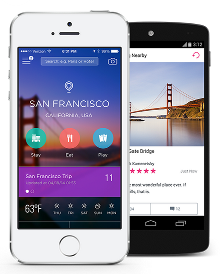
While I am planning a family trip to California, I found Gogobot app.

This application lets the user to plan for group in different locations.

Gogobot has a website too, and their new app looks great and friendly user interface.

Once I create a trip, I can invite other people and add a hotel, restaurant or place.

It has three categories which are Stay, Eat and Play.

Pros:

Plan a trip collaboratively with others

Cons:

The new interface within this app is hard to get used to it.

The information about the restaurant and hotel is not really helpful.

Screen Shot 2014-05-19 at 7.12.28 PM

#thursdayplays:venmo

Venmo is a wallet app that makes easy to pay friends for just about anything.

This is like a paypal mobile version plus facebook.

The good thing of Venmo than other competitors like Square Cash or Google wallet  is friendly and simplicity of the interface.

While I was using this app, it was quite troublesome to set up my debit card with an app but it’s secure because exchanging payments with people in my facebook friends.

The interface of venmo is simple and easy to use once user link a debit card.

Screen Shot 2014-04-16 at 10.12.12 PMScreen Shot 2014-04-16 at 10.28.23 PM

#thursdayplays: Duolingo

Duolingo: Good exiting English learning platform – They have a Website and a mobile application.

Website
mobile app

Duolingo is a free app that allows language learners to access language materials and practice translation. With this app, learners can check and track their learning process. 

Pros:

  • interactive lesson with a variety of tasks
  • random quiz like translating, listening, and speaking.
  • strong element of gamification, designed to keep the user engaged.
  • Checks user’s progress as they go forward 
  • animation part is interesting and motivated for children.

Cons:

  • Sometimes, texts are hard to read.
  • Animation is pointless in some part and these animation makes interaction slow.


User Testing


1st User Testing: Drew, Carrol, and Decho

Screen Shot 2014-03-13 at 5.11.24 PM Screen Shot 2014-03-13 at 4.42.07 PM

1. connect each menu together. so user can follow the story

2. from ingredients view, links to the shopping section.

3.  more information about the child labor

4. home view, (main page) the most important menu is donation part.  stand out donation part and the personal information is unnecessary.

what I applied

CONSISTENCY – size of lists, and position of images

CALL TO ACTION –let user to donate easily

CONNECTION – connect between three menus

INFORMATION HIERARCHY – from the most important to less important.

2nd User Testing and Feedback

Screen Shot 2014-03-13 at 9.23.49 PM Screen Shot 2014-03-13 at 9.23.16 PM

LEGIBILITY: less opacity UI: share button,consistency USER could be broader

UI: share button,consistency USER could be broader

USER could be broader. not only parents and kids

POP prototype LINK


This is new site map and I worked on app map again based on feedback.

21

Visual Design Iteration2

2