Iterations of PON

Slides:
https://docs.google.com/presentation/d/1F00RQVxIo-BUZ9C7aV5RZdYPBSHE-kSt1I9g-uxseGQ/edit?usp=sharing

First version of wires: http://invis.io/9Q28S95F6

First iteration: https://www.flinto.com/p/a7f3a844
(cut off some steps, make it simpler and more intuitive, add indication)

Second iteration: https://www.flinto.com/p/3664cdd4
(mainly simplified the sync process, hided the steps and timer, add setting, readability)

First UI: https://www.flinto.com/p/eec3a99d

iteration: https://www.flinto.com/p/6561cdd4
(add script before syncing all the stuff so that users won’t panic
iCalendar iReminder => calendar, reminder
tested Change Button on both left&right
smart suggestions => smart steps
call the user a name “hello, Poner” and can change later after
after finishing all tasks, says “peek at tomorrow”
add button to refresh the pie
change the readability on some of the screens
show the grey out in the pie chart after eliminating one task)

See more our learnings at: https://landzthesis.wordpress.com/
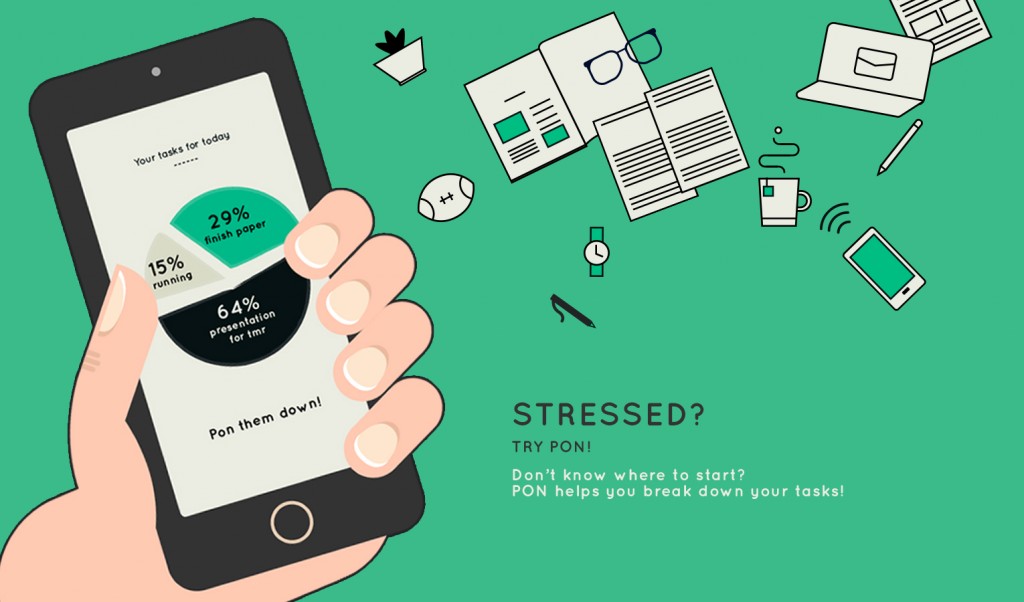
PON! UI

From last week we learned a lot from paper prototyping.

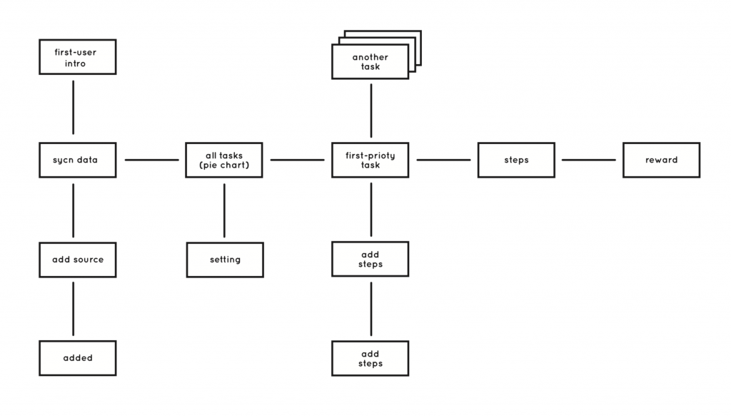
We decided to put the “adding source” feature before the app sync user data. Based on our A-B test, we realize that our users want to see the prioritized result as soon as possible, so we decided to simplify “adding sources” feature to one step. We did another A-B test of working steps in each single task. The thing we learnt is that every user group has a different opinion on this feature. For students, sometimes they are lack of motivation to finish tasks, so they wish to be motivated by steps. But for these professional people, who have better self management skill, they care more about the priority of tasks. So we decided to allow our user to turn on and off this step feature for their own use. Also, only these complex tasks will be broken down into steps. Some users don’t know how to punch phone. Because punch is the core interaction of this app, so we need a clear introduction to tell users how to interact (punch) with this app. Also, when users finish a single task, they want to have feedback from the app to tell them what they have been finished, so they will get more achievement from the task they finished. So we change the chart after user finish tasks. Sound or vibration feedback is very necessary for punch interaction. Because users can’t look at the screen when they punch the phone, so they need some feedback to let them know they are going to next step.

178_img_01

UI Prototype on Flinto:
https://www.flinto.com/p/eec3a99d

Apple Watch App UI

Feedback from last week:

  • Pay is not available currently
  • Make phone calls is not available, show number instead so that user can take out phone and dial
  • Force tap will only trigger the four button view, so should change it
  • The horizontal swipe is not allowed inside the app where the scrolling is enabled at the same screen
  • purse is specially for ladies, should change the category name to ‘wallet’
  • the distance of the restaurant shown on the detail page is not indicated clearly

All in all, it is so fun testing on the wrist.


https://www.flinto.com/p/5418b5c4

I also found this templets are helpful! Share with us: https://designcode.io/watch


Neko atsume (ねこあつめ) App Review

Screen Shot 2015-04-02 at 下午7.13.46

To download:
https://itunes.apple.com/us/app/nekoatsume/id923917775?l=ja&ls=1&mt=8

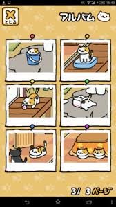
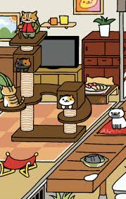
Neko atsume (ねこあつめ) is a virtual backyard for cats to show and play. You buy food and toys to feed and attract them, and they will give you cat money so that you can buy more toys. It is relaxing, and super super cute. Different cats will show up including mysterious cats and you can capture them in the album when they appear.

Their character, animation and sound design are all engaging and relaxing.


Screenshots:

download  download (1)

f0221360_1215206 images

A blogger review: http://kuroo10.blog.fc2.com/blog-entry-1.html

Their Official site:  http://nekoatsume.com/games/neko/other/index.html

Delectable – App Review

Screen Shot 2015-03-19 at 下午7.10.40

https://delectable.com/

Delectable is an app that recognize your wines when you take picture of the label in this app, and you can get reviews, recommendations, other comments about the wine.

I’m amazed by their humongous data base since I’m a sake lover and some of the brands can be less easy to find, however they have the information! And I also tried red wine and white wine – both work. And the response is fast, the information is clearly layout. The color palette is also not that generic  – it comes with a feeling of natural, graceful and high quality of life.

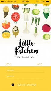
Digital Prototype on little kitchen

05_login

https://www.flinto.com/prototypes/158315

What I learned from paper prototyping
My initial idea of this kitchen is an app designed for two kinds of users – foodies and cooks, which is too ambitious and it turned out to be odd while testing. The users get confused when they were playing with the paper wireframes. Without the explanation, it’s not that clear for first time users.

That’s why in the flinto prototype, I removed the functions for cooks and refined the whole apps. Now it will only serve users who are trying new food at new places.

Crossy Road – App Review

http://www.crossyroad.com/

I didn’t notice that this app has been so popular that the vide review has been played for over 1,000,000 hits. I like the aesthetics, it reminds me of one of my favorite games – Minecraft. Each character is nicely designed and looks every appealing. The according map they design is funny and perfectly fits the character. And they hide nice details in the process when playing the game. The ad added there is acceptable too.

The UI is pixelated, pure colored and simple enough to play with. The gaming is simple too. I personally are not a big player but I play it now and then without any notification from the app. So I think this is a success.