#thursdayapps – Paper

Photo 5-1-16, 22 03 01

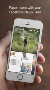
Paper is an alternative Facebook app for people who don’t like the original one. I have used Paper for a while because there are so many problems with the classical Facebook app. The biggest problem is that it occupies too many storage to just keep caches on my iPhone. And the only to free up is to delete and reinstall the app. Then I found Paper to replace the old one. There are a lot of difference between Paper and  classical Facebook app. Posts are going horizontally on Paper while Facebook displays posts vertically. To me, the UI is much clearer and easier to read on Paper.

screen322x572

screen322x572 (3)screen322x572 (4)


Also most functions we frequently use on Facebook work well on Paper, like posting, leaving comments, checking-in, sharing posts, etc. However, we cannot like posts with emoticons and do live stream for now because it does not update for more than one year(Yes, it has stopped updating since March 2015). If someone is tired of the classical app, you can try Paper. The only thing that new user has to do is to be familiar with the new operation but it won’t take long to get used it.

Facebook-Paper-Icon
Paper app icon

Notice: Paper is only available on US App Store. So it is required to have an US account to download it if you don’t have one.

Project #2: Food Guardian on Apple TV – User Insights & Design

Photo 3-17-16, 20 54 32 Photo 3-17-16, 21 10 35Photo 3-17-16, 21 08 43Photo 3-17-16, 21 09 14

  • User Insights

    1. Are showing bigger pictures or images necessary?
      Basically People know what their groceries look like, so it seems not very necessary to show larger pictures to users while browsing. It might be better use the way how details display under Home tag in Storage and Category tags.
    2. How focus move while there is a new layer?
      While user click a image, it will shows you a new layer and the details of the image, like name, category, expiration date and where it is. And there is also a button on that layer. Since the layer pop up, where the focus go? It should be more intuitive and simpler to users so they don’t have to think about how to control or where their focus go.
  • Design

Marvel App


Project #2: Food Guardian on Apple TV – App Map & Wireframes

  • Introduction

Although I only use the older Apple TV, I don’t like doing complex things with the small remote such as typing. So I remove all the input functions for iOS app and only keep deletion. Users now can only view what they have from their iOS Food Guardian on Apple TV and use the item is “already used up” function, which is a deletion basically. Thus, it makes the app simpler and easier to use.

  • App Map for tvOS

App Map

  • Wireframes

Ver 1.0-02

Ver 1.0-05 Ver 1.0-04  Ver 1.0-06

Ver 1.0-07

Ver 1.0-08

Project #1: Food Guardian – Final Iteration & Presentation

  • User Insights from last user testing

    1. Typo problem or choice of words:
      Bad choice of words or typo might mislead your users. It is important to check every text to prevent from misunderstanding.
    2. Color code:
      Good use of color helps users to understand the information directly and makes your app more intuitively. Also it makes the experience comfortable.
  • Feedback from Critics

    1. Food waste is good concept and also is a problem today.
    2. If there is a technology can analyze a photo with lots of groceries and see what kinds of food are they, which can make everything efficient.
    3. Good color code that makes information clearer and more understandable.
  • Final Iteration

Marvelapp

  • Final Presentation Slides

Project01-Food Guardian Final Presentation

#thursdayplays – The Mesh

I have been played “The mesh”, which is a mobile game that available on AppStore, for a while and it is really interesting. Basically, players do simple arithmetic–addition, subtraction,multiplication, division, and the only goal is to match the number that shows on screen.


This way to do arithmetic is dragging the numbers. Numbers with same color do addition, otherwise subtraction. If there is a “x 2” cell then it means “multiplied by 2”, and if it is “÷ 2” then it means “divided by 2”. And it is almost everything a player has to know. At the beginning, player has 12 cells and some cell with given numbers. However, if player fails to match the goal, it will remove cells from the view. But the good thing is that player has many chances to get those cells back as rewards during the game play.

After passing a stage, player will get a geometrical animal statue, which is one of the Chinese zodiac animals. But I have not figured out what roles they play in this game or just awards. But they are really beautiful and amazing design. It is still great if they are just awards.


I am trying to pass all 200 levels but I only get to lv.104 recently. If you are interested in The Mesh, it is nice to give it a try.


Image Source: AppStore


Project #1: Food Guardian – 1st Presentation & User Insights

  • App Map / Wireframe Presentation Slides

Food Guardian-Slides Link

  • User Insights

    1. Make the input process easier and faster:
      If user has a lot of groceries to record, it will take too long to finish inputting data. User would be tired of using the app while the experience is annoying and redundant. Try to find out a faster way to input, like scanning barcode or auto-categorizing by analyzing photos.
    2. Add “How much food have you wasted so far” function:
      In order to make the app more effective, letting user know how much foo have been wasted is not only useful but interesting. User will be aware of their groceries more and try to keep them from going bad.
    3. Expired Date v.s Purchased Date:
      It is a little confused between expired date and purchased date. User does not understand the difference and necessity of input purchased date. It would be better use clearer term of titles or have instruction tags to clarify the confusion.


Project #1: Food Guardian – App Map & Wireframe

  • Introduction

Most of people buy food and groceries regularly. Take myself as an example, I cook my own food and eat at home most of the time, at least breakfast and lunch. However, I sometimes forget what I have in the refrigerator or storage box and leave them in the depths. Of course they are no longer fresh after expired. And it is quite inconvenient to check the expired date frequently. Thus, it would be easier if our smartphones can take care of that for us.

Food Guardian is an app that can helps its users to manage their food and groceries. Users just have to input the info of food, especially the expired date, then Food Guardian will notice you while the food is about to go bad.

  • App Map

  • Wireframe

1.0 Home
1.1.1 Food Detail
1.1.2 Food Used Up
2.0 New
2.1 Take Photo
2.2 Edit_NAME
2.2 Edit_CATEGORY
2.2 Edit_DATE
3.0 Search
4.0 Setting


Apple HIG Notes

  • Give people confidence that their work is always preserved unless they explicitly cancel or delete it. Sometimes I lose some of my texts or notes in certain apps after I use other apps and want to continue my works. Because they restart themselves after recovering from multi-tasking. I always consider these situations as my personal problems. I think I should have saved everything before I switch away from the current app. I do not know that it is app’s responsibility to save user’s data periodically or automatically.
  • Tailor Customization to the Task. I believe that many designers want to be innovative and creative while design their products. At least I do. Because being different is attractive to audiences occasionally. However, it is really important to balance UI customization with clarity of purpose and ease of use. Briefly, we have to be aware of how users do their jobs and the necessity of elaborate design.
  • Avoid asking for health data before users have a chance to understand what it will be used for. I never used HealthKit before but it became popular since Apple Watch is released. And there are more and more apps using health data. It is really important while accessing user’s private information. It would be an issue if apps are not designed properly to do the tasks. Every designer has to pay attention to this detail.